









Kitchen wall art: choosing artwork that belongs where people gather
The kitchen has changed. It is no longer just a place for preparing meals. It has become a breakfast corner, a coffee bar, a home office between meetings and the room where conversations often last longer than dinner itself. Artwork has followed that shift. Today's kitchen wall art ranges from vintage food advertisements and cocktail illustrations to botanical studies, fish engravings, humorous typography and classic paintings, allowing the room to reflect personality rather than simply function.
Start with the atmosphere, not the food
Many people begin by searching for artwork featuring coffee, wine, fruit or vegetables. That approach works, but it can also limit the possibilities. The stronger question is how you want the kitchen to feel.
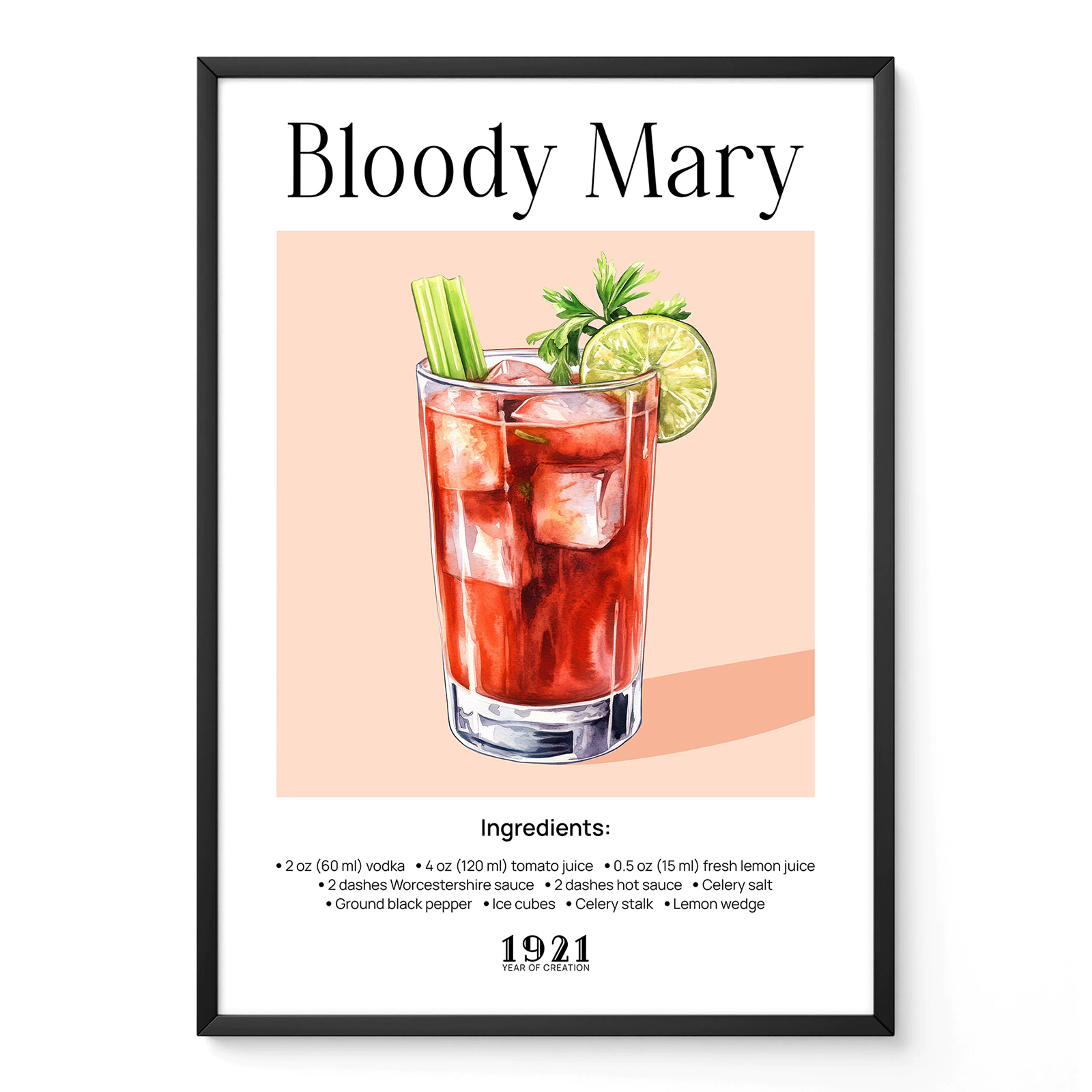
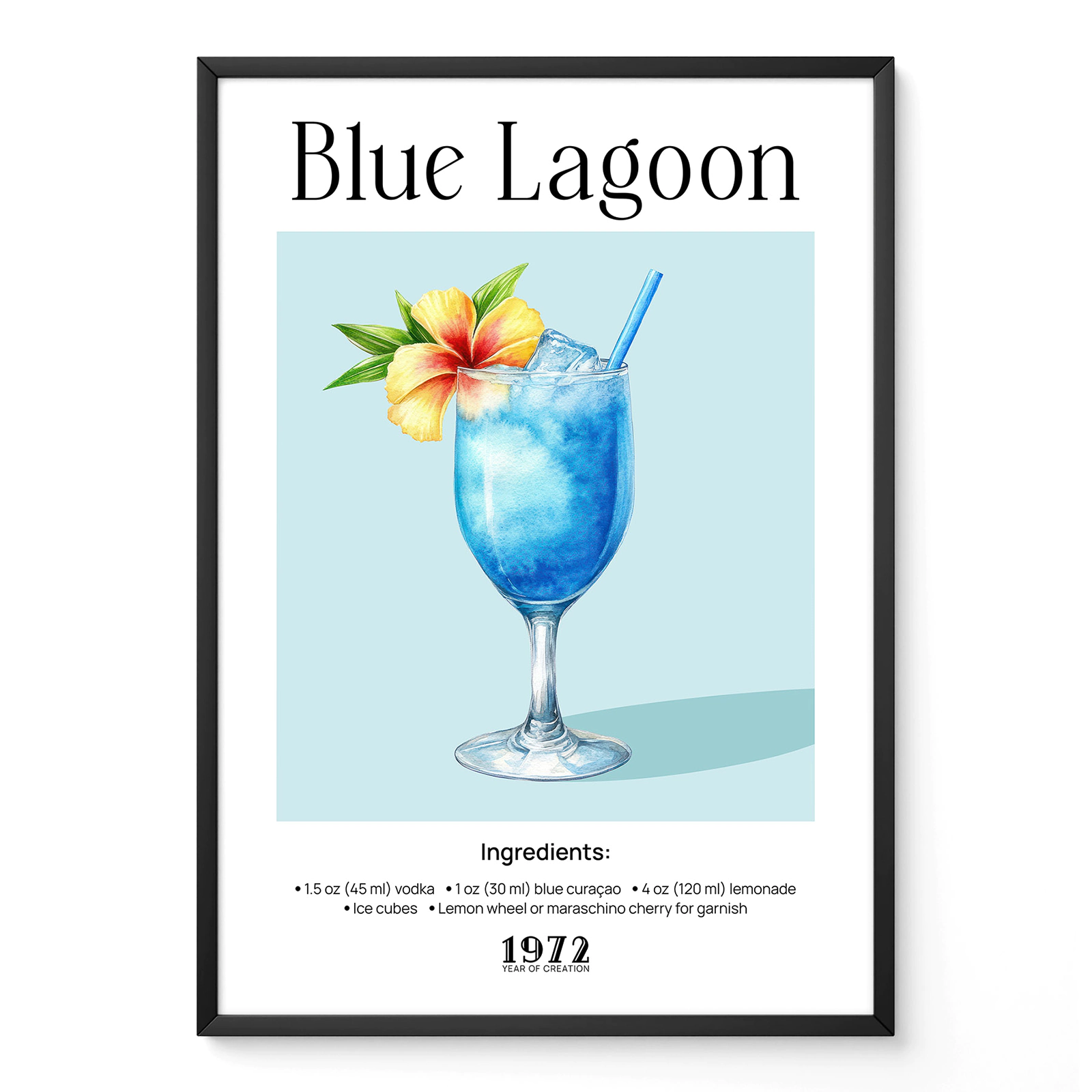
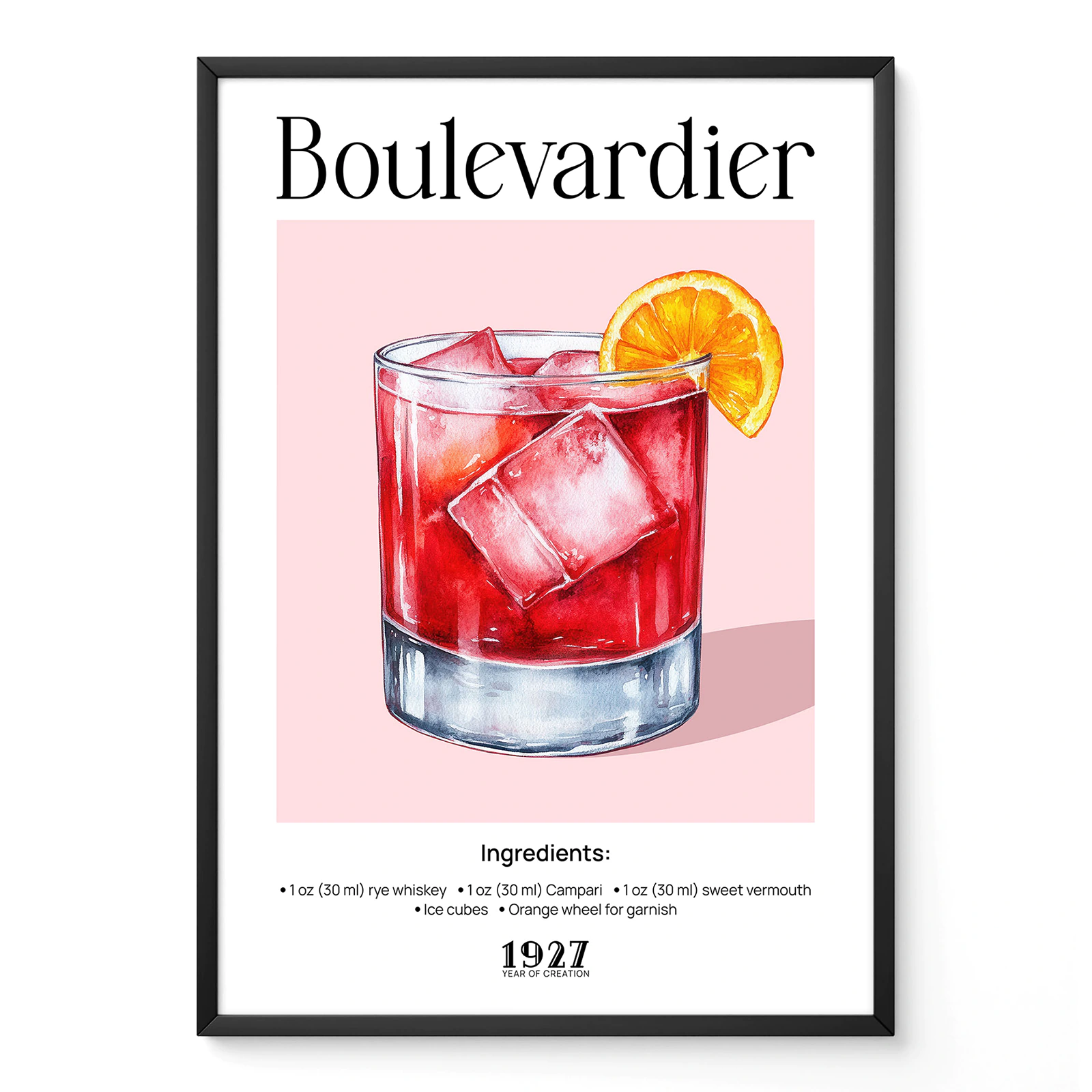
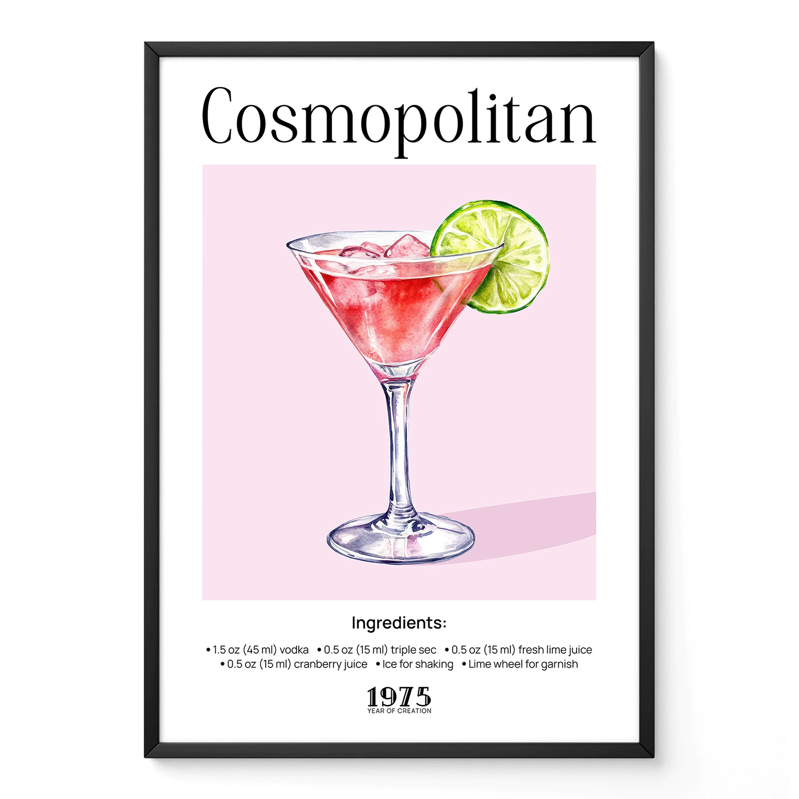
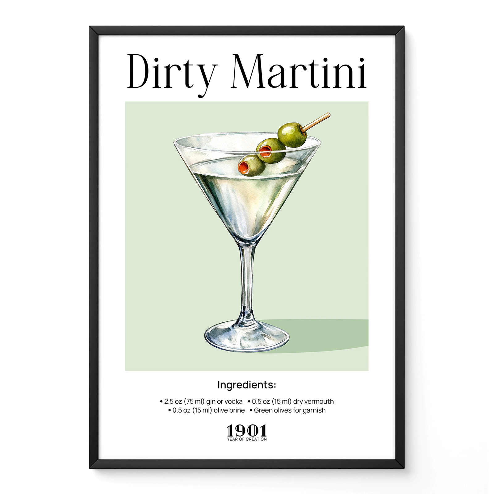
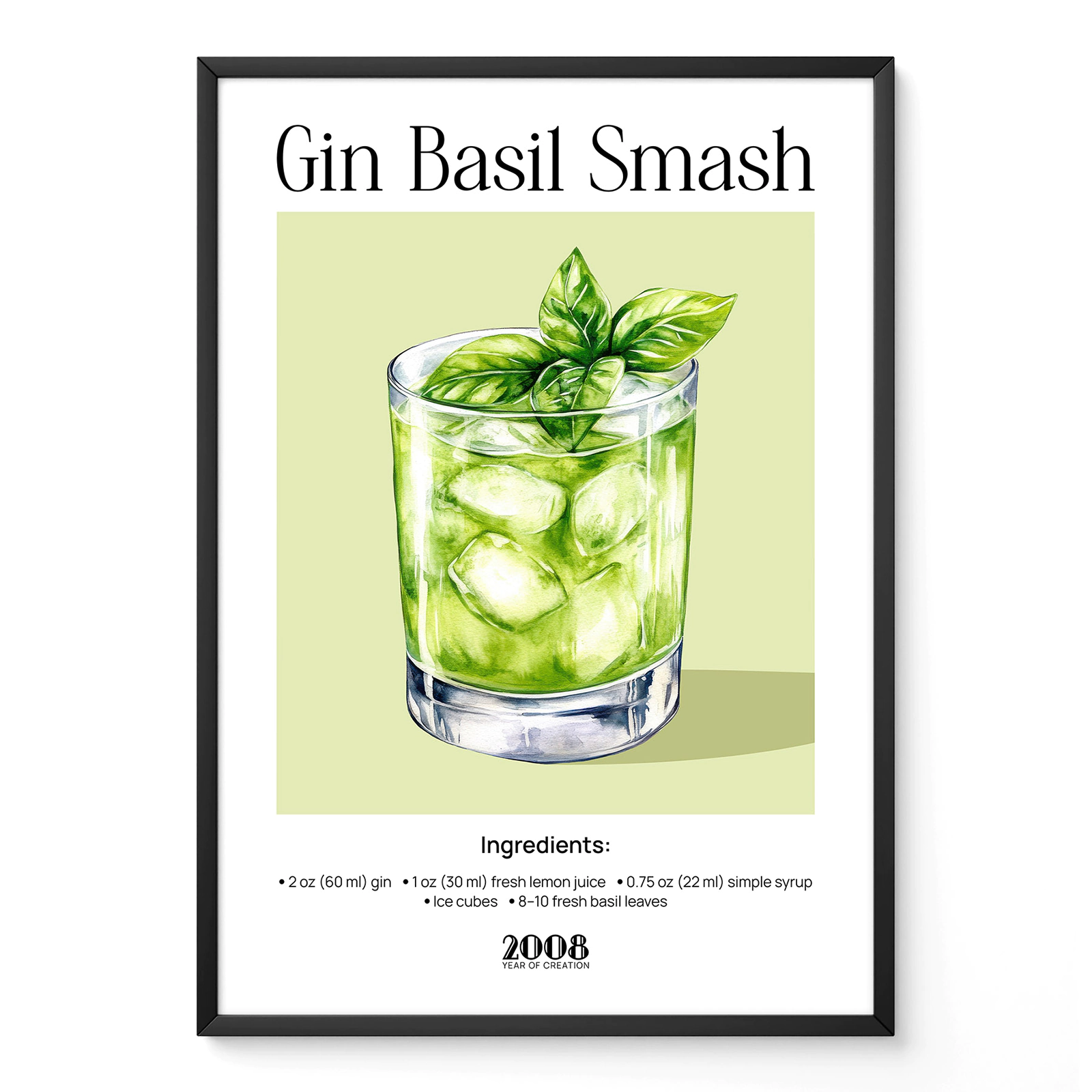
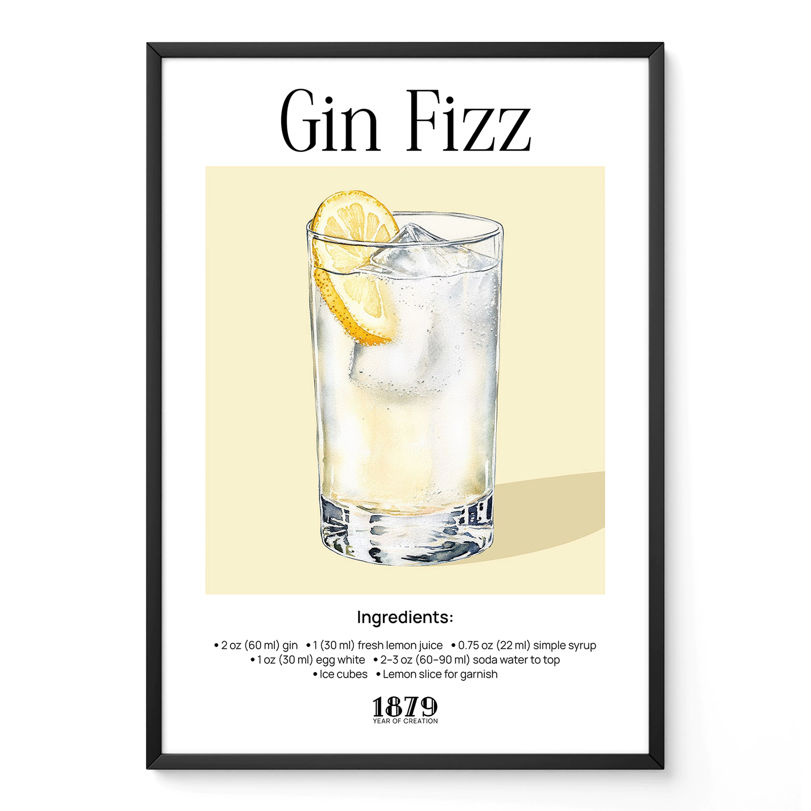
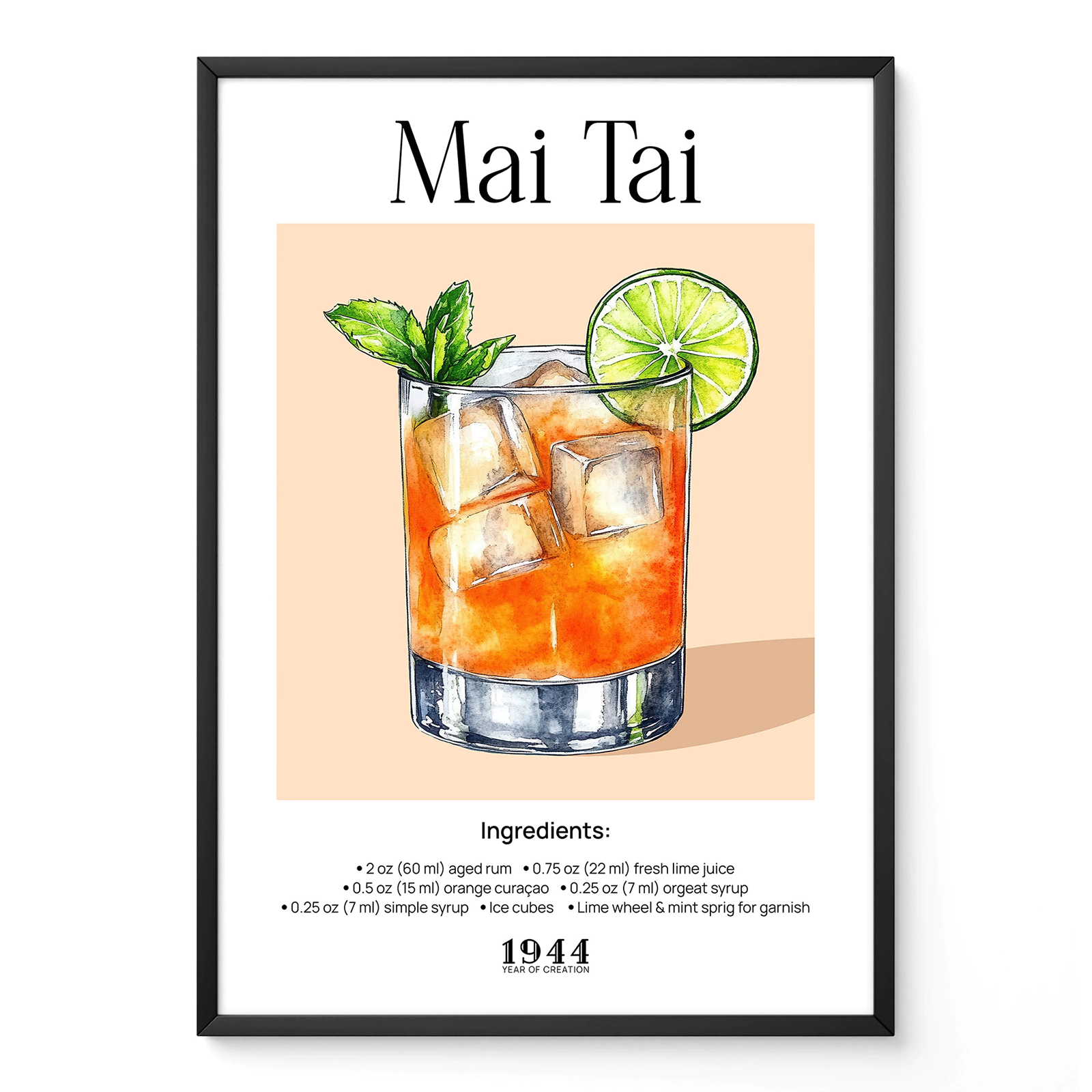
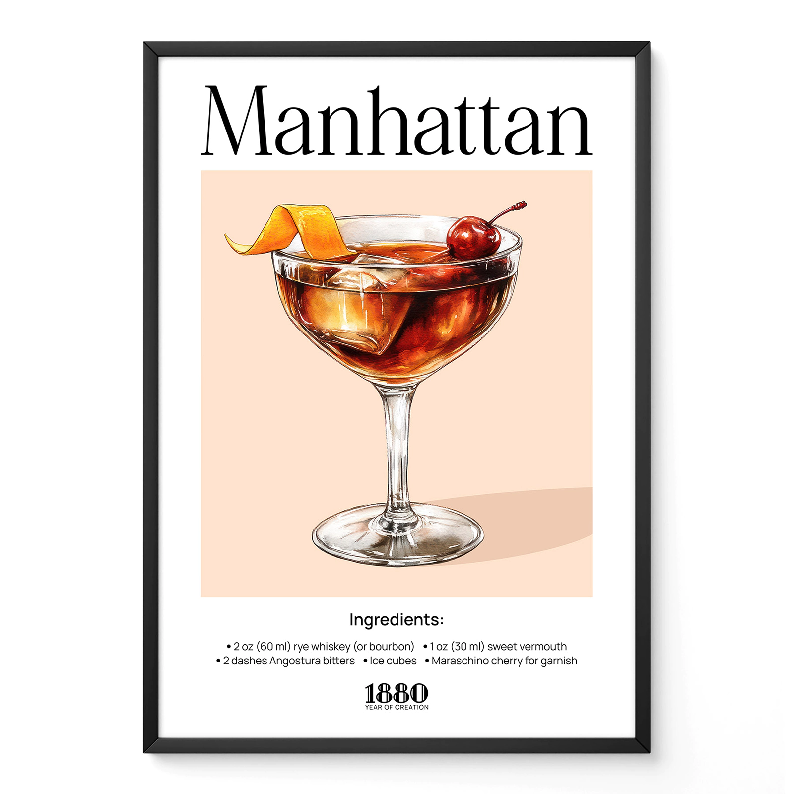
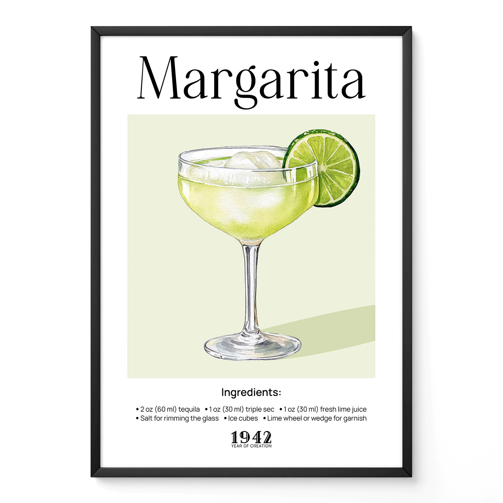
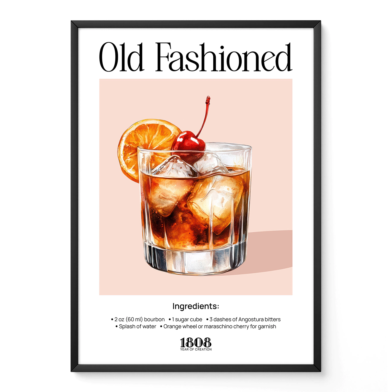
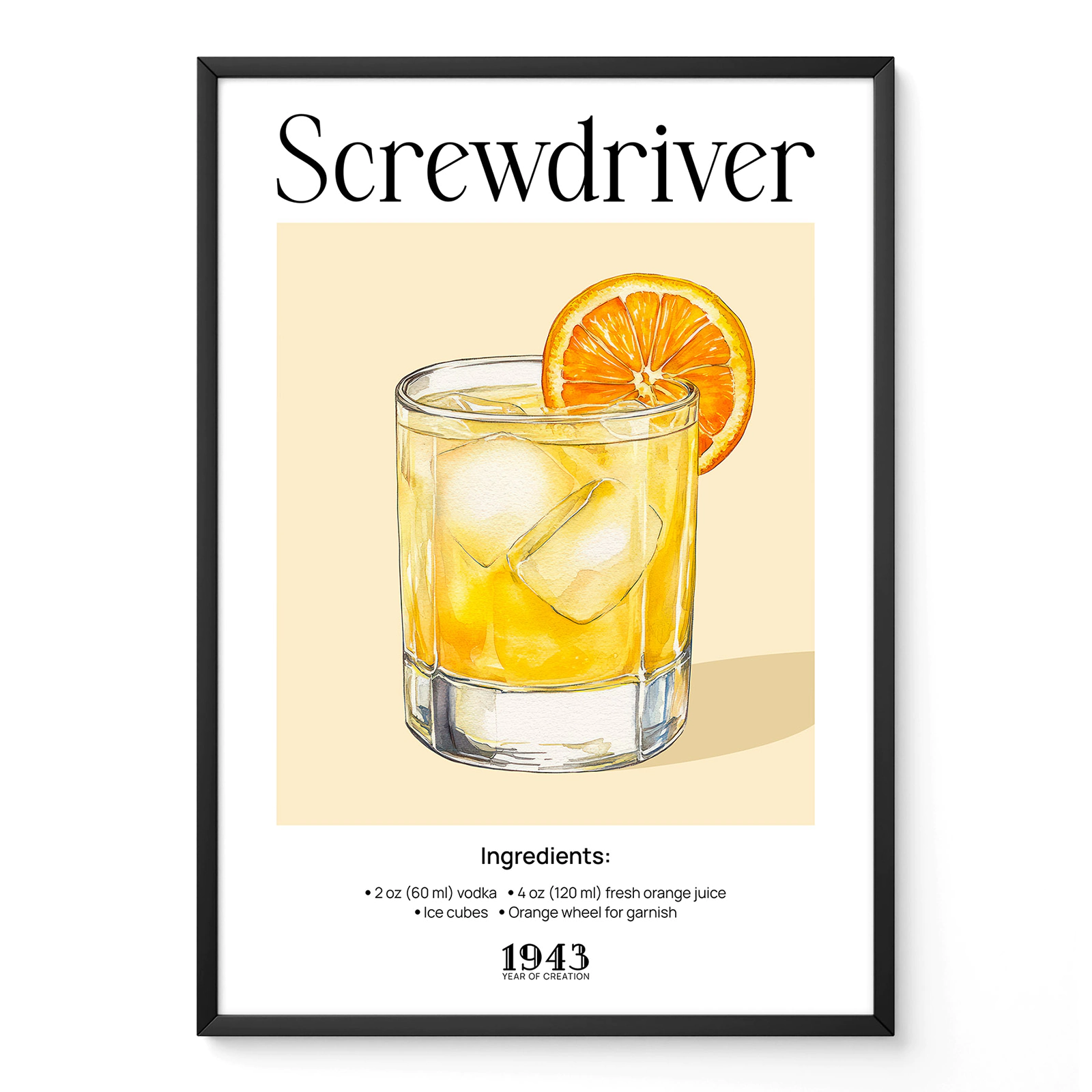
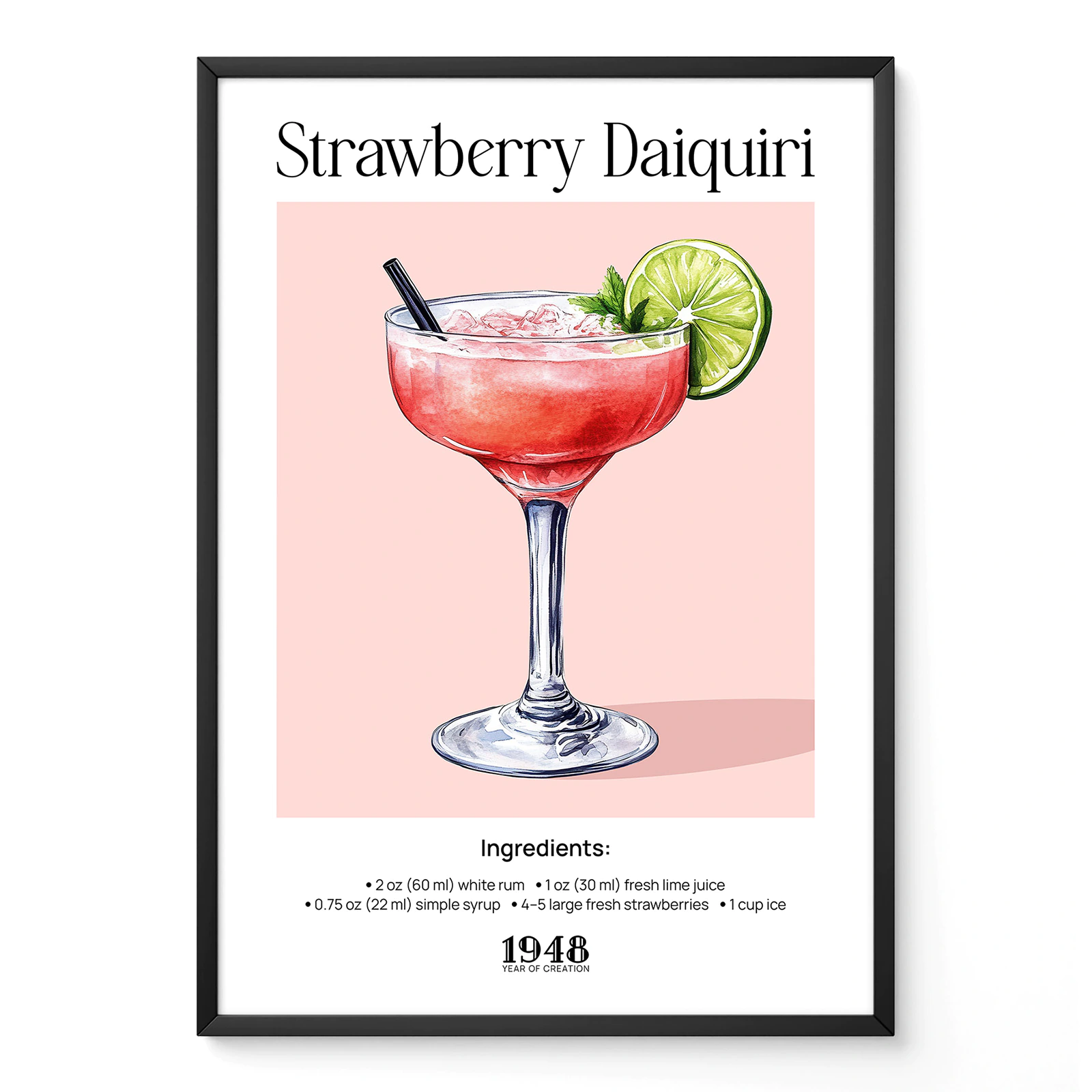
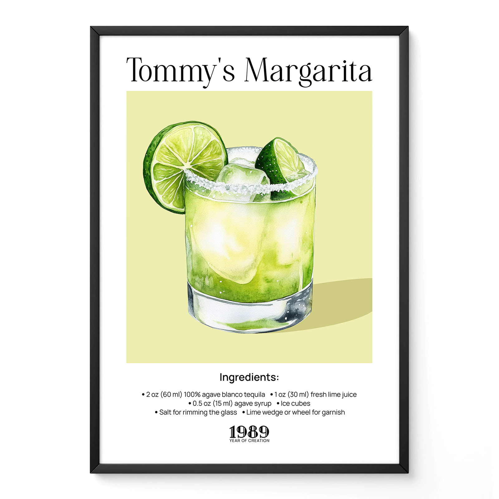
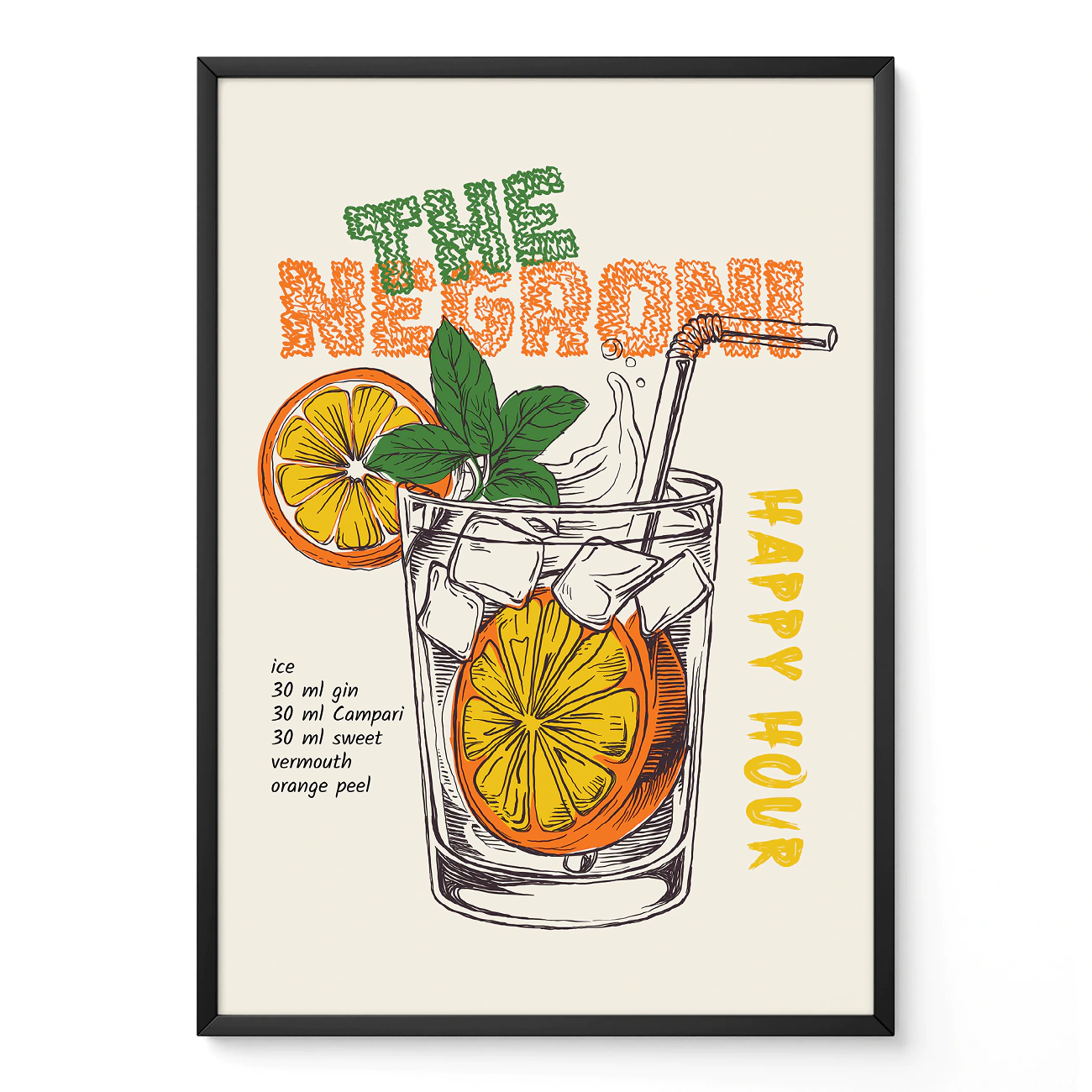
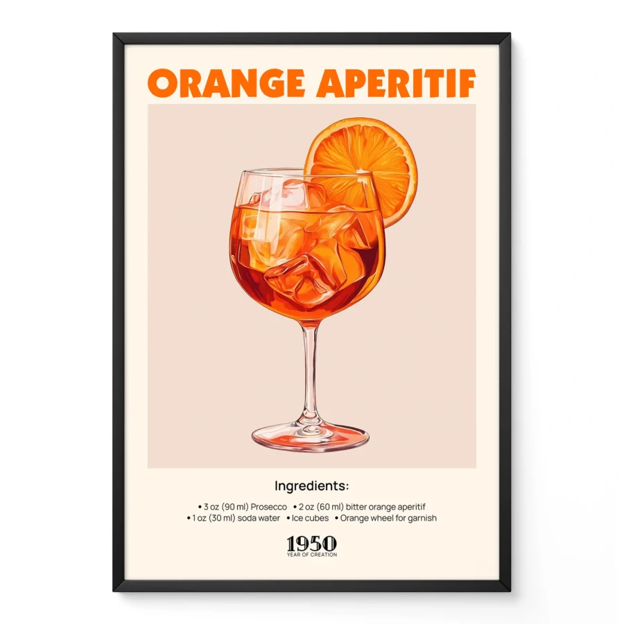
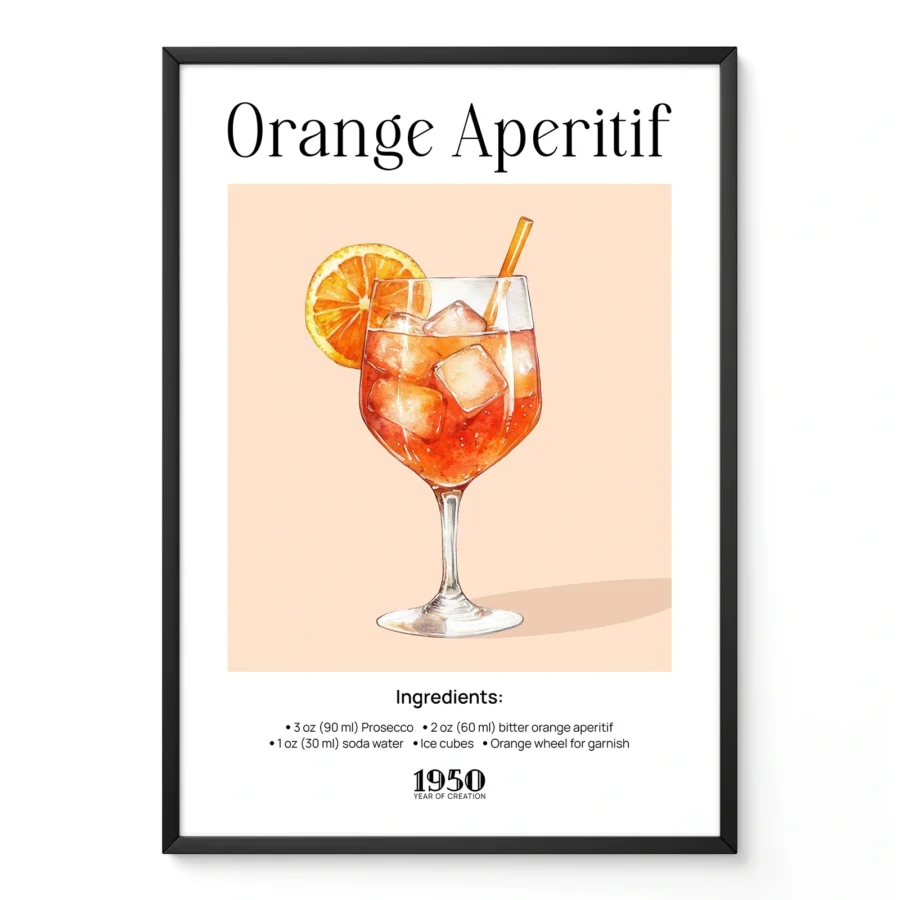
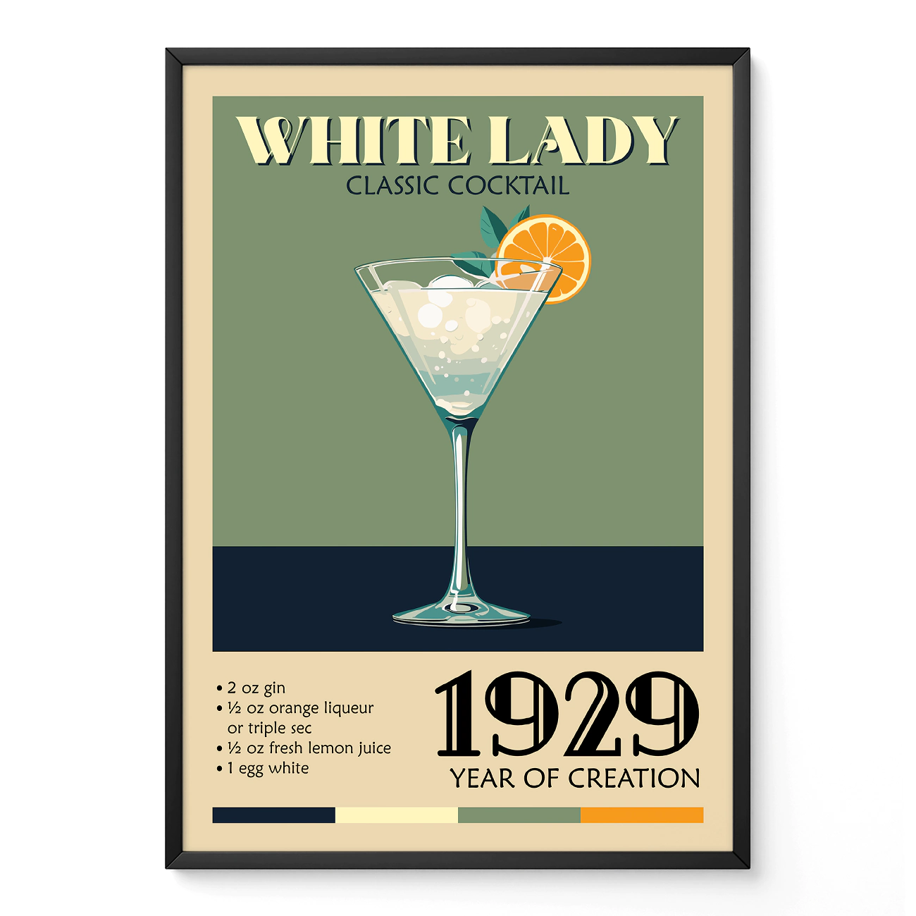
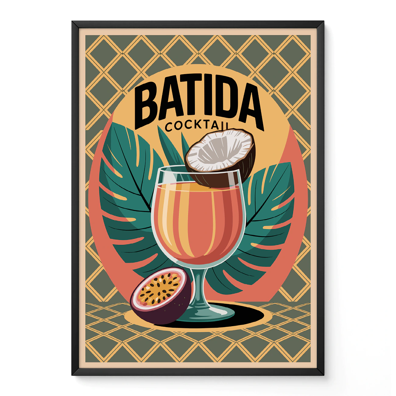
A vintage sardine label creates a playful Mediterranean character. A botanical citrus illustration introduces freshness through colour rather than realism. Cocktail recipe posters add a relaxed bar-inspired atmosphere, while antique fish engravings or natural history illustrations bring a quieter, more traditional mood. Even paintings by artists such as Vincent van Gogh can feel perfectly at home in a dining area if their colours complement the surrounding materials.
This broader way of choosing explains why kitchen wall art has become far more varied than collections based solely on food.
Mixing different themes creates a stronger interior
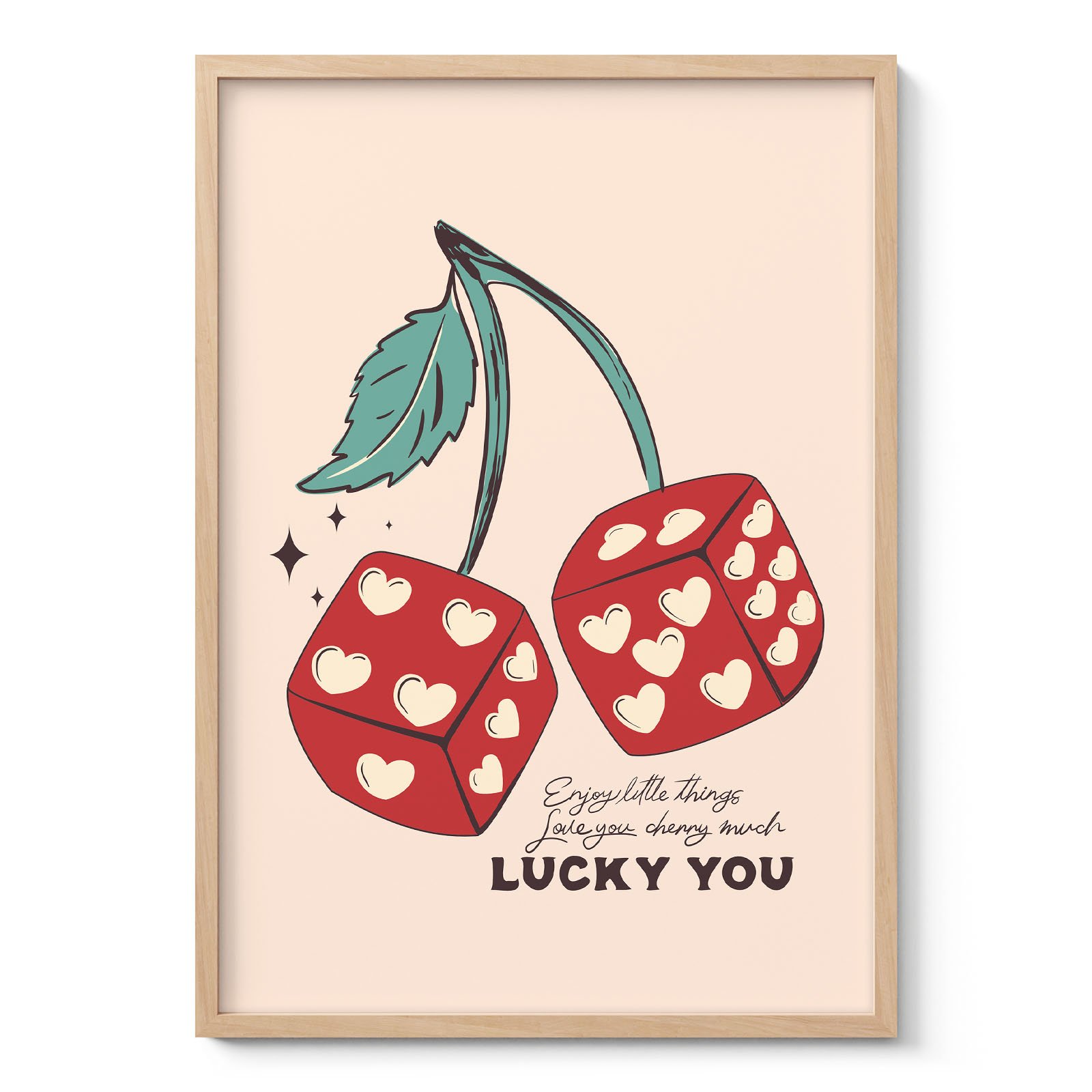
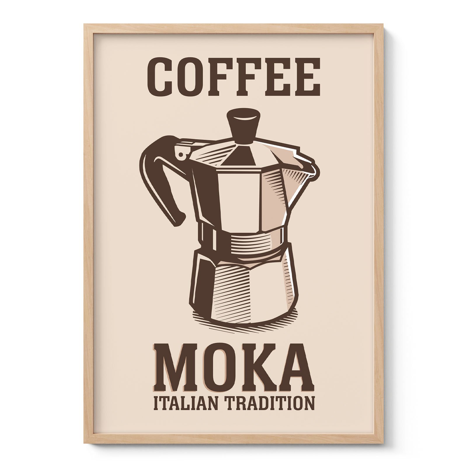
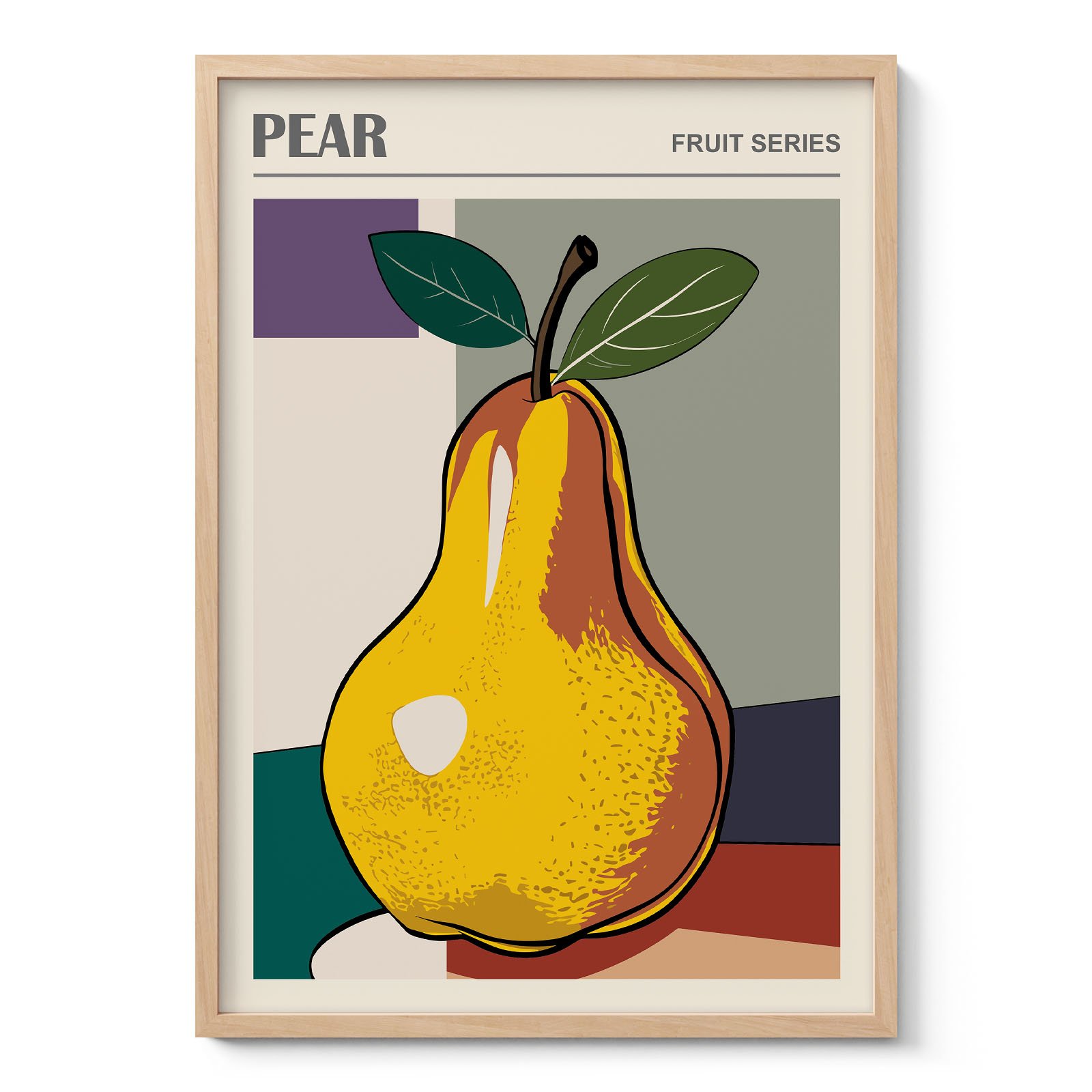
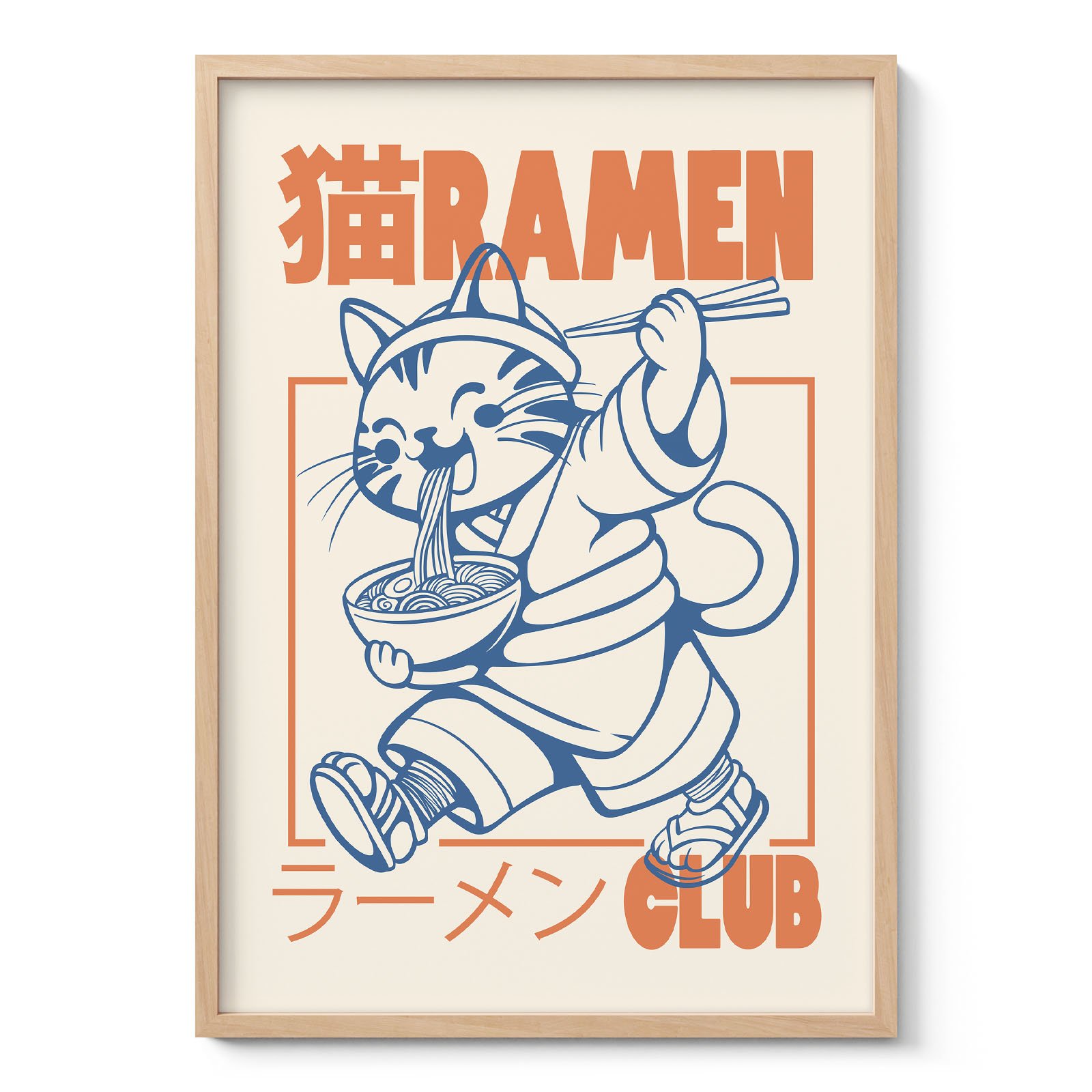
One of the most effective decorating techniques is combining subjects that share a common visual language rather than the same theme. A retro espresso poster can hang comfortably beside a vintage fruit illustration if both use similar muted colours. Humorous cat prints fit surprisingly well next to cocktail artwork because they share the same playful tone, even though their subjects are unrelated.
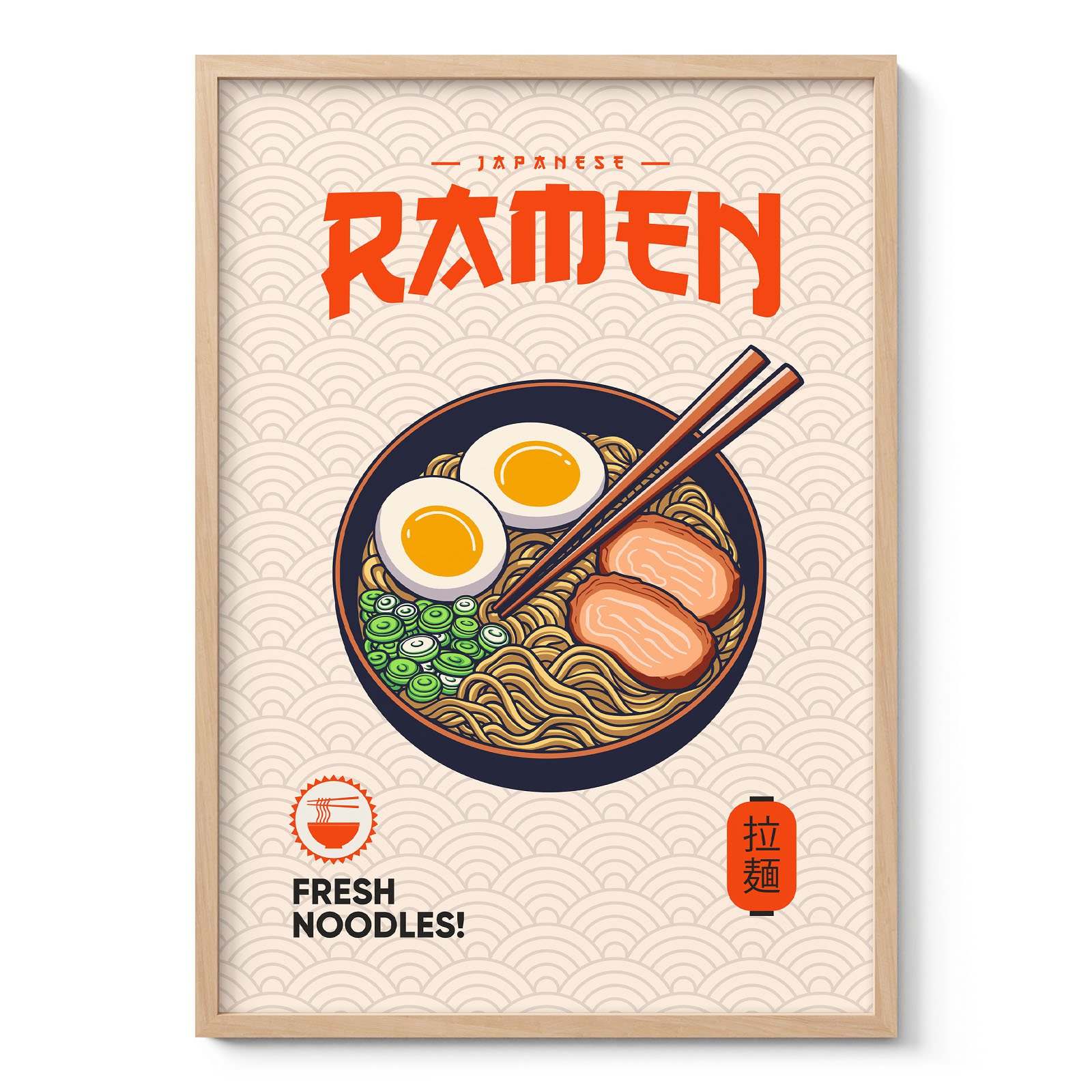
Graphic typography also deserves consideration. Bold lettering naturally attracts attention, making it suitable for breakfast nooks, coffee stations or home bars. Detailed botanical illustrations reward closer viewing and often work better in spaces where people remain seated for longer periods.
Gallery walls benefit from this contrast. Mixing food illustrations, drinks, vintage packaging, natural history prints and occasional fine art usually feels more personal than repeating the same style throughout.
Colour has more influence than the subject
Kitchens contain many fixed elements, including cabinets, worktops, splashbacks and appliances. Because these cannot easily be changed, artwork often works best when it responds to the existing colour palette rather than competing with it.
Warm terracotta, olive green and mustard yellow naturally complement wood cabinetry and traditional kitchens. Soft cream backgrounds with restrained illustrations suit Scandinavian interiors where simplicity takes priority. Black-and-white graphics create crisp contrast in contemporary spaces, while pastel cocktail prints pair well with Mid-Century Modern influences.
The size of the artwork matters as well. Large statement pieces work best on uninterrupted walls, whereas smaller posters are easier to arrange around shelves, windows and cabinets. Canvas prints often emphasise painterly subjects such as fruit studies or still lifes, while posters highlight graphic illustrations and vintage advertising particularly well.
These practical decisions often determine whether kitchen wall art feels integrated into the room or simply occupies an empty wall.
Think about viewing distance
Unlike living rooms, kitchens are experienced in constant motion. People prepare meals, make coffee, carry groceries and move between work surfaces. Artwork therefore benefits from being readable at different distances.
Simple compositions with clear shapes are easily appreciated across the room. More detailed illustrations reveal themselves gradually while waiting for water to boil or sitting at the dining table. This layered experience keeps artwork interesting long after it has become part of everyday life.
Lighting deserves equal attention. Natural daylight changes throughout the day, meaning colours that appear subtle in the morning may become richer during the evening. Vintage prints with softer tones often respond beautifully to this shifting light, while high-contrast graphics remain visually clear regardless of changing conditions.
Rather than filling every available wall, leaving space between artworks allows each piece to breathe. Kitchens already contain visual information through utensils, cookware and shelving, so thoughtful spacing often produces a calmer result than a densely packed display.
Because the kitchen combines practicality with everyday living, its artwork should reflect both. Kitchen wall art offers the freedom to mix culinary themes, vintage illustration, fine art, typography, botanical subjects and playful graphics according to the personality of the home. From classic cocktail posters and antique fish studies to fruit prints, café-inspired designs and humorous illustrations, kitchen wall art creates visual interest that feels natural in one of the most frequently used rooms of the house.