
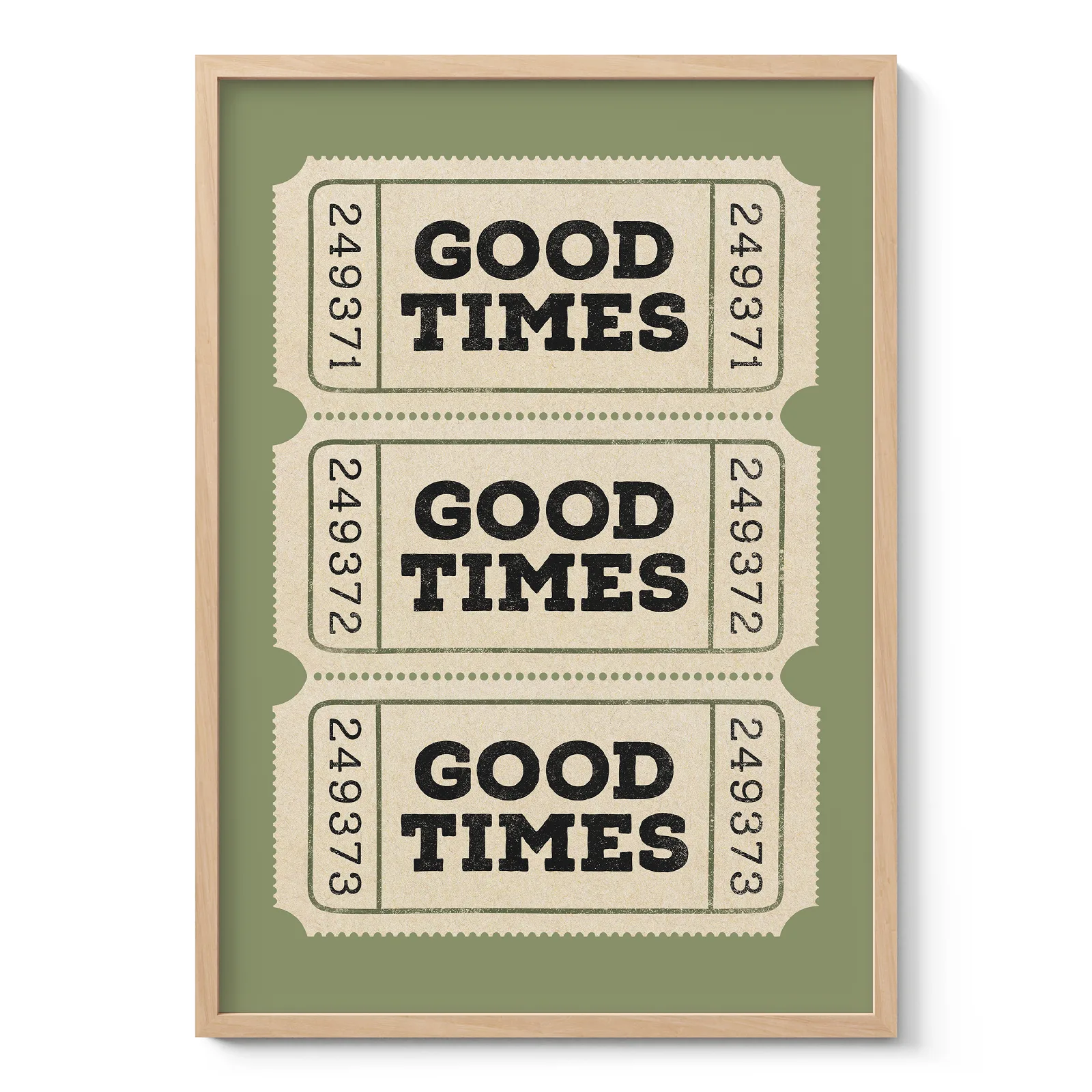
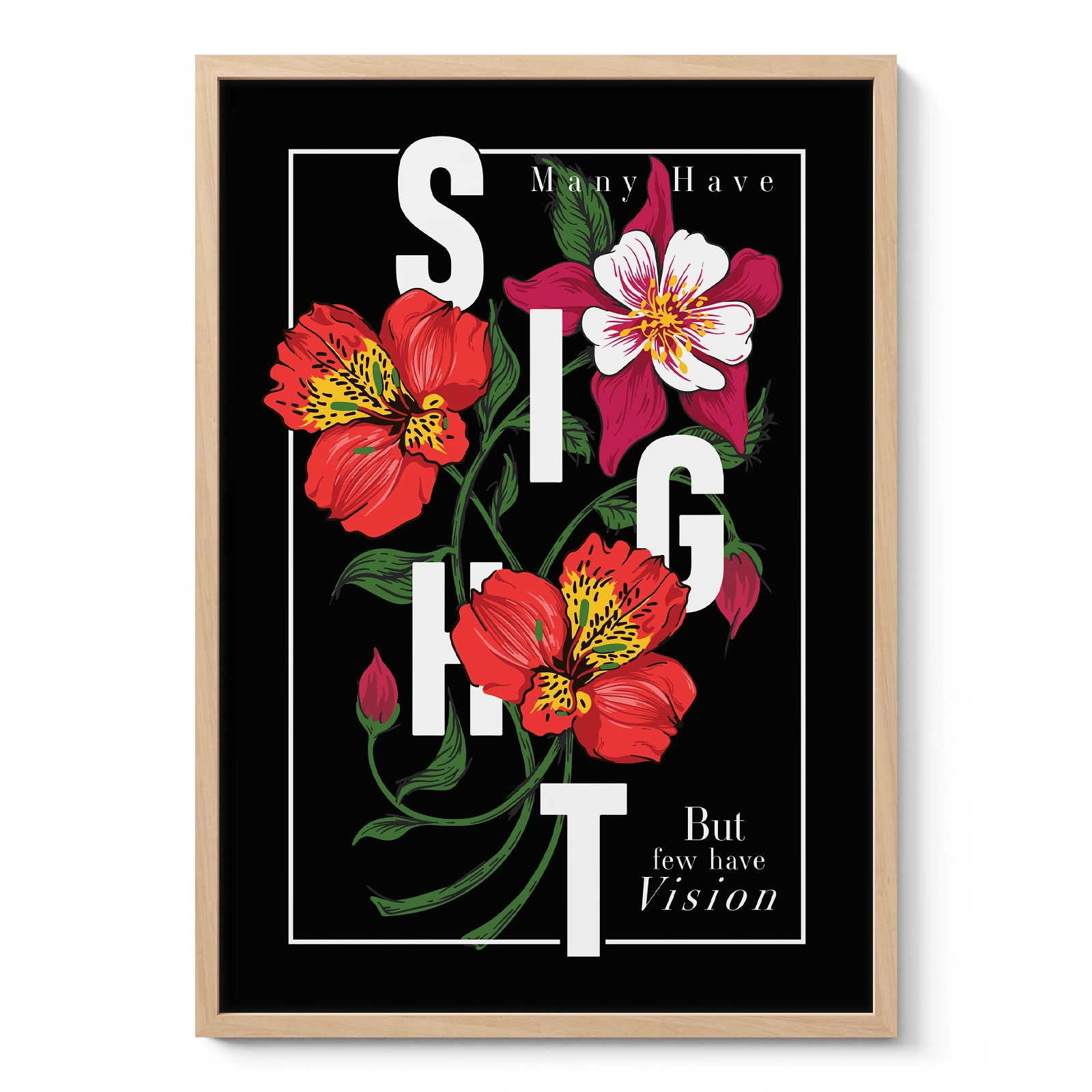
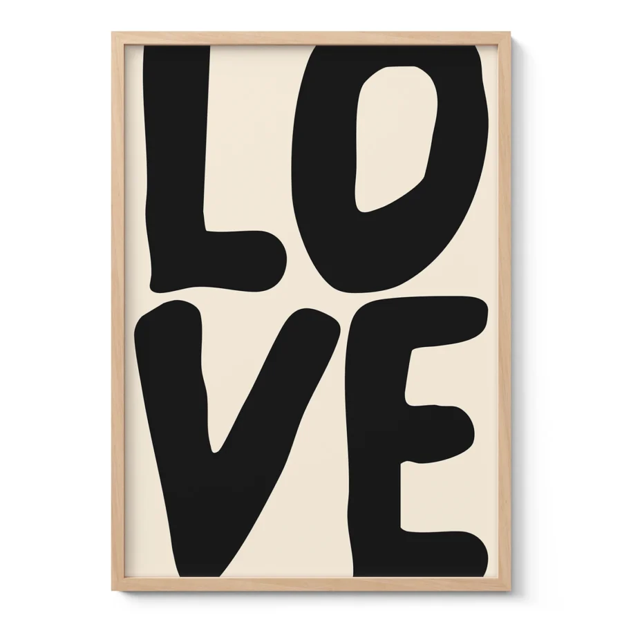
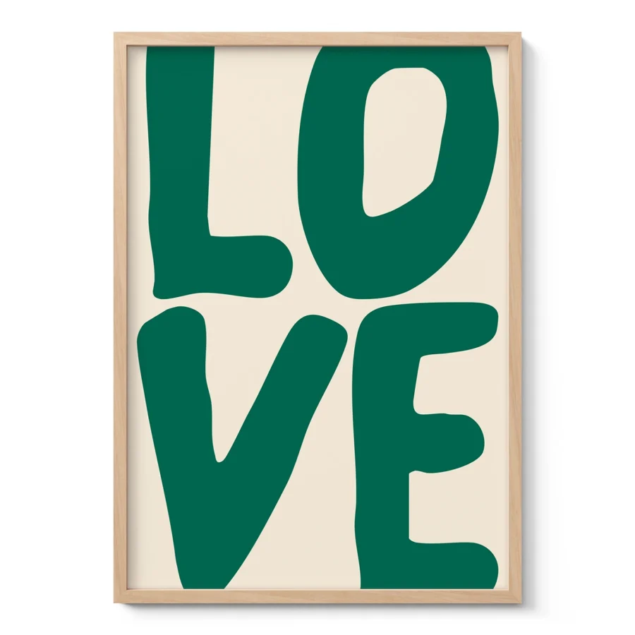
Typography wall art for homes with clear visual character
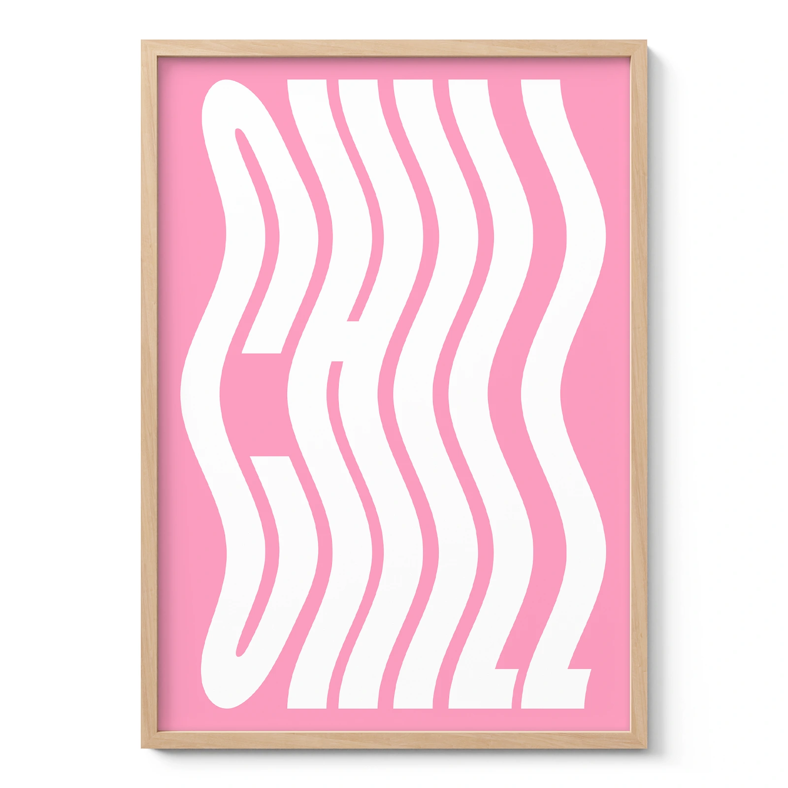
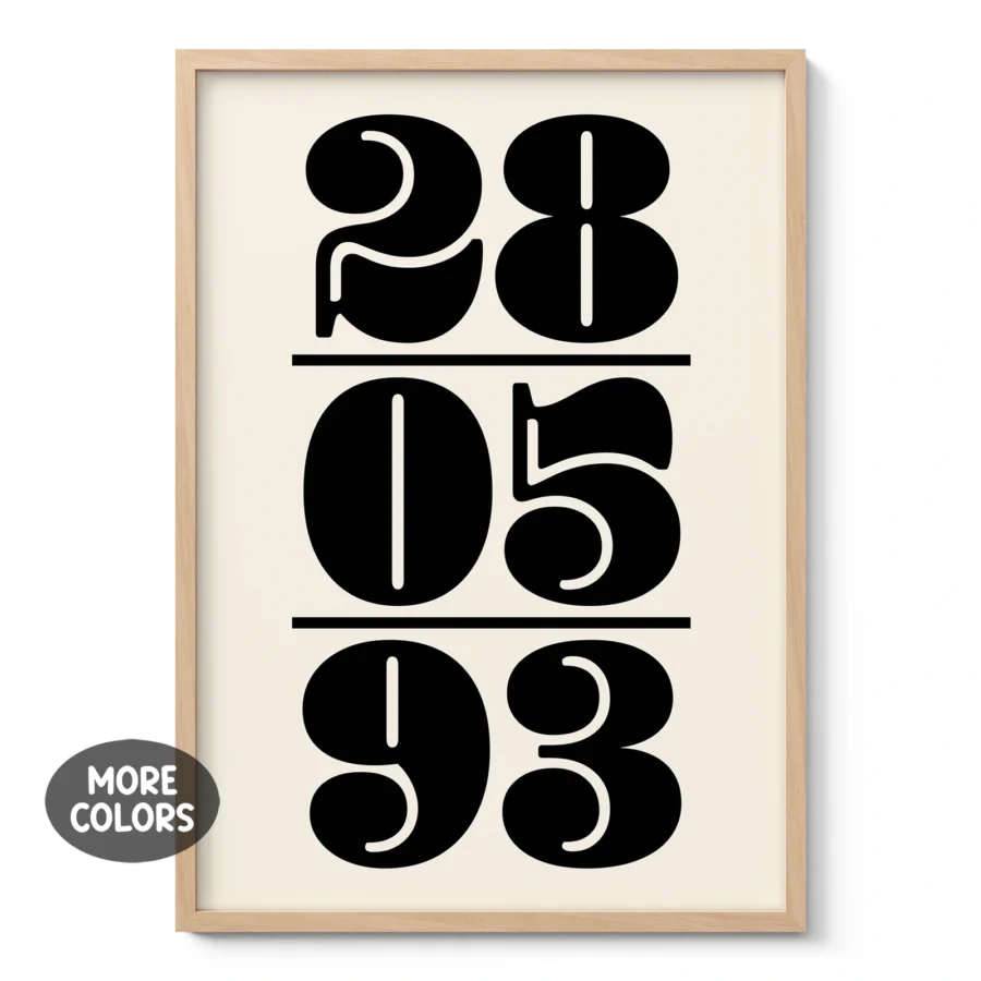
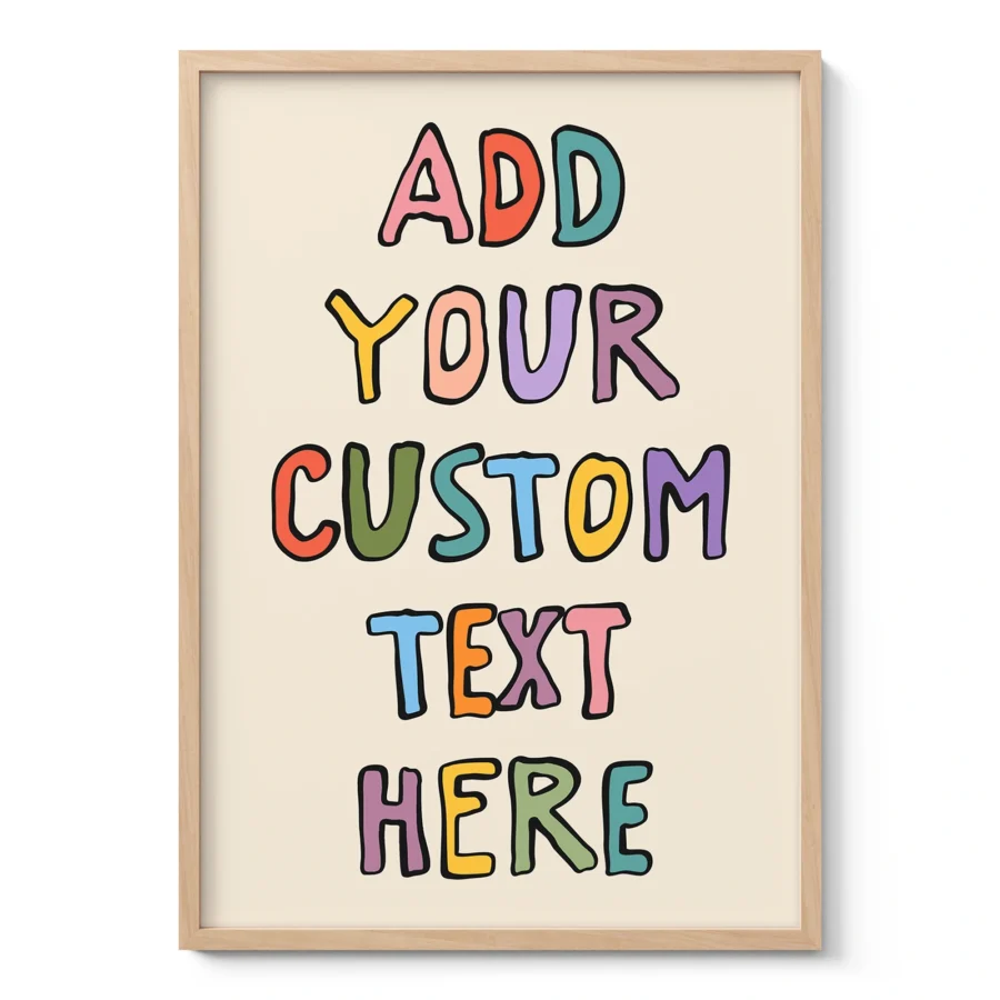
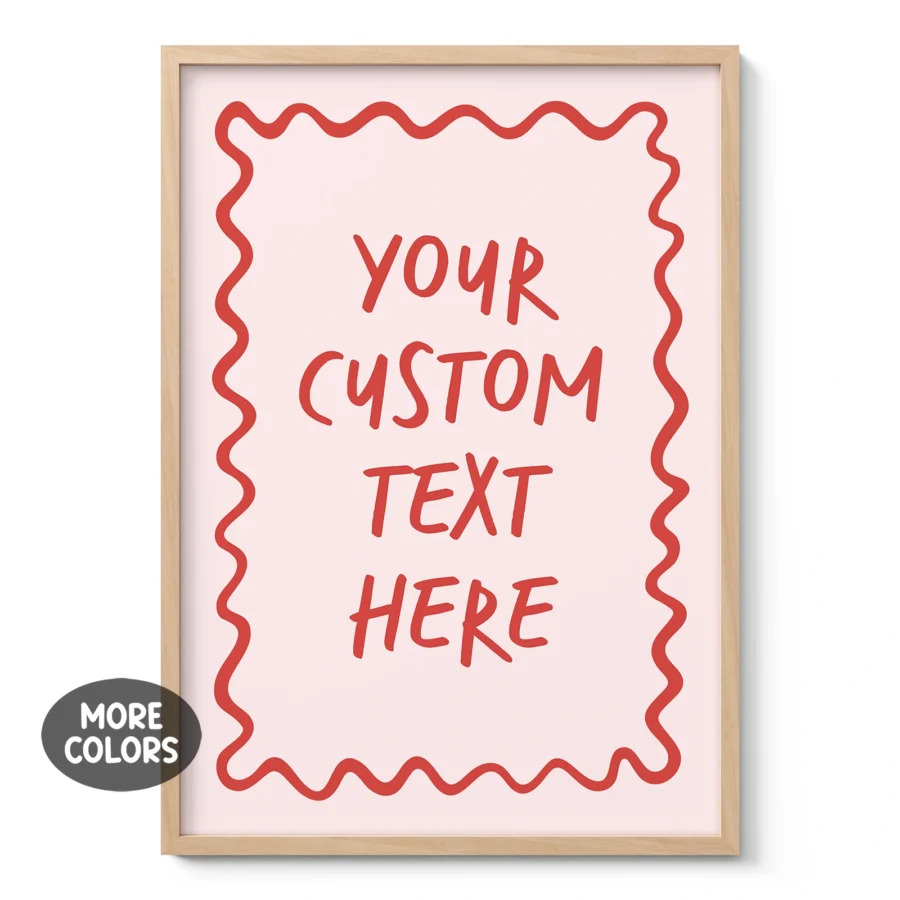
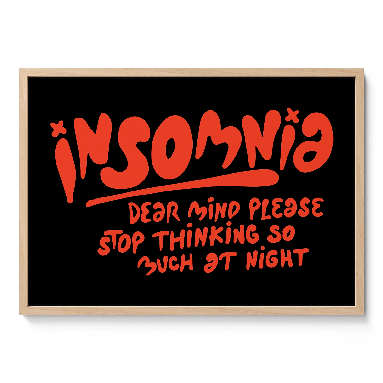
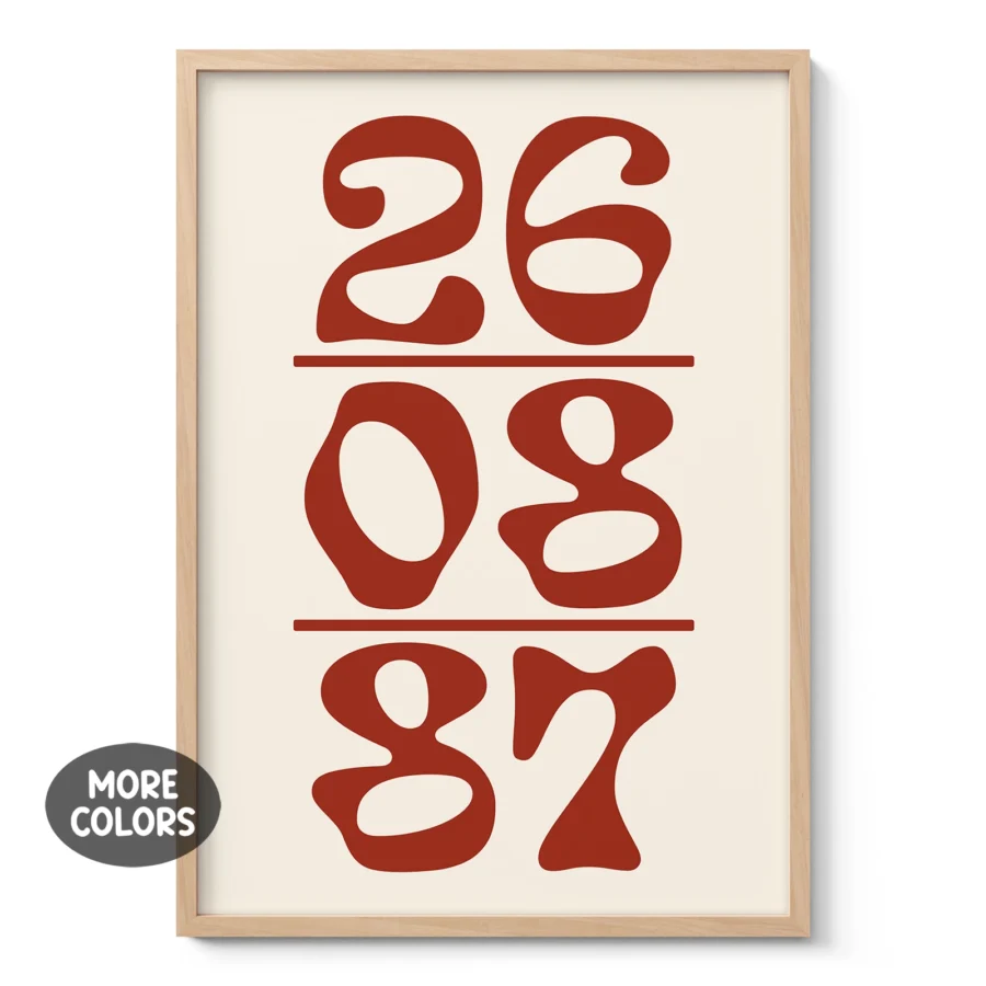
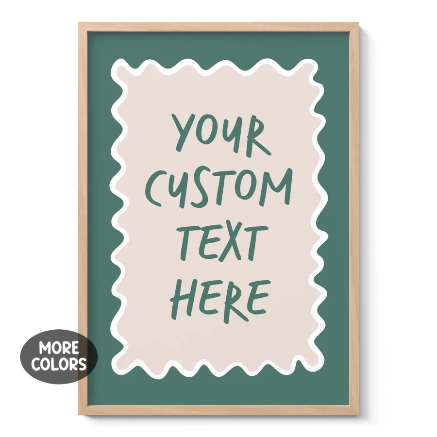
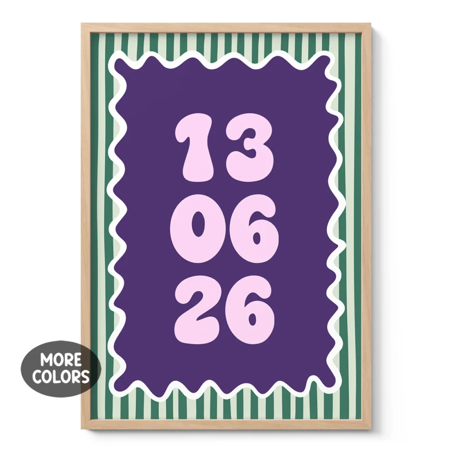
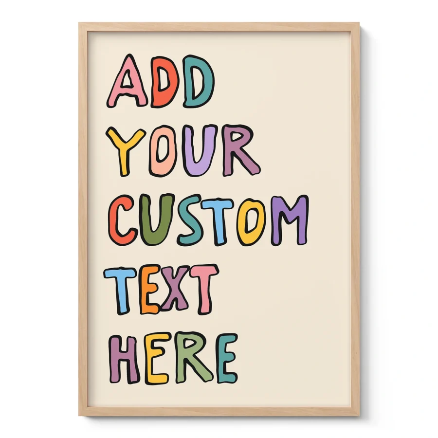
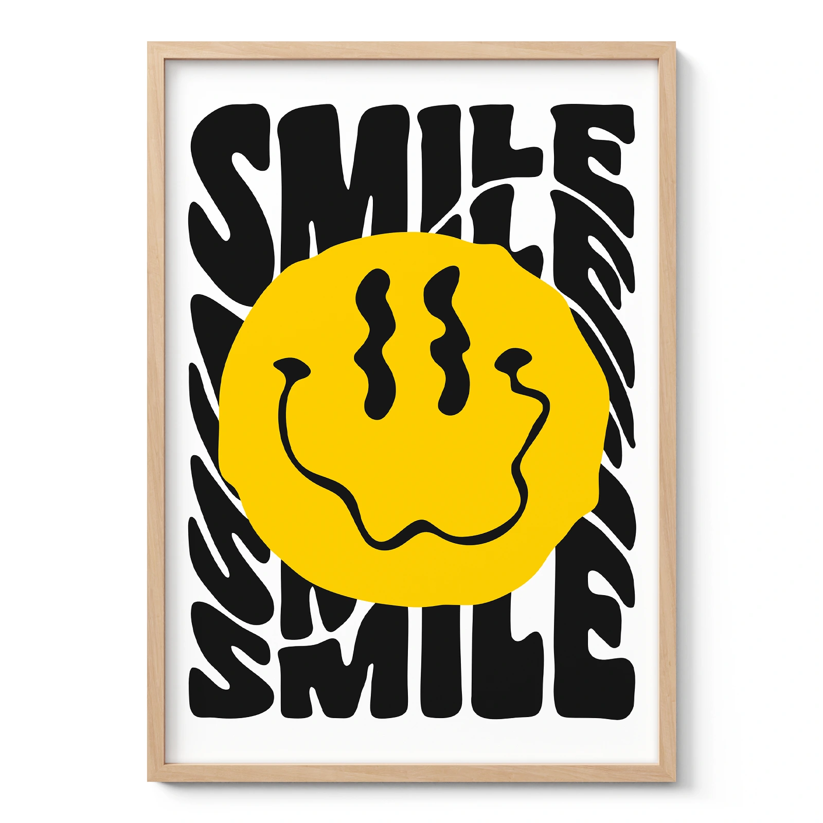
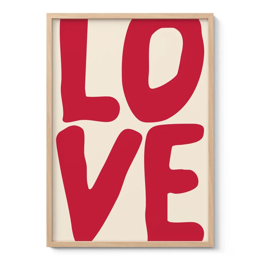
Typography wall art uses letters, words and layout as the main design element. Instead of relying on landscapes, portraits or abstract shapes, it turns language into visual communication. A single word, short phrase or carefully arranged typeface can influence how a room feels before anyone reads the full message.
This style suits people who enjoy clean design, graphic art and meaningful wall décor. It can be quiet and minimal, bold and architectural, or warm and vintage, depending on the font, spacing and composition.
Why typography works as art
Typography has always been part of graphic design, publishing, advertising and visual culture. Posters, book covers, shop signs and exhibition graphics all use lettering to guide attention and create mood. Typography wall art brings that same design thinking into interiors.
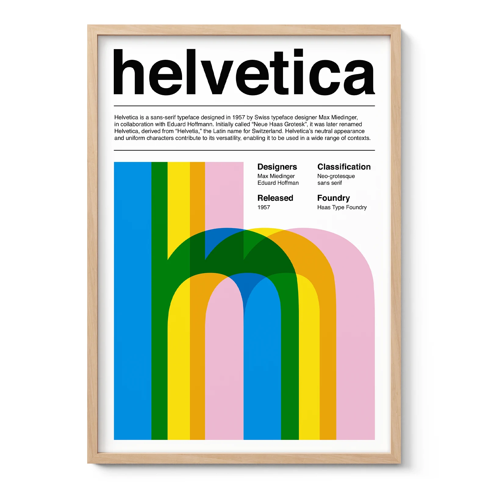
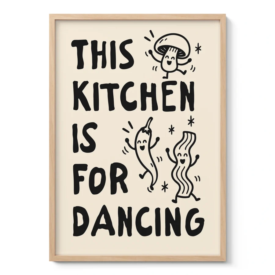
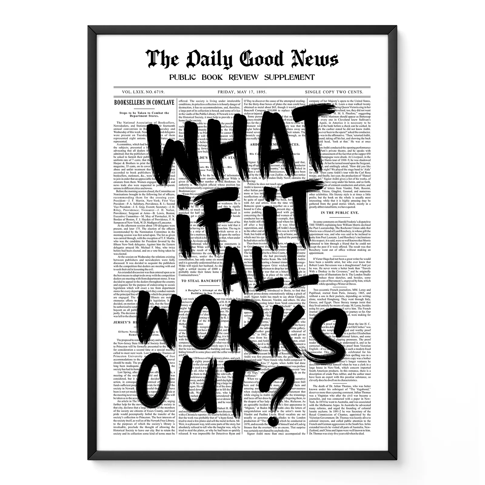
The appeal often comes from structure. A strong typography print can use only black text on a white background and still feel complete. Font choice, line length, alignment and negative space all matter. A narrow serif typeface may feel literary and classic. A bold sans serif can feel modern and direct. Hand lettering usually feels more personal, while industrial lettering can suggest old signage, factories or transport graphics.
Unlike abstract wall art, typography includes a readable element. Unlike many contemporary wall art styles, it communicates both visually and verbally.
Styles of typography wall art
Minimalist typography often uses simple fonts, limited colour and generous spacing. It works well in calm bedrooms, Scandinavian interiors and home offices where the artwork should support the room rather than dominate it.
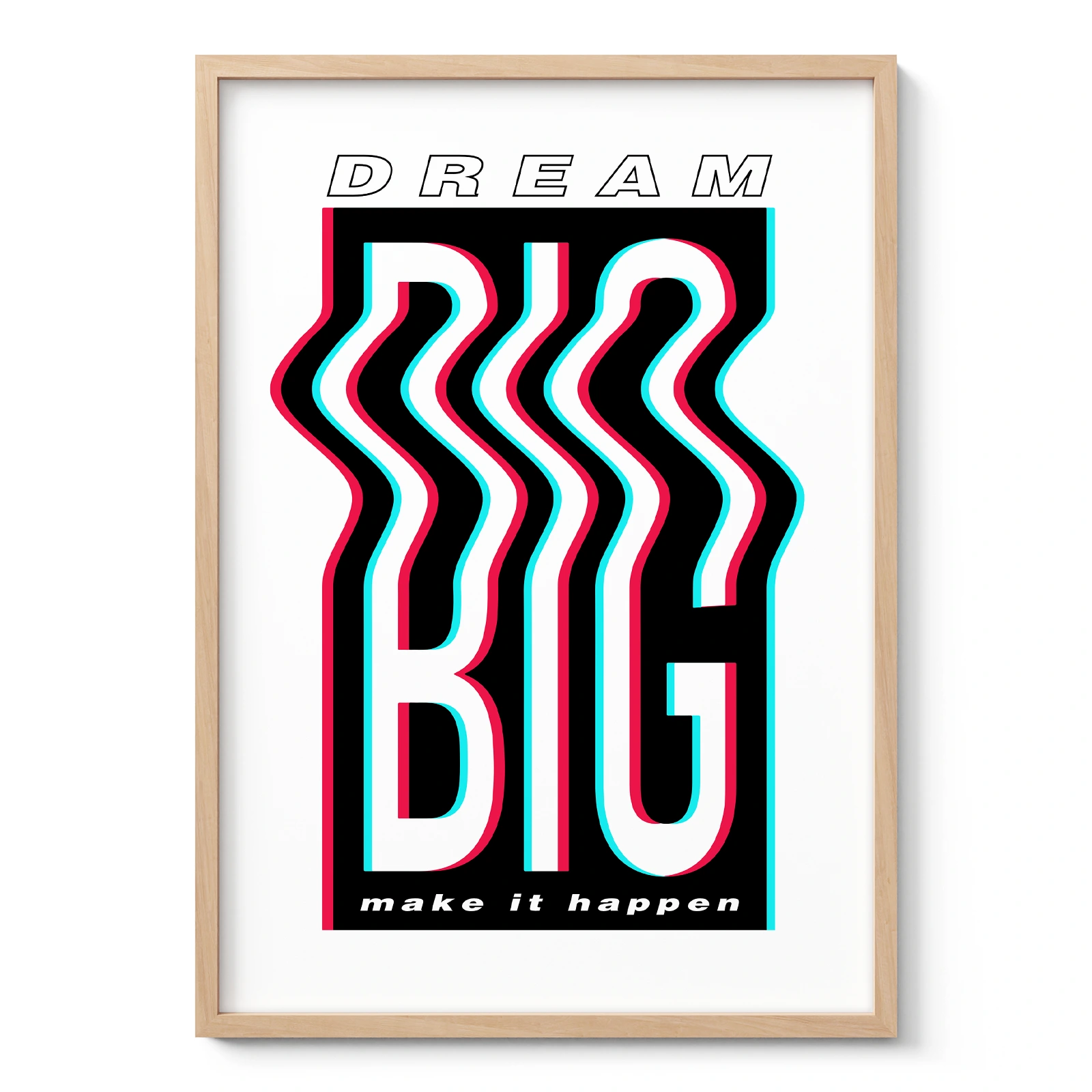
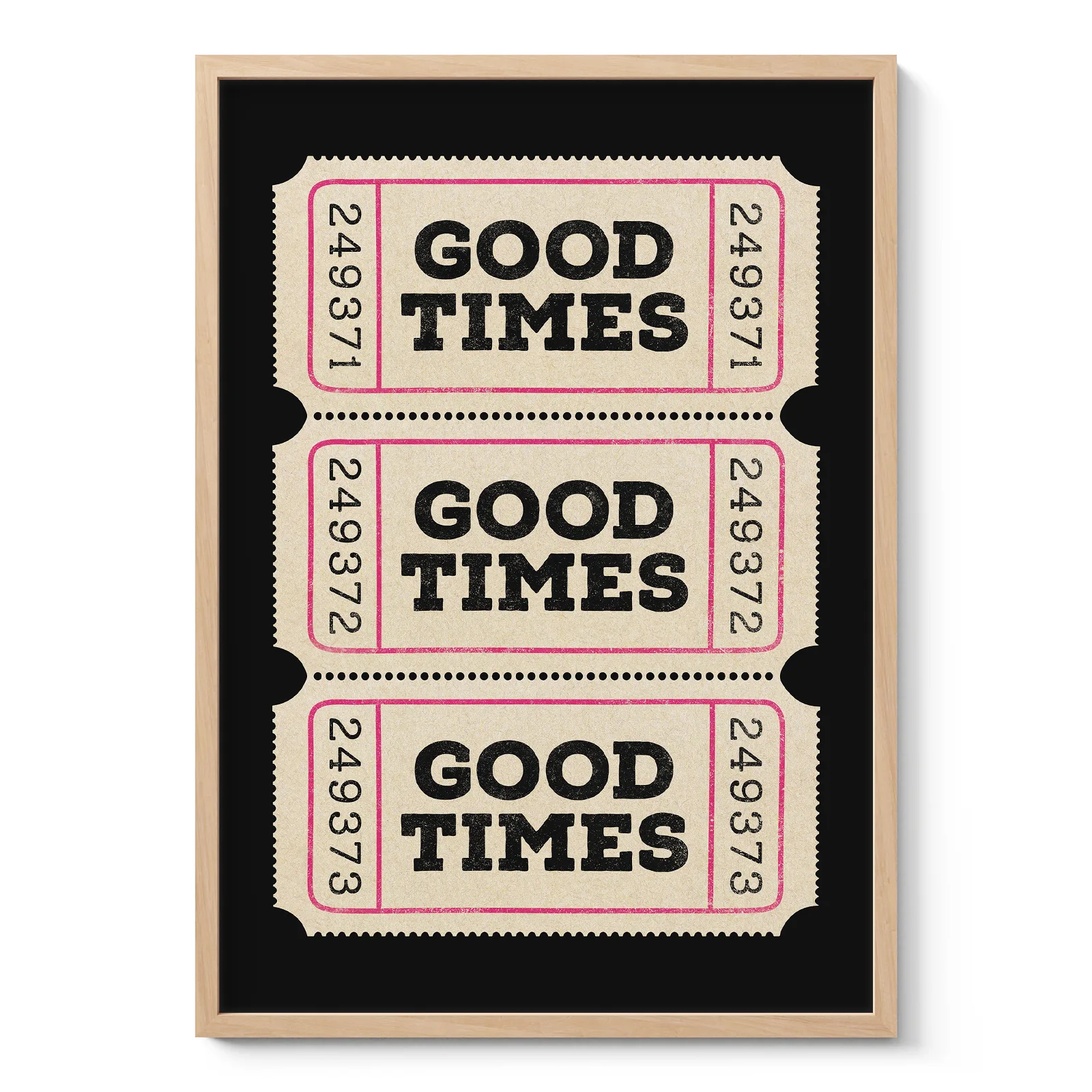
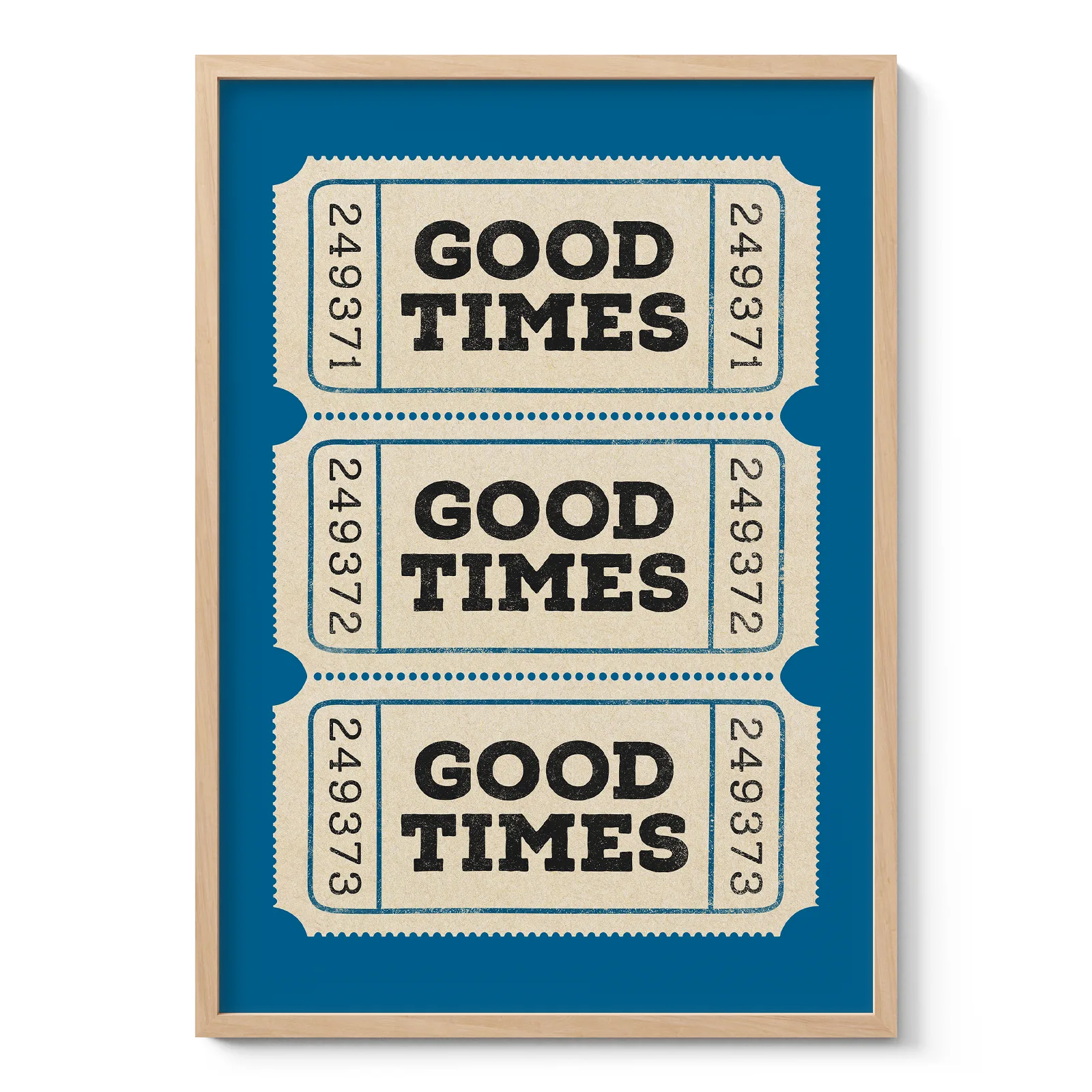
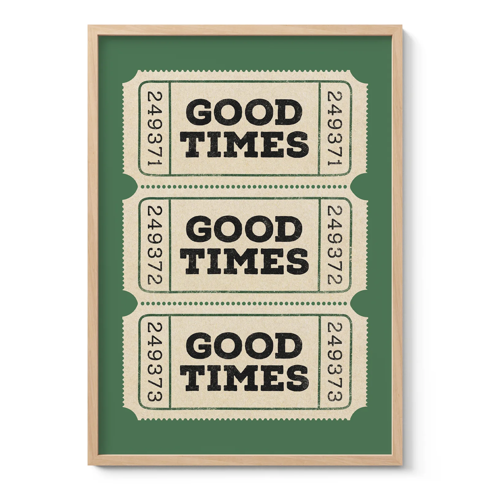
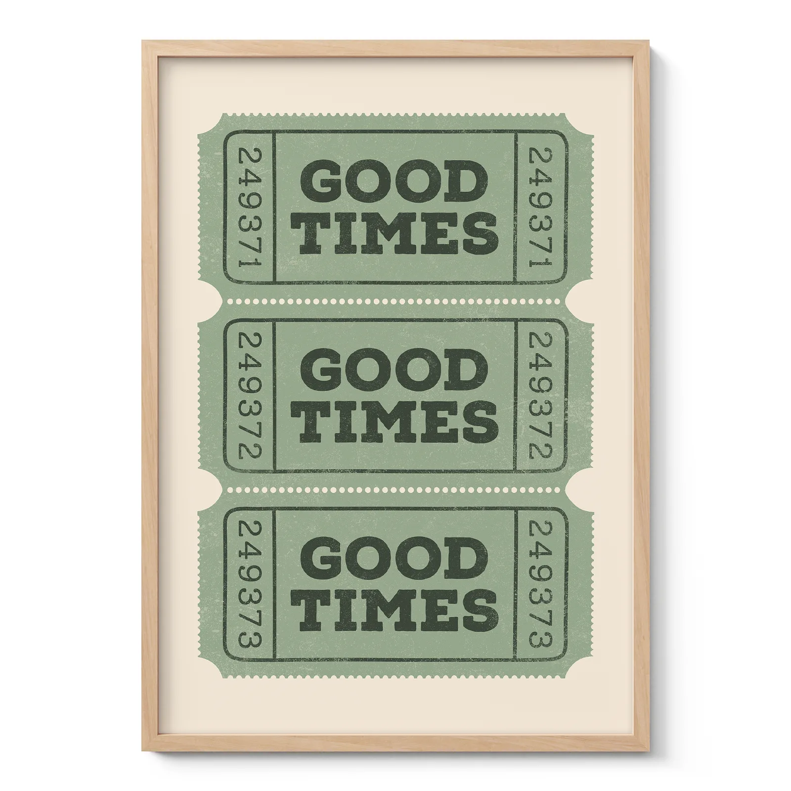
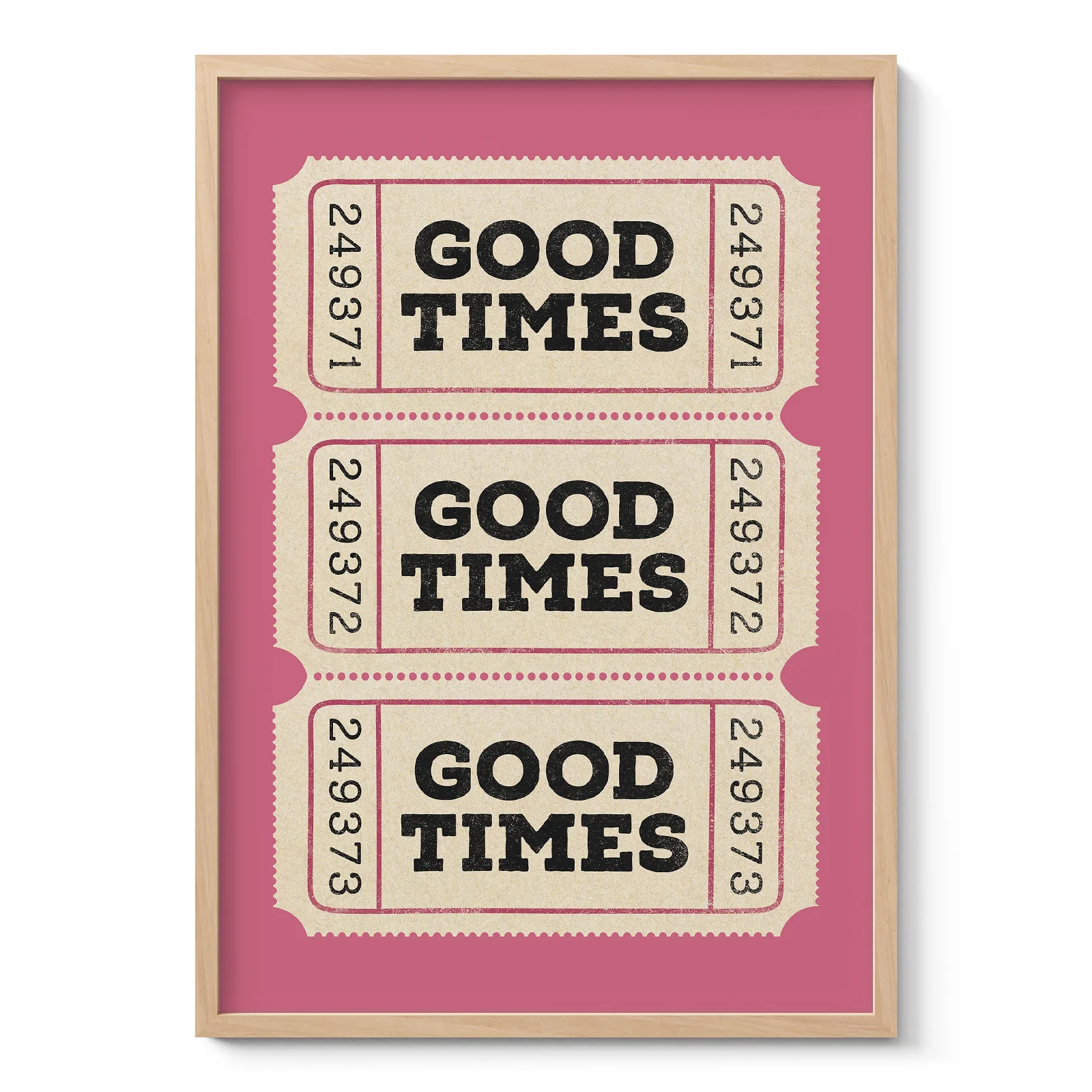
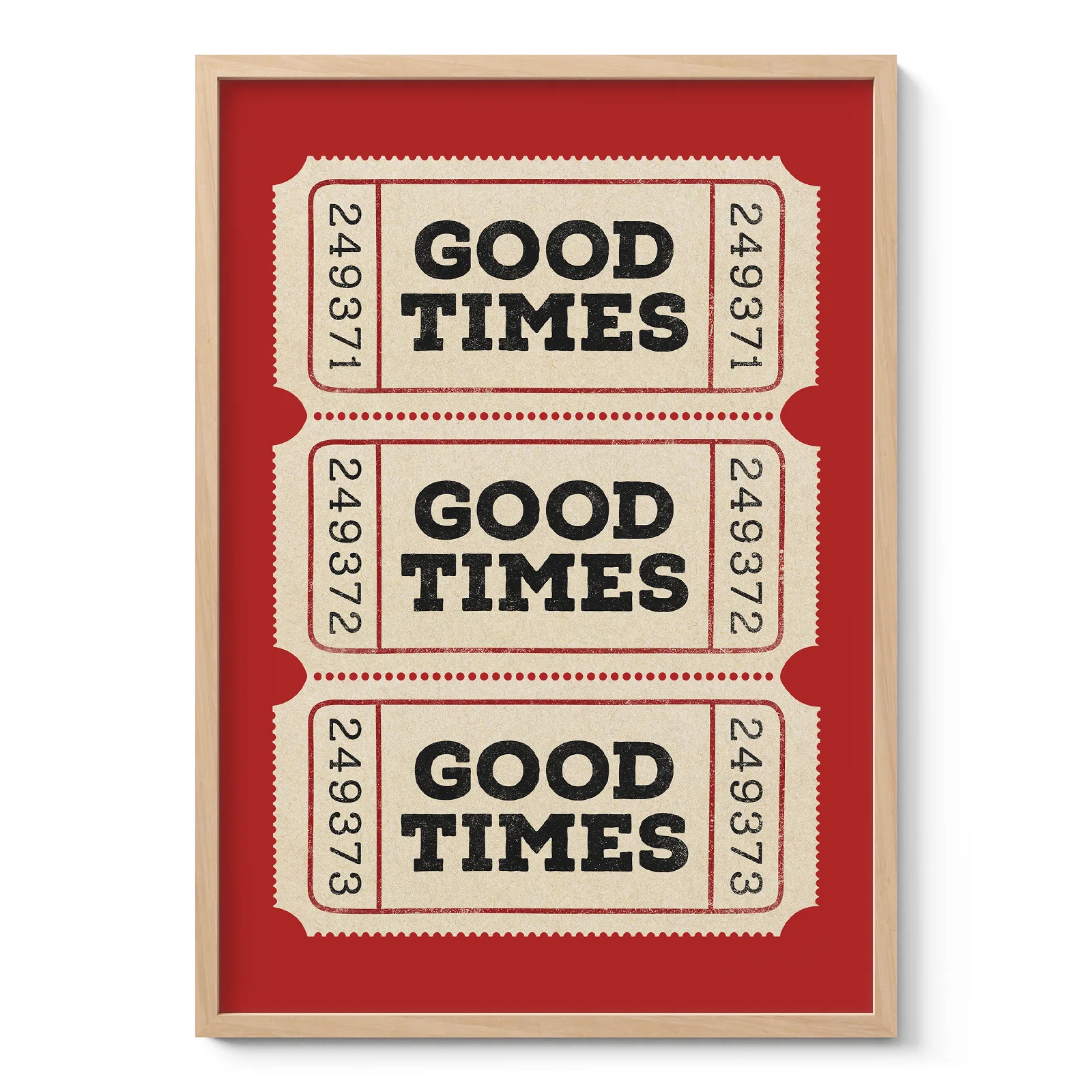
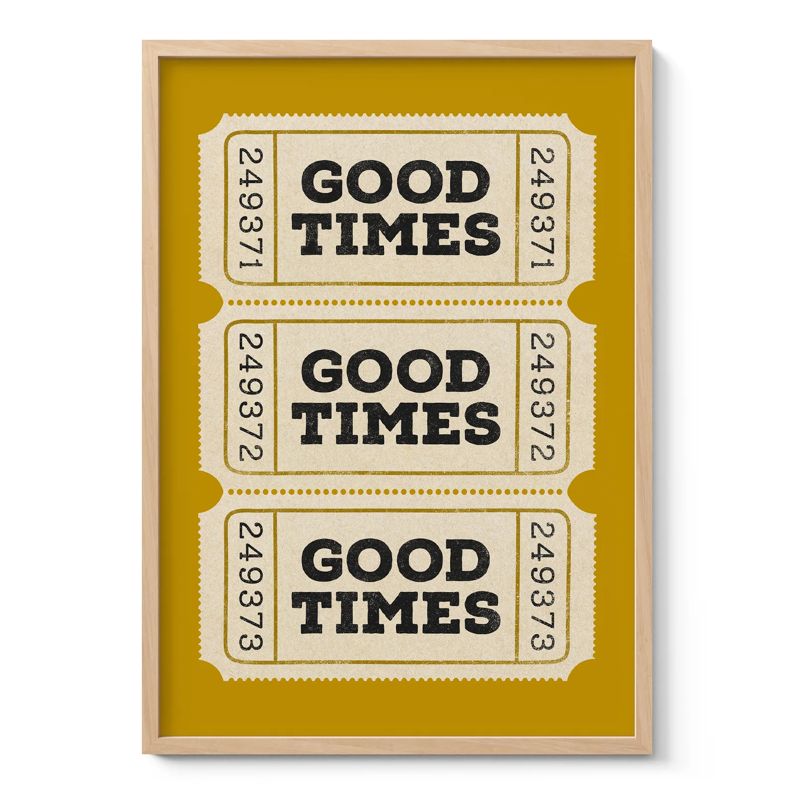
Modern typography tends to use clean lines, strong contrast and clear visual hierarchy. It suits contemporary interiors, modern apartments and office spaces. Vintage typography may include old advertising influence, retro posters, classic typefaces or letterpress-style layouts. It can add warmth to hallways, dining areas or reading corners.
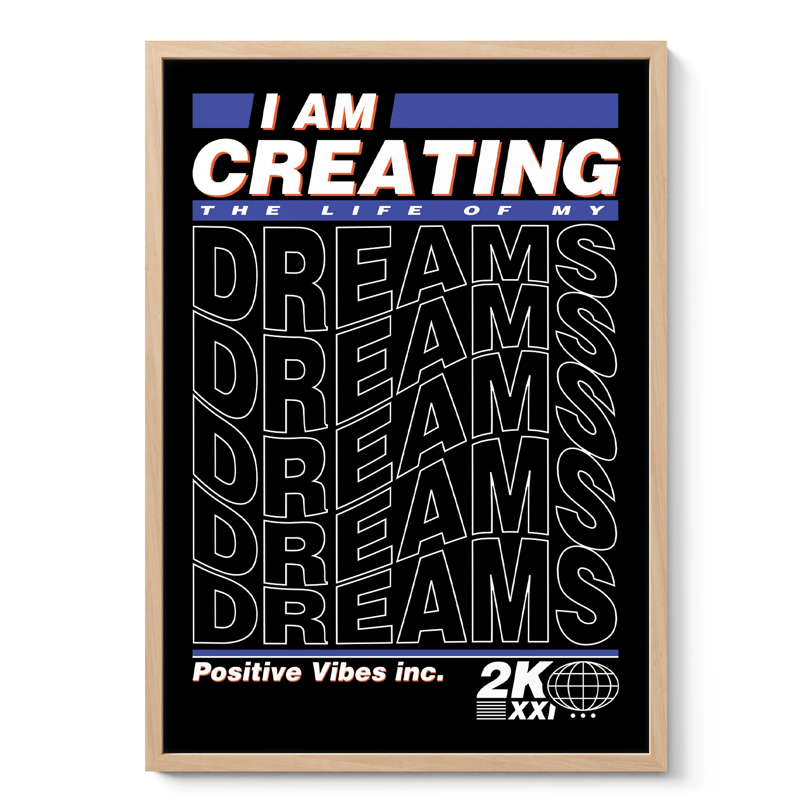
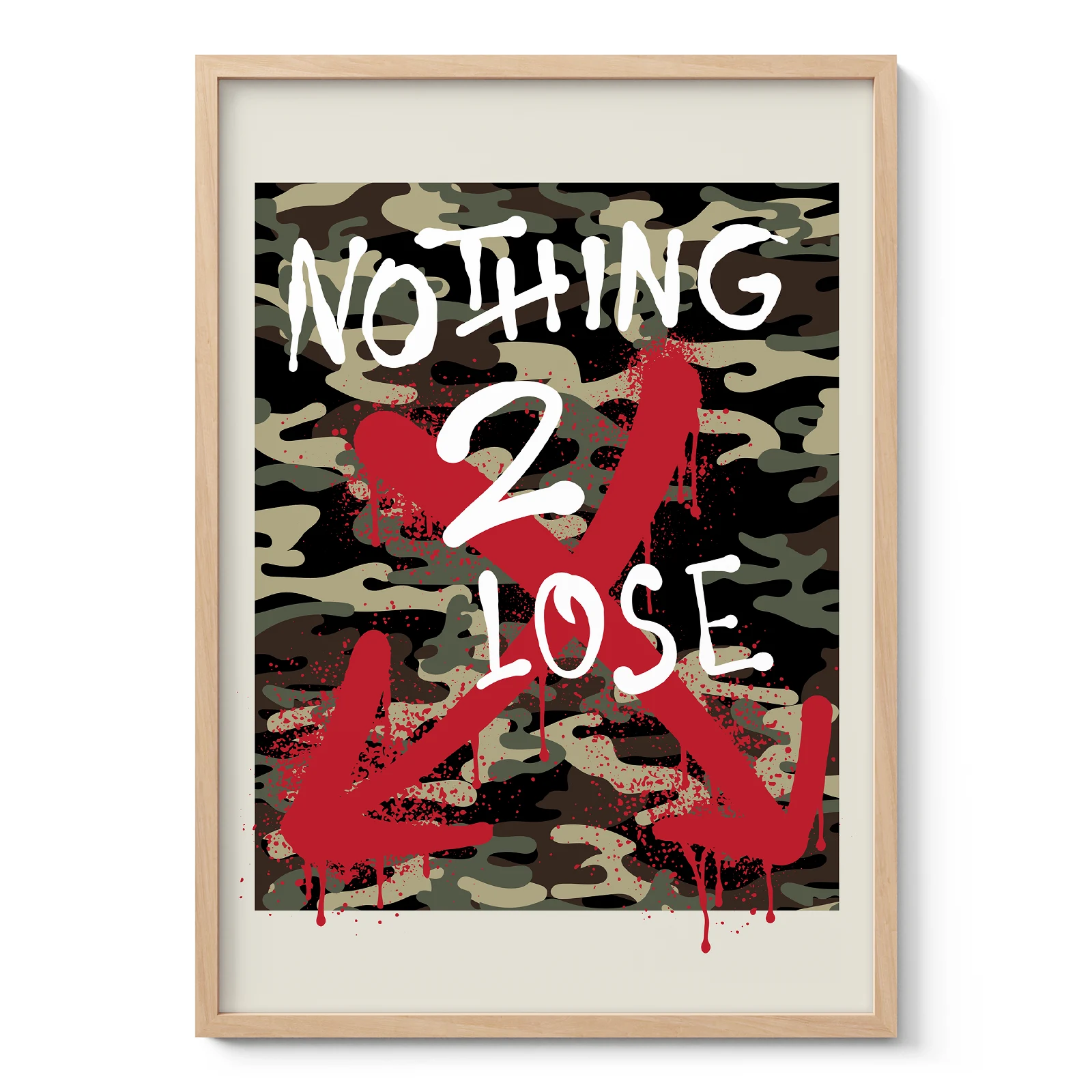
Industrial typography often uses black and white wall art, large lettering, grid layouts or distressed details. This style pairs well with concrete, brick, metal shelving and darker furniture. Scandinavian typography usually feels lighter, with simple wording, neutral colours and balanced spacing.
Choosing words, fonts and composition
A common mistake is choosing a quote only because the words feel nice. The design should also work from across the room. Typography wall art needs readable scale, good spacing and a clear layout. If the text is too small or crowded, the piece may look busy rather than intentional.
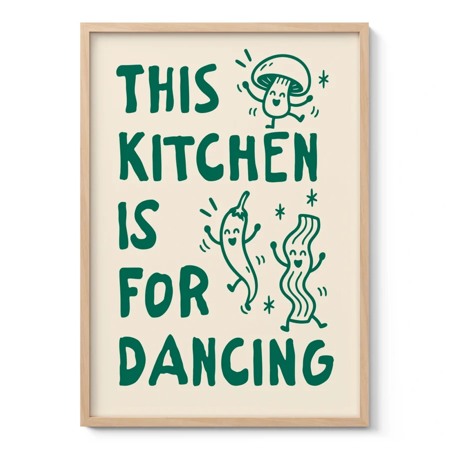
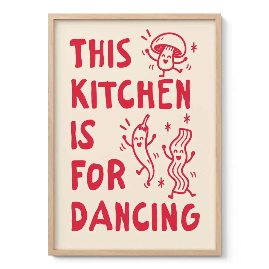
Inspirational quotes are popular, but they are only one category. Word art may focus on a single place, mood or idea. Typographic posters can use letters as part of a stronger graphic layout. Purely decorative typography may be chosen mainly for shape, rhythm and balance, even when the words are simple.
For living rooms, choose text that feels natural in a shared space. Bedrooms usually suit softer wording, calm fonts and lighter compositions. Hallways can handle short words, destination names or vertical layouts. In home offices, typography prints can add focus, especially when the message is brief and the design remains clean.
How it fits different interiors
Typography wall art works well in Scandinavian interiors because both value clarity and restraint. A black and white typography poster can sit easily above pale wood furniture, linen fabrics and neutral walls.
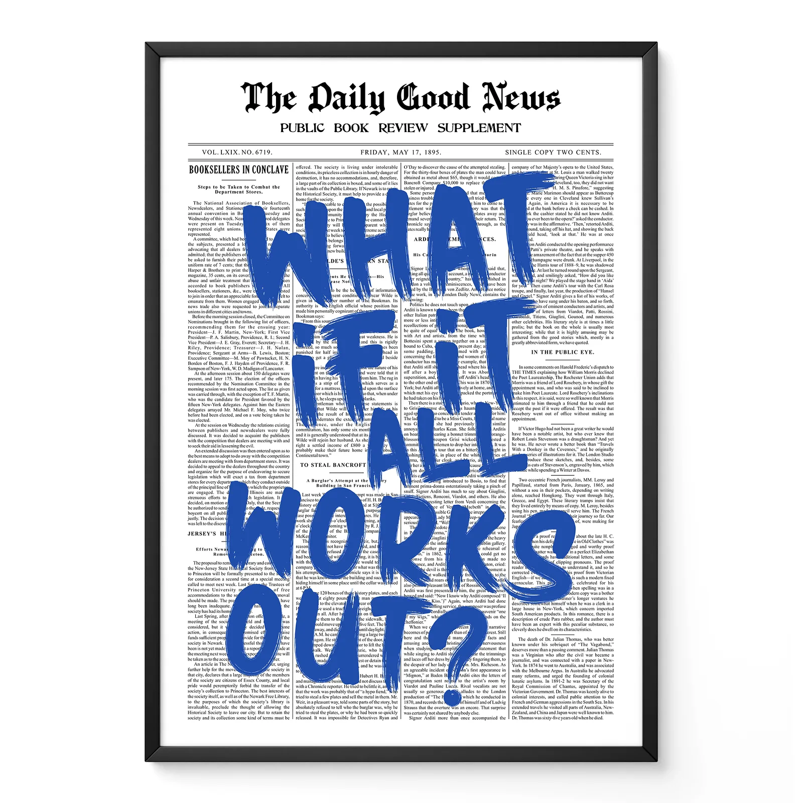
In minimalist décor, one large text art piece is often stronger than several small prints. Contemporary interiors can use bolder type, unusual layouts or colour accents. Industrial interiors can carry heavier fonts, vintage signage and graphic poster designs. Modern interiors usually benefit from clean typefaces and balanced alignment.
Commercial spaces also use typography effectively. Cafés, studios, offices and reception areas often need wall décor that feels designed but not distracting. Typography can support a brand mood without looking too decorative.
Posters, canvas prints and final choice
A poster is often the most precise format for typography because it keeps lettering sharp, especially with fine lines, small text or detailed spacing. A museum-quality print can show the contrast and clean edges that good typography needs.
A canvas print can work well for larger designs, bold typography and pieces where texture adds depth. It may suit open walls, offices or rooms with softer furniture and fewer framed elements.
Typography wall art is best chosen by looking at message, scale and visual weight together. The words should suit the room, but the typeface and composition must also feel right. When text, spacing and placement work as one, typography becomes more than a message on a wall. It becomes part of the room’s design language.