


Japanese wall art: nature, balance and calm design
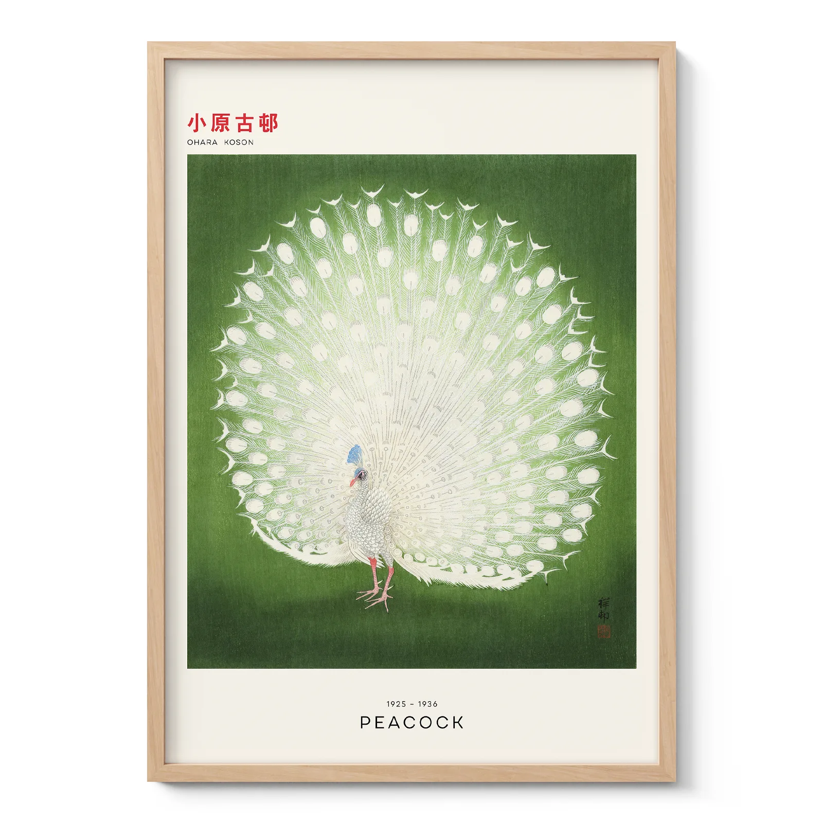
Japanese wall art is often chosen for its quiet beauty, but its appeal goes deeper than decoration. It brings together nature, balance, symbolism and strong artistic tradition. Many designs are inspired by Japanese prints, landscape art, temple scenes, gardens, birds, flowers and seasonal changes.
This type of wall art suits people who want their home to feel calm without looking empty. It can add colour, history and atmosphere while still keeping a room clean and balanced.
The artistic roots of Japanese prints
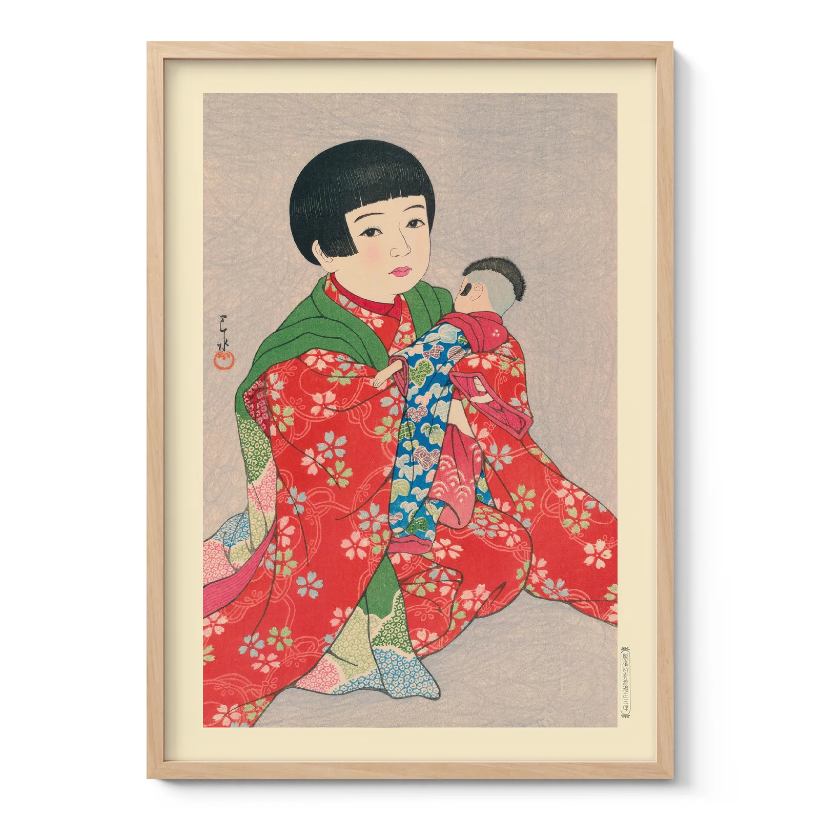
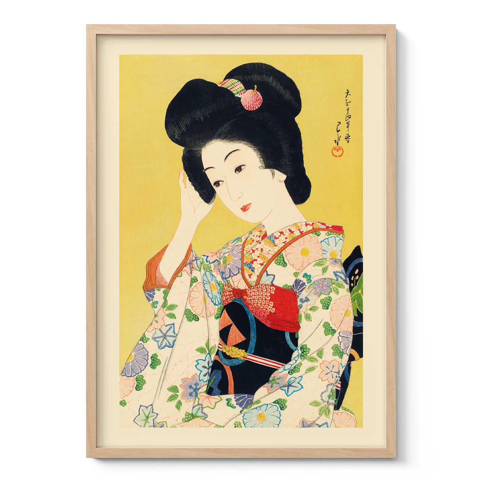
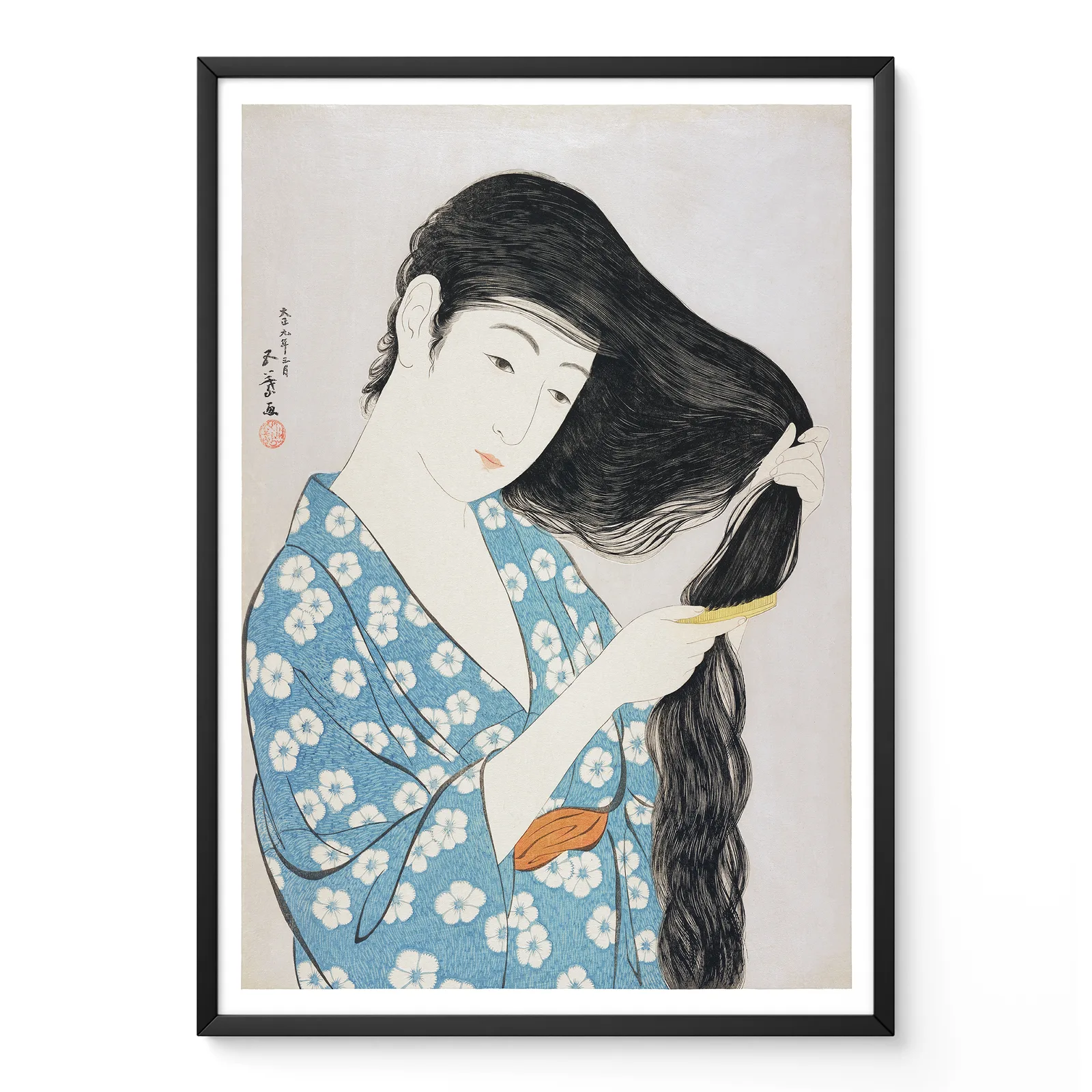
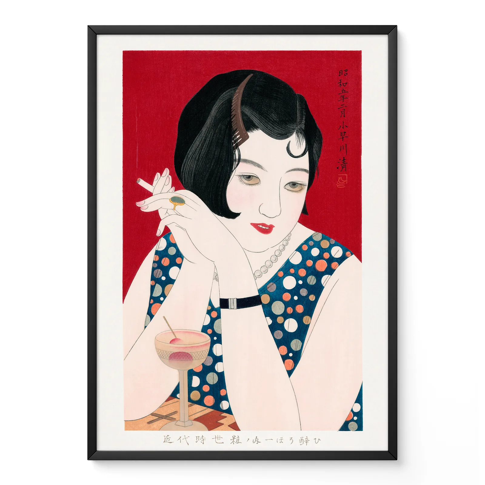
Much of today’s Japanese wall art is influenced by Ukiyo-e, a Japanese woodblock print tradition that developed strongly during the Edo period. These prints often showed landscapes, actors, women, travel routes, daily life and famous views.
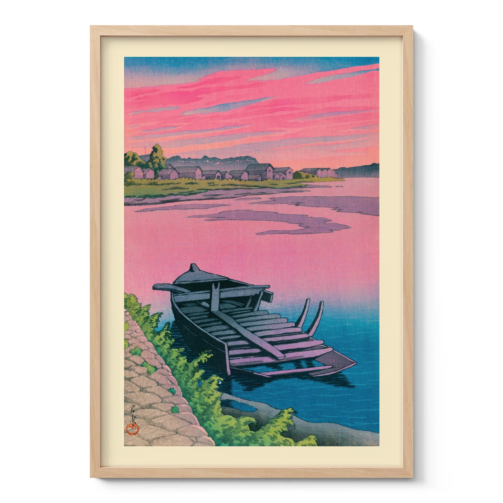
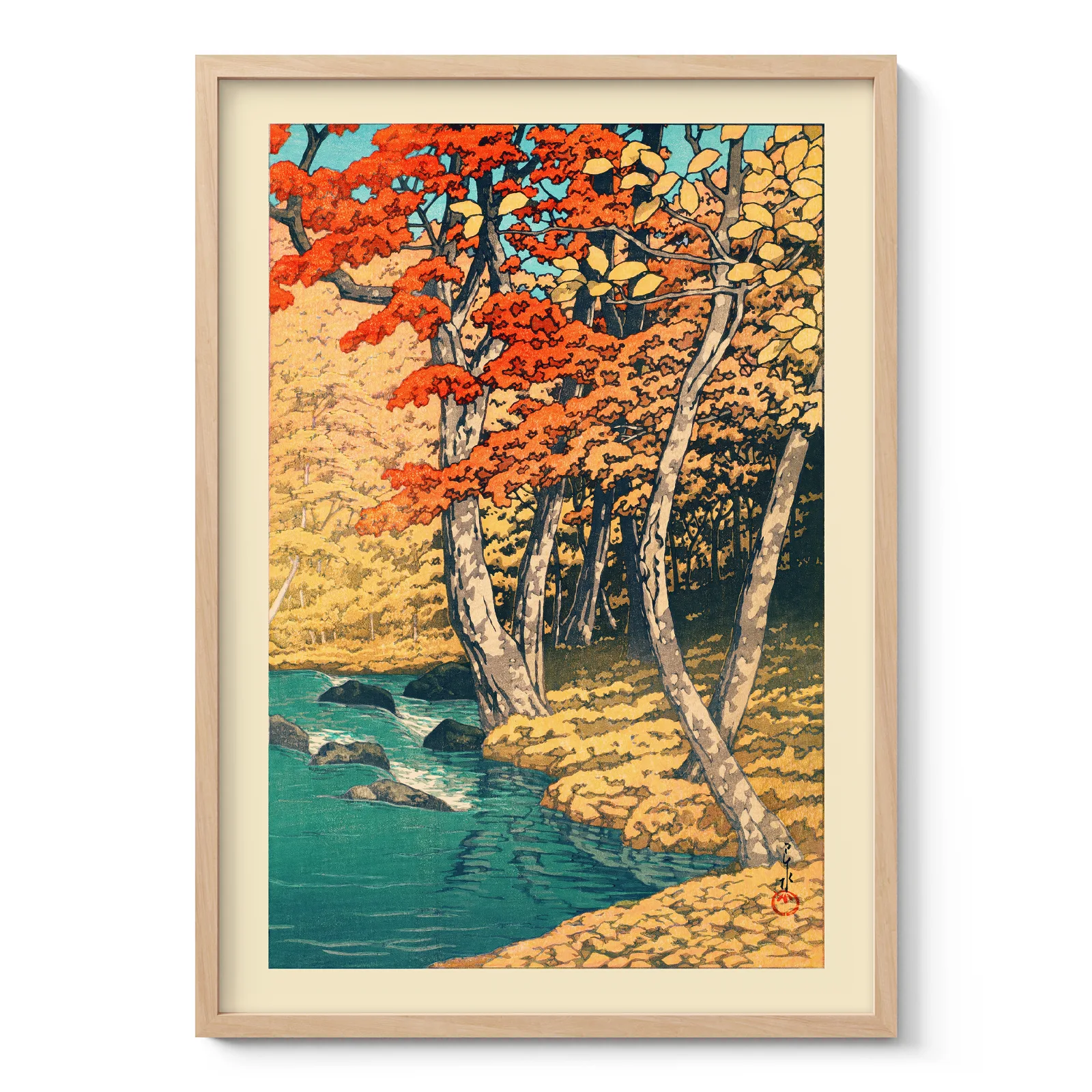
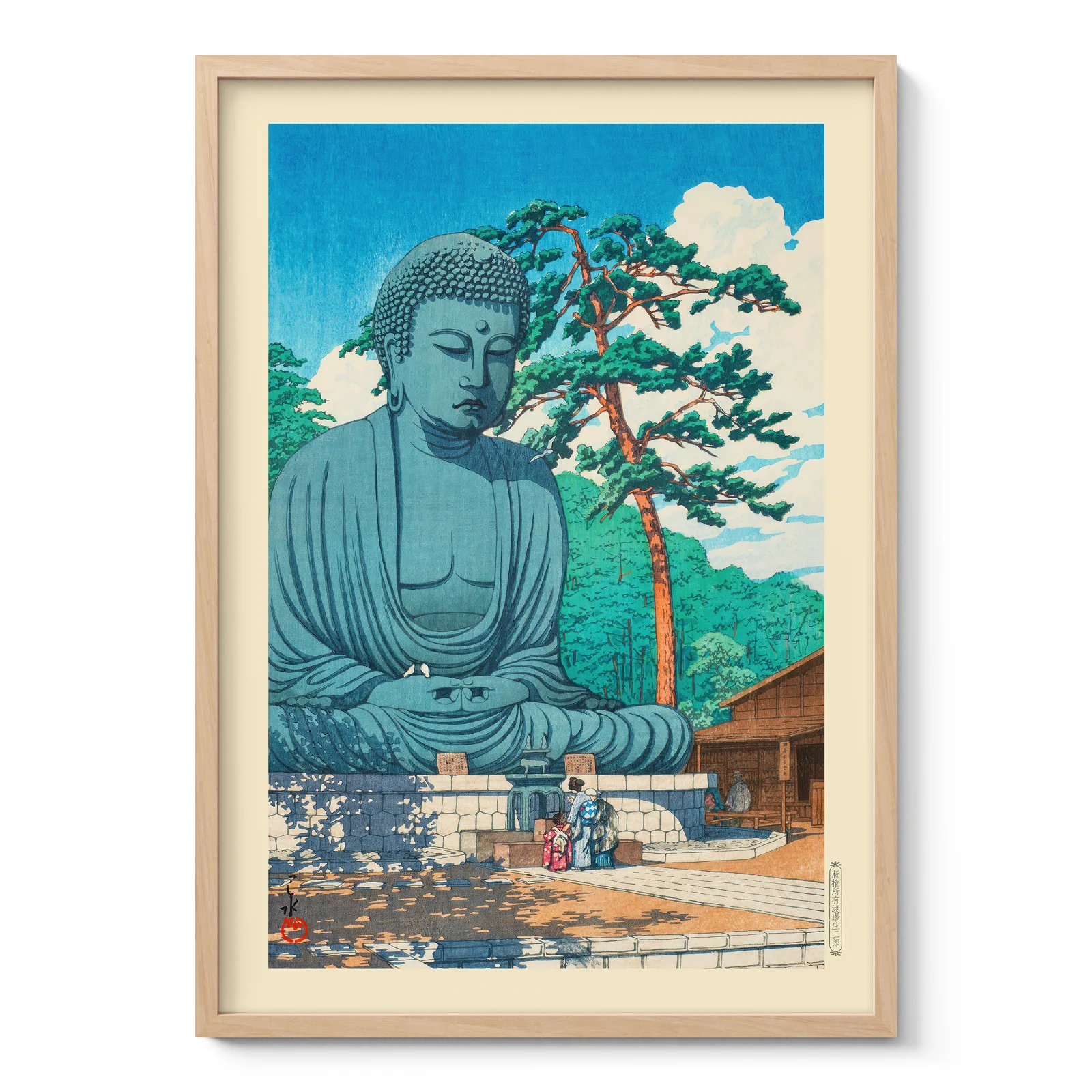
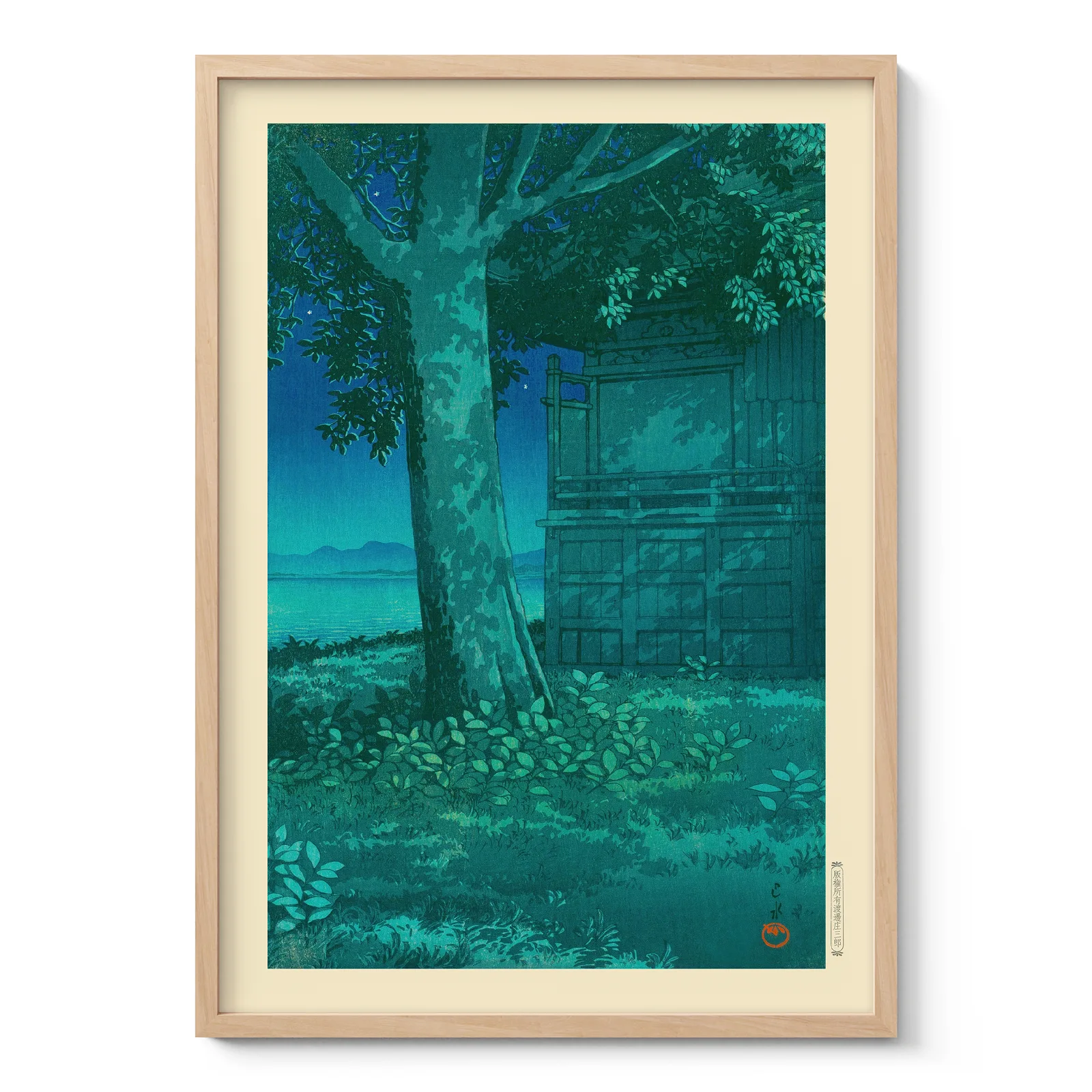
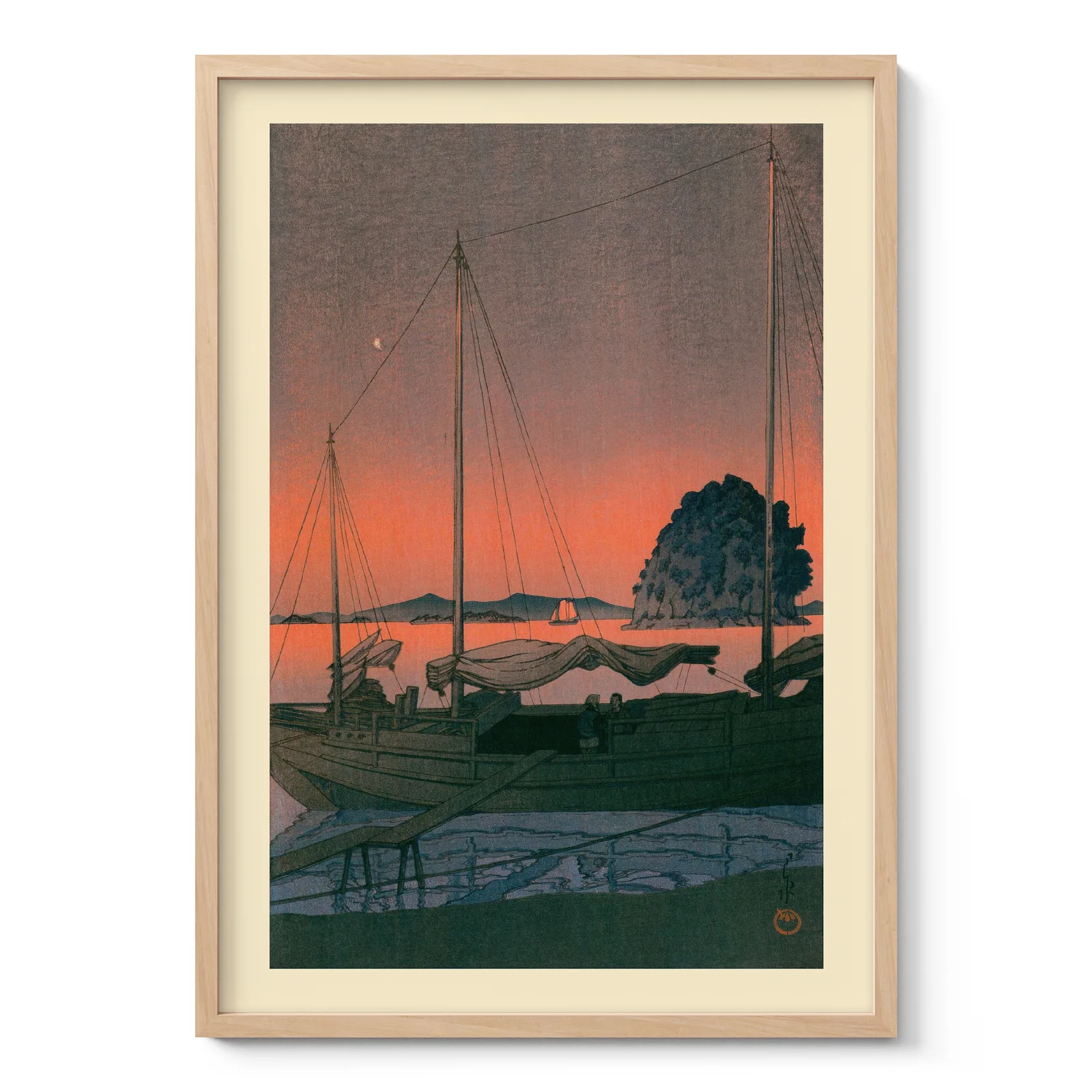
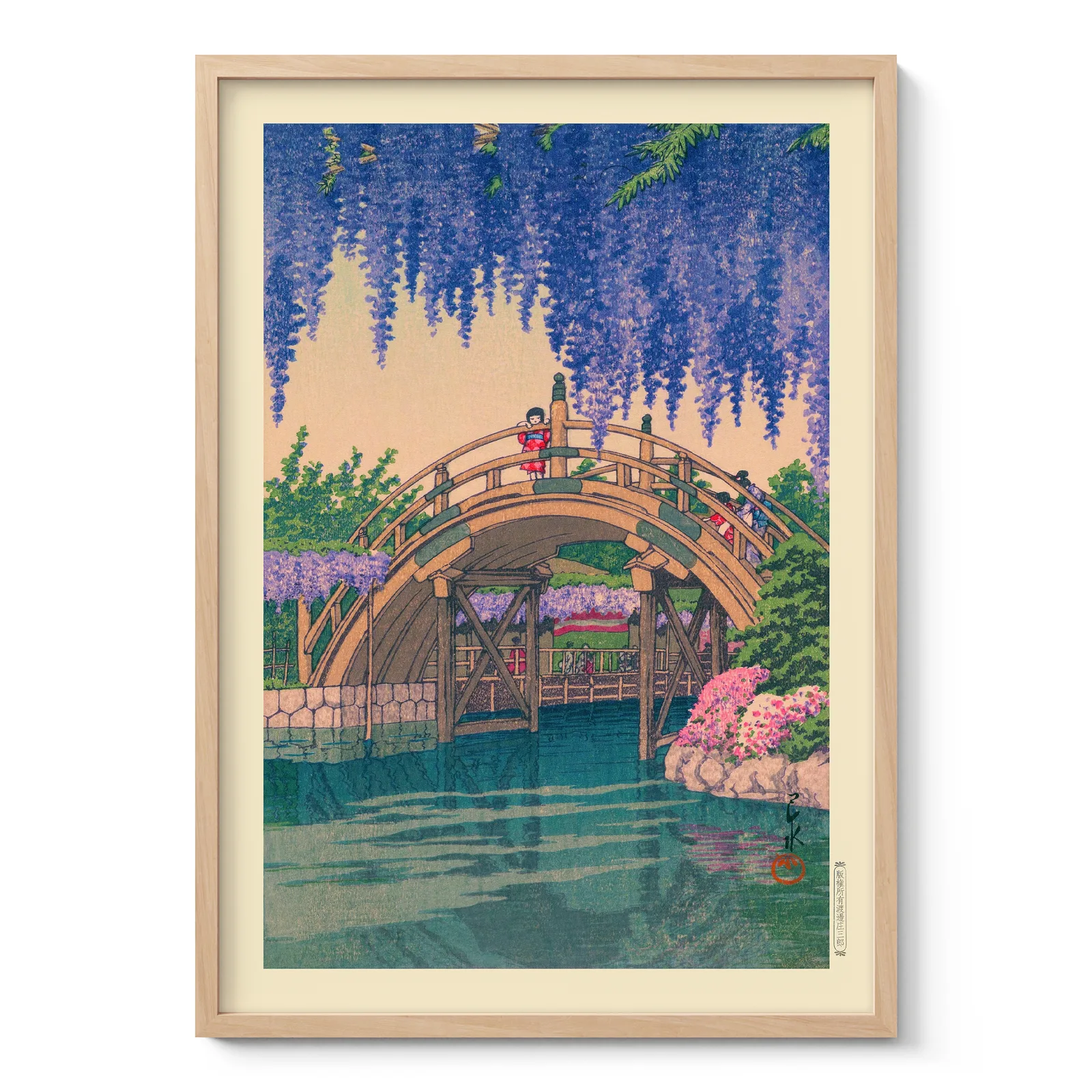
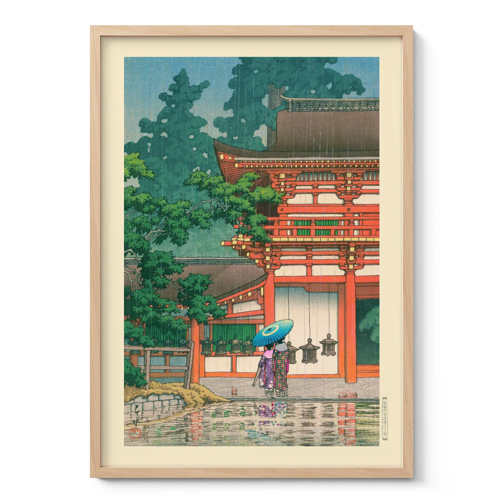
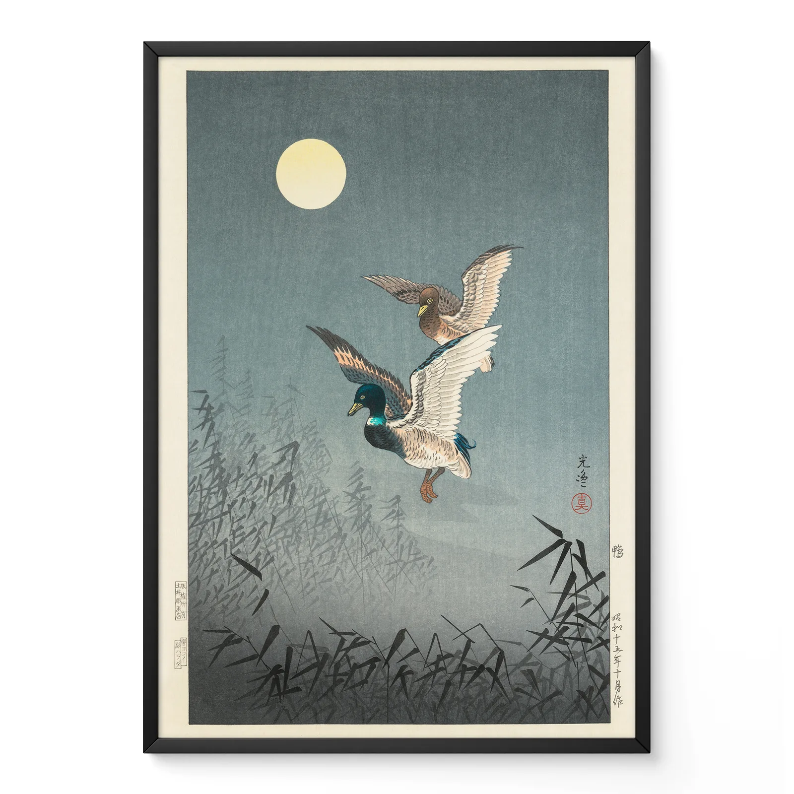
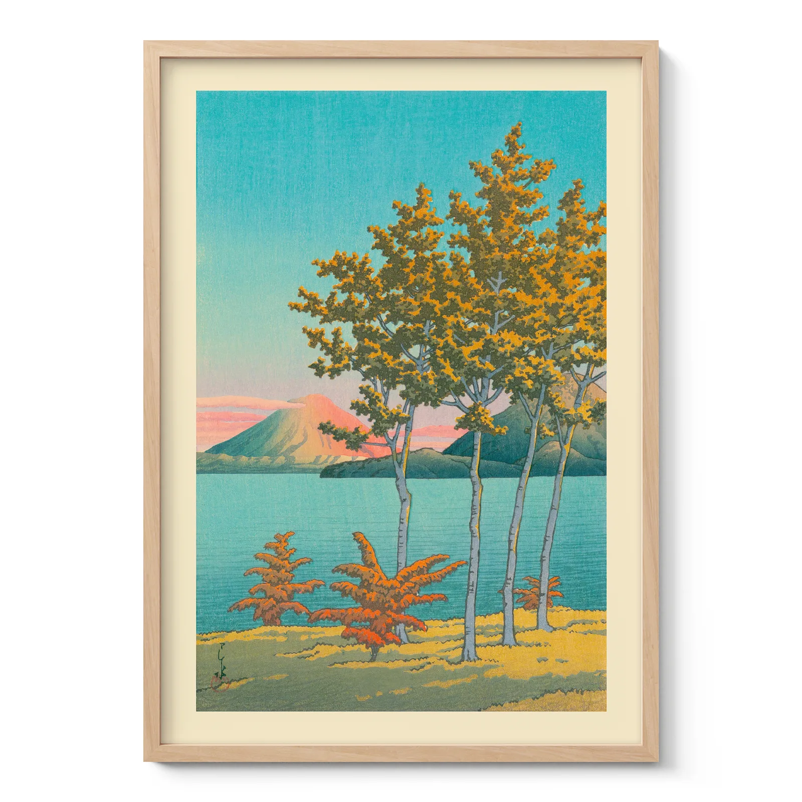
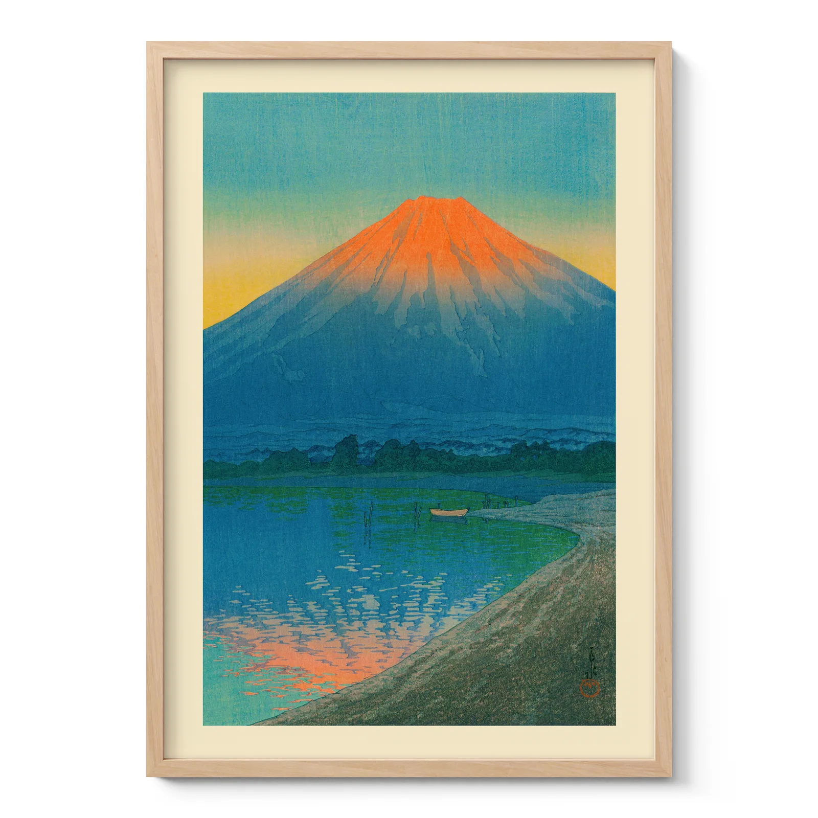
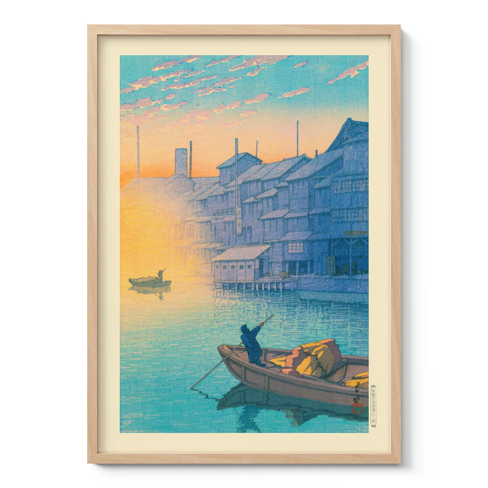
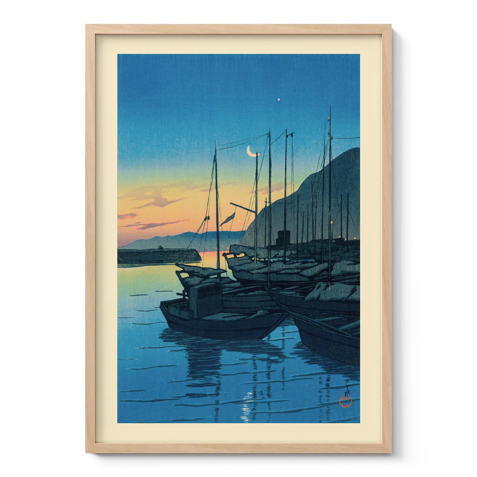
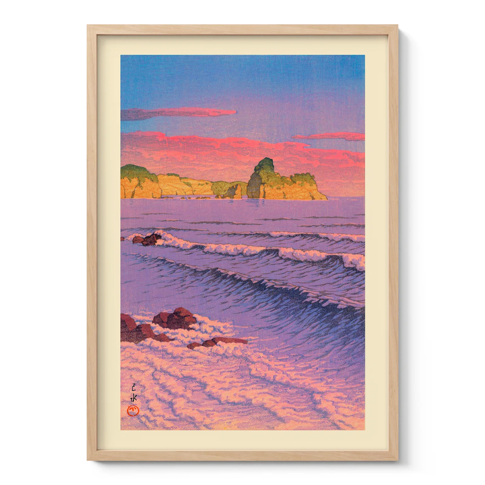
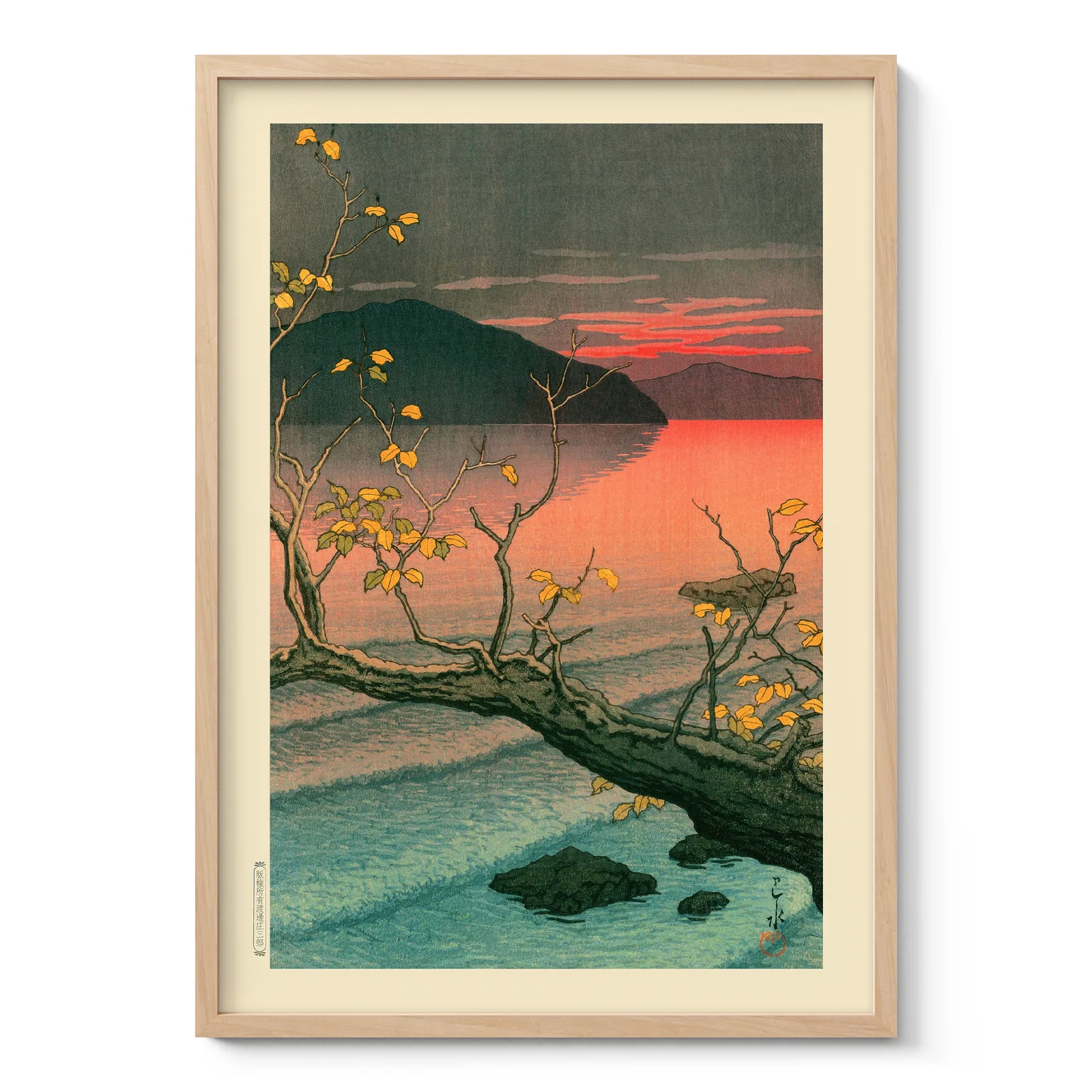
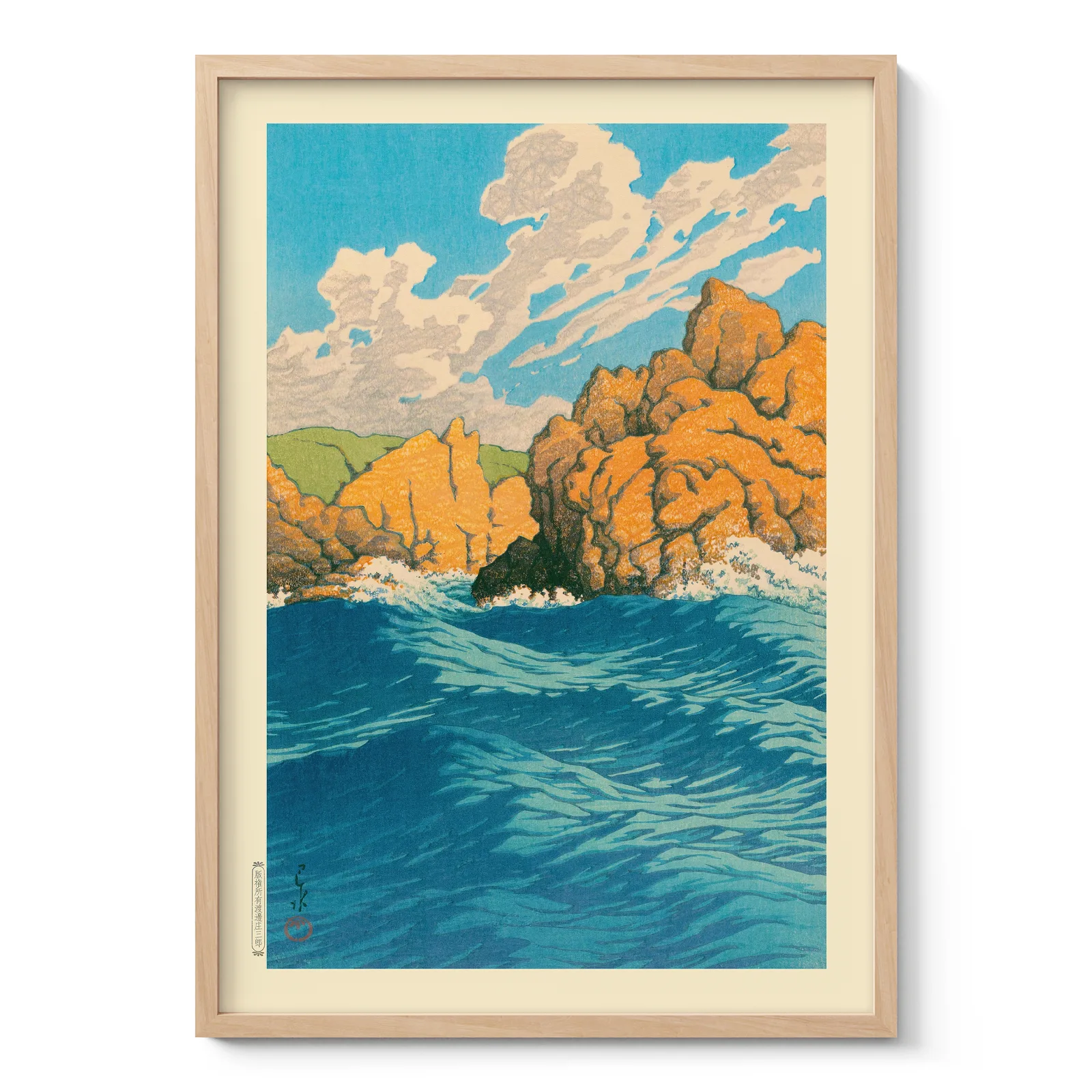
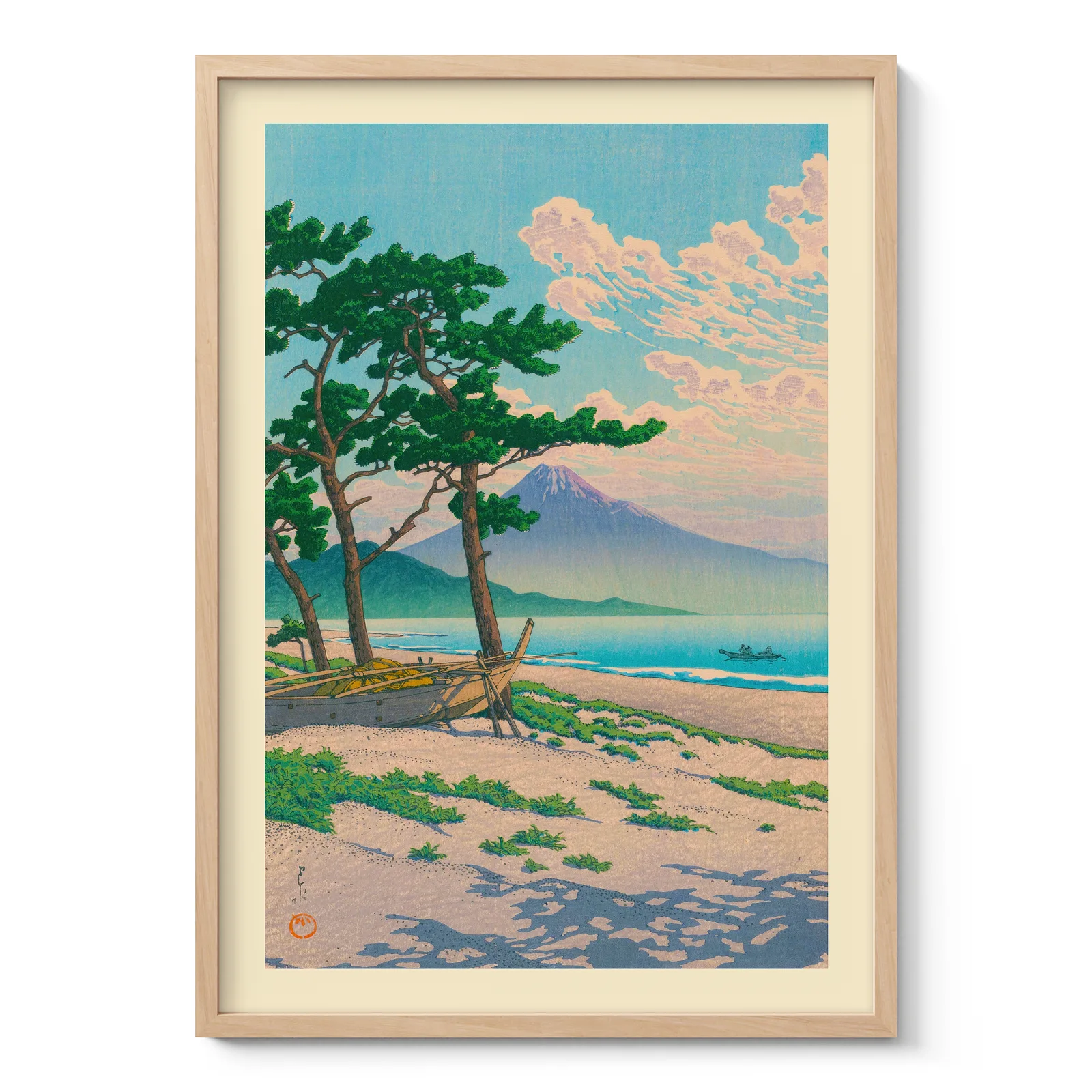
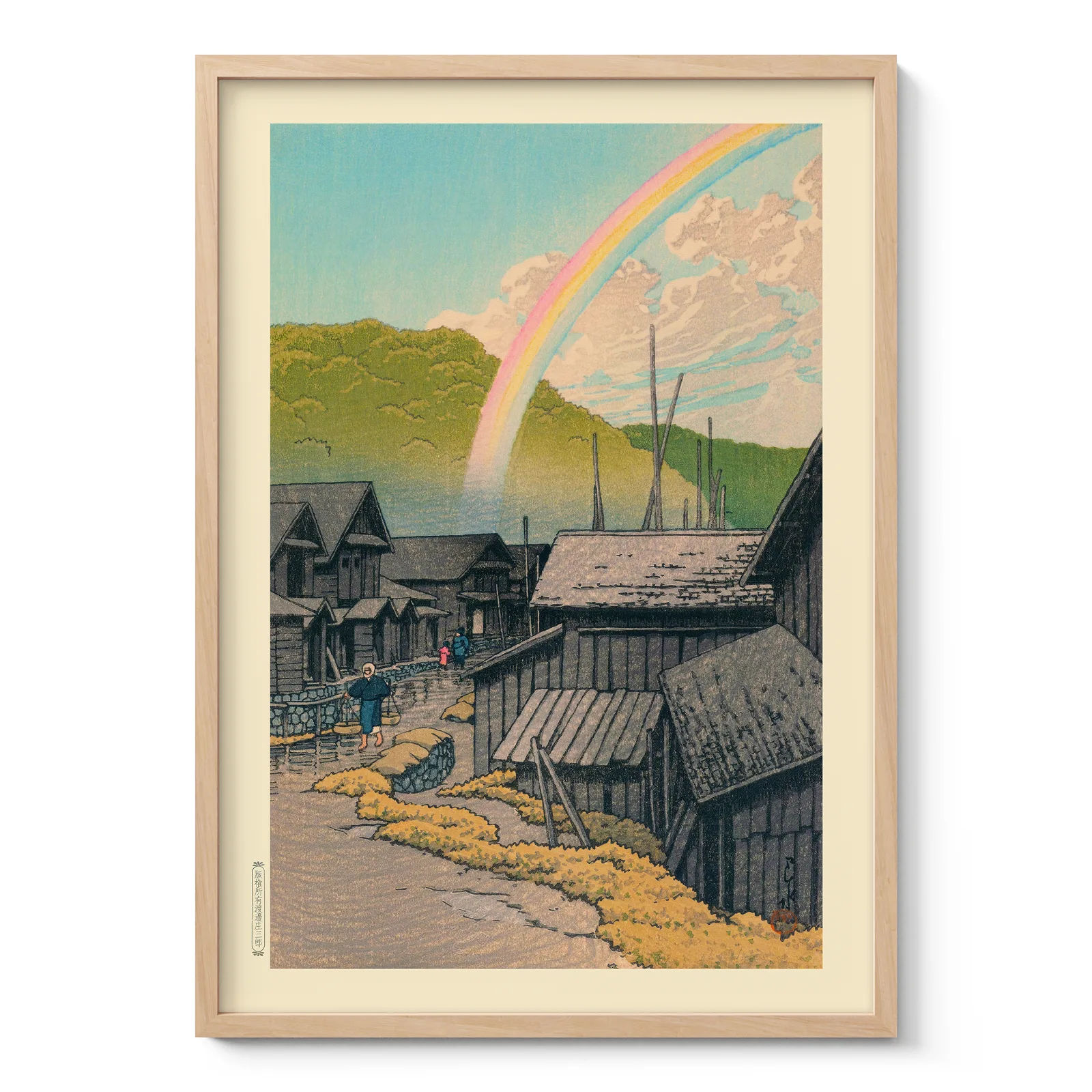
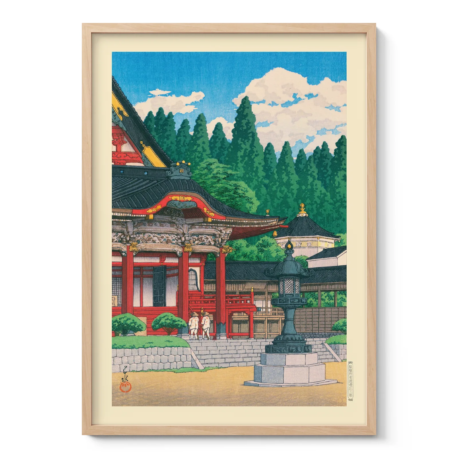
Artists such as Hokusai and Hiroshige helped make Japanese prints known around the world. Hokusai’s waves and Mount Fuji scenes showed nature with energy and structure. Hiroshige created poetic landscapes, rain scenes and travel views with a softer mood. Later, Hasui Kawase continued the landscape print tradition with quiet streets, temples, snow, moonlight and water reflections.
These works influenced Western artists and modern graphic design because they used strong composition, flat colour areas and unusual viewpoints.
Common themes in Japanese wall art
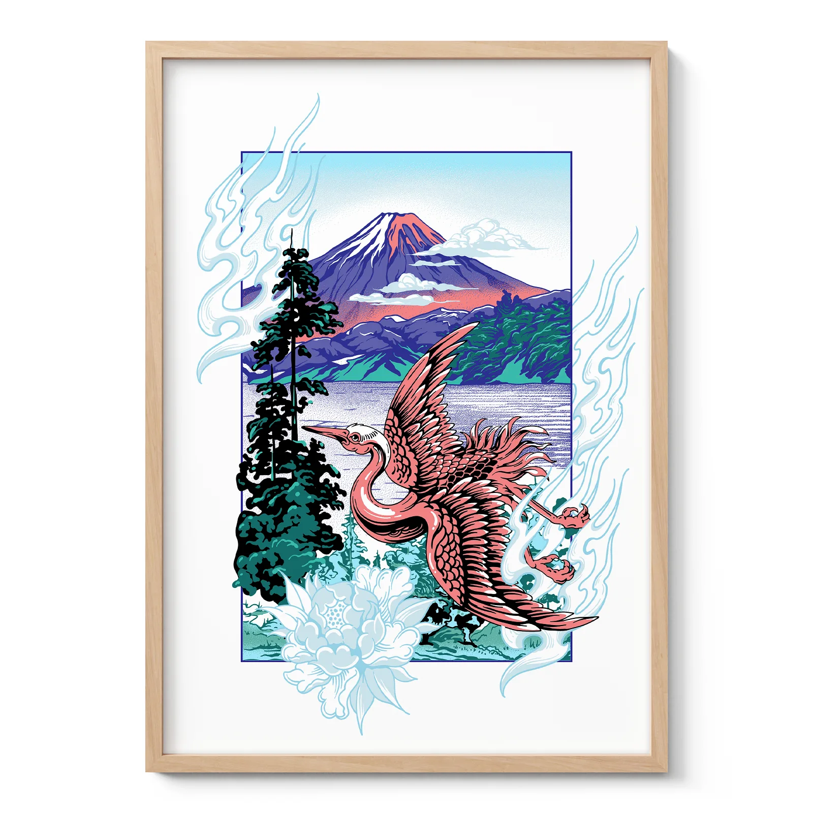
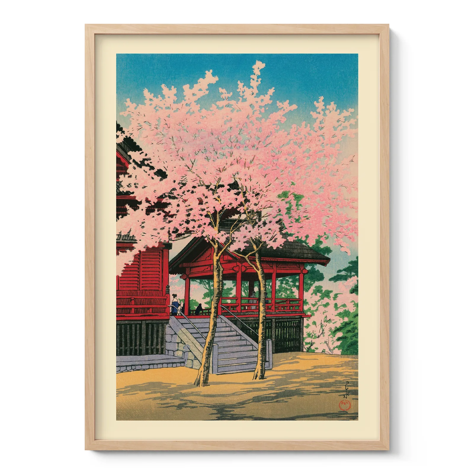
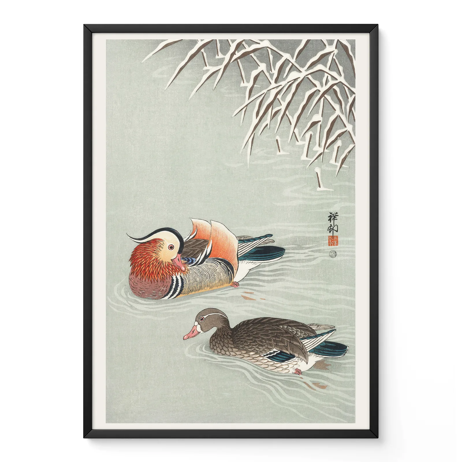
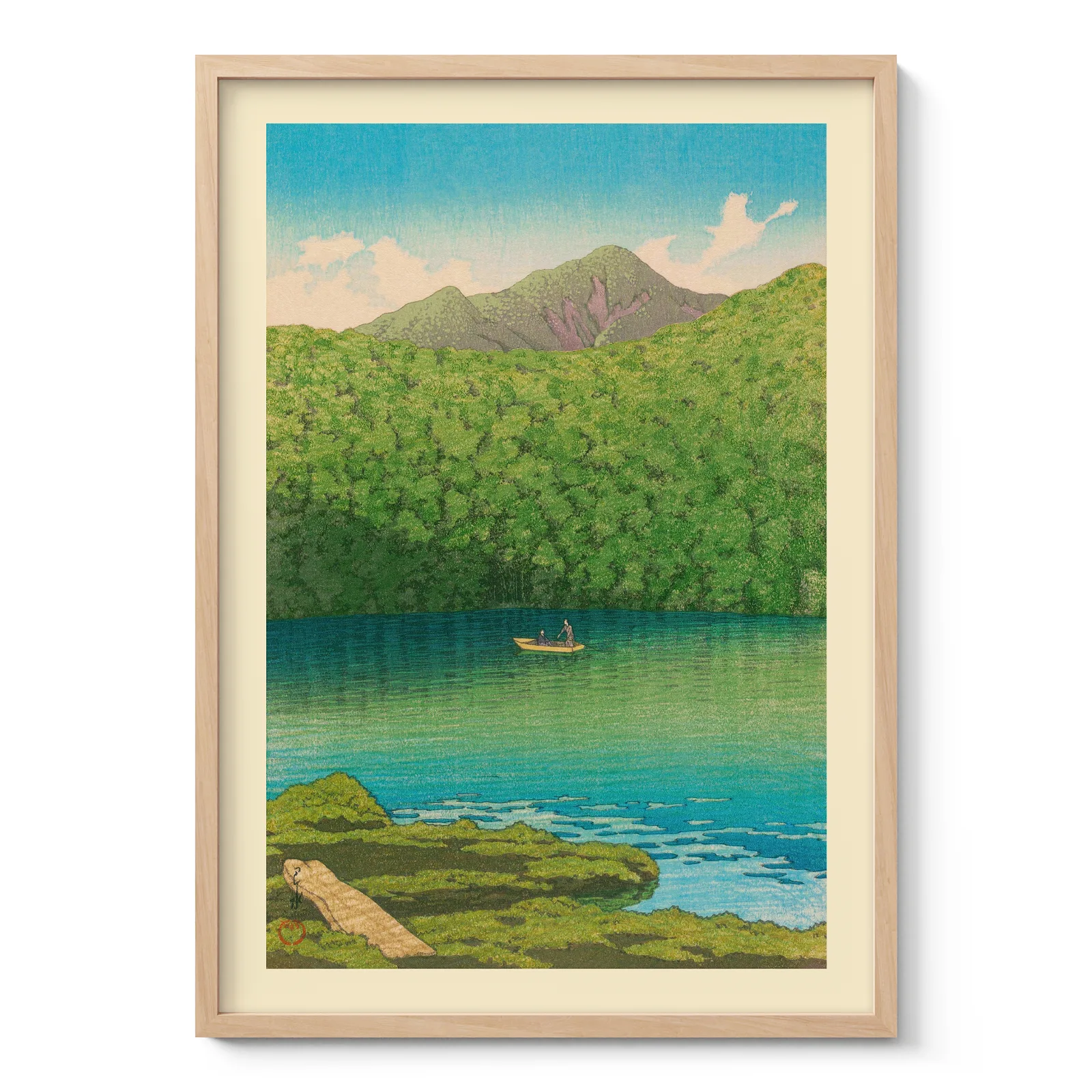
A Japanese wall art piece often carries meaning through its subject. Mount Fuji suggests strength, distance and stillness. Cherry blossoms are linked with spring and the short life of beauty. Cranes often represent longevity and grace. Waves can feel powerful, while gardens, forests and temples create a more reflective mood.
Seasonal landscapes are also important. Snow, autumn leaves, mist, rain and moonlight are common in traditional Japanese art. These details help the artwork feel connected to time and nature, rather than looking like simple decoration.
Why it works in modern interiors
Japanese design values simplicity, harmony and careful use of space. This is why Japanese wall art fits so well in modern homes. It has enough detail to hold attention, but it rarely feels visually heavy.
In Scandinavian interiors, Japanese prints work well with pale wood, soft textiles and neutral walls. In Japandi spaces, they connect naturally with low furniture, natural materials and calm colour palettes. Zen-inspired rooms often suit ink-style sumi-e art, temple views or quiet gardens. Minimalist and contemporary interiors can use stronger wave prints, Mount Fuji scenes or vintage Japanese prints as a clear focal point.
Compared with bold abstract art or colourful pop art, Japanese art usually feels more restrained. It still adds personality, but it does so through rhythm, line, atmosphere and negative space.
Choosing the right piece for each room
For a living room, larger landscape art can work well above a sofa, console table or fireplace. A wide Mount Fuji scene, waves or a forest view can give the room structure without making it feel crowded.
Bedrooms often benefit from softer subjects such as cherry blossoms, cranes, moonlit water or gardens. Hallways are good places for smaller prints arranged in a simple sequence. A home office or workplace can use temple scenes, bridges or landscape prints to add focus and calm during the day.
Japanese wall art also works well as both posters and canvas prints. Posters can feel crisp and close to the original print tradition, especially for graphic woodblock-style designs. Canvas prints can add texture and depth, which may suit larger rooms or more contemporary interiors.
Lasting appeal
Japanese art remains popular because it offers more than a decorative image. It reflects a way of seeing nature, seasons, space and balance. A museum-quality print or canvas print can help bring that feeling into daily life while respecting the visual language of traditional Japanese art.
The best choice is usually the piece that matches both the room and the mood you want to create. When colour, subject and scale work together, the artwork feels natural in the space rather than added at the end.