


Blog
Japanese Print Art: Enhancing Modern Home Decor
Bold colour, delicate linework, and timeless elegance make Japanese print art an irresistible choice for homeowners seeking unique style. Yet for many, confusion over what truly defines this celebrated tradition—and how it fits into modern and retro decor—creates hesitation. Whether you crave authentic craft or affordable reproductions, understanding the difference between techniques like traditional woodblock printing, or Mokuhanga, and mass-market prints helps you curate a collection that feels right for your space. Explore the real story behind Japanese prints and discover how these artworks bring both heritage and versatility to your home.
Table of Contents
- Japanese Print Art Defined and Debunked
- Major Styles: Ukiyo-e, Shin-hanga, Modern Prints
- Techniques and Materials: What Sets Them Apart
- Choosing Japanese Prints for Contemporary Interiors
- Buying, Authenticity, and Affordable Options
Key Takeaways
| Point | Details |
|---|---|
| Understanding Authenticity | Japanese prints vary widely; distinguishing between original, reproduction, and contemporary styles is crucial for informed purchasing. |
| Quality of Materials | Traditional woodblock prints utilise washi paper and natural pigments, which are essential for longevity and visual richness. |
| Cultural Value and Aesthetics | Different styles (Ukiyo-e, Shin-hanga, Modern) serve distinct purposes in home décor, influencing both atmosphere and visual impact. |
| Practical Purchasing Tips | Always seek transparency about provenance and condition; authentic prints or quality reproductions can be acquired within various budget ranges. |
Japanese Print Art Defined and Debunked
Japanese print art encompasses far more than the woodblock prints most people recognise from gallery walls. At its core, this art form spans centuries of refinement, technical mastery, and cultural expression. The confusion begins here: many assume all Japanese prints are identical in origin, age, and authenticity. They’re not. Understanding what Japanese print art actually is requires moving past surface-level assumptions and examining the craft itself.
The foundation of Japanese print art rests on traditional woodblock printing, known as Mokuhanga. Mokuhanga represents a labour-intensive technique where carvers hand-cut separate wooden blocks for each colour in a single design. This isn’t a modern printing process. Each colour requires its own precisely carved block, and printers then apply pigment and paper to each block in sequence. The result? Each print is technically a unique creation, even when produced from the same design. This matters because it fundamentally changes how we value and understand these works.
Here’s where common misconceptions crumble. Many people believe that Japanese prints fade naturally over time because older examples appear lighter or more muted. Not quite. Research into Japanese print pigments and dyes reveals that colour variations stem from multiple sources: the original pigments used during creation, storage conditions over centuries, exposure to light, and sometimes intentional colour additions made by later restorers. What looks “faded” might actually be an accurate representation of how the print originally appeared. Some prints received colour enhancements decades after their creation, adding layers of complexity to questions about authenticity.
The distinction between genuine antique prints and reproductions matters enormously, yet remains widely misunderstood:
- Original prints were created during specific historical periods (Edo, Meiji, and Taishō eras primarily) using hand-carved blocks and traditional methods
- Modern reproductions copy historical designs but use contemporary printing techniques, sometimes applied to new paper or canvas
- Contemporary works draw inspiration from Japanese aesthetics but feature original designs created by living or recent artists
- Commercial prints use mass-production methods to recreate famous designs affordably for modern home décor
For art-loving homeowners seeking to enhance their spaces, this distinction shapes both value and aesthetic impact. You might choose a contemporary piece inspired by Japanese traditions for its affordability and direct relevance to modern interior design. Alternatively, you might prefer a carefully sourced reproduction that honours historical designs without the premium price of genuine antiques. Both serve legitimate purposes in home décor.
To clarify the distinctions between Japanese print types, see this summary table:
| Print Type | Typical Era | Production Method | Suitability for Home Decor |
|---|---|---|---|
| Original Antique | Edo to Taishō | Hand-carved woodblocks, traditional pigment | High-value, historic focus |
| Modern Reproduction | Contemporary | Modern techniques, often archival paper | Affordable, honours tradition |
| Contemporary Work | Recent decades | Original designs, inspired by classic styles | Versatile, fits modern interiors |
| Commercial Print | Current | Mass-production, generic materials | Accessible, widely available |
Understanding Japanese print art means recognising that authenticity exists on a spectrum, not as a binary choice between “real” and “fake.”
Another persistent myth: bigger is better. Japanese prints traditionally featured modest dimensions because they were created for intimate domestic viewing, not grand wall displays. Standard ukiyo-e prints (the most famous category) measured roughly 25 by 38 centimetres. Scaling these designs dramatically for modern walls changes their visual impact entirely. ArtMandre offers both traditional-scale reproductions and thoughtfully enlarged versions that maintain design integrity whilst adapting to contemporary spaces. The key lies in understanding the original proportions before deciding what works for your home.
The role of colour deserves special attention. Traditional Japanese prints employed pigments derived from minerals, plants, and insects. Prussian blue, for instance, revolutionised Japanese printmaking when it became available in the 19th century. These pigments behaved differently from modern alternatives. They aged differently. They interacted with paper differently. When examining what you’re purchasing for your home, recognising these distinctions helps you make informed choices about aesthetic longevity and authentic visual appeal.
Today’s market for Japanese-inspired prints splits into several categories. High-end galleries stock carefully authenticated historical pieces at substantial cost. Museum-quality reproductions use archival methods and authentic paper stocks to recreate historical prints faithfully. Commercial retailers offer Japanese poster art options that draw upon Japanese design traditions whilst serving modern aesthetic preferences and budgets. None of these categories is inherently superior; they simply serve different purposes and audiences.
When you’re evaluating Japanese print art for your home, move beyond the question “Is this authentic?” and ask instead: “Does this piece serve my aesthetic goals, fit my budget, and align with my understanding of what I’m purchasing?” That shift in perspective transforms you from a potentially anxious buyer into a confident decision-maker.
Pro tip: When shopping for Japanese prints, examine the paper quality and printing technique (look for visible relief marks or colour registration variations that suggest hand-printing) rather than focusing solely on age claims, as these physical characteristics reveal more about a print’s actual origin than marketing descriptions.
Major Styles: Ukiyo-e, Shin-hanga, Modern Prints
Japanese print art isn’t monolithic. Three distinct styles dominate the landscape, each emerging from different historical periods and cultural moments. Understanding these styles transforms how you approach collecting and decorating with Japanese prints. They represent fundamentally different artistic philosophies, production methods, and visual aesthetics. Your choice between them shapes the mood and character of your space entirely.
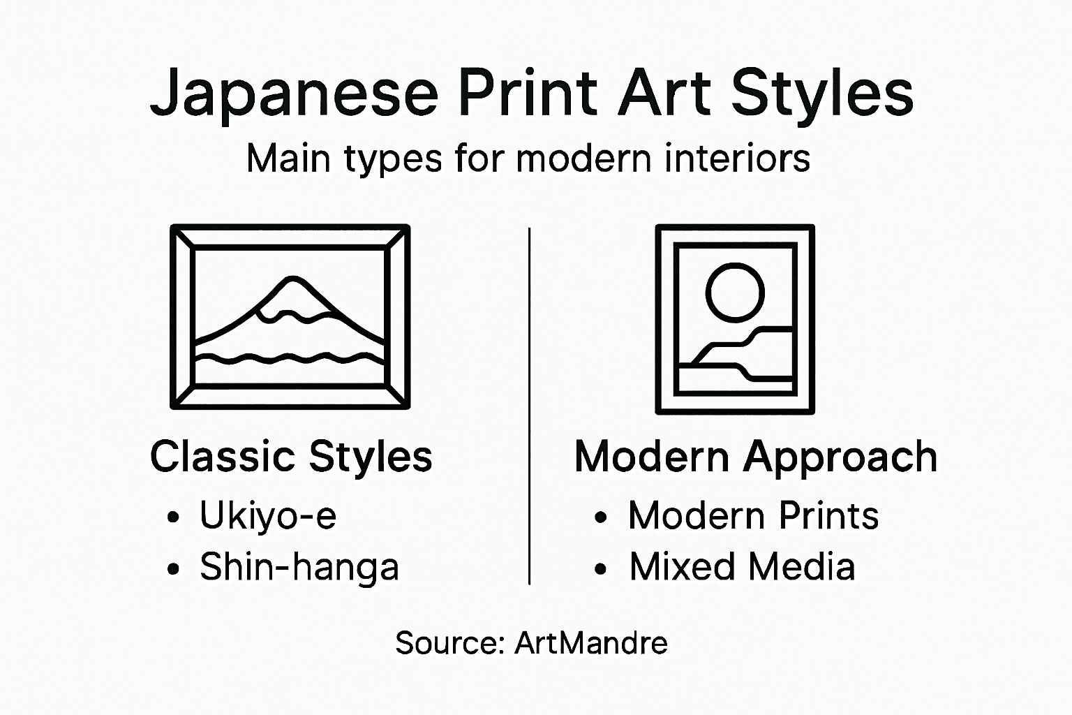
Ukiyo-e translates to “pictures of the floating world,” and it’s the style most people envision when imagining Japanese prints. Born during the Edo period (1603–1867), ukiyo-e captured scenes of urban life, theatre, nature, and beautiful women. These prints were genuinely popular art, not rarities. Woodblock carvers produced them in quantities that reached ordinary households across Japan. The style emphasises bold outlines, flattened perspectives, and vibrant colours—a radical departure from European artistic conventions of the time. Masters like Hokusai and Hiroshige created works that still captivate viewers today. What makes ukiyo-e distinctive is its democratic spirit; these weren’t paintings for wealthy collectors alone but affordable art for everyday people.
Shin-hanga, meaning “new prints,” emerged in the early 20th century as Japanese printmakers adapted to modernisation. Rather than abandoning woodblock traditions entirely, artists combined traditional techniques with Western artistic influences. Shin-hanga prints feature more sophisticated colour harmonies, greater technical refinement, and often more ambitious subject matter than their ukiyo-e predecessors. The key distinction lies in production approach. Shin-hanga was created for smaller, wealthier audiences and involved collaboration between artists, carvers, and publishers working towards artistic excellence rather than mass popularity. Colours appear more complex, compositions more carefully considered, and execution more polished. If ukiyo-e was the people’s art, shin-hanga represented a conscious artistic elevation.
The characteristics that separate these styles matter for your decorating choices:
- Ukiyo-e prints display bold, graphic quality with strong outlines and brilliant colour saturation
- Shin-hanga works showcase sophisticated colour gradations and subtle tonal variations
- Modern Japanese prints blend contemporary design sensibilities with traditional or inspired aesthetics
- Contemporary reproductions of historical styles offer affordable access to timeless designs
Modern prints represent the third major category, though “modern” encompasses considerable ground. Some contemporary artists work within traditional woodblock methods, honouring historical techniques whilst creating entirely original designs. Others employ modern printing technologies to produce works inspired by Japanese aesthetics. The distinction matters less than recognising that modern prints can feel either historically grounded or thoroughly contemporary depending on the artist’s approach.
Choosing between ukiyo-e, shin-hanga, and modern styles isn’t about determining which is “best”—it’s about identifying which aesthetic resonates with your home’s visual language.
For urban homeowners building retro and modern spaces, these styles serve different purposes. Ukiyo-e reproductions bring graphic energy and historical authenticity to rooms where bold, statement-making art works. Their graphic simplicity pairs beautifully with minimalist modern interiors. Shin-hanga pieces offer sophistication and subtle complexity, suiting spaces where refined taste and careful curation matter. Modern interpretations provide flexibility, allowing you to select designs that honour Japanese traditions whilst fitting seamlessly into your existing décor.
Consider also how these styles interact with your room’s colour palette. Ukiyo-e’s vibrant, sometimes clashing colour combinations demand confident interior design decisions. Shin-hanga’s more restrained and harmonious tones integrate more easily into diverse decorating schemes. Modern prints run the entire spectrum, giving you maximum flexibility.
The production quality differs significantly across these categories. Historical ukiyo-e prints, even those centuries old, often display surprisingly vivid colours because traditional pigments possessed remarkable permanence. Shin-hanga prints, created more recently, frequently exist in pristine condition. Modern reproductions vary wildly depending on printing method and paper quality. ArtMandre offers Japanese poster art options that accurately represent each style, using printing methods appropriate to each aesthetic.
When evaluating which style suits your home, think about the mood you’re creating. Do you want visual drama and graphic boldness? Ukiyo-e delivers that. Seeking sophistication and refined subtlety? Shin-hanga achieves it. Want contemporary designs with Japanese inspiration? Modern prints provide that path. Your space will benefit from understanding what each style genuinely offers rather than defaulting to whatever seems most recognisable.
Pro tip: Mix ukiyo-e and shin-hanga pieces in the same room by grouping them separately (perhaps on different walls) rather than alternating them directly, as their different visual weights work better when given their own space to breathe.
Techniques and Materials: What Sets Them Apart
The magic of Japanese prints lies beneath the surface. What you see visually represents only half the story; the other half involves technical mastery and carefully selected materials that took centuries to perfect. Understanding these techniques and materials transforms you from a casual observer into an informed collector. You’ll recognise quality instantly. You’ll appreciate the craftsmanship behind each print.
Traditional Japanese woodblock printing rests on three pillars: the carving, the pigments, and the paper. Each demands specialised knowledge. Traditional Japanese woodblock printing uses washi paper made from fibrous plant materials like kozo bark, mitsumata, and gampi. This paper differs fundamentally from Western alternatives. It possesses remarkable strength despite being thin, absorbs water-based pigments beautifully, and develops character with age. The texture ranges from smooth to distinctly tactile. Run your finger across authentic washi, and you’ll immediately recognise something different. Modern reproductions often use conventional paper stocks, which explains why they sometimes lack the visual depth of traditional pieces.
Pigments determine a print’s longevity and visual impact. Traditional Japanese printmakers employed water-based pigments derived from minerals and plants rather than oils. Prussian blue, imported from Europe in the 19th century, revolutionised the medium with its brilliance and permanence. Indigo provided deep blues and purples. Cinnabar created reds. Plant-based yellows and reds appeared in earlier ukiyo-e works. These pigments behave differently from modern synthetic alternatives. They age distinctly. They interact with washi paper in ways that modern inks don’t replicate. This explains why centuries-old prints retain such vivid colours whilst modern reprints sometimes fade within decades.
The carving process itself requires extraordinary skill:
- Key block carving creates the outlines and compositional structure
- Colour block carving produces separate wooden blocks for each colour layer
- Grain direction matters critically, as carvers follow the wood’s natural grain
- Negative space demands precision, with raised surfaces receiving pigment
- Registration marks (small notches) ensure colours align perfectly across multiple blocks
A single print required collaboration between master artists, skilled carvers, and experienced printers. The artist designed the composition. Carvers then cut separate wooden blocks for outlines and each colour. Finally, printers applied pigment and pressed paper onto each block in sequence. One misalignment ruined an entire print.
The technical complexity of traditional woodblock printing explains why hand-made reproductions cost significantly more than mass-produced alternatives—the labour remains intensive.
Specialised techniques further distinguish different print types. Polychrome printing applies multiple colours through sequential block impressions, requiring precise registration. Mica application involves adding crushed mica to pigment, creating subtle shimmer effects particularly valued in shin-hanga prints. Embossing (karazuri) creates raised surfaces without colour, adding tactile dimension. Blind printing creates outlines through pressure alone. These techniques demand equipment and knowledge that modern commercial printing doesn’t replicate.
The differences between traditional and modern production methods are substantial. Modern reproductions might use offset printing or digital methods, which produce flatter images with uniform colour saturation. Traditional methods create subtle variations in colour intensity because each block application deposits pigment slightly differently. Water absorption varies across the paper surface. Pressure fluctuates. These “imperfections” create the visual richness collectors treasure. ArtMandre distinguishes between reproduction styles, clearly indicating which pieces honour traditional techniques and which employ contemporary methods.
Consider also how materials affect print preservation. Authentic washi paper ages gracefully, developing warmer tones over decades. Modern paper often yellows unattractively. Traditional pigments remain stable for centuries. Modern inks sometimes shift colour unpredictably. When selecting prints for your home, asking about materials directly reveals whether you’re investing in longevity or purchasing purely for current aesthetics.
The paper sizing process adds another layer of sophistication. Traditional Japanese printmakers applied starch-based sizing to washi, creating a subtle surface that optimised pigment absorption. Too much sizing, and colours became dull. Too little, and pigment soaked through excessively. This sizing determines how colours appear and how the paper accepts the final impression. It’s invisible to untrained eyes but fundamentally affects the finished piece’s character.
When examining prints you’re considering for purchase, these technical elements provide clues about authenticity and quality. Examine the paper closely. Does it feel substantial and textured? Look at colour consistency. Do variations suggest hand application? Check the back of the print; traditional woodblock creates subtle embossing visible from behind. These physical characteristics reveal far more than marketing descriptions ever could.
Pro tip: Store prints in acid-free sleeves and folders rather than framing permanently; this preserves the paper and allows you to examine the back surface for evidence of hand-printing techniques that authenticate traditional methods.
Choosing Japanese Prints for Contemporary Interiors
Selecting Japanese prints for modern homes requires a different approach than collecting historical pieces. You’re not hunting for investment-grade antiques. You’re solving a design problem: how do you introduce Japanese aesthetics into spaces that blend contemporary furnishings, colour palettes, and lifestyle needs? The answer lies in understanding what you actually want from these prints and how they’ll function within your existing environment.
Start by identifying your design intentions. Are you seeking visual calm? Japanese prints excel at this. Nature-inspired compositions—mountains, water, botanicals—naturally slow the viewer’s eye and create psychological breathing room. Do you want graphic punch? Bold ukiyo-e-style prints deliver drama without requiring entire room redesigns. Are you building a cohesive narrative? Consider how specific themes or colour families work across multiple pieces. Understanding contemporary aesthetic values helps you select prints that genuinely enhance your space rather than feeling like obligatory cultural gestures.
Colour choices matter more than most people realise. Modern interiors often feature neutral walls—whites, greys, soft taupes. Japanese prints with restrained palettes integrate seamlessly. Indigo-dominant pieces, minimalist compositions, or monochromatic works complement contemporary minimalism beautifully. If your space already features bold accent colours, look for prints that echo or complement those tones rather than fighting them. Conversely, if your interior feels visually quiet, a vibrant ukiyo-e print becomes a justified focal point.
Consider also the print’s subject matter and how it resonates with contemporary living:
- Botanical themes work in kitchens, bedrooms, and living spaces—universally calming
- Landscape compositions provide visual escape and pair with nature-inspired décor
- Geometric or architectural prints suit minimalist and industrial interiors
- Water motifs create fluidity and work well near bathrooms or bedrooms
- Urban scenes appeal to city dwellers and complement contemporary design
- Seasonal imagery allows you to rotate prints, keeping your space dynamic
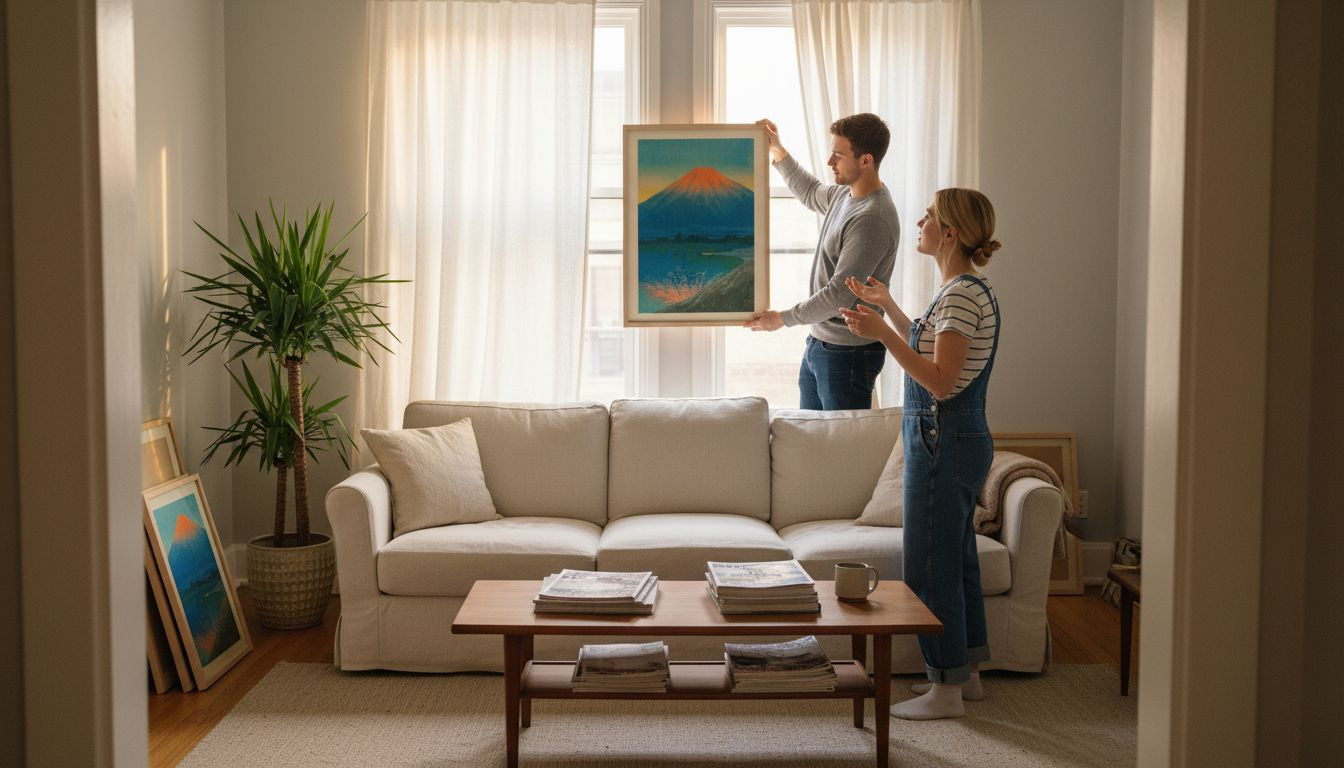
Size represents another critical decision point. Contemporary spaces often feature larger walls and simpler décor, allowing for bolder statement prints. However, resist the impulse to scale everything dramatically upward. A thoughtfully sized print—perhaps 60 by 90 centimetres for a feature wall, or a series of smaller pieces creating a gallery arrangement—often outperforms oversized single prints that dominate rooms awkwardly. Japanese artistic principles blend tradition with modern sensibilities, suggesting that restraint often achieves more impact than excess.
Frame selection dramatically affects how prints function in modern interiors. Minimal metal frames (stainless steel, matte black) suit contemporary spaces better than ornate wooden frames. Natural wood in warm tones works if your décor includes similar elements. Frameless options with simple glazing and backing emphasise the print itself. Consider mounting without frames entirely—simply placing prints under perspex allows wall colour to frame the artwork.
The most successful Japanese print selections solve visual problems whilst respecting the original aesthetic intent of the artwork.
Thinking about placement strategically prevents decorating mistakes. Avoid placing important Japanese prints in areas of extreme light exposure, humidity, or temperature fluctuation. Hallways, bathrooms with steam, or directly above heating systems compromise longevity. Instead, feature prints in living rooms, bedrooms, studies, or dining areas where they’ll age gracefully and receive proper environmental care. If you love a particular print but struggle to locate the perfect wall, consider that it might belong in a different room altogether.
Budget considerations shouldn’t feel limiting. ArtMandre offers contemporary-quality reproductions that respect Japanese design traditions without requiring antique-scale investment. High-quality reproductions on appropriate paper stocks genuinely outlast cheaper alternatives. You’re not sacrificing longevity by choosing affordably; you’re making a sensible financial decision. Invest in proper framing and placement instead.
When evaluating specific prints, ask practical questions: Does this composition genuinely appeal to me, or am I selecting it because it “should” appeal to me? Does the colour palette harmonise or clash with my existing scheme? Do I have appropriate wall space without forcing awkward arrangements? Will I enjoy living with this piece daily, not just initially? These questions separate purchases you’ll treasure from those you’ll eventually remove.
Consider also building a collection rather than selecting single statement pieces. A carefully curated series of related prints—perhaps all featuring water, or all employing similar colour palettes—creates visual cohesion whilst allowing individual pieces to breathe. This approach prevents your space from feeling randomly decorated and demonstrates the depth of Japanese aesthetics.
Consider these factors when selecting prints for contemporary interiors:
| Factor | Why It Matters | Practical Tip |
|---|---|---|
| Colour Palette | Harmonises with room decor | Choose restrained indigos for calm |
| Subject Matter | Influences atmosphere | Botanical prints for tranquility |
| Size & Placement | Impacts visual balance | Series arrangement enhances cohesion |
| Framing Choice | Alters overall aesthetic | Minimal frames match modern design |
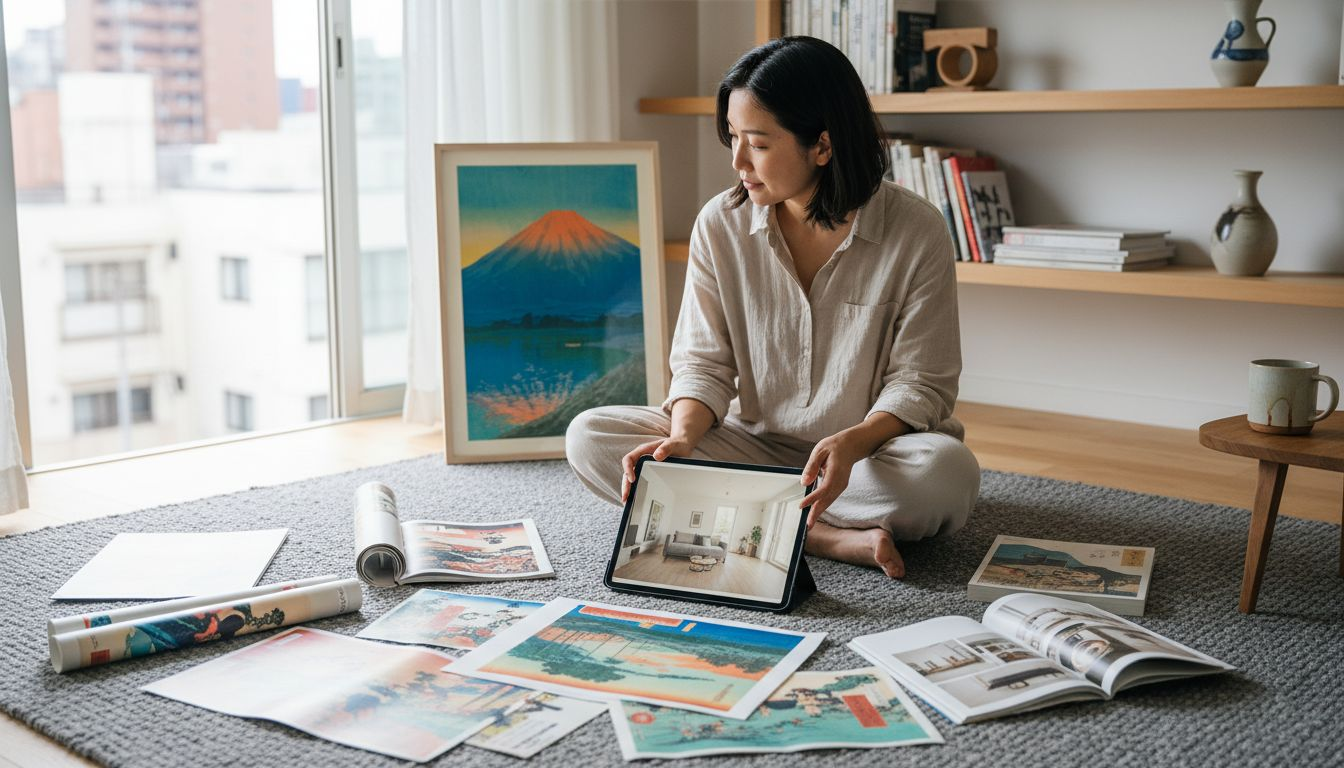
Pro tip: Before purchasing, photograph your wall space and use image editing software to digitally overlay potential prints; this reveals how scale, colour, and composition actually function in your environment rather than relying on imagination or gallery views.
Buying, Authenticity, and Affordable Options
The Japanese print market creates confusion for newcomers. Prices range from £20 to £20,000 for seemingly similar-looking pieces. Sellers use terms like “original,” “reproduction,” and “print edition” inconsistently. How do you navigate this landscape without overpaying or unknowingly purchasing something misrepresented? The answer requires understanding what authenticity actually means in this market and recognising where genuine value lies.
Authenticity in Japanese prints doesn’t follow the binary logic most people assume. An “original” ukiyo-e print from 1880 is technically authentic but might cost thousands. A museum-quality reproduction created last year using traditional woodblock methods honours the original artwork and offers genuine aesthetic value at a fraction of the cost. A contemporary print inspired by historical designs provides modern interpretation with Japanese roots. None of these categories is inherently fraudulent; they’re simply different products serving different purposes. Understanding Japanese print terminology and editions prevents misunderstandings that lead to buyer regret.
When examining prints claimed as “original” or “antique,” request specific information. Ask about provenance—the documented ownership history. Reputable dealers maintain records. They can explain how they acquired the piece and provide certificates of authenticity when appropriate. Be suspicious of sellers unable or unwilling to answer these questions. Ask about condition. Has the print been repaired? Recoloured? Are there foxing marks (brown spots from paper age) or other visible damage? Honest sellers disclose these details. They understand that transparency builds trust.
Consider the practical realities of different authentication levels:
- Historical originals require expert examination, authentication certificates, and significant investment
- Numbered limited edition reproductions offer authenticity verification through edition documentation
- Museum-quality reproductions use archival materials and traditional methods, verifiable through seller credentials
- Commercial reproductions serve aesthetic purposes without authentication claims
- Contemporary inspired prints blend Japanese traditions with modern creation
ArtMandre maintains transparency about what each piece genuinely is. You won’t encounter misleading authenticity claims masking commercial products. This clarity matters because it means you’re purchasing based on honest information, not marketing deception.
Affordable doesn’t mean cheap, and expensive doesn’t guarantee authenticity—the market contains both overpriced originals and quality reproductions offering superior value.
Where you purchase dramatically affects both price and reliability. Established galleries and museums maintain standards but charge accordingly. Online retailers like ArtMandre offer curated selections with transparent descriptions at accessible prices. Auction sites create bidding competition that inflates prices. Street vendors and unknown online sellers present the highest fraud risk. Each channel serves legitimate purposes; you simply need to understand what you’re actually getting.
Authentication red flags deserve your attention. Sellers claiming to offer “museum-quality” pieces at suspiciously low prices likely aren’t offering what they suggest. Vague descriptions avoiding specific details about production methods, paper type, or pigments suggest uncertainty about what’s actually being sold. Pressure to purchase quickly, refusal to accept returns, or demands for payment methods without buyer protection all signal problems. Trustworthy sellers welcome questions and accommodate reasonable requests.
The affordability question requires honest assessment. Genuine historical prints command high prices because they’re genuinely rare and historically significant. If you’re drawn to Japanese aesthetics but not to spending £5,000 on an antique, reproductions solve this problem intelligently. Quality reproductions printed on appropriate paper stocks with respect for original designs cost considerably less whilst delivering genuine visual satisfaction. You’re not “settling” by choosing affordably; you’re making a practical decision about what matters most to your home.
Numbered limited editions occupy a middle ground worth considering. These reproductions are created in specific quantities—perhaps 500 copies—adding scarcity without the price tag of true originals. Edition numbers provide verification that you own piece 247 of 500, for instance. This appeals to collectors seeking some exclusivity alongside affordability. Sellers should provide documentation proving these edition limits.
When purchasing online, examine images carefully. High-quality product photography reveals paper texture, colour accuracy, and printing quality that generic stock images won’t show. Ask sellers for additional photos if needed. Check return policies before committing. Reputable retailers offer satisfaction guarantees because they’re confident in their products. Read customer reviews, but recognise that reviews reflect individual experiences and preferences rather than objective truth.
Budget considerations should drive realistic expectations. If you’re spending £50 on a print, you’re purchasing a quality reproduction, not an antique investment. If you’re spending £500, you’re likely acquiring either a higher-quality reproduction or perhaps a lower-end historical piece. If you’re spending £5,000 or more, you’re entering genuine collector territory with authentic historical significance. Matching your budget to appropriate expectations prevents disappointment.
Pro tip: Request detailed product descriptions including paper type, printing method, and any restoration or colour enhancement information; sellers who provide this level of detail transparently demonstrate integrity and help you make informed decisions aligned with your actual needs.
Discover Authentic Japanese Print Art for Your Modern Home
Struggling to find Japanese print art that truly fits your contemporary decor and budget? The challenge lies in navigating authenticity, style, and material quality without losing sight of your unique aesthetic goals. Whether you want the bold graphic energy of ukiyo-e, the subtle sophistication of shin-hanga, or modern interpretations inspired by traditional techniques, understanding these nuances transforms your space and brings meaningful cultural expression to your walls.

Explore a curated selection of Japanese-inspired prints and other art styles at ArtMandre where authenticity meets affordability. Take advantage of our exclusive deals to build your perfect collection with confidence. Start your journey towards a beautifully balanced home today by visiting ArtMandre’s landing page and discover prints that honour tradition while complementing your modern lifestyle.
Frequently Asked Questions
What are the main types of Japanese print art?
The main types of Japanese print art include Ukiyo-e, Shin-hanga, and Modern prints. Ukiyo-e features bold colours and graphic designs from the Edo period, while Shin-hanga represents a more refined and sophisticated style that emerged in the early 20th century. Modern prints blend contemporary design elements with traditional aesthetics.
How do I identify authentic Japanese prints?
To identify authentic Japanese prints, look for characteristics such as high-quality washi paper, traditional water-based pigments, and evidence of hand-printing techniques, like visible relief marks. Detailed provenance or certificates of authenticity can also provide verification of a print’s originality.
What factors should I consider when choosing a Japanese print for my home?
Consider the colour palette, subject matter, size, and framing options when selecting a Japanese print. Ensure the print suits your existing décor and the mood you wish to create. For instance, botanical themes can enhance serenity, while bold ukiyo-e prints provide graphic impact.
Can Japanese prints fade over time?
Yes, Japanese prints can appear lighter or more muted over time, but this is often due to factors like original pigment composition, storage conditions, and exposure to light. Some prints may have undergone intentional colour enhancements, which adds complexity to their appearance and authenticity.