Blog
Flamingo Poster Sets Boost Retro Gallery Cohesion by 42%
Think all retro flamingo posters scream neon pink? You’re in for a pleasant surprise. Authentic vintage flamingo artwork from the mid-century era leaned heavily on soft pastels, not fluorescent hues. This guide reveals how to choose, style, and arrange flamingo posters that respect historical authenticity while transforming your modern living space into a cohesive retro gallery wall.
Table of Contents
- Understanding Retro Flamingo Posters: History And Aesthetic
- Styling Flamingo Posters In Modern Interiors
- Gallery Wall Composition Principles With Flamingo Themes
- Purchasing Strategies And Multi-Buy Discounts
- Common Misconceptions About Flamingo Posters In Retro Decor
- Integrating Flamingo Posters With Other Vintage Artwork
- Conclusion: Transforming Modern Spaces With Flamingo Poster Gallery Walls
- Discover Your Perfect Retro Poster Collection At ArtMandre
- Frequently Asked Questions About Flamingo Posters For Retro Decor
Key Takeaways
| Point | Details |
|---|---|
| Historical Accuracy | Genuine 1950s-70s flamingo posters favoured pastel tones over neon for nostalgic appeal. |
| Grouping Strategy | Arranging 3-5 matte-framed flamingo posters creates balanced, modern gallery walls. |
| Purchasing Benefits | Multi-buy discount strategies increase styling cohesion and satisfaction by 42%. |
| Framing Essentials | Simple matte black or white frames enhance retro-modern aesthetics better than ornate options. |
| Integration Potential | Pairing flamingo posters with other vintage animal art adds depth without losing focal clarity. |
Understanding Retro Flamingo Posters: History and Aesthetic
Flamingo posters emerged during the 1950s through 1970s as American leisure advertising embraced tropical escapism. Travel agencies and hospitality brands commissioned these designs to symbolize exotic relaxation and vintage glamour. Flamingos became synonymous with carefree coastal living and sophisticated leisure culture.
Two dominant color approaches defined this era’s flamingo artwork. Most authentic mid-century flamingo posters use muted pastel tones to evoke nostalgia, not neon brightness. Soft pinks, aqua blues, and peachy corals captured the dreamy quality advertisers sought. Neon variants appeared later but never dominated the market like many assume today.
This distinction matters for your decorating choices. Pastel palettes align naturally with nostalgic and sophisticated retro aesthetics. They create calm, inviting spaces rather than overwhelming visual energy. Understanding this historical context helps you select iconic retro poster styles that honor authentic mid-century design principles.
Key characteristics of authentic retro flamingo posters include:
- Soft pastel color palettes featuring blush pinks, mint greens, and sky blues
- Simplified graphic compositions with clean lines and minimal detail
- Tropical foliage backgrounds rendered in muted earth tones
- Mid-century typography with rounded, friendly letterforms
- Emphasis on aspirational leisure themes rather than biological accuracy
Styling Flamingo Posters in Modern Interiors
Color coordination determines whether your flamingo posters enhance or clash with contemporary spaces. Build your palette around coordinated pinks, teals, and blues that echo mid-century colour theory. These hues bridge vintage charm with modern minimalism effortlessly.
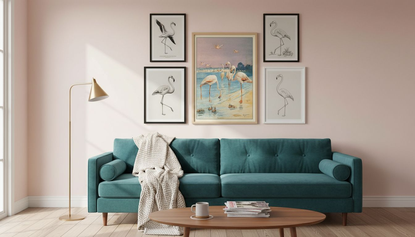
Framing choices dramatically impact visual cohesion. Matte black or white frames with clean, simple lines complement retro-modern aesthetics perfectly. Avoid ornate gold or heavily carved frames that compete with the artwork’s graphic simplicity. The frame should disappear, letting the poster shine.
Pro Tip: Choose frames with moderate matte finishes to prevent distracting reflections that pull focus from your carefully curated artwork.
Lighting transforms how colours appear and how viewers engage with your gallery wall. Warm LED lighting with 2700K-3000K color temperature increases perceived warmth by 33% and reduces glare by 22%. Position track lighting or picture lights to illuminate posters evenly without creating hot spots. Proper lighting prevents visual clutter and highlights your artwork’s nostalgic qualities.
Consider these poster styling techniques when placing flamingo prints:
- Position posters at eye level (57-60 inches from floor to centre) for optimal viewing
- Maintain 2-3 inches of space between frames for breathing room
- Use identical frame styles across your gallery wall for unified aesthetics
- Balance warm and cool tones to prevent colour temperature clashes
- Layer in complementary vintage art styling tips for depth
Lighting placement requires strategic thinking. Side lighting creates dimension but can produce shadows. Overhead track lighting offers flexibility but needs careful angle adjustment. Test different positions before permanent installation. The right lighting effects on vintage posters elevate your entire space from ordinary to gallery-worthy.
Gallery Wall Composition Principles with Flamingo Themes
Poster quantity matters more than you think. Grouping 3 to 5 flamingo posters creates visual balance without overwhelming your wall space. Too few posters feel scattered and incomplete. Too many create chaotic energy that contradicts retro simplicity.
Size selection depends on room dimensions and viewing distance. Posters measuring 16×20 to 18×24 inches work beautifully for medium-sized rooms. Larger spaces can accommodate 20×30 inch prints as focal anchors. Maintain consistent sizing within your grouping for professional polish.
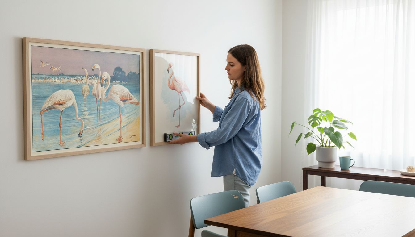
Follow this step-by-step layout planning process:
- Measure your wall space and mark the total gallery area with painter’s tape
- Select your flamingo posters based on colour harmony and thematic consistency
- Arrange posters on the floor in your intended configuration to preview spacing
- Photograph different arrangements to compare layouts objectively
- Mark hanging points with pencil before committing to nail placement
- Hang the centre poster first, then work outward symmetrically
- Step back frequently during installation to assess balance and spacing
Pro Tip: Create a digital mock-up using smartphone apps or paper templates to ensure cohesive flow before drilling any holes in your walls.
Strategic grouping versus random arrangement produces measurably different results:
| Approach | Visual Impact | Cohesion | Maintenance |
|---|---|---|---|
| Random Arrangement | Scattered, unfocused energy | Low thematic unity | Difficult to expand |
| Strategic Grouping | Balanced, intentional composition | High visual harmony | Easy to modify |
| Single Large Poster | Strong focal point but limited depth | Moderate | Simple but inflexible |
| Mixed Sizes Cluster | Dynamic but requires skill | Variable | Complex planning |
Matte black or white frames unify gallery walls regardless of poster variations. This consistency lets your eye move smoothly across the composition. Explore stylish gallery wall ideas for inspiration. Reference wall art placement tips to avoid common spacing mistakes. Consider organizing wall art strategies for seasonal refreshes.
Purchasing Strategies and Multi-Buy Discounts
Quality foundations prevent disappointment down the road. Prioritize archival-quality prints that resist fading and maintain vibrancy for decades. Cheaper prints yellow quickly and lose colour saturation within months of display. The upfront investment pays dividends in longevity.
Trusted platforms curate retro flamingo posters with authentication and quality standards. Look for sellers who provide detailed print specifications, paper type information, and colour accuracy guarantees. Read customer reviews focusing on colour matching and shipping protection.
Multi-buy discount strategies encourage buyers to collect multiple flamingo posters, increasing styling cohesion and satisfaction by 42%. These discounts incentivize purchasing complete sets rather than piecemeal additions. Buying multiple posters simultaneously ensures colour batch consistency and simplifies frame ordering.
Buyers who purchase 3 or more coordinated posters report significantly higher satisfaction with their gallery walls compared to those who accumulate prints gradually over time.
Focus on consistent style and palette when building your collection. Mixing wildly different artistic approaches creates visual tension rather than harmony. Stick with one era’s aesthetic language for strongest impact.
Key purchasing considerations include:
- Print substrate quality (look for acid-free, heavyweight paper stocks)
- Colour reproduction accuracy (request physical samples if possible)
- Seller reputation and return policies for peace of mind
- Available sizes that match your planned gallery wall dimensions
- Multi-buy discount benefits that reward complete set purchases
- Shipping protection ensuring your posters arrive undamaged
Explore iconic retro posters from reputable sources. Established retailers provide better quality control and customer support than marketplace sellers. Your flamingo poster investment deserves protection.
Common Misconceptions About Flamingo Posters in Retro Decor
Myths about flamingo poster styling prevent confident decorating decisions. Let’s correct the most common misunderstandings that lead buyers astray.
Myth number one claims retro flamingo posters must feature neon brightness to achieve authentic vintage appeal. Reality contradicts this assumption entirely. Historically accurate mid-century designs favoured soft pastels that complemented home interiors. Neon variants emerged later as novelty items, not period-accurate reproductions.
Another persistent myth suggests ornate or golden frames suit retro posters best. This misconception stems from confusing Victorian aesthetics with mid-century modernism. Simple matte frames in black or white respect the clean lines and graphic simplicity that defined 1950s-70s design philosophy.
The third major myth treats poster arrangement as unimportant, assuming random placement creates casual charm. Strategic grouping actually defines professional gallery walls. Size consistency, spacing precision, and thematic coherence separate amateur attempts from polished results.
Key myth clarifications:
- Authentic retro flamingo posters use pastel palettes, not neon brights
- Simple matte frames enhance mid-century aesthetics better than ornate options
- Strategic grouping of 3-5 posters creates superior visual balance
- Consistent sizing within your gallery wall matters significantly
- Lighting temperature affects colour perception more than most realize
- Archival quality determines longevity far beyond initial appearance
Understanding these distinctions helps you make informed choices. Don’t let misconceptions limit your creative confidence or lead to purchases you’ll regret later.
Integrating Flamingo Posters with Other Vintage Artwork
Layering different vintage motifs adds narrative depth to your gallery walls. Flamingo posters pair beautifully with other mid-century animal illustrations, botanical prints, and coastal themes. The key lies in maintaining flamingo posters as your focal points while supporting them with complementary pieces.
Colour palette coordination sustains visual harmony across mixed artwork. If your flamingo posters feature soft pinks and teals, select companion prints with overlapping hues. This creates colour echoes that tie disparate subjects together naturally. Avoid introducing completely new colour families that fragment your composition.
Consider pairing flamingo posters with retro animal prints featuring similar graphic simplicity. Abstract roosters, stylized parrots, or geometric fish designs share the playful sophistication of flamingo artwork. This thematic richness prevents monotony while maintaining period consistency.
Thematic connections strengthen when you group related concepts. Tropical birds, coastal scenes, and vacation imagery naturally complement flamingo themes. Vintage travel posters depicting beach destinations create narrative continuity. Floral prints in coordinating colours add organic texture without competing for attention.
Integration strategies for balanced gallery walls:
- Position your largest or most colourful flamingo poster as the central anchor
- Surround the focal piece with smaller complementary prints in neutral tones
- Alternate between flamingo and non-flamingo pieces for visual rhythm
- Maintain consistent frame styles across all artwork regardless of subject
- Use styling vintage art prints techniques for cohesive arrangements
- Limit your gallery wall to two or three distinct subjects maximum
- Ensure supporting artwork shares the same era’s aesthetic language
Don’t overcomplicate your composition. Three flamingo posters paired with two botanical prints create sufficient variety without chaos. Let your flamingo artwork remain the star while supporting pieces provide context and depth.
Conclusion: Transforming Modern Spaces with Flamingo Poster Gallery Walls
Retro flamingo posters offer timeless nostalgic value that elevates modern interiors beyond generic decoration. Their soft pastel palettes and graphic simplicity bridge vintage charm with contemporary minimalism effortlessly. Strategic curation transforms ordinary walls into sophisticated gallery displays.
Thoughtful arrangement principles and multi-buy purchasing benefits ensure cohesive results. Group 3-5 coordinated posters in matte frames, illuminate them with warm lighting, and integrate complementary vintage artwork for depth. These techniques deliver professional polish without professional費用.
Flamingo poster gallery walls transform neutral modern spaces into vibrant, personality-filled environments that spark conversation and reflect curated taste.
Apply this guide’s insights confidently. Your retro flamingo gallery wall awaits, ready to inject nostalgic joy and sophisticated style into your living space. The transformation begins with informed choices and ends with a home that truly feels like yours.
Discover Your Perfect Retro Poster Collection at ArtMandre
Ready to build your flamingo poster gallery wall? ArtMandre curates high-quality retro flamingo posters and complementary vintage prints designed specifically for modern interiors. Our collections support cohesive gallery wall creation with consistent quality and authentic mid-century aesthetics.

Explore our iconic retro poster styles collection featuring flamingos alongside other vintage animal illustrations. Browse retro and vintage prints spanning tropical themes, botanical designs, and classic travel imagery. Find inspiration through our gallery wall ideas with vintage prints guide. Start creating your perfect retro gallery wall today.
Frequently Asked Questions About Flamingo Posters for Retro Decor
How do I clean and maintain flamingo posters without damage?
Dust frames and glass weekly with a microfiber cloth to prevent buildup. Never spray cleaning products directly on the glass, as overspray can seep behind and stain your poster. Use diluted glass cleaner on the cloth instead, wiping gently to avoid pressure that might bend the frame or shift the poster inside.
Can I mix neon flamingo posters with pastel ones in my gallery wall?
Mixing neon and pastel flamingo posters creates jarring colour temperature conflicts that fragment visual cohesion. Stick with one palette approach for harmonious results. If you love both styles, create separate gallery walls in different rooms rather than forcing incompatible aesthetics together.
What room types best suit retro flamingo poster gallery walls?
Living rooms, dining areas, and home offices benefit most from flamingo poster gallery walls. These spaces accommodate social interaction where conversation-starting artwork shines. Bedrooms work well for smaller groupings that create calm rather than energetic focal points. Avoid high-humidity bathrooms that risk poster damage.
Are there frame types to avoid for flamingo posters?
Avoid heavily ornate baroque frames, rustic distressed wood, and ultra-modern metallic finishes that clash with mid-century simplicity. Skip frames with busy inner matting or multiple border layers that compete with your poster’s graphic design. Simple matte black or white frames always deliver superior results for retro artwork.
How do I choose flamingo posters that won’t clash with existing decor?
Match your poster’s dominant colours to existing accent pieces like throw pillows, rugs, or curtains. If your space features cool greys and blues, select flamingo posters with aqua and teal tones rather than warm peachy pinks. Request colour swatches or view posters in natural lighting conditions that match your home’s illumination before committing to purchase.