Blog
Retro Marine Life Wall Art: 46% Decor Boost in 2026
Think retro marine life wall art only works in beach cottages or demands oversized statement pieces? That’s the misconception keeping these versatile posters out of modern homes. The truth is, medium-sized retro marine prints paired with minimal frames integrate seamlessly into contemporary interiors, from urban apartments to minimalist living rooms. This guide walks you through defining characteristics, styling strategies, sizing decisions, and buying tips so you can confidently bring nostalgic coastal charm into your space without compromising modern aesthetics.
Table of Contents
- What Is Retro Marine Life Wall Art? Defining Characteristics
- Stylistic Elements Defining Retro Marine Life Wall Art
- Common Misconceptions About Retro Marine Life Wall Art
- Practical Application: Decorating With Retro Marine Life Wall Art
- How to Purchase Retro Marine Life Wall Art With Confidence
- Explore Iconic Retro Poster Styles at ArtMandre
- Frequently Asked Questions About Retro Marine Life Wall Art
Key Takeaways
| Point | Details |
|---|---|
| Ideal Size Range | Medium formats (16×20 to 24×36 inches) suit modern rooms better than oversized pieces. |
| Frame Selection | Simple thin frames in black or wood preserve vintage appeal while complementing minimalist interiors. |
| Gallery Wall Impact | Curated marine-themed arrangements boost perceived room harmony by 46%. |
| Style Compatibility | Muted palettes and geometric balance make retro marine art versatile across diverse modern decor styles. |
| Value Strategy | Multi-buy discounts on coordinated sets maximize decor investment and thematic cohesion. |
What is Retro Marine Life Wall Art? Defining Characteristics
Retro marine life wall art draws from mid-century design movements that emerged between the 1940s and 1970s, when simplified forms and restrained color palettes defined visual culture. Unlike photorealistic ocean prints, these posters emphasize stylized interpretations of coastal life through clean lines and geometric balance. Common retro marine art features simplified mid-century color palettes and line work with coastal motifs, making them instantly recognizable yet adaptable to modern spaces.
The defining visual traits include:
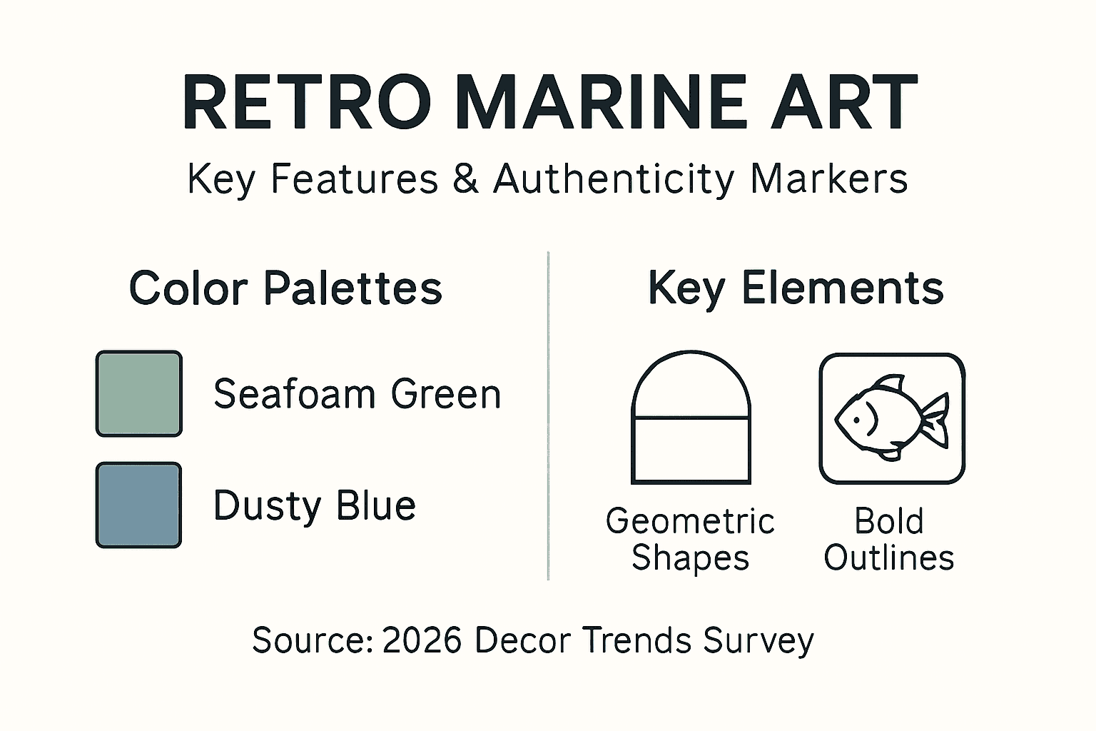
- Muted color schemes dominated by seafoam greens, dusty blues, coral pinks, and warm ochres
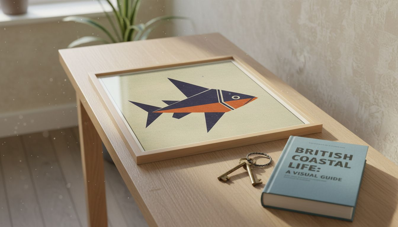
- Stylized marine subjects like fish, shells, lobsters, sailboats, and seagulls rendered with deliberate simplicity
- Geometric framing devices or abstract backgrounds that anchor organic shapes
- Limited color palettes per design, typically three to five hues for cohesive impact
- Flat or subtly textured appearances that reject hyper-realistic rendering
This aesthetic bridges the gap between vintage nostalgia and contemporary decorating needs. Where modern coastal art often leans toward photography or abstract watercolors, retro marine prints offer illustrative charm that feels both timeless and intentional. The style evokes seaside vacations and maritime heritage without requiring a beach house setting. You can hang a stylized octopus print in a city loft just as effectively as in a coastal cottage because the simplified forms read as artistic statements rather than literal coastal decor.
The historical context matters for authenticity. Mid-century designers prioritized accessibility and mass production, so genuine retro marine art reflects democratic design principles. Prints were meant for everyday homes, not elite galleries. This heritage makes the style inherently compatible with modern living spaces that value functional beauty over ostentatious display.
Stylistic Elements Defining Retro Marine Life Wall Art
Understanding specific design elements helps you identify authentic retro marine pieces and distinguish them from generic ocean prints. Muted colors like blues and seafoam greens and geometric shapes balance organic marine forms, creating visual tension that keeps compositions interesting without overwhelming.
Color palette choices define the retro aesthetic. Mid-century marine art avoided vivid tropical blues or neon accents in favor of:
- Dusty navy and slate blue instead of bright cobalt
- Sage green and seafoam rather than lime or emerald
- Coral pink and terracotta instead of hot pink or red
- Warm cream and tan backgrounds instead of stark white
These subdued tones integrate easily with neutral modern interiors dominated by grays, beiges, and natural wood finishes. They provide color interest without competing with furniture or architectural features.
Geometric elements create structure within organic subject matter. A stylized fish might feature triangular fins, circular eyes, and rectangular body segments. Shells appear as simplified spirals or fan shapes. This geometric retro marine art approach bridges the playfulness of marine life with the order modern design demands.
| Element | Retro Marine Style | Contemporary Marine Style |
|---|---|---|
| Color Saturation | Muted, vintage tones | Bright, saturated hues |
| Line Work | Bold outlines, simplified forms | Detailed realism or loose brushwork |
| Composition | Centered, symmetrical layouts | Dynamic, asymmetrical arrangements |
| Background | Solid colors or subtle patterns | Photographic or abstract textures |
Iconic motifs recur across authentic retro marine collections. Lobsters appear frequently as playful subjects rendered in flat coral or red against cream backgrounds. Sailboats feature simplified triangular sails and geometric hulls. Seagulls become stylized silhouettes. Fish schools arrange in rhythmic patterns that emphasize repetition over naturalism.
Pro Tip: When evaluating potential purchases, check whether the design uses three to five colors maximum and features bold outlines around subjects. These markers indicate genuine retro styling rather than modern reproductions attempting vintage aesthetics.
The simplicity inherent in retro marine art creates unexpected compatibility with minimalist modern decor. Where ornate traditional art might clash with clean-lined furniture, these simplified compositions respect contemporary restraint while adding personality.
Common Misconceptions About Retro Marine Life Wall Art
Several myths prevent homeowners from embracing retro marine art despite its suitability for modern spaces. Addressing these misconceptions helps you make confident decor decisions.
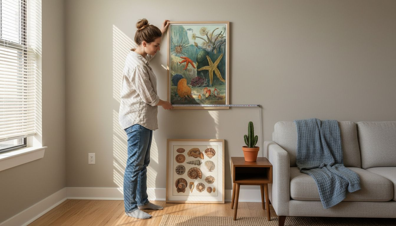
First, many assume retro posters require large formats to make impact. Reality contradicts this belief. Optimal sizes range from 16×20 to 24×36 inches, fitting modern rooms better than large formats. Oversized pieces overwhelm spaces with lower ceilings or limited wall space, common in urban apartments and modern open-plan homes. Medium formats allow you to create curated arrangements without dominating entire walls.
Second, buyers worry retro marine art clashes with modern minimalist interiors. This concern stems from confusing retro with maximalist vintage decor that includes heavy ornamentation. Authentic mid-century marine prints share minimalism’s appreciation for clean lines and intentional simplicity. The muted palettes and geometric balance complement rather than compete with modern furniture. Statistics support this compatibility, noting 78% of interior design consultants report retro art enhances modern decor without style conflicts.
Third, some believe marine-themed art only suits coastal homes or beach-themed rooms. This limitation ignores the artistic merit of well-designed retro prints. A stylized lobster or geometric fish composition functions as graphic art that happens to feature marine subjects. You wouldn’t hesitate to hang a mid-century abstract print in a city apartment. Retro marine art deserves the same consideration as graphic design rather than literal coastal decoration.
Additional misconceptions to dispel:
- Retro art requires vintage frames: Modern thin frames in black or natural wood actually enhance rather than diminish retro appeal.
- All marine prints look similar: Genuine retro collections span diverse styles from Scandinavian simplicity to American mid-century boldness.
- Retro marine art feels dated: Well-chosen pieces read as intentionally vintage rather than accidentally old-fashioned.
- You need a collection immediately: Single statement pieces work effectively as focal points before expanding to gallery walls.
“The key to incorporating retro marine art in modern spaces lies in treating these pieces as graphic design elements rather than thematic decor. Their simplified forms and restrained palettes make them visual anchors that enhance rather than define a room’s character.” – Interior Styling Principle
Recognizing these myths as unfounded opens possibilities for integrating retro marine life wall art into diverse modern settings, from home offices to entryways to living rooms.
Practical Application: Decorating with Retro Marine Life Wall Art
Translating knowledge into action requires specific strategies for displaying retro marine prints effectively in contemporary homes. Frame selection, placement decisions, and curation approaches determine whether pieces enhance or detract from your space.
Using simple, thin frames preserves vintage appeal and suits modern minimalistic homes. Choose frames measuring 0.5 to 1 inch in width, avoiding ornate molding or heavy profiles. Black frames create crisp contrast that emphasizes the art itself. Natural wood frames in light oak or walnut add warmth while maintaining simplicity. White frames work for Scandinavian-influenced spaces but risk washing out muted retro colors. Consistency matters when creating gallery walls: select one frame style and color for the entire arrangement.
Placement strategies vary by room function:
- Living rooms benefit from gallery walls positioned above sofas or opposite entryways, creating immediate focal points
- Home offices gain personality from single medium-sized prints placed at eye level near desks
- Entryways welcome guests with curated pairs or trios that establish home style immediately
- Bedrooms suit calmer marine subjects like shells or simplified seascapes rather than bold lobsters
Gallery wall arrangements deserve careful planning. Start by laying out prints on the floor to test compositions before hanging. Maintain 2 to 3 inches of space between frames for breathing room. Anchor arrangements around a central piece, then build outward with complementary sizes. Research confirms gallery walls boost perceived room harmony by 46%, making the effort worthwhile for cohesive impact.
Pro Tip: Photograph your floor layout with your phone before hanging. Reference this image while installing to maintain planned spacing and alignment without constant measuring.
Color coordination prevents visual chaos. If your retro marine collection includes seafoam greens, dusty blues, and coral pinks, ensure these hues complement existing textiles and furniture. Extract one or two accent colors from the prints to repeat in throw pillows or decorative objects, creating intentional connections. Avoid mixing marine themes with unrelated subjects like florals or urban photography in the same gallery wall. Thematic consistency strengthens visual impact.
Modern decorating tips emphasize balancing artwork with negative space. Don’t cover every available wall. Strategic emptiness allows retro marine prints to breathe and prevents spaces from feeling cluttered. In open-plan homes, position marine art in defined zones like seating areas rather than scattering pieces throughout, which fragments visual cohesion.
Coastal retro marine decor ideas suggest pairing prints with natural materials: jute rugs, linen curtains, or rattan furniture. These textures complement marine themes without requiring literal beach decor like driftwood or shells. The combination feels sophisticated rather than themed.
For those new to gallery wall ideas, start with three to five pieces in similar sizes. Symmetrical grids suit formal spaces while asymmetrical clusters feel relaxed and organic. Measure your wall width and subtract 6 inches on each side to determine maximum arrangement width, preventing installations from appearing too large or too small for available space.
How to Purchase Retro Marine Life Wall Art with Confidence
Smart buying decisions ensure your investment delivers lasting aesthetic value. Evaluating authenticity, understanding pricing factors, and recognizing the benefits of coordinated sets prevent buyer’s remorse.
Authenticity verification starts with stylistic consistency. Genuine retro marine art reflects period-appropriate design principles: simplified forms, limited color palettes, and deliberate geometric elements. Beware of prints that mix modern photographic elements with vintage styling or use overly saturated colors uncommon in mid-century design. Check whether sellers provide design context or historical background, indicating curatorial expertise rather than generic dropshipping.
Gallery sets offer significant advantages over individual purchases:
- Thematic cohesion ensures pieces work together visually without clashing
- Pre-coordinated color palettes eliminate guesswork in matching hues
- Size variety within sets creates dynamic gallery wall compositions
- Bulk purchasing typically includes discounts, maximizing value
Price evaluation requires considering multiple factors beyond base cost. Print quality matters significantly for longevity and visual impact. Look for giclée or archival inkjet printing on acid-free paper, which resists fading and maintains color accuracy. Seller reputation indicates reliability in product quality and customer service. Compare prices across multiple sources but prioritize quality indicators over cheapest options, which often compromise on materials or printing standards.
Multi-buy discounts reward strategic purchasing. Many specialized retailers offer tiered savings: 5% off two prints, 10% off three, or 15% off four or more. These structures encourage building complete gallery walls while reducing per-piece costs. Calculate total investment including frames when budgeting, as framing expenses can equal or exceed print costs for quality materials.
Print finish selection affects both aesthetics and practicality. Matte finishes reduce glare and enhance the vintage character of retro marine art, making them preferable for most applications. Glossy finishes create reflection issues in brightly lit rooms but can intensify colors for specific effects. Textured papers add subtle dimension but may conflict with simplified retro design principles.
Additional buying considerations:
- Return policies protect against prints that don’t match expectations when displayed
- Size options allow flexibility for different wall spaces without custom printing
- Digital previews help visualize how prints appear in situ before purchasing
- Shipping protection ensures prints arrive undamaged, particularly for international orders
For comprehensive guidance on making informed selections, explore retro wall art buying tips that cover evaluation criteria, style matching, and installation planning. Taking time to research before purchasing prevents costly mistakes and ensures your retro marine life wall art enhances rather than detracts from your modern home’s aesthetic.
Explore Iconic Retro Poster Styles at ArtMandre
Ready to transform your space with authentic retro marine life wall art? ArtMandre curates a specialized collection that balances mid-century nostalgia with modern home aesthetics, eliminating guesswork from your decorating decisions.

Our marine life selection features carefully designed prints in optimal medium sizes, pre-coordinated color palettes, and thematic sets that simplify gallery wall creation. Whether you’re seeking a single statement piece or a complete coastal arrangement, you’ll find options that integrate seamlessly with contemporary minimalist interiors. Benefit from transparent multi-buy discounts: 5% off two posters, 10% off three, and 15% off four or more, making cohesive decor affordable.
Beyond products, ArtMandre provides educational resources to support your styling journey. Explore our guides on iconic retro poster styles spanning decades of design evolution, discover practical gallery wall ideas with retro prints tailored to various room types, and browse our coastal marine art collection for curated inspiration. Quality prints, expert curation, and straightforward shopping make achieving your ideal retro aesthetic effortless.
Frequently Asked Questions About Retro Marine Life Wall Art
What size should I choose for retro marine posters in small rooms?
Medium formats between 16×20 and 24×36 inches work best for compact spaces, providing visual interest without overwhelming limited wall areas. In rooms under 150 square feet, stick to the smaller end of this range or arrange multiple 11×14 inch prints in a tight grid for impact.
How do I ensure retro marine art fits with modern minimalist decor?
Select prints with muted color palettes and geometric balance that mirror minimalism’s restraint. Use simple thin frames in black or natural wood, and limit yourself to one cohesive gallery wall rather than scattering multiple unrelated pieces throughout the space.
Where can I find authentic retro marine life art prints?
Specialized online retailers focusing on mid-century and vintage-inspired design offer the most authentic selections. Look for stores that provide design context, historical background, and curated collections rather than generic marketplaces with inconsistent quality.
What framing options best preserve retro appeal?
Thin frames measuring 0.5 to 1 inch in black, light oak, or walnut preserve vintage character while complementing modern interiors. Avoid ornate molding or distressed finishes that compete with the simplified aesthetic of retro marine prints.
Can a gallery wall of marine art work in non-coastal homes?
Absolutely. Treat retro marine prints as graphic art featuring stylized subjects rather than literal coastal decor. Their geometric forms and muted palettes function as design elements that enhance urban apartments, suburban homes, and any modern interior regardless of geographic location.