Blog
Decorating tips for prints: style walls with charm
Arranging prints in your home can transform bare walls into personal galleries that reflect your taste and character. Whether you favour retro cocktail posters or Bauhaus-inspired designs, the challenge lies in selecting pieces that harmonise with your space whilst maintaining visual balance. This guide provides practical decorating tips for prints, covering key selection criteria, modern display options like acrylic, and expert placement strategies to help you confidently style your walls with prints that blend vintage charm and contemporary elegance.
Table of Contents
- Understanding Key Criteria For Decorating With Prints
- Decorating With Acrylic Prints: Vibrant, Modern Options
- Gallery Walls And Print Arrangements: Balancing Scale And Variety
- Common Mistakes And Expert Recommendations For Print Decorating
- Explore Retro And Vintage Prints To Enhance Your Home Décor
Key takeaways
| Point | Details |
|——-|———||
| Acrylic prints deliver impact | Light interaction creates depth and vibrant colour ideal for modern interiors. |
| Scale relates to furniture | Art width should be roughly two-thirds of sofa width with centre positioned 57-60 inches from floor. |
| Gallery walls need variety | Mix frame sizes, styles, and three-dimensional elements for engaging visual interest. |
| Personal connection matters most | Choose art that resonates with you rather than merely matching existing décor. |
| Start in smaller spaces | Experimenting with gallery walls in hallways reduces pressure and builds confidence. |
Understanding key criteria for decorating with prints
Before purchasing or hanging prints, establish foundational criteria that guide smart decorating decisions. Personal connection forms the bedrock of successful wall art selection. Choosing art that you actually like is more important than matching existing décor, as art should reflect your personality and values.
Consider these essential criteria when selecting prints:
- Personal meaning: You should feel a connection to every piece, whether through a personal story or appreciation for the artist’s work.
- Room style: Harmonise prints with your interior design aesthetic, whether mid-century modern, industrial, or eclectic bohemian.
- Scale proportions: Art must relate proportionally to furniture and wall space to avoid visual imbalance.
- Ceiling height: Higher ceilings accommodate larger or vertically oriented pieces, whilst standard eight-foot ceilings suit medium-sized prints.
- Colour palette: Prints can complement or contrast with room colours, but avoid forcing exact matches that feel contrived.
Pro Tip: Walk around your favourite rooms and notice which walls feel empty or lifeless. These spaces offer the best opportunities for prints that genuinely enhance your environment rather than filling space arbitrarily.
One common mistake involves choosing prints that are too small for the wall or furniture they accompany. Undersized art creates awkward gaps and fails to anchor the visual composition properly. When decorating with prints, think generously about scale and don’t hesitate to go larger than your initial instinct suggests. Choosing art prints that reflect your personality ensures your selections remain meaningful long after trends fade.
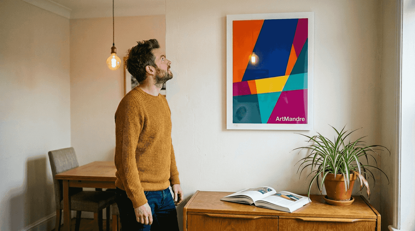
Decorating with acrylic prints: vibrant, modern options
Acrylic prints represent a contemporary alternative to traditional framed posters, offering distinct advantages for modern interiors. The material’s interaction with light gives prints exceptional depth and luminosity without requiring bulky frames or glass. Acrylic prints enhance visual sharpness and depth, making colours vibrant and details crisp.
Key benefits of acrylic prints include:
- Frameless elegance: The clean, minimalist presentation suits contemporary and Scandinavian-inspired spaces beautifully.
- Moisture resistance: Acrylic withstands humidity better than paper, making it suitable for kitchens and bathrooms.
- Fade resistance: UV-resistant properties preserve colours and prevent deterioration over time.
- Depth perception: Light penetrates the acrylic surface, creating a three-dimensional effect that standard prints cannot achieve.
- Conversation starters: Personal photographs transformed into acrylic prints become striking focal points.
When selecting images for acrylic printing, quality matters immensely. High-resolution images are crucial for acrylic prints to prevent pixelation and preserve detail, especially since the glossy surface magnifies imperfections. Bold, high-contrast designs with saturated colours maximise acrylic’s visual impact.
Pro Tip: Acrylic prints work exceptionally well with retro designs featuring strong geometric shapes and vibrant palettes. The material’s inherent sheen enhances the bold aesthetic of vintage travel posters and Bauhaus compositions.
Consider modern wall art prints that complement your interior style whilst leveraging acrylic’s unique properties. The elevated, gallery-quality appearance justifies the investment for focal wall spaces. Research places to hang wall art prints to identify locations where acrylic’s reflective qualities enhance rather than compete with natural light sources.
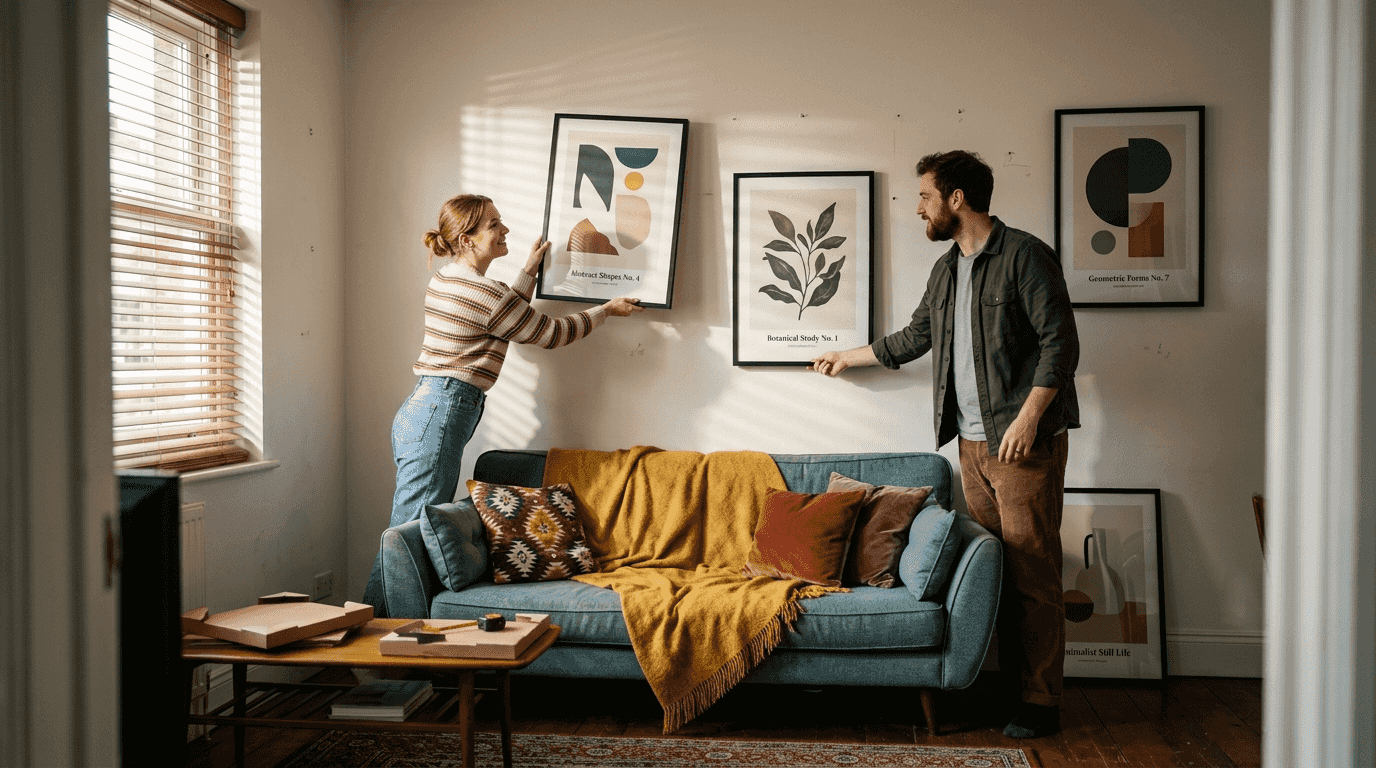
Gallery walls and print arrangements: balancing scale and variety
Creating gallery walls requires strategic planning to achieve visual cohesion whilst maintaining individual print impact. Scale serves as the foundation for successful arrangements. The two-thirds rule suggests art width should be about two-thirds of the sofa width for balance, preventing prints from appearing lost or overwhelming.
Essential placement guidelines include:
- Eye-level positioning: The centre of wall art should be hung at 57-60 inches from the floor for comfortable viewing in most spaces.
- Ceiling considerations: Higher ceilings permit larger artworks or vertical arrangements that draw the eye upward and emphasise room height.
- Furniture relationship: Maintain 15-20 centimetres between furniture tops and artwork bottoms to create breathing room.
- Frame variety: Variety in frame sizes and styles enhances visual interest in gallery walls compared to uniform setups.
- Three-dimensional elements: Incorporate shallow shelves, small sculptures, or textured pieces amongst prints for depth.
| Gallery wall approach | Best for | Key advantage | Potential challenge |
|---|---|---|---|
| Symmetrical grid | Formal spaces, matching frames | Clean, organised appearance | Can feel rigid or corporate |
| Salon style | Eclectic interiors, mixed media | Dynamic visual energy | Requires careful planning |
| Linear arrangement | Hallways, narrow walls | Guides eye along pathway | Limited creative expression |
| Themed clusters | Collectors, series displays | Tells cohesive story | May limit future additions |
Pro Tip: Before hammering nails, arrange prints on the floor in your desired configuration. Photograph the layout and measure distances between pieces to replicate the arrangement on your wall accurately.
Gallery walls benefit from starting in less prominent spaces like hallways or guest bedrooms. These areas allow experimentation without the pressure of perfecting high-visibility rooms immediately. Learn stylish gallery wall ideas to understand composition principles, then adapt them to your unique collection and space constraints.
When arranging prints above sofas specifically, consult guidance on how to style art prints above the sofa for proportions and height recommendations. For international collectors managing valuable pieces, understanding logistics like shipping fine art and antiques overseas ensures safe transport during relocations.
Common mistakes and expert recommendations for print decorating
Even enthusiastic decorators fall into predictable traps when styling walls with prints. Awareness of these pitfalls helps you avoid frustration and create displays that genuinely enhance your home. The most significant error involves neglecting personal preference. Number one mistake is not selecting pieces that speak to you personally and represent something meaningful.
Common decorating mistakes include:
- Mass-produced prints: Big-box stores sell mass-produced prints worn by thousands, lacking uniqueness and personal character.
- Décor-driven selection: Choosing art solely to match throw pillows or rugs creates superficial, uninspired spaces.
- Incorrect scale: Undersized prints float awkwardly on large walls, whilst oversized pieces overwhelm small rooms.
- Ignoring lighting: Failing to consider natural and artificial light sources affects how colours and textures appear throughout the day.
- Rushing decisions: Purchasing prints impulsively without considering long-term appeal leads to frequent replacements and wasted investment.
Expert recommendations emphasise patience and experimentation. Start with one or two prints you genuinely love rather than filling every wall immediately. Live with these pieces for weeks or months to understand how they interact with your space across different seasons and lighting conditions.
“The art you choose should tell your story, not just fill a gap. Every piece should spark joy, curiosity, or meaningful reflection each time you encounter it. When you prioritise personal connection over decorative coordination, your space becomes authentically yours.”
Pro Tip: Create a shortlist of prints you love, then wait one week before purchasing. If you still think about them daily, they likely deserve wall space in your home.
Consider choosing art prints that reflect your personality as an investment in your wellbeing, not merely décor. Prints that resonate personally create environments that energise and comfort you, making your house feel genuinely like home.
Explore retro and vintage prints to enhance your home décor
Now that you understand key decorating principles, explore curated collections that combine retro charm with modern sensibilities. ArtMandre offers distinctive retro art prints and vintage posters spanning cocktail designs, classic travel imagery, and Bauhaus-inspired compositions.

Discover pieces like the red Bauhaus vintage mid century modern art print that exemplify bold geometric aesthetics perfect for contemporary interiors. Multi-buy discounts reward curated gallery wall compositions, offering 15% off when purchasing four or more prints. Explore the guide to finding your art style to identify themes and aesthetics that align with your decorating vision.
How to decorate with prints: frequently asked questions
What is the optimal height for hanging prints?
The centre of your print should sit 57-60 inches from the floor, which aligns with average eye level for comfortable viewing. In dining rooms where people are seated, lower this measurement slightly to 54-56 inches for better sightlines.
How do I choose the right print size for above my sofa?
Apply the two-thirds rule, where your artwork’s total width should be approximately two-thirds of your sofa’s width. For a 180-centimetre sofa, aim for 120 centimetres of combined print width, whether one large piece or multiple smaller prints.
Are acrylic prints suitable for retro style décor?
Absolutely. Acrylic prints enhance visual sharpness, making them ideal for vibrant retro designs with bold colours and geometric shapes. The frameless, modern presentation complements vintage aesthetics beautifully in contemporary spaces.
How should I start creating a gallery wall?
Begin in smaller, less prominent spaces like hallways or guest bedrooms where you can experiment without pressure. Layout prints on the floor first to test arrangements, then measure and photograph your configuration before transferring it to the wall.
Where can I find unique prints that reflect my personality?
Explore vintage shops, local artists’ studios, and curated online boutiques like Etsy or specialised retailers. Choosing art prints that reflect your personality requires discovering sources aligned with your aesthetic values rather than mass-market options.