Blog
Choose orange retro posters to brighten modern homes
Vintage artwork featuring warm tones has surged in popularity, with a 35% increase in preference among US homeowners from 2023 to 2025. Orange retro posters bring vibrant colour and nostalgic design to modern spaces, offering bold visual interest while evoking warmth and energy. This guide helps you confidently select and style orange posters to create balanced, harmonious décor that celebrates vintage aesthetics in contemporary homes.
Table of Contents
- Understanding The Psychological And Aesthetic Power Of Orange In Retro Posters
- Styling Strategies To Integrate Orange Retro Posters With Contemporary Décor
- Historic And Narrative Significance Of Orange Retro Posters
- Material Quality And Purchasing Tips For Authentic Orange Retro Posters
- Common Misconceptions About Using Bold Orange Posters In Home Décor
- Bringing It All Together: Creating A Cohesive Vintage-Modern Wall With Orange Posters
- Discover Your Perfect Orange Retro Poster Today
- Common Questions About Orange Retro Posters In Home Décor
Key takeaways
| Point | Details |
|---|---|
| Orange evokes energy and warmth | Ideal for social areas like living rooms and kitchens where vibrancy enhances mood and interaction. |
| Balance orange with neutrals | Pair with beige, grey, or cool blues to prevent visual overwhelm and maintain harmony in smaller spaces. |
| Vintage themes add emotional depth | Travel and cocktail posters create nostalgic connections and narrative personality beyond mere decoration. |
| Prioritise quality materials | Use archival prints and durable frames for lasting colour vibrancy and polished presentation. |
| Plan size and lighting carefully | Proportional sizing and layered lighting ensure orange posters complement rather than dominate your rooms. |
Understanding the psychological and aesthetic power of orange in retro posters
Orange stimulates energy, creativity, and social interaction in living spaces. Research confirms that orange is psychologically associated with energy, making it effective for enhancing interiors with vibrancy and positivity. This makes orange retro posters particularly powerful in rooms designed for gathering and conversation.
Historically, orange featured prominently in Bauhaus and mid-century poster design, often paired with geometric patterns and bold typography. These vintage artworks balanced modernist simplicity with emotional warmth, creating pieces that felt both structured and inviting. The colour’s vividness naturally grabs attention, yet its warmth prevents it from feeling harsh or cold.
Retro orange art connects viewers to a nostalgic era whilst maintaining contemporary appeal. Mid-century designers understood the psychology of colour in marketing and communication, using orange to convey optimism and adventure in travel posters or leisure and sophistication in cocktail prints. This dual quality makes orange posters ideal focal points that add character without overwhelming modern minimalist aesthetics.
“Orange occupies a unique position in colour psychology, bridging the passion of red with the cheerfulness of yellow to create a hue that energises without aggression.”
The enduring popularity of orange in vintage poster design reflects its ability to balance nostalgia with forward-looking energy. When you choose orange retro posters, you’re selecting artwork that carries historical weight whilst feeling fresh and relevant. This timeless quality ensures your investment remains stylish as design trends evolve, making orange prints a smart choice for design-conscious homeowners.
Styling strategies to integrate orange retro posters with contemporary décor
Successfully integrating orange posters requires thoughtful colour pairing and spatial planning. Studies show that improper use of bold colours overwhelms small rooms, but balanced pairing with neutrals reduces perceived visual tension by up to 40%. This data underscores the importance of strategic styling rather than avoiding bold art entirely.
Here’s how to pair orange posters effectively:
- Combine with neutral backgrounds like beige, grey, or white to create visual breathing room
- Balance warmth by adding cool tones such as navy, teal, or soft blues in textiles and furniture
- Layer lighting with ambient, task, and accent sources to control how vibrancy appears throughout the day
- Choose poster sizes proportional to wall space, avoiding oversized prints in compact rooms
Pro Tip: Test lighting at different times before permanently hanging orange posters. Morning light enhances warmth, whilst evening artificial light can intensify orange tones, so adjustable lighting fixtures give you control over the mood.
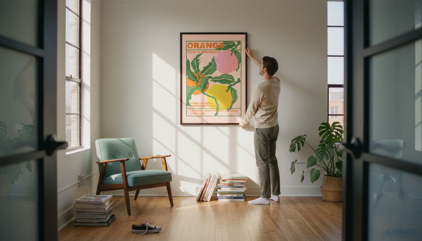
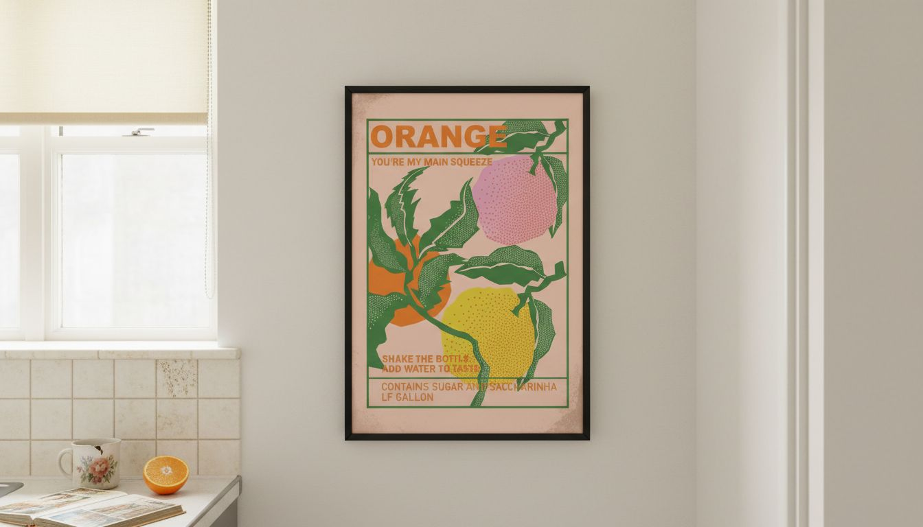
Frame selection significantly impacts how orange posters integrate with modern interiors. Matte black frames add contemporary edge and contain vibrancy, whilst natural wood frames soften the look and enhance vintage character. Avoid ornate or gilded frames that compete with the poster’s design, opting instead for clean lines that complement both the artwork and your existing décor.
The following table illustrates effective pairing strategies:
| Room element | Complementary approach | Why it works |
|---|---|---|
| Wall colour | Neutral beige or grey | Creates contrast without clashing, lets orange stand out as intentional accent |
| Furniture | Cool-toned upholstery | Balances warmth, prevents room from feeling too stimulating or visually hot |
| Lighting | Layered ambient and accent | Controls intensity, allows adjustment for different times and moods |
| Textiles | Mixed warm and cool patterns | Adds depth whilst maintaining harmony between bold poster and subtle surroundings |
Consider placement carefully to maximise impact. Position orange posters as focal points on feature walls rather than scattering them throughout a room. This creates intentional visual hierarchy and prevents the space from feeling chaotic. In open-plan homes, use orange art to define zones, placing a Bauhaus print waves orange poster above a seating area to anchor the social space visually.
Historic and narrative significance of orange retro posters
Orange emerged as a signature colour in mid-century travel and cocktail posters during the 1950s and 1960s, symbolising warmth, excitement, and leisure. These prints promoted exotic destinations and sophisticated drinking culture, using vibrant hues to evoke adventure and relaxation simultaneously. The colour became synonymous with optimism and modern living during this transformative post-war period.
Trend data reveals a 35% increase in preference among US homeowners for vintage artwork featuring warm colours from 2023 to 2025. This resurgence reflects a broader desire for authentic, emotionally resonant décor that tells a story beyond mere aesthetic appeal. Orange retro posters satisfy this craving by connecting contemporary spaces to a specific cultural moment.
Thematic elements in vintage orange prints add layers of meaning:
- Travel posters featuring sunsets, beaches, and architectural landmarks evoke wanderlust and memories of journeys past or future
- Cocktail prints with stylised glassware and typography celebrate leisure and social sophistication
- Bauhaus designs with geometric patterns represent modernist ideals of form, function, and accessible beauty
- Nature illustrations in orange tones bridge organic warmth with human creativity
These narrative dimensions transform orange posters from simple decoration into conversation pieces that express personal values and interests. A bauhaus vintage poster art orange print might signal appreciation for design history, whilst a vintage travel poster communicates adventurous spirit. This storytelling capacity makes retro art uniquely valuable in contemporary homes seeking personality and depth.
The emotional connection to vintage orange prints also stems from collective nostalgia for mid-century aesthetics. Even younger homeowners who didn’t experience the 1950s and 1960s firsthand respond to the optimism and craftsmanship these posters represent. Selecting thematic prints allows personalised expression whilst maintaining cohesive vintage-modern style that bridges past and present seamlessly.
Material quality and purchasing tips for authentic orange retro posters
Quality determines how well orange retro posters maintain their vibrancy and visual impact over time. Prioritise archival paper and fade-resistant inks when selecting prints, as these materials preserve colour intensity even with prolonged light exposure. Standard paper and dyes can yellow or fade within months, diminishing the bold character that makes orange posters appealing.
Follow these steps for smart purchasing:
- Verify that sellers specify archival or museum-quality materials in product descriptions
- Read customer reviews focusing on colour accuracy and print durability after months of display
- Check for money-back guarantees or quality assurance policies that protect your investment
- Compare framing options to ensure frames suit your décor style and provide UV protection
- Evaluate multi-buy offers to build coordinated collections for gallery walls at better value
Authenticity matters when sourcing vintage reproductions. Reputable retailers provide clear information about original poster dates, designers, and reproduction methods. This transparency helps you distinguish between faithful vintage reproductions and generic prints that lack historical accuracy or visual refinement.
Pro Tip: Purchase multiple coordinating prints at once using multi-buy discounts. Planning a gallery wall from the outset ensures colour harmony and thematic consistency, whilst saving money compared to adding pieces individually over time.
Framing elevates both protection and presentation. Look for frames with UV-resistant glazing to prevent fading, especially in rooms with abundant natural light. Consider whether pre-framed options offer convenience and value, or if custom framing better suits your specific décor needs. Quality framing transforms a poster from a print into a polished art piece that commands attention and respect.
Buyer protection extends beyond materials to shipping and returns. Ensure sellers package prints securely to prevent damage during transit, and verify return policies allow exchanges if colours don’t match expectations. Specialist poster retailers typically offer superior customer service compared to general marketplace sellers, providing expertise on selecting and caring for vintage prints.
Common misconceptions about using bold orange posters in home décor
Many homeowners avoid orange posters due to unfounded concerns about overwhelming spaces or clashing with modern aesthetics. The misconception that orange inevitably dominates small rooms stems from poor implementation rather than inherent unsuitability. Proper pairing with neutrals and strategic sizing actually allows orange to enhance intimacy rather than overpower it.
Key myths to dispel:
- Orange clashes with contemporary design: Modern interiors benefit from vintage contrast that adds warmth and visual interest to minimalist schemes
- Retro posters lack sophistication: Quality vintage reproductions demonstrate craftsmanship and design heritage that elevate rather than cheapen spaces
- Bold colours require bold personalities: Anyone can successfully incorporate orange art through balanced styling, regardless of personal decorating confidence
- Vintage artwork feels dated: Well-chosen retro prints create timeless vintage-modern fusion that transcends fleeting trends
The belief that orange retro posters suit only maximalist or eclectic styles underestimates their versatility. Scandinavian interiors, for example, successfully incorporate warm accent colours against neutral backgrounds to prevent coldness. Similarly, industrial lofts gain approachability through vintage art that softens hard surfaces and mechanical elements.
“Effective use of bold accent colours like orange in contemporary spaces requires not avoidance but strategic balance through complementary tones, proportional sizing, and intentional placement.”
Another misconception suggests retro posters provide purely aesthetic value without emotional resonance. In reality, themed vintage prints offer strong nostalgic connections that make homes feel personally meaningful. This emotional layer transforms living spaces from showrooms into narratives that reflect inhabitants’ interests, memories, and aspirations.
Expert interior designers increasingly advocate for mixing eras and styles rather than adhering to single aesthetic categories. This approach validates vintage-modern combinations and encourages experimentation with bold elements like orange retro posters. The key lies in thoughtful curation rather than matching everything perfectly, creating collected-over-time character that feels authentic and lived-in.
Bringing it all together: creating a cohesive vintage-modern wall with orange posters
Successful gallery walls require systematic planning rather than improvisation. Follow this framework to build harmonious displays:
- Assess your room’s lighting conditions and existing colour palette to determine appropriate orange intensity
- Select a cohesive style or theme (Bauhaus geometric, travel, cocktail) to unify multiple posters
- Plan arrangement by laying prints on the floor, experimenting with spacing and positioning before hanging
- Choose frames consistently in either matte black or natural wood to create visual continuity
- Install appropriate lighting to highlight artwork whilst controlling vibrancy levels throughout the day
Research confirms that retrofitting vintage orange posters works best with layered lighting and matte black or natural wood frames to visually balance vibrancy. This technical guidance removes guesswork and increases confidence in bold décor choices.
The following comparison illustrates layout strategies:
| Space type | Recommended approach | Example combination |
|---|---|---|
| Small room (under 15 m²) | Single focal poster, 50×70 cm or smaller | One bauhaus orange vintage wall poster centred above furniture |
| Medium room (15-25 m²) | Two to three posters, mixed sizes | Mid century orange bauhaus poster flanked by smaller complementary prints |
| Large room (over 25 m²) | Gallery wall, four or more posters | Grid or salon-style arrangement mixing abstract orange bauhaus poster with coordinating themes |
Combine posters of varied sizes to create visual interest without clutter. Place the largest print slightly off-centre as the anchor, then arrange smaller pieces around it asymmetrically. This salon-style approach feels organic and curated rather than rigid or formulaic.
Lighting deserves special attention when displaying orange art. Use picture lights or adjustable track lighting to illuminate posters directly, preventing shadows whilst controlling how colour appears. Dimmable fixtures allow you to reduce intensity in evening hours when orange might otherwise feel too stimulating. Natural light exposure requires UV-protective glazing to prevent fading over time.
This systematic approach reduces common errors like mismatched frames, poor spacing, or overwhelming colour saturation. By planning comprehensively before purchasing and hanging, you create gallery walls that enhance emotional impact and maintain visual harmony. The result is sophisticated vintage-modern style that feels intentional and professionally curated.
Discover your perfect orange retro poster today
Now that you understand how to select and style orange retro posters effectively, explore curated collections that simplify the process. Specialist retro posters and vintage prints retailers offer archival-quality reproductions designed specifically for modern living spaces, eliminating concerns about authenticity and durability.

Browse themed collections featuring Bauhaus geometric designs, classic travel prints, and sophisticated cocktail artwork that pair beautifully with contemporary interiors. Expert guidance on matching prints and framing options removes uncertainty, helping you build cohesive gallery walls confidently. Take advantage of multi-buy discounts to create coordinated displays whilst maximising value, with savings increasing as you add more pieces. Whether you’re drawn to the structured beauty of a Bauhaus vintage mid century art print or seeking practical tips on using Bauhaus art in interiors, dedicated resources support your vintage-modern decorating journey from inspiration through installation.
Common questions about orange retro posters in home décor
How can I prevent an orange poster from overpowering a small room?
Pair orange with neutral wall colours like beige or grey, and choose poster sizes proportional to your space. Use layered lighting to control vibrancy, positioning the print as a focal point rather than covering entire walls.
What frame styles best complement orange retro posters?
Matte black frames add contemporary edge and contain vibrancy, whilst natural wood frames enhance vintage warmth. Avoid ornate or decorative frames that compete with the poster’s design, prioritising clean lines instead.
Are orange retro posters suitable for bedrooms or only social spaces?
Orange works brilliantly in lively areas like living rooms and kitchens where energy enhances atmosphere. For bedrooms, select subtler orange tones or smaller prints to maintain restful balance.
Where can I find authentic, high-quality orange vintage posters?
Specialist retailers focusing on retro poster design offer archival materials and buyer protection that guarantee authenticity. Check product specifications for fade-resistant inks and read customer reviews before purchasing.
Can I mix different vintage poster themes for a gallery wall?
Absolutely. Combining Bauhaus geometric prints with travel or cocktail themes adds narrative richness and visual interest. Maintain colour harmony and consistent framing to unify diverse designs into a cohesive display.