Blog
Typography Poster Art: Elevate Stylish Home Decor
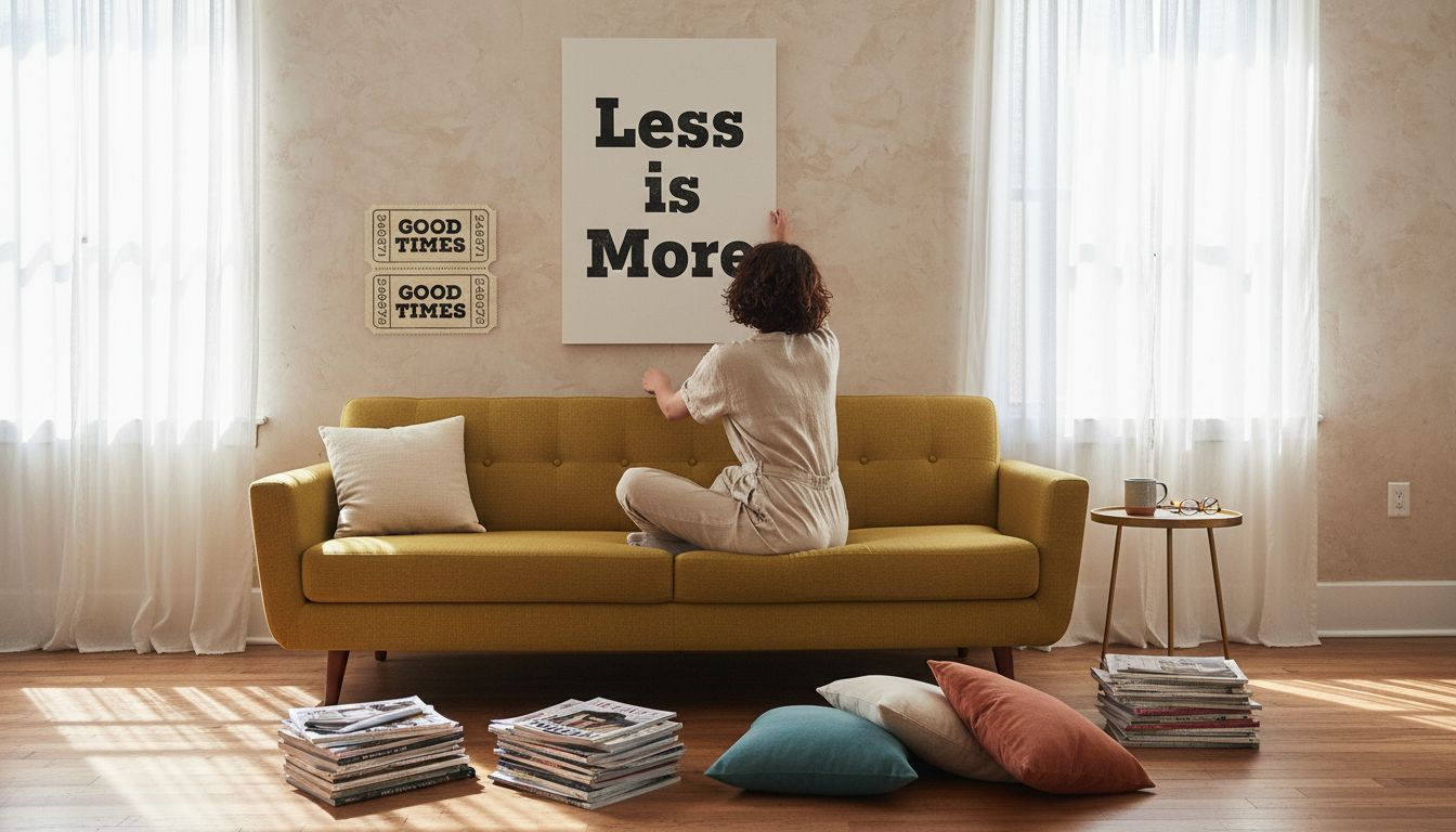
Space and budget can make stylish home updates feel out of reach, but typography posters offer a smart solution for design-conscious homeowners. These artful pieces use bold fonts, curated layouts, and expressive color to make words both decorative and meaningful, fitting perfectly in any size room. Whether you are drawn to Minimalist Modern or playful script, typography turns text into artistic impact, letting you elevate your walls with visual storytelling that fits your taste and your budget.
Table of Contents
- Typography Posters Defined And Debunked
- Key Styles And Popular Variations
- Essential Design Elements And Hierarchy
- Creative Display And Home Styling Ideas
- Common Pitfalls And How To Avoid Them
Key Takeaways
| Point | Details |
|---|---|
| Typography Posters Utilize Artistic Expression | Typography posters transform text into visual art, making messages emotionally engaging through design elements like font, color, and layout. |
| Effective Design Balances Readability with Aesthetics | Prioritize visual hierarchy by using 2-3 font families and ample white space to enhance clarity and viewer engagement. |
| Avoid Common Design Pitfalls | Steer clear of overcrowding text, using too many fonts, and neglecting color contrast to maintain effective communication. |
| Innovative Display Enhances Decor | Use creative styling techniques like gallery walls and unexpected placements to personalize spaces with typography art. |
Typography Posters Defined and Debunked
Typography posters represent a sophisticated visual communication method that transforms text into artistic expression. At their core, these design pieces go beyond simple lettering, using fonts, sizes, colors, and layouts to convey messages with striking visual impact. The fundamental goal of typography poster art is to make words not just readable, but emotionally engaging and visually compelling.
Designing effective typography posters requires understanding core design principles. Academic poster design techniques emphasize readability and visual hierarchy. Key considerations include strategic font selection, appropriate sizing, and maintaining clear visual contrast. Professional designers typically recommend using sans-serif fonts for maximum legibility, limiting text volume, and creating visual pathways that guide the viewer’s eye through the composition.
The artistic potential of typography posters lies in their ability to transform language into graphic design. By manipulating text elements like scale, weight, color, and spatial relationships, designers can create powerful visual narratives. Research communications strategies suggest that effective typography communicates not just information, but emotion and context.
Pro tip: When selecting a typography poster, consider how the text design creates visual movement and communicates a specific mood or message beyond its literal words.
Key Styles and Popular Variations
Typography poster styles represent a dynamic landscape of visual communication, each design approach offering unique aesthetic and emotional possibilities. Creative typographic approaches reveal how designers transform text into compelling visual narratives through strategic manipulation of typography elements.
Font Selection plays a critical role in defining poster styles. Some prominent variations include:
- Minimalist Modern: Clean sans-serif fonts with ample white space
- Vintage Script: Ornate, handwritten fonts suggesting nostalgia
- Geometric Grid: Structured layouts emphasizing mathematical precision
- Experimental Disruption: Unconventional text placements challenging traditional reading patterns
Typography poster design techniques recommend maintaining strict visual hierarchy by using no more than two to three font families. This approach ensures readability while creating visual interest through intentional contrast in font weight, size, and spacing. Professional designers often leverage bold headlines paired with lighter subheadings to guide viewers’ visual engagement.

Pro tip: When selecting a typography poster, analyze how the font choices and layout contribute to the overall emotional impact and storytelling potential of the design.
Here’s a summary comparing popular typography poster styles and their design impact:
| Style Name | Typical Fonts | Visual Mood | Best Used For |
|---|---|---|---|
| Minimalist Modern | Clean sans-serif | Calm, sleek, refined | Contemporary interiors |
| Vintage Script | Handwritten, ornate | Nostalgic, romantic | Retro-inspired settings |
| Geometric Grid | Structured, bold | Ordered, precise | Offices, modern living rooms |
| Experimental Disruption | Varied, irregular | Energetic, bold | Creative studios |
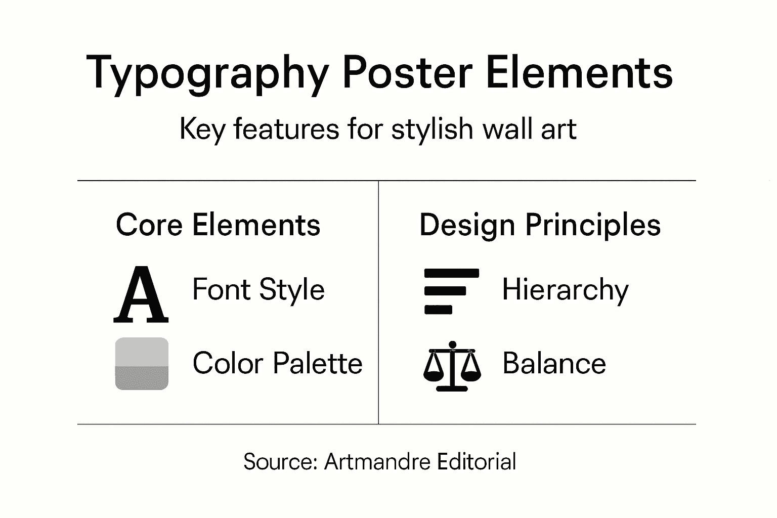
Essential Design Elements and Hierarchy
Typography poster design demands a strategic approach to visual communication, where every element serves a deliberate purpose. Effective poster composition requires careful consideration of hierarchy, ensuring viewers can quickly comprehend the most important information.
The fundamental design elements of a successful typography poster include:
- Title Prominence: Largest font size and boldest weight
- Subheading Structure: Secondary size, distinct from body text
- Body Text: Consistent, readable font at smaller scales
- Color Contrast: Strategic use of color to guide visual attention
- White Space: Crucial for preventing visual clutter and enhancing readability
Design principles for poster layout emphasize the importance of creating intuitive visual pathways. Designers achieve this by using grid systems, maintaining consistent alignment, and carefully controlling font relationships. The goal is to create a balanced composition that leads the viewer’s eye naturally through the content, highlighting key messages and creating visual interest.
Pro tip: Create a visual hierarchy by using font sizes that decrease progressively, with the most important information standing out most dramatically.
Below is a reference guide for key design elements and their influence on poster readability:
| Element | Role in Design | Impact on Viewer |
|---|---|---|
| Title Prominence | Draws attention | Highlights main message |
| Color Contrast | Separates content | Guides viewer’s eye |
| White Space | Reduces clutter | Enhances focus and clarity |
| Hierarchy | Orders information | Improves comprehension |
Creative Display and Home Styling Ideas
Typography posters offer remarkable versatility in home decor, transforming ordinary spaces into personalized artistic statements. Creative poster styling techniques enable homeowners to curate unique visual experiences that reflect their individual aesthetic and personality.
Several innovative display strategies can elevate typography poster art throughout different home spaces:
- Gallery Wall Composition: Combine multiple typography posters with varied frame styles
- Unexpected Placement: Install posters in unconventional areas like kitchens or bathrooms
- Layered Displays: Mix poster sizes and orientations for visual depth
- Minimalist Statements: Use large single posters as dramatic focal points
- Shelf Styling: Float posters alongside decorative objects for dynamic arrangements
Framing and hanging methods dramatically impact poster presentation. Minimalist frames can create clean lines, while vintage frames add character. Alternatives like washi tape or clipboard mounts offer flexible, damage-free options for renters or those wanting frequent style updates. Professional designers recommend considering room color schemes and existing decor to ensure typography posters complement rather than compete with surrounding elements.
Pro tip: Create visual harmony by selecting typography posters with complementary color palettes that subtly echo your room’s existing design elements.
Common Pitfalls and How to Avoid Them
Designing typography posters requires careful navigation of potential visual communication challenges. Common poster design mistakes frequently undermine the aesthetic and communicative power of visual art, making awareness and strategic planning critical.
Key typography poster design pitfalls include:
- Text Overload: Cramming too much information into limited space
- Font Chaos: Using more than 2-3 competing font styles
- Color Confusion: Selecting clashing or low-contrast color palettes
- Hierarchy Breakdown: Failing to establish clear visual importance
- Spacing Mistakes: Neglecting white space and creating visual clutter
Poster design quality control demands attention to technical details such as image resolution and legibility. Professional designers recommend using high-resolution images (minimum 300 DPI), maintaining clear font sizing relative to viewing distance, and ensuring sufficient color contrast. The goal is creating a design that communicates effectively while maintaining visual elegance.
Pro tip: Before finalizing your typography poster, step back and view the design from a distance to assess overall visual balance and readability.
Transform Your Space with Stunning Typography Posters from Artmandre
Struggling to find typography poster art that balances style, readability, and emotional impact? The article highlights common challenges such as font chaos, color confusion, and unclear hierarchy that can make decorating with typography posters tricky. At Artmandre, we understand how important it is to create harmonious visual statements that elevate your home decor while maintaining clarity and artistic expression.

Explore our carefully curated collection of art prints and wall decor that emphasizes clean font choices, balanced layouts, and compelling stories told through text and design. Whether you prefer vintage scripts, minimalist modern looks, or bold geometric grids, our selection helps you avoid common design pitfalls by offering pieces already perfected for readability and style. Take advantage of our exclusive offers like buy 2 get 1 free to effortlessly craft stylish gallery walls or bold focal points that resonate with your home’s personality. Start browsing now at Artmandre to unlock the perfect typography poster art that transforms any room into an inspired living space.
Frequently Asked Questions
What are typography posters?
Typography posters are artistic expressions that transform text into visual compositions, using elements like fonts, sizes, and colors to convey messages with emotional engagement.
How can I enhance the design of my typography poster?
To enhance a typography poster’s design, focus on strategic font selection, maintain a clear visual hierarchy, and ensure good color contrast. Use white space effectively to prevent clutter.
What styles of typography posters are popular?
Popular styles of typography posters include Minimalist Modern, Vintage Script, Geometric Grid, and Experimental Disruption, each offering unique emotional and aesthetic qualities.
What are common mistakes to avoid when designing typography posters?
Common mistakes include text overload, using too many fonts, poor color combinations, lack of visual hierarchy, and neglecting white space, all of which can undermine readability and impact.