


Blog
Retro Japanese Poster: Nostalgia Meets Modern Decor
Bright colours and bold graphics can completely change how your living room or office feels. For homeowners and decorators across Tokyo or Osaka, retro Japanese posters offer more than simple decoration. Their fusion of traditional motifs and Western influences creates a style that feels both nostalgic and fresh, making them ideal for affordable upgrades or thoughtful gifts. Discover how these unique designs can add vibrant colour palettes and authentic character to any space, connecting the past with personal expression.
Table of Contents
- What Defines A Retro Japanese Poster
- Key Styles And Iconic Design Eras
- Cultural Symbols And Artistic Features
- Incorporating Retro Posters In Modern Homes
- Authenticity, Sourcing, And Common Pitfalls
Key Takeaways
| Point | Details |
|---|---|
| Visual Characteristics | Retro Japanese posters combine traditional aesthetics with bold contemporary elements, featuring vibrant colours and confident minimalism. |
| Cultural Fusion | The designs merge Eastern symbolism with Western pop culture, offering a rich narrative while maintaining authentic Japanese heritage. |
| Design Eras | Japanese poster styles evolved through distinct periods, reflecting societal changes from wartime propaganda to vibrant consumerism and social consciousness. |
| Authenticity | Identifying genuine retro posters involves examining paper quality, printing techniques, and subtle imperfections, crucial for collectors. |
What Defines a Retro Japanese Poster
Retro Japanese posters represent a distinct visual language born from post-WWII Japan’s artistic evolution. These pieces blend traditional Japanese aesthetics with contemporary design elements, creating something uniquely compelling for modern spaces.
The most recognisable feature is the vibrant colour palette. These posters embrace bold, saturated hues that grab attention instantly. Reds, oranges, and deep blues dominate compositions with confidence.
Post-WWII graphic design landscape shows how traditional and Western influences merged during this period. This fusion created the visual vocabulary we recognise today.
Key defining characteristics include:
- Symbolic imagery that references both Eastern traditions and Western pop culture
- Simplified, bold typography that remains readable from a distance
- Geometric compositions mixing curves with sharp lines
- Limited colour separation often used for cost-effective printing
- Hand-drawn quality even in lithographed pieces
These posters emerged from commercial needs. Artists designed for everything from travel agencies to entertainment venues, film studios to consumer brands. Each piece told a story whilst promoting something specific.
Retro Japanese posters capture a moment when Japan balanced its heritage with global influence, creating visual designs that still feel fresh today.
What makes them distinctive is the confident minimalism. Unlike some vintage posters drowning in detail, Japanese retro designs use whitespace strategically. Every element serves a purpose.
When selecting Japanese art posters for retro home décor, look for authentic design principles from this era. Authentic pieces reflect the commercial art traditions that defined the period.
The influence of pop culture shaped these designs considerably. Comic book aesthetics, kabuki theatre traditions, and Western advertising styles collided in interesting ways. This created designs that feel both nostalgic and remarkably modern.
Pro tip: When choosing a retro Japanese poster, examine the colour saturation and printing technique—authentic designs from this era typically show subtle imperfections in registration and layering that modern reproductions often miss.
Key Styles and Iconic Design Eras
Japanese poster design evolved through distinct periods, each reflecting the nation’s cultural and political landscape. Understanding these eras helps you recognise authentic styles and choose pieces that resonate with your aesthetic.
The journey began in the 1920s when Western art movements influenced Japanese designers. Art Nouveau, Constructivism, Bauhaus, and Futurism merged with traditional Japanese graphic techniques. This synthesis created something entirely new.
Key design eras include:
- Wartime propaganda (1930s-1945): Bold messaging with nationalist themes
- Postwar commercial boom (1945-1960s): Vibrant advertising blending tradition with Western pop culture
- Golden age of consumerism (1960s-1970s): Experimental typography and psychedelic colour palettes
- Socially conscious design (1970s-1980s): Political messaging and cultural commentary
The postwar period marked a turning point. Japanese artists embraced commercial advertising whilst maintaining their cultural identity. Travel posters, film promotions, and product advertisements flooded the market with striking visuals.
Each design era tells a story about Japan’s relationship with tradition and modernisation.
The 1960s and 1970s brought experimental boldness. Designers pushed typographic boundaries, layered colours fearlessly, and drew inspiration from manga and kabuki. These posters became cultural artefacts reflecting societal shifts.
20th-century Japanese poster art exhibitions showcase how collaboration between artists and commercial clients shaped design evolution. Wartime constraints gave way to unlimited creative freedom.
Late-century designs shifted towards socially conscious messaging. Artists addressed environmental concerns, peace movements, and cultural identity. These posters combined striking visuals with purposeful social commentary.
Colour palettes evolved dramatically across eras. Early postwar designs favoured warm, earthy tones. By the 1970s, electric blues, shocking pinks, and acid greens dominated compositions. Understanding these shifts helps you date and authenticate pieces.
What unified all these eras was the Japanese ability to synthesise influences without losing cultural identity. Western techniques served Japanese storytelling sensibilities perfectly.
Here’s a summary of how retro Japanese poster styles evolved across eras:
| Era | Visual Approach | Typical Subjects | Colour Trends |
|---|---|---|---|
| Wartime (1930s-1945) | Bold, nationalistic imagery | Propaganda, patriotism | Muted reds, dark blues |
| Postwar (1945-1960s) | Fusion of East and West | Travel, consumer goods | Warm, earthy tones |
| Golden Age (1960s-1970s) | Psychedelic, experimental | Pop culture, film, manga | Electric blues, vibrant pinks |
| Social Consciousness (1970s-1980s) | Purposeful, message-driven | Environment, peace, identity | Acid greens, crisp contrasts |
Pro tip: When collecting across different eras, notice how colour saturation and printing techniques changed over time—early postwar prints show softer registration, whilst 1970s pieces display crisp, clean colour separation that marks the era’s technical advancement.
Cultural Symbols and Artistic Features
Retro Japanese posters communicate through a visual language steeped in cultural meaning. Each symbol, colour choice, and compositional decision carries weight beyond mere decoration.
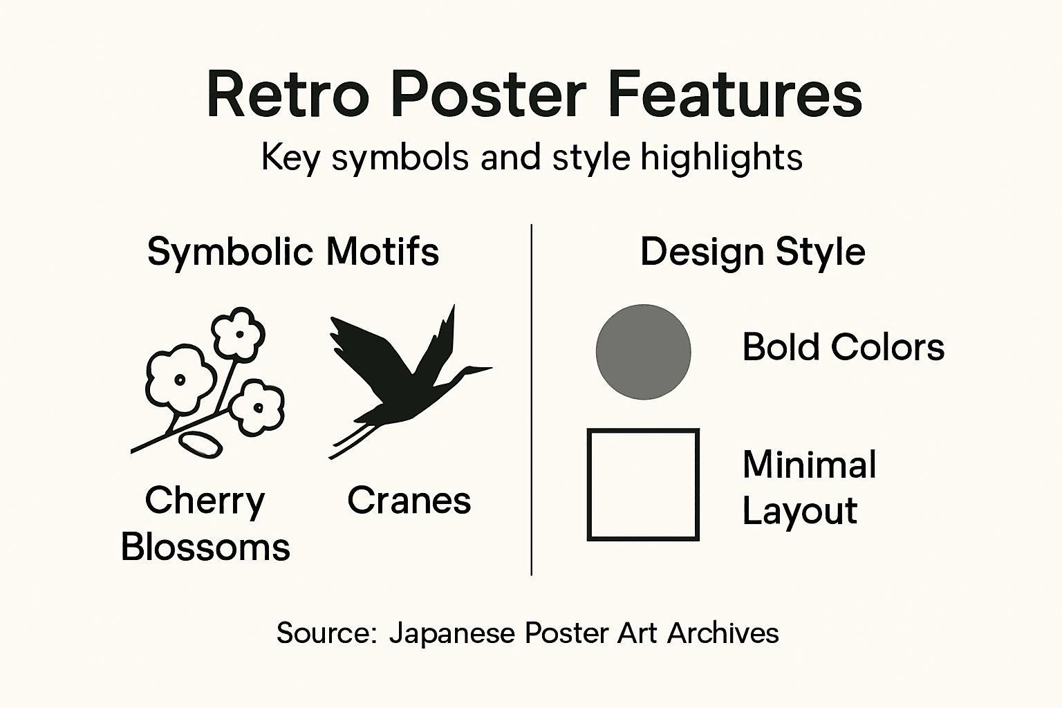
Symbolic imagery forms the foundation of these designs. Cherry blossoms represent beauty and transience. Cranes symbolise longevity and peace. Mountains evoke stability and spiritual elevation. These traditional motifs appear alongside modern Western imagery, creating rich visual narratives.
The cultural heritage and artistic authenticity embedded in Japanese poster design reveals how artists preserved tradition whilst embracing innovation. This duality defines the medium’s soul.
Common symbolic elements include:
- Natural imagery: Mountains, water, flora representing timelessness
- Geometric patterns: Circles and grids reflecting Japanese design principles
- Calligraphy and typography: Bridging ancient script with modern lettering
- Human figures: Stylised faces conveying emotion and movement
- Animals: Mythological creatures alongside everyday subjects
Colour carries profound meaning in Japanese aesthetics. Red symbolises vitality and celebration. Blue represents tranquility and depth. Gold suggests prosperity and importance. Rather than random choices, colour palettes tell deliberate stories within each composition.
Authentic retro Japanese posters use symbolic language that speaks to viewers on conscious and subconscious levels simultaneously.
Compositional techniques distinguish these posters from Western equivalents. Japanese designers favour asymmetrical balance, creating dynamic tension rather than static harmony. Negative space becomes an active design element, not empty filler.
Typography in retro Japanese posters blends styles fearlessly. Curved, flowing scripts sit alongside rigid geometric letterforms. Hand-drawn quality persists even in mechanically printed pieces, maintaining human warmth.
The fusion of traditional and modern represents the era’s artistic philosophy. Ukiyo-e woodblock printing techniques influence composition and colour separation, whilst modernist principles drive layout and typography. This synthesis created visually arresting designs that feel timeless.
Litho printing allowed artists to achieve rich colour gradations impossible in earlier techniques. Yet designers maintained subtle registration shifts that give authentic pieces their distinctive character.
When examining a piece, look beyond surface aesthetics. Understanding the symbolic language deepens appreciation for these designs’ cultural significance and artistic sophistication.
Pro tip: Study the symbolic meanings behind motifs and colour choices in your collection—recognising these cultural references transforms casual wall art into meaningful cultural ambassadors that spark conversation with visitors.
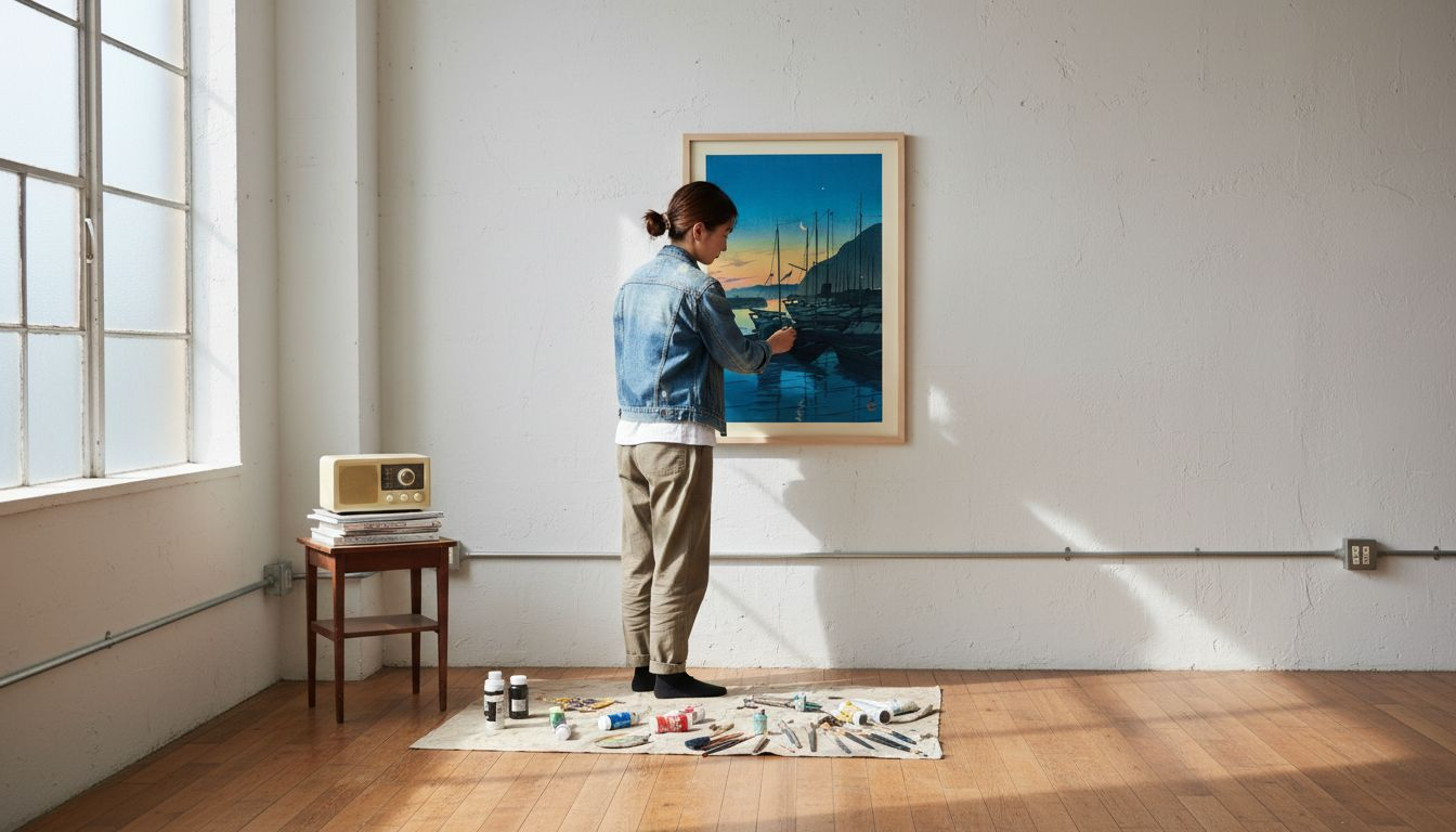
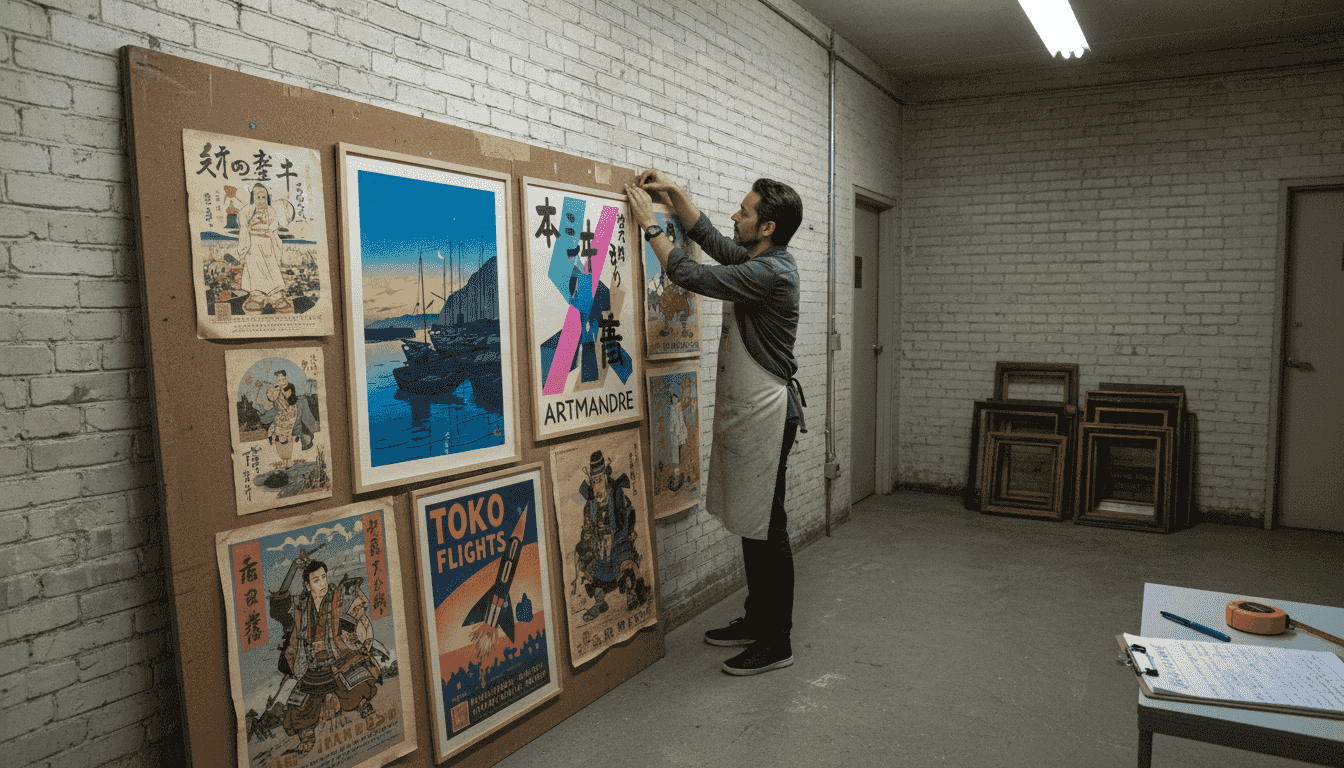
Incorporating Retro Posters in Modern Homes
Integrating retro Japanese posters into contemporary spaces requires thoughtful placement and styling. These pieces bridge historical aesthetics with today’s design sensibilities, creating visual interest without feeling outdated.
Start by identifying your room’s existing palette. Retro Japanese posters work best when they complement, not clash with, your current décor. Neutral walls provide excellent canvases for bold poster designs. Coloured walls need careful consideration to avoid visual competition.
Placement matters significantly. Consider these strategic locations:
- Living room focal points: Above sofas or console tables for maximum impact
- Bedroom walls: Near beds to create intimate, personalised spaces
- Kitchen areas: Smaller posters work well in gallery-style arrangements
- Hallways: Extended walls perfect for thematic collections
- Home offices: Inspiring designs that boost creativity and focus
Wall colour choices determine poster visibility. Light, neutral backgrounds allow retro designs to command attention. Darker walls require posters with sufficient contrast to stand out.
Successful integration happens when retro posters feel intentional, not accidental—they should enhance your space’s story, not simply fill empty wall space.
Framing transforms impact dramatically. Glass frames add sophistication and protect valuable pieces. Wooden frames introduce warmth and traditional elegance. Choosing vintage posters for stunning décor involves understanding how framing complements both poster and room design.
Grouping multiple posters creates compelling visual narratives. Arrange thematically—all travel posters, all advertising designs, or mixed eras. Asymmetrical arrangements feel more dynamic than rigid grids.
Lighting deserves attention. Spotlights highlight individual pieces beautifully. Ambient room lighting prevents glare and maintains the posters’ colour integrity over time.
Scale matters when selecting pieces for your space. Large posters work beautifully in spacious rooms with high ceilings. Smaller spaces benefit from more modest sizing to avoid overwhelming viewers.
Mix retro posters with complementary décor thoughtfully. Modern furniture pairs unexpectedly well with vintage imagery. Minimalist spaces gain warmth and personality from bold retro designs.
Pro tip: Layer your décor by combining retro posters with contemporary furniture and accessories—this contrast creates visual depth and prevents your space from feeling like a museum, maintaining the lived-in comfort that makes homes inviting.
Authenticity, Sourcing, and Common Pitfalls
Finding genuine retro Japanese posters requires knowledge and vigilance. The market floods with reproductions, making authentication skills essential for serious collectors and design enthusiasts.
Authenticity markers distinguish originals from reproductions. Examine paper texture, printing quality, and colour registration carefully. Authentic lithographed pieces show subtle imperfections—slight misalignments between colours, visible dot patterns, and natural paper aging.
Authenticating original Japanese posters involves understanding classification systems and examining provenance documentation. Provenance proves ownership history and establishes legitimacy. Ask sellers for condition reports and historical background.
Key authentication considerations include:
- Paper quality: Original posters use period-appropriate stock with specific weights and finishes
- Printing techniques: Lithography shows characteristic traits different from modern offset printing
- Colour fading: Authentic pieces display natural, uneven fading patterns
- Ink consistency: Hand-drawn elements reveal artist signatures and variations
- Size specifications: Original dimensions differ from contemporary reproductions
Sourcing matters tremendously. Reputable dealers provide authentication certificates and condition assessments. Auction houses document provenance thoroughly. Online marketplaces carry risks—verify seller credentials and return policies before purchasing.
For collectors, identifying authenticity quickly is crucial. This reference table highlights key comparison points:
| Factor | Authentic Vintage Poster | Modern Reproduction |
|---|---|---|
| Paper Texture | Ageing, fibrous, period-accurate | Smooth, uniform, new stock |
| Colour Registration | Minor misalignments, dot patterns | Consistent, flawless layers |
| Printing Method | Lithography, rich gradients | Offset, digital, flat colour |
| Provenance | Tracked history, certificates | Often minimal or unclear |
Common pitfalls destroy value quickly: over-restoration, improper framing, and neglecting storage conditions can irreversibly compromise authentic pieces.
Restoration challenges demand ethical consideration. Balancing preservation with accessibility means avoiding aggressive cleaning or repairs that erase historical character. Over-restoration compromises authenticity and diminishes collector value significantly.
Avoid these common mistakes:
- Exposing posters to direct sunlight causing colour degradation
- Using acidic materials in framing that damage paper
- Attempting amateur restoration without professional guidance
- Purchasing from sellers unwilling to provide provenance
- Ignoring condition issues that worsen over time
Storing posters properly prevents deterioration. Climate-controlled environments maintain stability. Acid-free storage boxes protect from dust and moisture. Avoid damp basements or hot attics where humidity fluctuates wildly.
When evaluating prices, research comparable sales. Authentic vintage pieces command premium prices reflecting rarity and condition. Suspiciously cheap offerings often indicate reproductions or misattributed works.
Build relationships with established dealers specialising in Japanese poster art. They offer expertise, fair pricing, and reliable authentication. This investment in knowledge protects your collection’s integrity and value.
Pro tip: Request detailed condition reports before purchasing and photograph any damage from multiple angles—this documentation proves valuable for insurance purposes and protects you if disputes arise regarding authenticity or condition.
Discover Authentic Retro Japanese Posters to Elevate Your Home Décor
The article reveals the challenge of finding genuine retro Japanese posters that blend traditional symbolism with vibrant colours and minimalist design. Many enthusiasts struggle with sourcing authentic pieces that bring meaningful cultural narratives into modern interiors without clashing with existing décor. The mix of bold typography, symbolic imagery, and distinct colour palettes calls for carefully chosen artwork that complements your style and tells a story.
At ArtMandre.com, we understand your goal to bring nostalgia and sophistication into your living space through authentic and visually striking wall art. Our curated collection offers carefully selected prints that resonate with the confident minimalism and rich symbolism of retro Japanese posters. Whether you want to create a striking focal point or a layered gallery wall, our artworks help you bridge history and modernity effortlessly.
Explore our selection to find artworks inspired by vintage themes and bold graphic design.
Ready to transform your walls with timeless retro art?

Shop now at ArtMandre.com and enjoy exclusive offers like buy 2 get 1 free. Discover how combining retro Japanese posters with contemporary décor can bring warmth and personality to your home today. Let your walls tell a story with art that inspires and captivates. Browse the collection and start your stylish home makeover now.
Frequently Asked Questions
What defines a retro Japanese poster?
Retro Japanese posters are characterised by a blend of traditional Japanese aesthetics and contemporary design, featuring vibrant colours, symbolic imagery, and simplified typography. They emerged in post-WWII Japan, reflecting a fusion of Eastern traditions and Western pop culture.
How can I effectively incorporate retro Japanese posters into my home decor?
To integrate retro Japanese posters into your decor, identify your room’s existing palette and choose posters that complement it. Placement is essential; consider locations like living room focal points or above beds. Use proper framing and consider lighting to enhance their impact.
What are the key characteristics of different design eras in retro Japanese posters?
Retro Japanese posters evolved through distinct eras such as wartime propaganda, postwar commercial boom, the golden age of consumerism, and socially conscious design. Each era showcases specific visual approaches, typical subjects, and colour trends that reflect Japan’s cultural and historical context.
How can I determine the authenticity of a retro Japanese poster?
To authenticate a retro Japanese poster, examine the paper texture, printing methods, and colour registration. Authentic pieces often show subtle imperfections characteristic of lithography, while modern reproductions tend to have flawless printing. Provenance documentation can also help verify authenticity.