Blog
Mix & Match: How to Combine Art Prints for Playful Results
Mix & Match: How to Combine Art Prints for Playful Results
Transforming your living space into a personalized sanctuary is all about expressing yourself through design choices. Among these, art prints offer one of the most accessible and impactful ways to infuse personality into any room. But why stop at just one piece when you can create a captivating visual story by mixing and matching multiple prints?
This playful approach to wall decor breaks traditional rules, encourages creative expression, and results in spaces that feel uniquely yours.

A stylish display of modern art enhances the ambiance of the living room, blending comfort with creativity.
The beauty of combining art prints lies in its accessibility—you don’t need an art history degree or interior design background to create something spectacular. Throughout this guide, you’ll discover how to develop a cohesive vision, play with sizes and shapes, create color harmony, explore different textures and frames, and master layout techniques. Whether you’re starting from scratch or reimagining an existing collection, these strategies will help you create wall art displays that captivate, inspire, and reflect your individual style. For beginners looking for additional wall art ideas, there are countless possibilities to explore beyond what we’ll cover here.
Start with a vision: setting the mood and theme
Before hanging your first nail, take time to envision the story your art collection will tell. Every thoughtful display begins with an underlying concept—a mood, theme, or visual narrative that ties diverse pieces together. This foundation doesn’t restrict creativity; rather, it provides a framework that makes experimental combinations feel intentional rather than chaotic.
Consider what atmosphere you want to create in your space. Are you drawn to calming, minimalist aesthetics? Or perhaps vibrant, energetic compositions? Your collection might revolve around a specific color scheme, artistic movement, subject matter (like botanicals or abstracts), or even a particular emotion you want to evoke. This guiding principle will help narrow your focus when selecting pieces and ensure cohesion even in eclectic arrangements.
Playful gallery wall inspiration
For those seeking specific direction, consider these themed collection ideas that naturally lend themselves to playful combinations:
- Nostalgic narratives: Blend retro & vintage posters with contemporary photography for a conversation between past and present
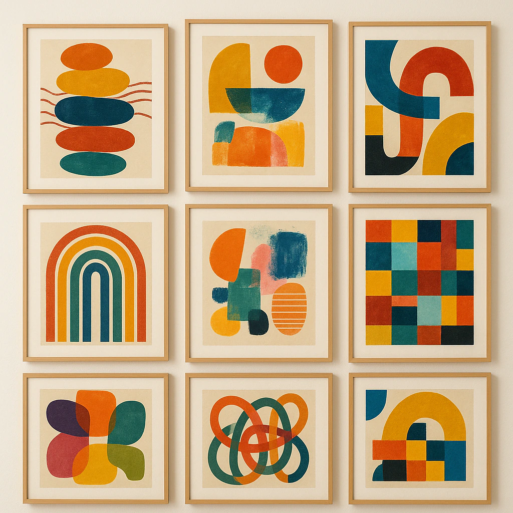
- Geometric journeys: Pair abstract shapes and patterns from different eras for visual rhythm
- Nature studies: Combine botanical illustrations, landscape photography, and abstract nature-inspired pieces
- Color stories: Group artworks solely by their dominant hues, regardless of subject matter or style
- Global perspectives: Mix art prints representing different cultures and regions to create a worldly aesthetic

A creative arrangement of framed art capturing the essence of travel, centered around a poster inviting visitors to explore Italy.
The most successful gallery walls often break conventional rules while maintaining a subtle through-line. Interior designers frequently suggest starting with a single “anchor” piece you absolutely love, then building your collection around its elements—whether color palette, subject matter, or emotional resonance.
This approach creates natural cohesion while allowing for creative exploration.
Mastering size, shape, and proportion
Creating visual interest in your art display requires thoughtful variation in dimensions. A wall filled exclusively with same-sized pieces often appears flat and institutional, while thoughtfully mixed proportions create movement that draws the eye across the entire composition.
When arranging art prints, treat larger pieces as anchors that provide visual weight and structure to your display. Smaller prints then act as accents, filling spaces and adding detail without overwhelming. Most professional designers recommend including at least one statement piece (approximately 16×20 inches or larger) for every few smaller works to establish proper visual hierarchy.

An empty wall in a hallway, adorned with blank art boards waiting for creative expression.
Don’t limit yourself to standard rectangular formats. Incorporating different shapes—square, circular, panoramic—adds dimension and unexpected visual breaks. Triangle groupings often create pleasing compositions, with a larger piece establishing the focal point and smaller works arranged around it. When arranging wall art, experiment with hanging prints at varying heights to create pathways for the eye to travel, rather than forcing everything into rigid horizontal alignment.
For beginners, a helpful technique is the “paper template method”—cutting paper to match the exact dimensions of each art print, labeling them, and temporarily taping these templates to the wall. This allows you to visualize and adjust proportions before committing to nail holes, ensuring your art print styling creates balanced composition from the start.
Harmonize with color (but don’t be afraid of contrast)
Color represents perhaps the most powerful tool for creating cohesion when you mix and match art prints. Even wildly different subjects or styles can feel intentionally curated when unified by a thoughtful color approach. There are several strategies to consider, each offering different visual impacts.
The monochromatic method involves selecting prints that explore variations of a single color. This creates instant harmony while still allowing for variety in subject matter and artistic style. Alternatively, the complementary approach leverages color wheel opposites—blue and orange, purple and yellow—for energetic, vibrant pairings that naturally balance each other. For a more subtle effect, analogous color schemes use colors adjacent on the color wheel, creating gentle transitions that feel sophisticated and intentional.
Don’t overlook the power of neutrals as unifying elements. Black, white, and gray prints can serve as visual palate cleansers between more vibrant pieces, creating rhythm and preventing visual fatigue. Similarly, metallic elements (gold, silver, copper) can thread throughout a collection, adding cohesive accents that catch the light.
When coordinating art prints through color, remember that connections don’t need to be obvious. Sometimes a tiny splash of turquoise in one piece might beautifully echo a predominantly turquoise print elsewhere in your arrangement. These subtle color callbacks create subconscious cohesion while maintaining visual interest and playfulness.
For maximalist aesthetics, embrace controlled chaos by selecting prints with one unifying element—perhaps similar undertones or a recurring accent color—while allowing the remaining palette to vary widely. This strategy creates enough harmony to feel intentional while celebrating exuberant contrasts and unexpected pairings.
Bring it to life with textures, mediums, and frames
Dimension transforms flat wall displays into captivating sensory experiences. When choosing art prints for your home, consider how different printing techniques and substrates create textural variety. Matte prints offer subtle sophistication, glossy finishes bring vibrancy and depth, canvas prints add organic texture, and metal prints deliver contemporary sheen. Even within paper prints, variations in weight, finish, and printing method create subtle textural differences worth exploring.
Creating truly dynamic wall print combinations means thinking beyond traditional flat art. Consider incorporating three-dimensional elements—embossed prints, shadow boxes containing small objects, textile art, or sculptural pieces—alongside conventional prints. This dimensional contrast creates visual complexity that flat images alone cannot achieve.

A stylish living room with an eclectic gallery wall that beautifully complements the green sofa.
Framing choices dramatically impact how prints interact with each other.
For cohesive, classic looks, uniform framing unifies diverse artwork through consistent presentation. Conversely, deliberately mismatched frames—varying in material, width, and color—create more eclectic, collected-over-time aesthetics. Many designers recommend a middle approach: selecting frames from a limited palette (perhaps all wood tones, or a mix of black and brass) to maintain some cohesion while still allowing for variation.
Consider how frames interact with the art they contain. Thin, minimal frames let the artwork speak for itself and create less visual weight on your wall. Substantial frames make stronger statements and can help smaller pieces hold their own alongside larger works. Bauhaus posters with their bold geometric elements often shine in simple black frames that echo their graphic qualities, while more delicate illustrations might benefit from ornate framing that enhances their intricate details.
Mat boards offer another dimension for creativity. Standard white mats create breathing room around artwork and visual consistency across a collection. However, colored mats can draw out specific hues within the artwork or add unexpected contrast. Varying mat widths creates additional rhythm across your display, with wider mats lending importance to smaller pieces that might otherwise feel insignificant.
Layout, spacing, and experimentation: making it your own
The physical arrangement of your art prints determines how they converse with one another and how viewers engage with your collection. While there are classical approaches to layout, playful gallery walls thrive on thoughtful rule-breaking and personal expression.
For beginners, grid arrangements offer approachable structure. This systematic approach works particularly well with uniformly sized and framed pieces, creating clean visual order. Salon-style hanging represents the opposite end of the spectrum—an organic, often asymmetrical arrangement that evolved from historical art exhibitions where paintings covered walls from floor to ceiling. This approach embraces controlled chaos and works beautifully for eclectic collections.
Linear arrangements position prints in straight horizontal or vertical lines, creating simple elegance that complements architectural features like mantels or furniture. For more dynamic energy, staggered layouts break from rigid alignment while maintaining intentional spacing relationships. The clustered approach groups prints in tight proximity with minimal spacing, creating the impression of a single, larger art piece from multiple components.
Spacing dramatically affects how viewers perceive your collection. The standard gallery recommendation of 2-3 inches between frames creates clear separation while maintaining relationship. Tighter spacing (1-2 inches) creates more unified groupings, while wider gaps establish more independence for each piece. Consistent spacing throughout your arrangement creates harmony, while intentionally varied spacing can emphasize relationships between specific works.
Before committing to nail holes, experiment extensively. Many designers recommend the “floor layout” approach—arranging all pieces on the floor or large table first to visualize relationships before transferring to walls. Photograph different arrangements to compare options objectively. Digital previewing tools and apps can also simulate different layouts in your actual space.
Remember that gallery walls need not be static. Consider creating a flexible system using picture ledges, adjustable hanging systems, or command strips that allow for seasonal rotation and evolution of your collection. This approach keeps your wall decor ideas fresh and allows you to incorporate new Japanese & Asian posters or other distinctive art prints as your collection grows.
The most successful gallery walls often grow organically over time. Begin with a core grouping that feels balanced, leaving room for expansion. As you discover new pieces that speak to you, integrate them thoughtfully, allowing your display to evolve alongside your aesthetic preferences and life experiences.
Conclusion
The most captivating art displays share one fundamental quality: they reflect genuine personal connection rather than rigid adherence to design rules. While the guidelines we’ve explored provide helpful structure, the most meaningful collections transcend formulas, revealing something authentic about the people who curated them.
As you embark on your own art-mixing journey, embrace the process of experimentation. Some combinations will surprise you with their unexpected harmony, while others might require adjustment. This ongoing conversation with your space and the art you love is precisely what makes home curation so rewarding.
Trust your instincts. If a particular arrangement brings you joy each time you enter the room, you’ve succeeded—regardless of whether it follows conventional design wisdom. The ultimate goal isn’t perfection but creating a living environment that energizes, comforts, and inspires you daily.
Ready to start building your own playful art collection? Explore diverse prints that speak to your personal aesthetic, and begin the delightful process of mixing, matching, and creating walls that tell your unique story.
Frequently Asked Questions
How do I choose art prints that complement each other?
Focus on a unifying element—such as color palette, theme, or style—to create a cohesive look. Mixing sizes, frames, or mediums can add visual interest as long as there’s an underlying connection.
How much space should I leave between art prints?
Generally, 2–4 inches works well for most gallery walls, but adjust spacing to suit your display area and the visual weight of each piece.
Should all my art prints be the same style or period?
Not necessarily! Mixing styles and eras can create playful, dynamic displays. The key is balancing contrast with a unifying visual thread.
Can I combine original art, prints, and photographs on one wall?
Yes—blending different art forms enriches your display, especially when thoughtfully arranged with attention to color, size, and framing.
What’s the best way to experiment before hanging art prints?
Lay out your pieces on the floor first, take photos of different arrangements, and adjust until you find a layout that feels balanced and expressive.