Blog
How to Style a Mantel Using Retro & Vintage Art Prints
How to Style a Mantel Using Retro & Vintage Art Prints
A thoughtfully styled mantel can transform an ordinary living space into something extraordinary. More than just a shelf above your fireplace, your mantel is a stage—a place to showcase your personality and design sensibilities. When adorned with retro and vintage art prints, this focal point becomes a storytelling opportunity that adds character, nostalgia, and visual interest to your entire room.
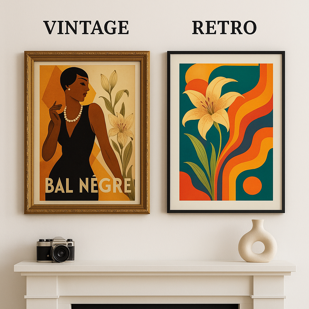
While many homeowners struggle with mantel styling, combining the timeless appeal of vintage prints with the playful energy of retro artwork creates a perfect balance of old and new. Retro artwork typically refers to pieces that intentionally mimic styles from the recent past (especially the 1950s-1980s), while vintage genuinely originates from earlier eras.
This distinction offers endless creative possibilities for your mantel.
In this comprehensive guide, you’ll learn how to select the perfect art for your space, understand fundamental styling principles, and follow a step-by-step approach to creating a beautifully curated mantel display. Whether you’re drawn to the bold graphics of mid-century modern posters or the subtle elegance of Victorian illustrations, you’ll discover how to transform your fireplace into a stunning focal point that captures attention for all the right reasons.
Understanding retro vs vintage art—which style is right for your mantel?
Before diving into styling techniques, it’s important to understand the distinction between retro and vintage art, as these terms are often incorrectly used interchangeably.
Vintage art refers to authentic pieces created during a specific time period, typically at least 20 years old. These pieces carry historical significance and often feature era-specific artistic techniques, color palettes, and subject matter. True vintage prints might include Art Deco posters from the 1920s, Victorian botanical illustrations, or authentic advertising prints from the 1940s. The appeal of vintage lies in its authenticity, history, and often the patina that comes with age.
Retro art, by contrast, is contemporary work designed to evoke nostalgia by mimicking styles from past eras. These pieces adopt visual elements, color schemes, and themes from specific time periods but are created recently. Think bold geometric patterns reminiscent of the 1970s, or digital art with 1950s diner aesthetics. Retro art offers the advantage of being more readily available and often more affordable than authentic vintage pieces.
Choosing the best era for your space
When selecting retro or vintage prints for your mantel, consider your existing décor and architectural elements:
- Contemporary homes often pair beautifully with mid-century modern art prints, which offer clean lines and geometric patterns that complement minimalist spaces.
- Traditional interiors might benefit from classical vintage botanical prints, sepia-toned photography, or reproduction advertising posters from the early 20th century.
- Farmhouse or rustic settings work wonderfully with vintage landscape prints, nostalgic Americana artwork, or reproductions of vintage seed packet labels.
- Eclectic spaces provide freedom to mix eras, perhaps combining 1970s-inspired abstract prints with Victorian botanical illustrations for an unexpected juxtaposition.
The key is identifying artwork that resonates with your personal style while harmonizing with your space’s architecture and existing décor elements. Rather than forcing a disconnected aesthetic, look for art that enhances the room’s current personality.
Key principles for styling a mantel with retro & vintage prints
Successfully styling a mantel with art prints requires understanding some fundamental design principles that will help you create a balanced, visually appealing focal point.
The principle of scale is perhaps the most critical element when selecting art for above your fireplace. A common mistake is choosing artwork that’s too small for the space, which can look lost and diminutive against the expanse of the wall. Ideally, your main art piece should be approximately 60-75% of the width of your mantel, creating a sense of proportion while leaving breathing room around the edges. Height matters too—the bottom edge of your artwork should typically hang 4-8 inches above the mantel surface, creating visual connection without crowding.
Creating balance doesn’t necessarily mean perfect symmetry. While a centered art print flanked by matching objects creates a classic, formal look, asymmetrical arrangements can feel more dynamic and contemporary. Try anchoring with a substantial art print positioned slightly off-center, then balancing with complementary objects of varying heights on the opposite side.
The concept of negative space—the empty areas between and around objects—is often overlooked but critically important. A common styling mistake is overcrowding the mantel with too many small items, creating visual clutter. Instead, be intentional about leaving some empty space to let your vintage or retro art breathe. This restraint allows the eye to appreciate each element and creates a more sophisticated arrangement.
Layering adds depth and dimension to your mantel display. Consider leaning smaller framed prints against larger ones or against the wall, creating visual interest through overlapping elements. This technique works particularly well with vintage prints of varying sizes, creating a collected-over-time gallery effect that enhances the nostalgic feel.
Step-by-step guide to styling your mantel
Transforming your mantel into a showcase for retro and vintage art prints doesn’t have to be intimidating. Follow these actionable steps to create a cohesive, designer-worthy display:
1. Start with a clean slate
Remove everything currently on your mantel. This allows you to see the space objectively and build your new arrangement without being influenced by existing elements. Take a photo of your empty mantel and wall space for reference—this will help you visualize the proportions when shopping for art.
2. Select your focal point artwork
Choose a statement art piece that will anchor your arrangement. This should be the largest visual element and should reflect the style direction you want to establish. For a retro feel, consider bold geometric prints, vintage travel posters, or mid-century advertising reproductions. For a more vintage aesthetic, look for botanical illustrations, architectural drawings, or antique maps.
Consider the orientation of your artwork in relation to your mantel. Horizontal mantels typically pair best with landscape-oriented art, while taller, narrower mantels might call for portrait-oriented pieces. The frame style matters too—ornate gold frames enhance traditional vintage prints, while slim black frames complement mid-century modern artwork.
3. Position your anchor piece
Place your primary artwork in position, either centered above the mantel or slightly off-center if you’re planning an asymmetrical arrangement. If hanging the art, position it 4-8 inches above the mantel surface—close enough to create connection with items on the mantel, but not so close that it feels crowded.
Alternatively, consider leaning a larger framed print against the wall for a more casual, layered look. This approach works particularly well with vintage art as it creates a relaxed, collected-over-time aesthetic.
4. Layer in secondary elements
Once your anchor piece is positioned, begin adding complementary items that enhance your theme without overwhelming it:
- Additional smaller art prints that complement your main piece—perhaps smaller works from the same era or with complementary color schemes
- Objects with period-appropriate significance, like vintage cameras paired with photography prints, or retro clocks with mid-century artwork
- Natural elements like dried flowers in a vintage vase or interesting driftwood to add organic texture
- Books that relate thematically to your artwork, perhaps vintage design books or collections related to the art’s subject matter
5. Consider your color story
Create visual cohesion by pulling colors from your artwork into your accessory selections. If your vintage travel poster features rich blues and warm yellows, incorporate small decorative objects in those hues. This creates a harmonious relationship between your art and decorative elements without being overly matched.
6. Edit ruthlessly
The final—and perhaps most important—step is editing. Step back frequently during the styling process to assess your arrangement. Remove anything that feels unnecessary or distracting. A common mistake is including too many small objects, which can create visual clutter. Remember, in mantel styling, less is often more. The goal is to create a display where your retro or vintage art remains the star of the show.
Choosing the perfect retro or vintage art prints
Finding the right artwork is arguably the most important aspect of styling your mantel. Here’s where to look and what to consider when selecting retro and vintage art prints:
Sources for authentic vintage prints
True vintage prints carry history and character that reproductions can’t always match. Look for these treasures at:
- Estate sales and auctions, which often yield high-quality artwork from specific periods
- Antique shops and flea markets, where careful browsing can uncover hidden gems
- Vintage poster dealers, who specialize in authenticated original prints
- Online marketplaces like Etsy and eBay, though authentication can be trickier
When purchasing authentic vintage prints, examine them carefully for damage, fading, or repairs. While some aging is expected and can add character, excessive damage will detract from the display and potentially decrease value.
Sources for reproduction and retro-inspired art
High-quality reproductions and contemporary retro-style prints offer accessibility and affordability:
- Museum shops (online and physical), which offer reproductions of historic works
- Specialty online retailers focusing on specific eras or styles
- Print-on-demand services with extensive libraries of retro designs and vintage reproductions
- Independent artists and Etsy creators who specialize in retro-inspired original works
When selecting reproductions, pay attention to print quality, paper type, and color accuracy. Matte finishes typically look more authentic for vintage reproductions, while semi-gloss may better showcase the vibrant colors in retro-style prints.
Framing considerations
The right frame enhances your art and connects it to your overall décor scheme:
- For authentic vintage prints, consider period-appropriate frames or conservation framing to protect delicate pieces
- For mid-century retro prints, slim black or walnut frames often complement the clean aesthetic
- For eclectic styling, mixing frame styles can create interesting juxtapositions—perhaps combining ornate vintage frames with modern simple ones
Custom framing is ideal but can be expensive. For budget-friendly alternatives, look for ready-made frames in standard sizes, or consider having mats cut to fit standard frames while accommodating non-standard art dimensions.
Styling ideas by era—visual examples & inspiration
Different eras of retro and vintage art lend themselves to distinct styling approaches. Here’s how to create cohesive looks inspired by specific time periods:
Mid-century modern mantel (1950s-1960s)
The mid-century aesthetic features clean lines, organic forms, and bold graphic elements. For a mantel inspired by this era:
- Anchor with abstract geometric prints or stylized illustrations in characteristic mustard yellow, teal, burnt orange, and olive green
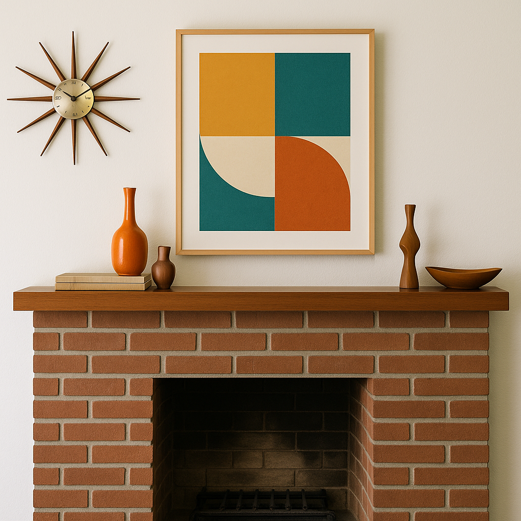
- Add a sleek, low-profile clock with a sunburst design
- Incorporate wood elements with clean lines—perhaps small teak accessories or a simple wooden sculpture
- Include one statement ceramic piece in a solid, vibrant color
- Keep the arrangement asymmetrical but balanced, with plenty of negative space
This styling works particularly well in contemporary homes or apartments with architectural elements that echo mid-century design.
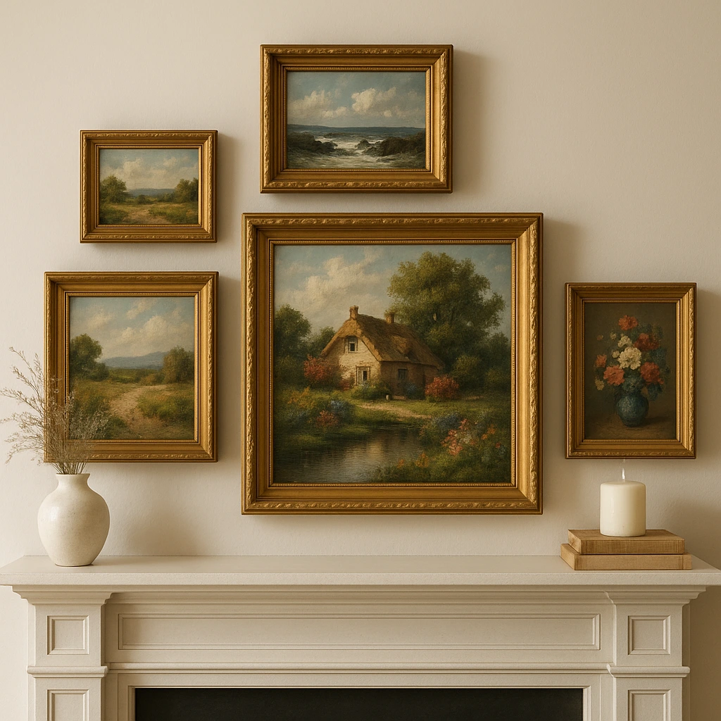
Victorian-inspired elegance (1880s-1900s)
Victorian styling embraces ornate details, rich textures, and natural motifs:
- Center your display around botanical illustrations, bird studies, or classical landscape prints in ornate gold frames
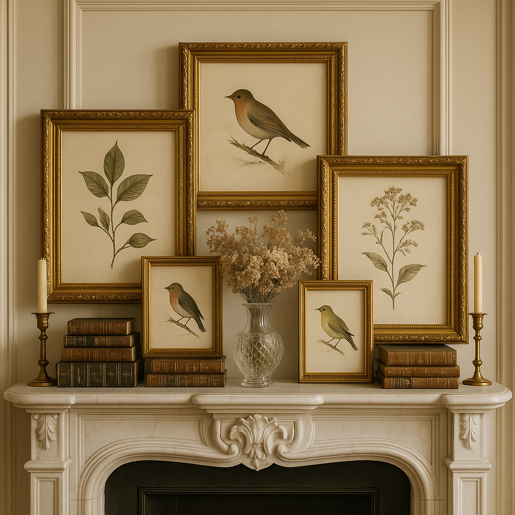
- Layer in vintage books with decorative spines
- Add a touch of romance with a small crystal vase holding dried flowers
- Incorporate brass elements like candlesticks or a small clock
- Arrange with symmetry and formality for an authentic Victorian feel
This approach complements traditional homes, particularly those with original architectural details like crown molding or ceiling medallions.
Pop art vibrance (1960s-1970s)
For bold personality and playful energy, embrace the pop art aesthetic:
- Showcase bright, graphic prints with bold colors and cultural references
- Mix in record albums with iconic cover art
- Add unexpected elements like vintage cameras or colorful glass objects
- Incorporate metallic accents for visual punch
- Embrace asymmetry and unexpected juxtapositions
This vibrant approach works well in contemporary spaces and lofts where bold statements complement clean architecture.
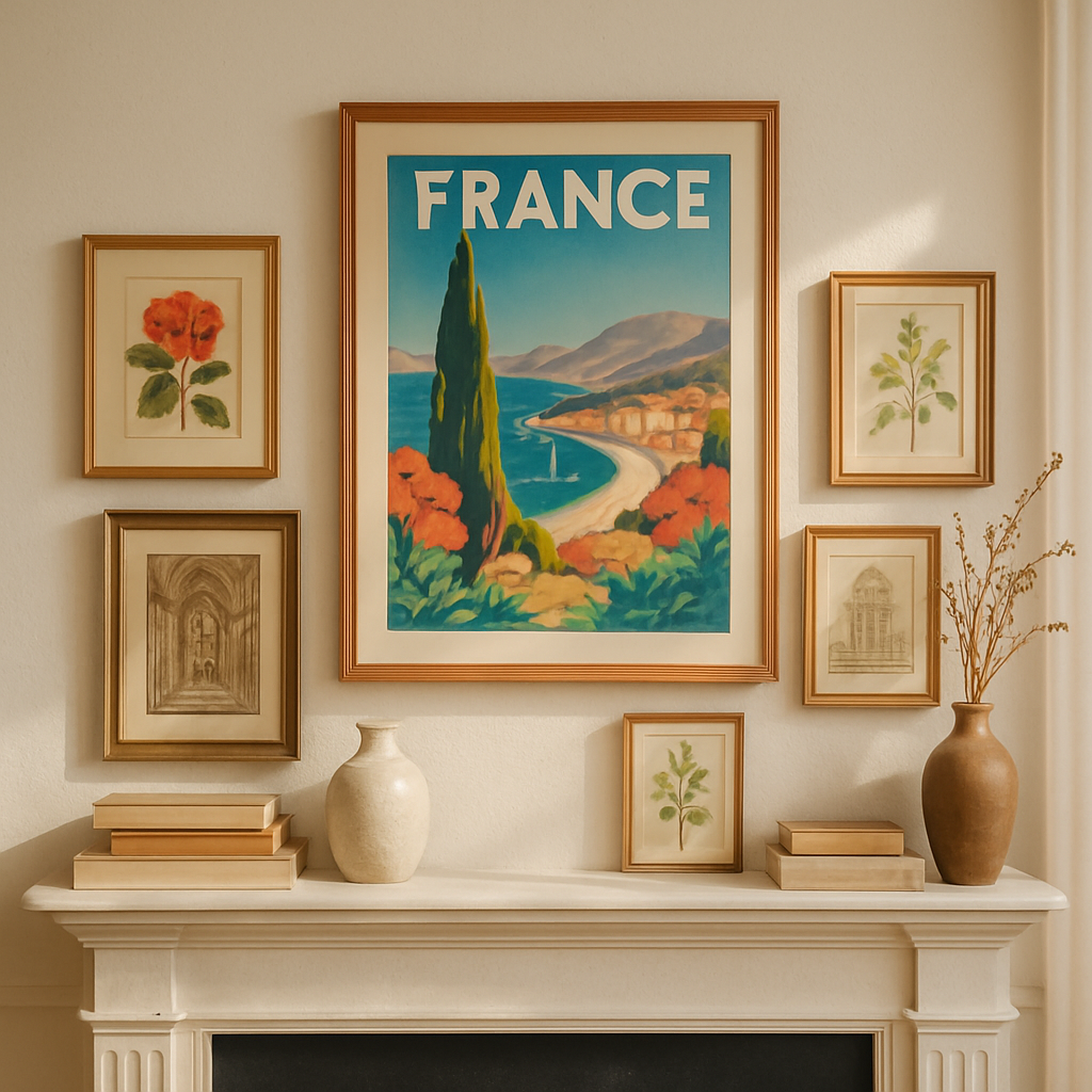
Art deco sophistication (1920s-1930s)
Art Deco styling offers glamour and geometric precision:
- Feature vintage travel posters or fashion illustrations from the era
- Add metallic elements with clean, geometric patterns
- Incorporate black and white photography in sleek frames
- Include one statement piece of colored glass or crystal
- Arrange with deliberate symmetry and precision
This sophisticated approach pairs beautifully with contemporary interiors that feature luxurious materials and decisive lines.
Eclectic mix-and-match approach
Perhaps the most personal and creative approach is mixing elements from different eras:
- Combine prints from various time periods united by a color theme
- Layer contrasting frame styles—perhaps an ornate vintage frame alongside a minimalist modern one
- Mix high and low elements, like a valuable vintage print paired with playful retro accessories
- Use books as unifying elements between disparate objects
- Create mini-collections within the larger display
This styling approach works in any architecture but requires a confident eye and willingness to experiment. The key to success is finding a unifying element—be it color, theme, or material—that ties diverse pieces together.
Conclusion
Styling your mantel with retro and vintage art prints offers endless opportunities to express your personality while creating a captivating focal point in your living space. By understanding the differences between retro and vintage aesthetics, applying key design principles, and following a thoughtful step-by-step approach, you can transform an ordinary mantel into an extraordinary display of curated style.
The beauty of using retro and vintage art lies in its versatility—whether you’re drawn to the bold graphics of mid-century design, the romantic illustrations of the Victorian era, or an eclectic mix that spans decades. Each print brings its own story and character, creating a display that feels personally meaningful rather than mass-produced.
Remember that the most successful mantel styling evolves over time. As you discover new art pieces that speak to you, don’t hesitate to refresh your display. The best mantels feel dynamic and collected rather than static and staged. By embracing the nostalgic charm of retro and vintage art prints, you’ll create a mantel that not only enhances your décor but also becomes a conversation piece that tells your unique story.
Frequently Asked Questions
What is the best size art for above a fireplace mantel?
Aim for artwork 2/3 to 3/4 the width of the mantel, leaving 6–8 inches of space all around for best visual balance.
Is it okay to lean artwork instead of hanging it above a mantel?
Yes—leaning creates a relaxed, layered look and makes it easy to swap out art seasonally or as your tastes evolve.
How can I mix other decor with retro/vintage art prints?
Choose accents (vases, clocks, candleholders, books) that echo the era of your artwork, but keep scale and color palette cohesive for a curated effect.
Are reproduction prints less valuable for decorating than originals?
Not at all. High-quality reproductions can look stunning and offer more affordable, flexible décor options.
Where can I buy retro or vintage art prints for my mantel?
Explore specialty online shops, art fairs, antique stores, or browse dedicated retro wall art collections and living room art prints for curated options.