


Famous Bauhaus Poster Artists and Their Iconic Works
The Bauhaus movement revolutionized the way we think about design, architecture, and visual communication in the 20th century. Founded in 1919 by Walter Gropius in Weimar, Germany, this groundbreaking school merged fine arts with crafts and industrial design, creating a new visual language that continues to resonate in our contemporary world. Among its most enduring legacies are the striking poster designs that embodied the school’s principles of simplicity, functionality, and geometric precision.
Vintage is having a major moment. From fashion runways to interior design magazines, the influence of the past is everywhere. Yet few historical design movements have maintained such a powerful and persistent influence as the Bauhaus. Its poster designs, with their bold colors, clean lines, and innovative typography, didn’t just advertise events or products—they announced a new visual era.
In this exploration, we’ll discover the revolutionary graphic designers who defined the movement, analyze their most iconic poster works, and understand how their experimental approach to visual communication continues to shape modern design. Whether you’re an art enthusiast, a design student, or simply curious about the roots of contemporary visual culture, you’ll gain insight into why these modernist masterpieces remain so captivating nearly a century later.
The Bauhaus poster revolution: Origins and aesthetic principles
The Bauhaus graphic design revolution didn’t happen overnight. It emerged from a post-World War I Germany seeking new directions and rejecting ornate traditions that had dominated European visual culture. When Walter Gropius established the school, he envisioned merging art with everyday functionality—a radical departure from conventional thinking that separated “high art” from practical design.
Bauhaus poster design established core principles that would transform visual communication forever.
Primary among these was functionalism—the belief that design should serve a clear purpose without unnecessary embellishment. This philosophy manifested in geometric poster art characterized by bold primary colors, stark contrasts, and mathematical precision. Circles, squares, triangles, and straight lines became the building blocks of a new visual vocabulary.
Typography underwent a particularly dramatic transformation under Bauhaus influence. Traditional ornate lettering gave way to sans-serif fonts that emphasized readability and efficiency. Text was no longer merely informative—it became an integral design element, arranged to create visual harmony and guide the viewer’s eye. These minimalist poster designs rejected the decorative flourishes of Art Nouveau, replacing them with asymmetric compositions that felt dynamic and modern.
The distinctive style developed at the Bauhaus combined elements of Constructivism, De Stijl, and modernist poster design approaches. What made it revolutionary was its rejection of historical references in favor of forms derived from function and industrial processes. Design became democratic rather than elitist, intended to communicate clearly to mass audiences rather than appeal exclusively to refined tastes.
Discover eye-catching Bauhaus posters with bold shapes and vibrant colors, ready to hang in seconds. Shop exclusive designs now! Free Shipping Worldwide!
Meet the iconic Bauhaus poster artists
The Bauhaus school attracted some of the most innovative minds of the early 20th century, each contributing unique perspectives to the development of modernist design. These pioneering figures didn’t merely create promotional materials—they established a visual language that would influence generations of designers to follow.
Herbert Bayer: Typography reinvented
Herbert Bayer stands as perhaps the most influential figure in Bauhaus graphic communication. Beginning as a student in 1921, he later became the director of printing and advertising at the school. Bayer’s most radical contribution was his Universal typeface, which rejected capital letters in favor of streamlined lowercase letters—a democratic approach to typography that emphasized efficiency and clarity.
His 1923 poster for the Bauhaus exhibition in Weimar exemplifies his revolutionary approach. Using stark geometric forms, primarily circles and squares, against a white background, Bayer created a composition that felt simultaneously mathematical and dynamic. The bold red circle becomes a focal point that draws the eye, while the black text provides necessary information without unnecessary flourish. This piece demonstrates how Herbert Bayer art merged information with visual innovation.
Bayer’s influence extended far beyond the Bauhaus years. After emigrating to America, he brought Bauhaus principles to corporate design, creating iconic work for companies like Container Corporation of America and developing what we now recognize as integrated corporate identity systems.
László Moholy-Nagy: Photography and typography merged
Hungarian-born Moholy-Nagy brought a multidisciplinary approach that expanded the possibilities of graphic communication. His background in painting, photography, and sculpture informed his groundbreaking poster designs, which often incorporated photomontage techniques—merging photographic elements with abstract forms and typography.
Moholy-Nagy’s iconic works, such as his designs for the Bauhaus books series, demonstrated his fascination with light, transparency, and spatial dynamics. He frequently incorporated photograms (camera-less photographic images) and experimental typographic arrangements that played with the relationship between positive and negative space. His posters weren’t static images but visual experiences that engaged viewers in new ways.
His enduring influence stems from how he integrated new technologies into traditional design practices.
By incorporating photography into graphic design, Moholy-Nagy created a bridge between abstract modernism and documentary realism that continues to inform contemporary visual communication.
Joost Schmidt: Exhibition design master
Joost Schmidt initially studied sculpture before joining the Bauhaus, where he eventually led the sculpture, printing, and advertising workshops. His masterful exhibition poster for the 1923 Bauhaus exhibition stands as one of the most recognizable pieces of the movement, featuring a balanced yet dynamic arrangement of geometric elements and distinctive typography.
What makes Schmidt’s approach unique was his understanding of how typographic elements could function as both text and image simultaneously. In his exhibition poster, letters become architectural elements within the composition—building blocks that create rhythm and movement while conveying information. The energetic arrangement of shapes and text exemplifies the Bauhaus principle of unifying art and technology.
Schmidt’s work on exhibition design extended beyond posters to comprehensive environmental graphics and display systems. This holistic approach to visual communication environments anticipated contemporary practices in environmental graphic design and exhibition planning.
Marianne Brandt: Crossing disciplines
While primarily celebrated for her industrial design work in the metal workshop, Marianne Brandt also created remarkable photomontage posters that deserve recognition. As one of the few women to break through the gender barriers at the Bauhaus, her multidisciplinary approach exemplified the school’s ideal of bringing different creative disciplines together.
Brandt’s photomontage works combined sharp geometric elements with photographic fragments to create politically charged images commenting on Weimar Germany’s social conditions. Her poster designs feature dramatic contrasts, asymmetrical arrangements, and a sophisticated understanding of visual hierarchy that reflected her training in both fine art and industrial design disciplines.
Her legacy reminds us that the Bauhaus movement wasn’t confined to specific media but represented a philosophical approach to creativity that could manifest across disciplines—from teapots to typography, from lighting fixtures to lithographic prints.
Josef Albers: Color theory pioneer
Josef Albers brought a systematic approach to color that would transform design education worldwide. Initially a stained glass artist, Albers developed theories about color interaction that influenced his poster and print designs, which explored how adjacent colors affect our perception.
While teaching at the Bauhaus, Albers created promotional materials that demonstrated his meticulous approach to composition. His poster designs featured carefully balanced geometric elements arranged with mathematical precision. What distinguished his work was his sophisticated understanding of color relationships—how identical colors appear different depending on their surroundings, and how different colors can appear identical in certain contexts.
After emigrating to America following the Bauhaus closure, Albers continued developing these theories at Black Mountain College and later Yale University, where his teaching and his book “Interaction of Color” revolutionized how designers understand and use color in visual communication.
Signature posters & visual techniques
The iconic 1923 Bauhaus exhibition poster by Joost Schmidt represents the quintessential Bauhaus aesthetic.
Its composition centers around a large geometric face constructed from circles, triangles, and lines, rendered in bold black and red against a clean white background. The typography integrates perfectly with the geometric elements, creating a unified visual statement rather than separate text and image components.
Herbert Bayer’s “Kandinsky” exhibition poster from 1926 demonstrates his masterful use of primary colors and geometric forms. The poster features concentric circles in blue, yellow, and red—a reference to Kandinsky’s paintings—with typography arranged in a precise grid system. This Wassily Kandinsky poster demonstrates how Bauhaus designers could reference the work of fellow artists while maintaining their distinctive graphic language.
Bauhaus wall art with colorful geometric pattern inspired by 1923 design. Modern abstract decor for creative spaces.
László Moholy-Nagy’s cover designs for the Bauhaus books series represent another significant achievement. These covers featured asymmetrical compositions with diagonal lines creating dynamic tension, transparent color overlays producing secondary colors where they intersected, and innovative use of photography integrated with geometric shapes. These techniques created a sense of movement and dimension that pushed flat graphic design into new perceptual territory.
Walter Gropius posters promoting the school often employed architectural elements that reflected his background. His design philosophy emphasized clarity and precision, with typography arranged according to structural principles borrowed from architecture. These promotional materials embodied the school’s mission of unifying different creative disciplines under a common visual language.
The legacy of Bauhaus posters in modern art and design
Nearly a century after its closure, the design principles pioneered at the Bauhaus continue to influence contemporary visual culture in profound ways. The clean lines, geometric compositions, and functional approach to typography have become fundamental elements of graphic design practice worldwide.
Modern digital designers creating everything from website interfaces to mobile apps draw directly from Bauhaus principles of clarity, hierarchy, and purposeful design. The movement’s emphasis on stripping away unnecessary decoration in favor of functional communication remains especially relevant in our information-saturated world. When you encounter a particularly clean, geometric logo or a website with a strong grid-based layout, you’re seeing the continuing influence of this modernist poster design tradition.
The market for vintage Bauhaus prints has grown steadily over decades, with original posters now commanding significant prices at auction houses and galleries. Authentic pieces from the 1920s and early 1930s are increasingly rare, with most preserved in museum collections. For collectors, provenance is crucial—verifying that a poster is an original print rather than a later reproduction requires expert knowledge of paper types, printing techniques, and design history.
Contemporary designers continue creating Bauhaus-inspired wall art that reinterprets the movement’s aesthetic principles for modern spaces. These pieces range from faithful reproductions of classic designs to creative homages that adapt Bauhaus visual language to contemporary themes. What distinguishes thoughtful contemporary interpretations from mere imitation is an understanding of the underlying principles rather than simply mimicking surface aesthetics.
The Bauhaus movement’s influence extends beyond visual style to methodology—its interdisciplinary approach to creative problem-solving remains relevant in fields ranging from user experience design to architecture. The school’s workshop model, where theory and practice were integrated rather than separated, anticipated contemporary design thinking approaches that emphasize prototyping and experimentation.
Major retrospectives at institutions like MoMA, the Bauhaus Archiv in Berlin, and the Tate Modern continue introducing new generations to these influential works. Contemporary designers studying these pieces find not merely historical artifacts but enduring lessons in visual communication that transcend their historical context.
Bauhaus exhibition poster inspired by 1923 geometric circles. Modernist wall art for creative interiors.
What makes the Bauhaus aesthetic so enduringly appealing is its balance between mathematical precision and dynamic energy. These designs feel simultaneously rational and emotional—carefully constructed yet visually exciting. They demonstrate that effective communication doesn’t require elaborate decoration, and that visual power can emerge from restraint rather than excess.
Collecting and displaying Bauhaus posters
For those inspired to bring Bauhaus design into their own spaces, several approaches are available depending on budget and collecting goals. Museum-quality reproductions offer accessible entry points, with institutions like the Bauhaus Archiv producing authorized prints that maintain the integrity of original designs while being more affordable than vintage originals.
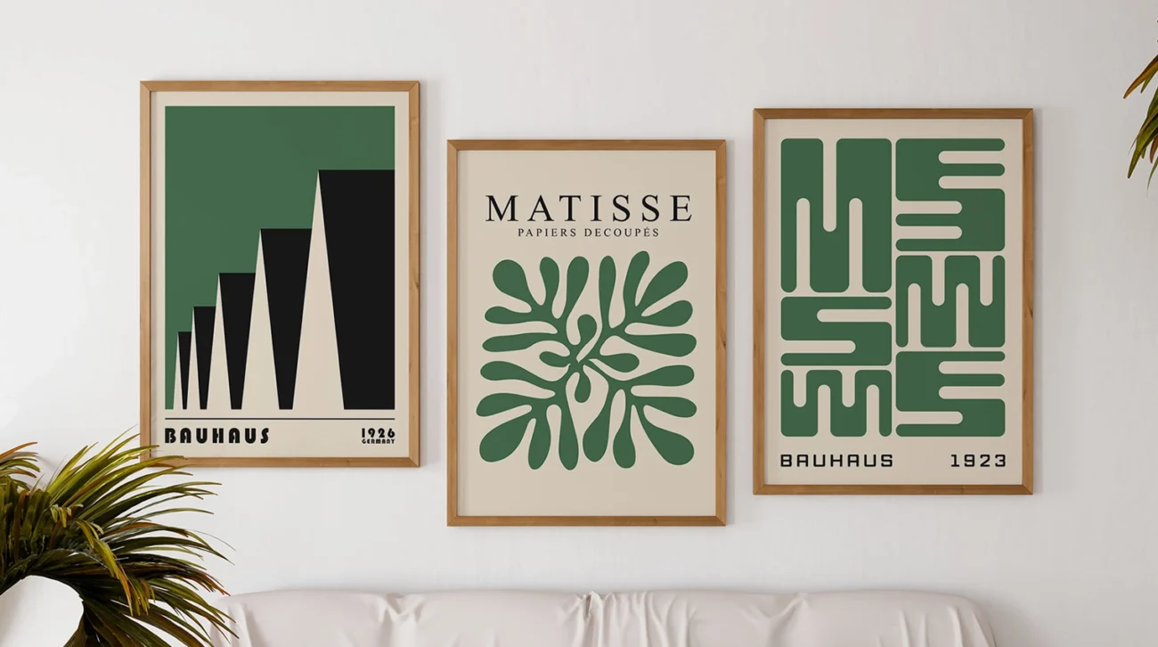
When displaying Bauhaus posters, consider framing approaches that honor their modernist aesthetic. Simple frames in black, white, or natural wood complement rather than compete with the designs. Matting in neutral tones creates breathing space around bold graphics. For maximum impact, consider grouping related designs together as a gallery wall that showcases different aspects of the movement.
Digital collections have made Bauhaus designs more accessible than ever. The Harvard Art Museums’ Bauhaus collection, the MoMA archives, and the Bauhaus Archiv all offer online databases where enthusiasts can study these works in detail. These resources allow for close examination of printing techniques, typography choices, and compositional strategies that might not be apparent at first glance.
Contemporary designers creating Bauhaus-inspired work often incorporate modern references while maintaining the geometric discipline and typographic clarity of the originals. These contemporary interpretations demonstrate how enduring design principles can be applied to current themes and technologies without losing their essential character.
Whether through original vintage pieces, quality reproductions, or contemporary interpretations, bringing Bauhaus poster design into everyday environments connects us with a pivotal moment in design history while surrounding ourselves with visual principles that remain as fresh and relevant today as they were a century ago.
Conclusion
The revolutionary poster artists of the Bauhaus didn’t simply create attractive advertisements—they fundamentally reimagined the relationship between form and function in visual communication. Through their geometric compositions, innovative typography, and rejection of unnecessary ornamentation, they established design principles that continue to resonate throughout contemporary visual culture.
From Herbert Bayer’s typographic innovations to László Moholy-Nagy’s experimental photomontage, from Joost Schmidt’s dynamic compositions to Marianne Brandt’s multidisciplinary approach, these designers demonstrated how creative vision could merge with practical purpose. Their posters weren’t merely promotional tools but manifestos for a new visual language suited to an industrialized, increasingly global society.
Today, as we navigate an ever more visually saturated digital world, the clarity and purposefulness of Bauhaus design principles offer valuable lessons. The movement reminds us that effective communication doesn’t require complexity—often, it’s achieved through thoughtful restraint and precise execution. Whether in corporate branding, interface design, or environmental graphics, the Bauhaus approach to visual hierarchy, spatial organization, and typography continues to inform best practices.
The enduring appeal of these modernist masterpieces lies in their timeless balance between mathematical precision and visual excitement. They demonstrate that design can be simultaneously rational and emotional, systematic yet dynamic. By studying these works and the principles behind them, contemporary designers connect with a transformative moment in visual history while finding inspiration for future innovations.
As we celebrate these pioneering figures and their iconic works, we’re not simply looking backward but recognizing how their revolutionary vision continues to shape our visual environment. Their experimental spirit reminds us that design at its best doesn’t merely solve existing problems but imagines new possibilities—a lesson as relevant today as it was in the workshops of Weimar, Dessau, and Berlin nearly a century ago.
FAQ
Who are the most famous Bauhaus poster artists?
Herbert Bayer, Joost Schmidt, Laszlo Moholy-Nagy, and Marianne Brandt are among the best-known figures, each bringing unique techniques and iconic posters to the movement.
What defines a Bauhaus poster?
Bauhaus posters are characterized by geometric shapes, bold typography, asymmetrical layouts, and a focus on functionality over ornamentation.
How did Bauhaus posters influence modern graphic design?
They introduced minimalist design principles and innovative use of type and form, which remain foundational in contemporary graphic design and advertising.
Where can I purchase Bauhaus-inspired posters today?
Several specialized online galleries offer high-quality Bauhaus reproductions and homages, allowing you to bring this iconic style to your own space.
Are vintage Bauhaus posters valuable collectibles?
Authentic vintage Bauhaus posters are highly prized by collectors, with many fetching significant prices at auctions due to their rarity and cultural significance.