Blog
Create vintage gallery walls with curated retro art ideas
Curating a cohesive vintage-inspired gallery wall in a modern home presents a delightful challenge. Blending retro art styles, colour palettes, and framing choices requires careful consideration to avoid visual clutter whilst achieving that nostalgic charm. This guide walks you through essential selection criteria, standout retro styles, and practical layout strategies to transform your living space with a thoughtfully curated gallery wall that marries vintage character with contemporary simplicity.
Table of Contents
- How To Select The Perfect Retro Wall Art For Your Space
- Top Retro Wall Art Styles To Inspire Your Gallery Wall
- Comparing Retro Styles And Framing Choices For Cohesive Gallery Walls
- Deciding And Executing Your Curated Vintage Gallery Wall
- Explore Curated Vintage Wall Art Collections At ArtMandre
- Frequently Asked Questions
Key takeaways
| Point | Details |
|---|---|
| Selection criteria | Consider theme consistency, colour palette harmony, appropriate scale, and unified framing styles to create cohesive retro gallery walls. |
| Popular retro styles | Mid-century modern, pop art, psychedelic designs, and vintage travel posters each offer distinct moods and visual appeal. |
| Frame coordination | Mix varied frame styles and sizes whilst maintaining a consistent colour scheme to add depth without sacrificing unity. |
| Layout planning | Arrange pieces on the floor first, use painter’s tape to preview wall placement, and maintain 3-inch spacing between artworks. |
| Aesthetic impact | Thoughtfully curated gallery walls can enhance your living space’s visual appeal by up to 15-20%. |
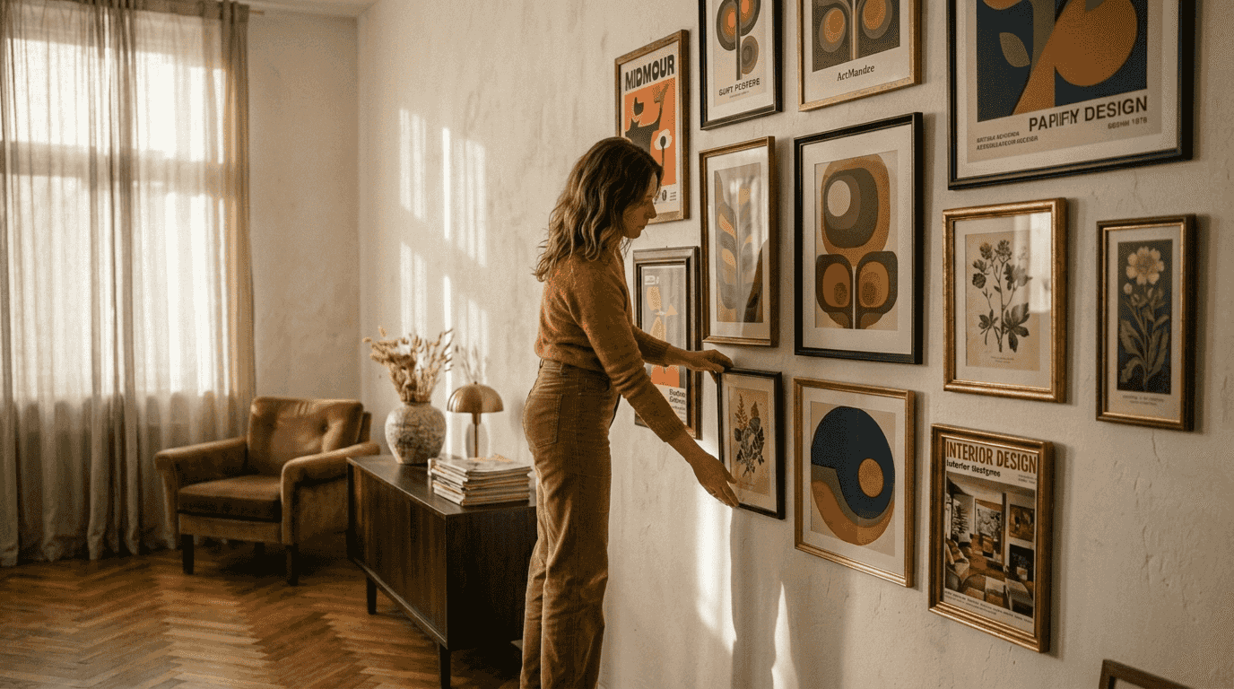
How to select the perfect retro wall art for your space
Choosing retro wall art begins with identifying a style theme that complements your existing décor. Mid-century wall art works beautifully in spaces with clean lines and organic shapes, whilst pop art injects vibrant energy into neutral rooms. Consistency matters more than uniformity.
Establishing a cohesive colour palette ties disparate pieces together seamlessly. Select two to four dominant colours that recur across your chosen artworks, creating visual harmony even when mixing different retro styles. Earth tones paired with mustard yellows and burnt oranges evoke classic mid-century vibes, whilst bold reds, blues, and blacks deliver striking pop art impact.
Scale determines whether your gallery wall commands attention or overwhelms the space. Measure your wall dimensions and surrounding furniture before selecting artwork sizes. A general rule: your gallery wall should occupy approximately two-thirds to three-quarters of the available wall space, leaving breathing room around edges.
Framing choices significantly influence overall cohesion. You can mix frame styles and sizes for visual interest, but maintain colour consistency across frames. Black frames offer timeless versatility, whilst natural wood frames enhance mid-century warmth. White or cream frames lighten the display and work particularly well with vintage travel posters.
Pro Tip: The resurgence of retro wall art reflects a broader desire for nostalgia blended with contemporary interiors, so choose pieces that speak to your personal aesthetic rather than following trends blindly.
Avoid the common pitfall of lacking cohesion by ensuring all art pieces share a common theme, colour palette, or style. Overcrowding kills the vintage aesthetic. Plan for proper spacing and limit the number of pieces to what the wall can accommodate comfortably. Quality curation trumps quantity every time.
Essential selection criteria:
- Theme alignment with your interior style
- Colour palette consistency across pieces
- Appropriate artwork scale relative to wall size
- Frame style coordination
- Adequate spacing between pieces
Top retro wall art styles to inspire your gallery wall
Mid-century modern dominates the retro revival, characterised by organic shapes, geometric patterns, and a sophisticated colour palette. These pieces feature clean lines paired with earthy tones like olive green, terracotta, and warm browns, accented by bright pops of colour. The style balances simplicity with boldness, making it exceptionally versatile for contemporary homes.
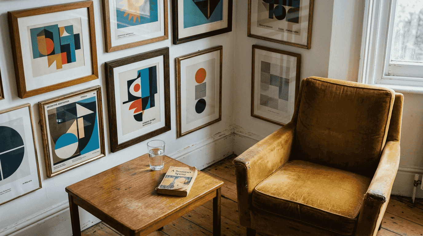
Pop art and psychedelic designs offer vivid colours, swirling shapes, and cultural iconography that spark conversation. These energetic patterns inject personality and playfulness into any room. Think bold graphics, comic-book aesthetics, and kaleidoscopic visuals that celebrate the rebellious spirit of the 1960s and 1970s.
Vintage travel and movie posters deliver narrative depth and historical charm. These pieces transport viewers to different eras and destinations, evoking wanderlust and nostalgia simultaneously. Their illustrative quality and period typography add sophisticated storytelling elements to your gallery wall, creating focal points that invite closer examination.
Advantages each style imparts:
- Mid-century modern: Timeless sophistication with contemporary compatibility
- Pop art: Bold energy and conversational focal points
- Psychedelic: Creative dynamism and artistic expression
- Vintage posters: Historical charm and narrative depth
Mixing styles without losing cohesion requires intentional colour bridging. If combining mid-century modern with vintage travel posters, select pieces that share common accent colours. A mustard yellow background in a mid-century print can harmonise beautifully with the same yellow appearing in vintage poster typography.
Steps for successful style mixing:
- Identify your dominant style (60-70% of pieces)
- Select complementary styles that share colour elements
- Use framing to unify disparate styles
- Maintain consistent visual weight distribution
- Test arrangements before committing to wall placement
The mood each style creates matters when selecting pieces for specific rooms. Mid-century modern brings calm sophistication to bedrooms and studies. Pop art energises living rooms and dining spaces. Vintage posters add character to hallways and entryways, creating welcoming first impressions.
Comparing retro styles and framing choices for cohesive gallery walls
Understanding how different retro styles and framing options interact helps you create visually harmonious displays. This comparison table breaks down key characteristics to guide your selections:
| Style | Colour Palette | Mood | Best Framing | Room Suitability |
|---|---|---|---|---|
| Mid-century modern | Earthy tones, mustard, teal | Calm, sophisticated | Natural wood, black | Living rooms, bedrooms |
| Pop art | Primary colours, bold contrasts | Energetic, playful | Black, white | Dining rooms, offices |
| Psychedelic | Vibrant rainbow, swirling gradients | Creative, dynamic | Coloured frames | Studios, creative spaces |
| Vintage travel posters | Muted pastels, sepia tones | Nostalgic, worldly | Cream, gold | Hallways, studies |
Framing choices profoundly impact gallery wall cohesion. Varied frame styles add depth and visual interest, preventing the display from appearing too matchy or sterile. However, maintaining a consistent colour scheme across frames ensures unity even when mixing sizes and profiles.
Pro Tip: Space pieces approximately 3 inches apart to create breathing room whilst maintaining visual connection. Closer spacing creates a dense, salon-style wall, whilst wider gaps produce a more contemporary, minimalist feel.
Layout geometry affects the overall vibe dramatically. Symmetrical arrangements with evenly spaced, similarly sized frames convey order and calm. This approach suits traditional interiors and formal spaces. Asymmetrical layouts with varied frame sizes create dynamic, modern energy that feels more casual and creative.
Combining framing and art style effectively:
- Match natural wood frames with mid-century modern prints for authentic period feel
- Pair bold black frames with pop art to enhance graphic impact
- Use cream or white frames with vintage posters to preserve delicate colour palettes
- Consider coloured frames sparingly as accent pieces within predominantly neutral framing
Selecting a specific colour palette ensures harmony across your entire gallery wall. This doesn’t mean every piece must share identical colours, but recurring tones create visual threads that tie the collection together. Even when mixing mid-century modern with vintage travel posters, shared accent colours prevent the display from feeling disjointed.
Deciding and executing your curated vintage gallery wall
Planning your layout on the floor before hanging prevents wall damage and ensures aesthetic cohesion. Arrange your selected pieces in various configurations, photographing each attempt to compare options later. This low-stakes experimentation reveals which arrangements achieve the balance and flow you’re seeking.
Using painter’s tape on the wall to mark frame positions eliminates guesswork during installation. Measure each frame’s dimensions, cut corresponding tape rectangles, and affix them to the wall in your chosen arrangement. Step back frequently to assess the overall composition from viewing distance. Adjust tape positions until the layout feels perfectly balanced.
Pro Tip: Start with a smaller, less prominent wall area before tackling your main living room feature wall. Hallways, stairwells, or bedroom walls offer excellent practice opportunities where mistakes matter less and experimentation feels safer.
Execution steps for flawless installation:
- Gather all frames, artwork, hanging hardware, and tools
- Lay out your arrangement on the floor
- Measure and mark the wall centre point
- Apply painter’s tape templates to visualise placement
- Install hanging hardware following tape guides
- Hang frames working from centre outward
- Use a level to ensure straight alignment
Maintaining consistent spacing and framing rules throughout prevents the gallery wall from appearing haphazard. If you’ve established 3-inch gaps between pieces, maintain that measurement religiously. Similarly, if you’ve chosen black frames as your unifying element, don’t introduce a rogue silver frame mid-installation unless it’s a deliberate focal point.
Refreshing your collection over time keeps the display dynamic and personally relevant. Gallery walls needn’t remain static for years. Swap out seasonal pieces, incorporate new finds from travels, or rotate artworks based on mood shifts. This evolutionary approach maintains your emotional connection to the display whilst preventing visual fatigue.
Maintenance and evolution tips:
- Rotate one or two pieces every 6-12 months
- Clean frames and glass quarterly to maintain crisp appearance
- Reassess colour palette annually as décor evolves
- Document your gallery wall evolution through photographs
- Consider seasonal rotations for dynamic variety
Thoughtfully curated gallery walls can enhance living space appeal by up to 15-20%, making this investment in time and curation genuinely worthwhile. The visual impact extends beyond aesthetics, creating conversation starters and reflecting your personality through carefully chosen vintage pieces.
Explore curated vintage wall art collections at ArtMandre
ArtMandre specialises in carefully curated retro art prints and vintage posters that perfectly align with the selection criteria and styles discussed throughout this guide. Our collections feature authentic mid-century modern designs, Bauhaus-influenced compositions, and nostalgic travel posters that bring vintage character to contemporary living spaces.

Discover pieces like our red Bauhaus mid-century modern print that exemplify the organic shapes and bold colour choices characteristic of the era. Each design balances nostalgic aesthetics with modern simplicity, ensuring your gallery wall feels cohesive rather than cluttered. Beyond individual prints, we offer stylish gallery wall ideas and expert styling guidance to help you execute your vision with confidence. Browse our categorised collections to find pieces that speak to your aesthetic whilst maintaining the colour palette harmony essential for successful vintage-inspired gallery walls.
Frequently asked questions
What are the essential criteria for choosing retro wall art?
Key criteria include theme consistency, colour palette harmony, appropriate scale, unified framing style, and cohesion with existing décor. Ensure your selected art reflects your personal style whilst fitting the room’s intended mood and functional requirements.
How can I mix different retro art styles without cluttering my gallery wall?
Use a unified colour palette or consistent framing style to tie disparate styles together visually. Vary frame sizes for interest but maintain consistent spacing of approximately 3 inches between pieces to prevent the display from appearing chaotic or overwhelming.
What is the best way to plan and arrange a vintage gallery wall?
Lay out all art pieces on the floor to experiment with arrangements before committing to wall installation. Use painter’s tape rectangles on the wall to mark frame positions and spacing, allowing you to visualise the final result and make adjustments easily. Start with smaller wall areas to practise before tackling prominent feature walls.
How often should I update or rotate pieces in my retro gallery wall?
Rotate or introduce new pieces every 6 to 12 months to keep the display feeling lively and personally relevant. Consider seasonal variations, new finds from travels, or mood-based swaps to maintain your emotional connection whilst preventing visual fatigue over time.