Blog
Choosing Color Palettes That Make Your Wall Art Pop
Choosing Color Palettes That Make Your Wall Art Pop
The right color palette can transform an ordinary piece of wall art into the focal point of your entire room.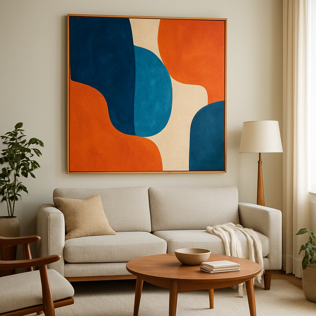
Color selection isn’t just about aesthetics—it’s a powerful tool that sets the mood, creates visual harmony, and makes a powerful statement about your personal style. In the world of interior design, a “color palette” refers to a curated selection of hues that work together to create a cohesive visual experience, influencing everything from the energy of a space to its perceived size and temperature.
Whether you’re a seasoned interior designer or simply looking to refresh your living space, understanding how to select colors that make your artwork truly pop can elevate your entire home. For additional ideas on infusing color and energy into your space, you can explore our abstract retro posters-modern art prints collection. In this guide, you’ll discover the principles of color theory, learn how to match artwork with your existing décor, explore trending palettes for 2024, and gain practical tips for creating visual impact that transforms your walls from ordinary to extraordinary.
Understanding color theory in wall art
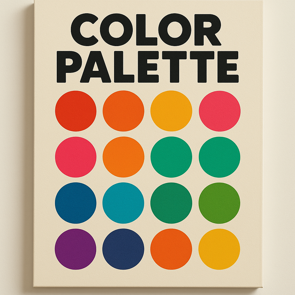
Color theory provides the foundation for making informed decisions about your wall art selections. At its core, color theory explains how different hues interact with each other and influence our perceptions and emotions. The color wheel, a visual representation of color relationships, shows us primary colors (red, blue, yellow), secondary colors (green, orange, purple), and the tertiary colors that fall between them.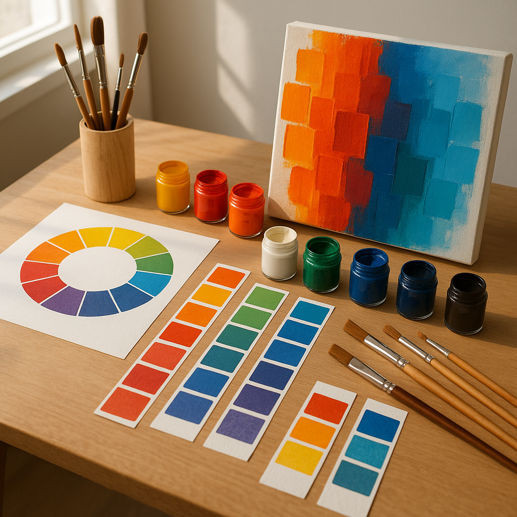
When selecting wall art, understanding warm versus cool tones can dramatically change how a piece feels in your space. Warm colors like reds, oranges, and yellows tend to energize and advance visually, making them perfect for creating focal points. Cool colors like blues, greens, and purples typically recede visually and create a sense of calm and spaciousness. Complementary colors—those opposite each other on the color wheel—create maximum contrast and visual excitement when placed together, explaining why blue artwork often looks striking against orange-toned walls.
Artists and designers rely on complementary colors wall art arrangements to create visual tension and interest. For instance, a predominantly purple artwork will seem to vibrate with energy when placed against a pale yellow wall. Similarly, analogous color schemes—those using colors adjacent on the wheel—create harmony and cohesion, perfect for spaces where you want a more subtle, sophisticated aesthetic.
How color interacts with light and space
The appearance of wall art colors changes dramatically depending on the lighting conditions in your room. Natural northern light tends to cast a cooler blue tone, while southern exposure brings warmer golden light. Western exposure creates dramatic warm lighting in the afternoon, and eastern light provides bright morning illumination that becomes more neutral as the day progresses.
This interaction between light and pigment explains why that perfect blue abstract piece might look stunning in the store but completely different in your living room. When selecting art, consider how your room’s lighting changes throughout the day and how this might enhance or diminish certain colors in your chosen artwork. See how bold shapes and creative color energy work together in our abstract retro posters collection.
Selecting wall art colors to complement your space
Matching wall art with room decor begins with an honest assessment of your existing space. Before purchasing any artwork, take inventory of your dominant wall colors, furniture finishes, flooring, and even your room’s architectural features. These elements create the backdrop against which your art will be viewed and should influence your selection process.
When determining whether your artwork should blend in harmoniously or stand out dramatically, consider your overall design goals. For harmonious integration, look for wall art containing colors already present in your space, perhaps pulling from accent pillows, rugs, or existing décor items. This approach creates a cohesive, intentional look that feels curated rather than random. For art that makes a statement, choose pieces with colors that complement but contrast with your dominant room palette—this creates visual tension that draws the eye.
Art color palettes for interiors generally fall into three categories: neutral, complementary, or contrasting. Neutral palettes featuring whites, grays, blacks, and earth tones work in virtually any space and allow the composition rather than color to make the statement. Complementary palettes include colors from the same family as your existing décor but perhaps in different intensities. Contrasting palettes deliberately break from your room’s color scheme to create focal points and visual interest.
The best colors for wall art often depend on your existing wall color. Against white walls, nearly any artwork can shine, though pieces with deeper saturated colors tend to create the most dramatic effect. For colored walls, consider these classic combinations: blue walls pair beautifully with artwork featuring oranges and yellows; green walls complement art with reds and purples; and neutral gray walls provide an excellent backdrop for virtually any color palette, especially bold primary colors.
To see color in action, check out this colorful geometric wall art with playful retro pattern for inspiration. Notice how the distinct colors create rhythm and movement within the composition while still maintaining visual harmony—this balanced approach works well in almost any setting.
Trend-inspired color palettes & art styles for 2024
Interior color trends 2024 reflect our collective desire for both expression and comfort. Leading color authorities are highlighting several key directions: earthy, grounded tones inspired by nature; vibrant, optimistic hues that energize spaces; and nostalgic retro palettes that provide both comfort and playfulness. These trends translate directly to wall art preferences, with many collectors seeking pieces that incorporate these contemporary color sensibilities.
Modern wall art colors currently gaining popularity include terracotta, sage green, and deep indigo as grounding elements, often paired with unexpected pops of coral, mustard yellow, or teal blue.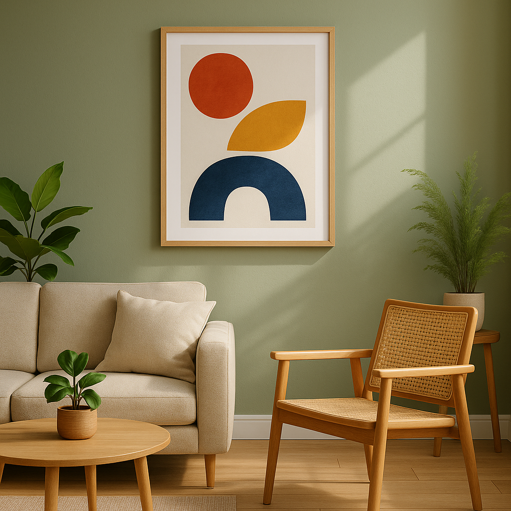
Digital blues—colors inspired by technology and virtual spaces—are also making their way into contemporary art pieces, creating interesting tensions between the natural and digital worlds. Many trending wall art palettes incorporate metallic accents like copper, brass, and gold, adding dimension and luxury to otherwise simple color schemes.
For those seeking wall art inspiration that feels current yet timeless, consider these popular combinations: deep emerald green with brass accents and pale pink; warm terracotta with cool blue and neutral cream; or sophisticated charcoal gray with vibrant lemon yellow and crisp white. These combinations offer enough contemporary flair to feel fresh while remaining versatile enough to endure beyond passing fads.
Incorporating trends doesn’t mean completely redecorating your space. Start small with a statement art piece that introduces one or two trending colors into your existing scheme. This approach allows you to refresh your space without committing to major changes. Add a creative, modern touch to any room with this abstract face art print colorful modern wall decor.
Creating visual impact with color contrasts
Understanding how to leverage color contrast is essential for creating wall displays that command attention. High-contrast combinations—like black and white, navy and yellow, or purple and lime green—naturally draw the eye and create dynamic energy in a space. When selecting art that needs to stand out, look for pieces that incorporate strong value contrasts (light versus dark) in addition to hue contrasts.
Visual hierarchy within your display arrangement helps direct attention where you want it. A single high-contrast piece can serve as an anchor in a gallery arrangement, with supporting artwork in more subtle tones extending the color story without competing for attention. This technique works particularly well when you have one significant piece you want to showcase among a collection.
The frame selection also plays a crucial role in either enhancing or diminishing your artwork’s color impact. White or light-colored frames tend to emphasize brighter colors within the art itself, while black frames create a strong boundary that can help contain visually busy compositions. For a more subtle approach, choosing a frame color that picks up a secondary color from within the artwork creates cohesion without overwhelming the piece.
Strategic placement relative to lighting also affects how much your artwork’s colors will pop. Position high-contrast or color-rich pieces where they’ll receive adequate illumination—either from natural light sources or dedicated art lighting. Even the most vibrant painting can appear dull if poorly lit, while thoughtful illumination makes colors appear more saturated and dimensional.
Balancing color between wall art and room elements
Creating visual harmony requires thoughtful distribution of color throughout your space. The 60-30-10 rule provides a useful framework: 60% of your room should feature a dominant color (typically walls and large furniture), 30% should incorporate a secondary color (medium-sized elements like accent furniture or large textiles), and 10% should include accent colors (accessories, small décor items, and potentially your wall art).
Your wall display can either support this color distribution or intentionally disrupt it for effect. If you’re seeking a calm, cohesive space, choose artwork that incorporates your room’s existing color palette but perhaps in different proportions or intensities. For spaces that need energy and visual interest, select pieces that introduce completely new hues as accents, creating moments of surprise and delight.
Scale and proportion affect color impact significantly. A small piece with vibrant colors might create an interesting accent but won’t dramatically shift the color balance of your room. In contrast, a large-scale artwork in bold colors can redefine your entire color scheme, potentially requiring adjustments to accessories and textiles to maintain balance. Consider both the intensity and quantity of color when determining how a piece will influence your overall space.
Textural elements further enhance the interplay of colors between your art and room. Matte and glossy finishes reflect light differently, creating varied color experiences even within the same hue family. Similarly, incorporating textiles that echo colors from your wall art helps distribute color throughout the space, creating connections that make your design feel intentional rather than haphazard.
Psychological effects of color in wall art displays
The emotional impact of different colors has been extensively studied and can be leveraged to create specific moods through your wall art selections. Blues typically evoke calmness and tranquility, making blue-dominant artwork appropriate for bedrooms and spaces dedicated to relaxation. Reds and oranges stimulate energy and appetite—perfect for dining areas but potentially overwhelming in restful spaces unless used as accents.
Yellow-dominant artwork tends to promote optimism and creative thinking, making it excellent for home offices and creative spaces. Green connects us with nature and promotes balance, working well in nearly any room but especially in spaces where stress reduction is a priority. Purple, historically associated with luxury and creativity, adds a touch of sophistication and works beautifully in spaces where you entertain or want to make a statement.
Cultural and personal associations with specific colors should also inform your selections. While color psychology provides general guidelines, your personal experiences with certain hues may override these tendencies. If a particular shade evokes strong memories or feelings for you, prioritize these personal connections over general color theory when selecting artwork for your most personal spaces.
Creating intentional mood shifts between rooms through your art selections can help define different functional zones in open-concept homes.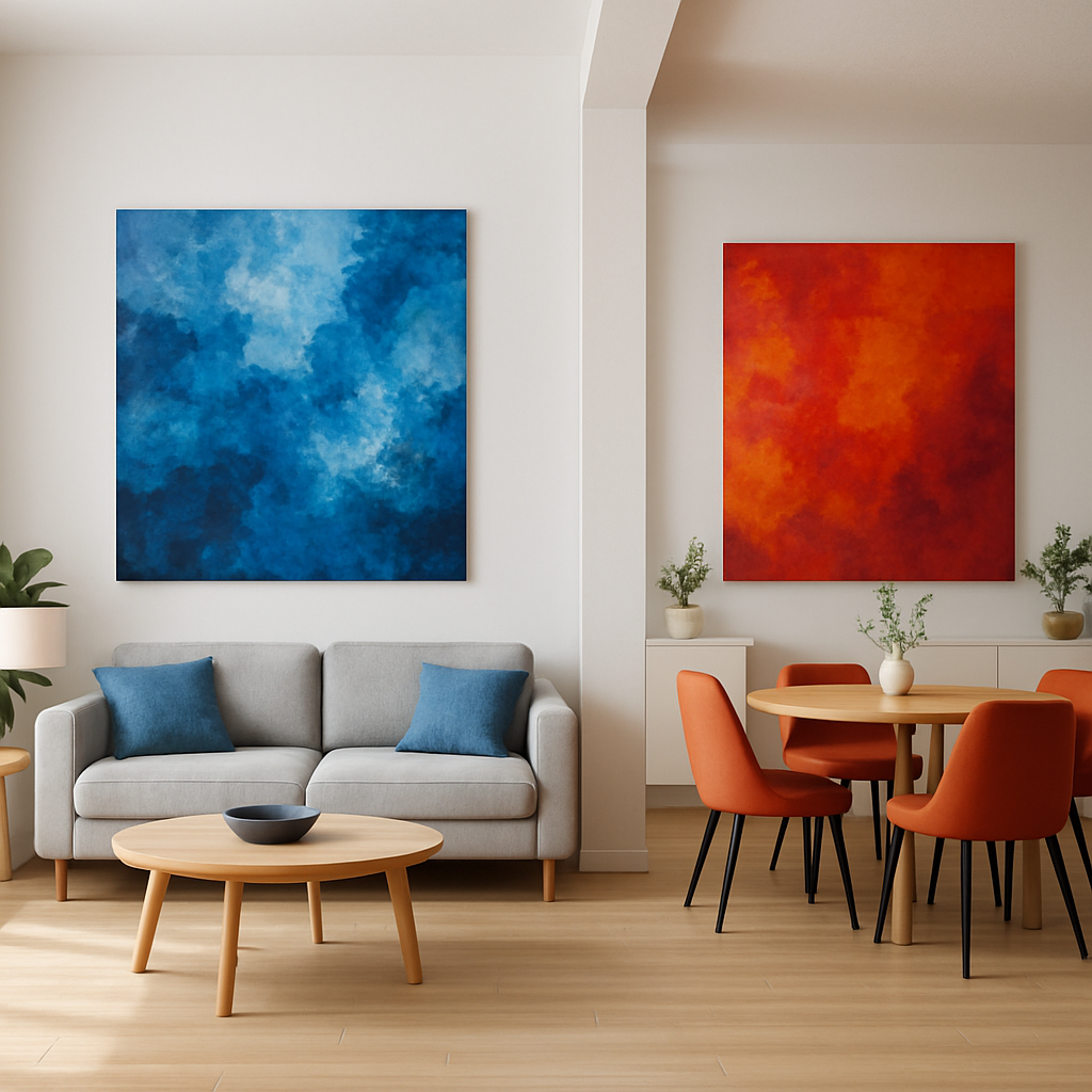
Using cooler, calmer palettes in relaxation areas and warmer, more energetic pieces in social spaces helps create psychological boundaries even without physical walls separating these spaces.
Practical tips for testing and arranging color palettes
Before committing to artwork, test potential color combinations in your actual space. Digital visualization tools allow you to upload photos of your room and overlay potential artwork, helping you preview how different pieces might look in context. Many online galleries and retailers now offer this feature, making it easier than ever to experiment without commitment.
Creating physical color swatches by painting small boards or using large paint chips gives you tangible tools to move around your space, testing how colors react to your specific lighting conditions throughout the day. Hold these swatches against your walls, furniture, and existing décor to see which combinations create the harmony or contrast you’re seeking.
When arranging multiple pieces together, create visual connections through color repetition. This doesn’t mean every piece needs to feature identical hues, but rather that colors should recur throughout your display in different proportions and intensities. This technique, known as color echoing, creates cohesion even among diverse artistic styles.
Start with a centerpiece artwork that captures your desired color palette, then build outward with supporting pieces that extract and expand upon these colors. For larger gallery arrangements, maintain balance by distributing similar colors throughout the display rather than clustering them in one area. This approach creates rhythm and movement that guides the eye through your entire collection.
Conclusion
Selecting color palettes for your wall art is both an art and a science—balancing color theory principles with your personal aesthetic and the unique characteristics of your space. Whether you prefer bold, attention-grabbing displays or subtle, harmonious integrations, understanding how colors interact with each other and your environment empowers you to make choices that truly enhance your living experience.
Remember that color preferences are deeply personal, and there’s no single “correct” approach to selecting wall art colors. The most successful spaces reflect their inhabitants’ personalities while creating environments that support their desired moods and activities. Don’t be afraid to experiment with unexpected combinations or to break conventional design rules if the result resonates with you.
As you explore different options, consider consulting with design professionals for personalized guidance or browsing curated collections for inspiration. Most importantly, trust your instincts—the artwork that consistently draws your eye and brings you joy is likely the perfect choice for your space, regardless of current trends or conventional wisdom.
Frequently asked questions
How do I choose a color palette for my wall art?
Start with your room’s dominant colors, then select art with complementary or contrasting hues to either harmonize or make the art stand out.
What wall art colors make a room look bigger?
Light, cool tones like blues and light greens can create an airy, spacious feel, especially when paired with similarly light wall colors.
Should wall art match furniture or wall color?
Not necessarily; use wall art to add interest. Consider both matching tones for harmony or using accent colors for a pop.
What are the 2024 color trends for wall art?
Key trends include bold retro brights, earthy muted tones, and graphic contrast palettes inspired by mid-century and Bauhaus art.
Is it okay to mix different color palettes within the same space?
Yes, as long as there’s a unifying color or theme. Mixing palettes can add depth and personality to a room.