Blog
Bauhaus Print: Transforming Retro Home Decor
Finding artwork that balances style and substance can be a real challenge for retro-loving homeowners. The appeal of Bauhaus prints lies in their bold simplicity and purposeful design, a combination that feels both modern and timeless. Originating in Germany under Walter Gropius in 1919, the Bauhaus movement transformed the way the world thinks about design by merging art, functionality, and industry. Discover how these iconic prints can bring a sophisticated yet accessible statement to your American home.
Table of Contents
- Defining Bauhaus Print And Its Origins
- Hallmarks Of Bauhaus Print Designs
- Popular Bauhaus Print Styles Today
- Choosing Bauhaus Prints For Your Space
- Decorating With Bauhaus Prints Effectively
Key Takeaways
| Point | Details |
|---|---|
| Bauhaus Prints Reflect Philosophy | These prints embody a philosophy where art, design, and function merge to serve human needs. |
| Visual Characteristics Matter | Authentic Bauhaus prints use simplicity, geometric forms, and restrained color palettes to create impactful designs. |
| Consider Your Space | When selecting Bauhaus prints, assess how they interact with existing decor and overall room aesthetics. |
| Focus on Functionality | Bauhaus prints combine beauty and practicality, enhancing visual interest without overwhelming the space. |
Defining Bauhaus Print and Its Origins
When you encounter the term “Bauhaus print,” you’re looking at something far more specific than just any geometric artwork or vintage poster. Bauhaus print refers to visual work created through the design principles and aesthetic vision of the Bauhaus movement, a revolutionary approach to art, design, and education that emerged in early 20th century Germany. The name itself comes from the German words “Bau” (building) and “Haus” (house), but the movement transcended architecture to reshape how we think about every creative discipline. These prints feature distinctive characteristics: bold geometric shapes, limited color palettes, clean typography, and a marriage of form with function that feels intentional and purposeful. Unlike decorative prints that simply look pretty on a wall, Bauhaus prints carry philosophy within their composition. They’re not just art; they’re a philosophy made visible.
The movement started in 1919 when Walter Gropius founded the Bauhaus school in Weimar, Germany, with an ambitious vision. Gropius created a revolutionary design approach that combined traditional crafts with fine arts and industrial production. This was radical for the time. Most schools separated art from commerce, treating them as opposing forces. Bauhaus rejected this division entirely. The school believed that artists and artisans should work together, that creativity could coexist with technology, and that good design should be accessible to everyone, not just the wealthy. The original curriculum included a preparatory course called the “Vorkurs,” which helped students develop their creative thinking before diving into specific disciplines. This foundational approach meant that every student, regardless of their eventual specialization, learned the same core principles about color, form, composition, and materials. By the time students created their first prints or designs, they understood the “why” behind every decision.
The Bauhaus became the most influential art and design institution of the early twentieth century, pioneering modern design by fusing art with industrial production. The school operated during a transformative period in history. From 1919 until its closure in 1933 under political pressure, the Bauhaus attracted visionary teachers and students who understood that design could shape culture itself. The movement emphasized that beauty and utility weren’t enemies; they enhanced each other. A chair should be beautiful and sit comfortably. A poster should catch your eye and communicate its message clearly. A print should make people think while looking striking on their walls. This philosophy spread globally as designers trained at Bauhaus dispersed worldwide, bringing these principles to America, Israel, and beyond. Today, when you buy a Bauhaus-inspired print from ArtMandre, you’re purchasing a piece of this legacy, a connection to a design movement that fundamentally changed how humans approach creativity and problem-solving.
Understanding Bauhaus origins matters when selecting retro prints for your home because it helps you recognize quality and authenticity. The movement wasn’t just an aesthetic; it was a complete philosophy about how design should serve human needs while maintaining artistic integrity. When you see clean lines, purposeful use of negative space, and typography that feels both modern and timeless on a Bauhaus print, those aren’t accidental features. They reflect decades of intentional design thinking. The North American design-conscious homeowners embracing Bauhaus prints today aren’t simply decorating with trendy patterns; they’re bringing a curated, thoughtful design tradition into their living spaces. This distinction matters when you’re investing in artwork that will live on your walls for years to come.
Pro tip: When shopping for Bauhaus prints, look for pieces that combine geometric shapes with minimal text or imagery, and verify that color palettes are restrained rather than vibrant—these hallmarks signal designs rooted in authentic Bauhaus principles rather than merely geometric-inspired artwork.
Hallmarks of Bauhaus Print Designs
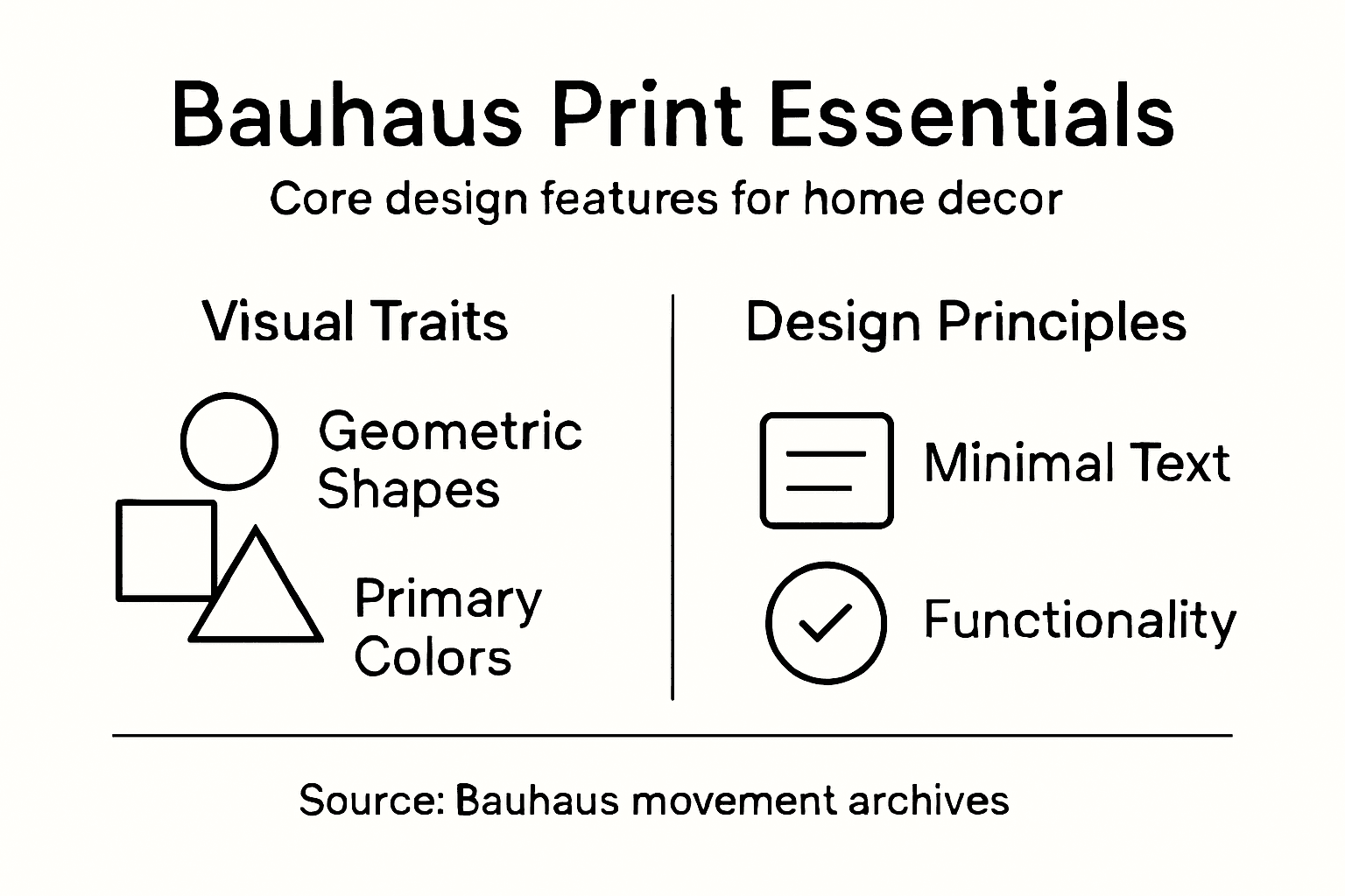
Walking into a room decorated with authentic Bauhaus prints feels different from spaces filled with other artwork. The difference isn’t subtle or hard to name; it’s immediately visible. Bauhaus prints share unmistakable visual characteristics that separate them from other design styles. The most obvious hallmark is simplicity without sacrifice. Rather than overwhelming viewers with details, these prints strip away everything unnecessary while keeping the design impactful. You’ll notice the absence of ornamental flourishes, decorative flourishes, and historical references that might appear in Victorian or Art Deco prints. Instead, Bauhaus prioritizes what actually matters: the core message or visual concept expressed through the clearest possible means. Clean lines dominate the composition. Geometric forms replace organic, flowing shapes. The color palette stays intentionally restrained, often using only primary colors (red, blue, yellow) paired with black, white, or neutral grays. This isn’t limitation; it’s deliberate choice. By reducing the color spectrum, designers force every hue to earn its place. Each color serves a function, whether drawing attention, creating balance, or establishing hierarchy. When you examine a Bauhaus print closely, you realize nothing exists by accident.
Typography and geometric abstraction form the second major hallmark of Bauhaus print design. Geometric forms and abstraction became the visual language through which Bauhaus communicated ideas. Circles, rectangles, triangles, and intersecting lines replace realistic imagery or decorative patterns. The typography itself functions as both text and visual element; letterforms become design components rather than simply conveying words. Bold, sans serif typefaces dominate because they align with the machine-age aesthetic and universal readability that Bauhaus champions. A Bauhaus poster might use a single oversized word positioned asymmetrically on the canvas, with geometric shapes anchoring the composition. This approach creates tension and visual interest without clutter. The spacing matters intensely. What designers call negative space—the empty areas surrounding the design elements—becomes as important as the elements themselves. Unlike traditional design where empty space might feel like a missed opportunity, Bauhaus embraces it as essential to the work’s power. This restrained approach influences how ArtMandre curates its Bauhaus print collection, selecting pieces that demonstrate this sophisticated balance between form and void.
The third defining hallmark involves the principle of functionality meeting aesthetics. Bauhaus design rejects the notion that beauty and practicality exist separately. Simplicity, functionality, and rationalism work together in these designs. A Bauhaus poster advertising a theater production isn’t merely decorative; it communicates essential information clearly while maintaining visual beauty. The hierarchy guides your eye naturally, emphasizing what matters first. The color choices direct attention strategically. The typography ensures legibility even from a distance. This dual purpose means Bauhaus prints age differently than purely decorative artwork. They don’t feel dated because they solve fundamental design problems rather than chasing temporary trends. When you hang a Bauhaus print from ArtMandre on your wall, you’re not just adding decoration; you’re introducing a piece of design history that still functions exactly as intended. The principles that made these prints work in 1920s Germany remain valid in your North American home today.
Recognizing these hallmarks helps you distinguish authentic Bauhaus-inspired work from pieces merely borrowing geometric aesthetics. True Bauhaus prints demonstrate restraint, intentionality, and the marriage of form with purpose. They speak through what they show and what they deliberately hide. When shopping for retro prints to refresh your interior spaces, look for designs that respect this philosophy rather than simply copying the visual style. The difference between a print that merely looks geometric and one rooted in genuine Bauhaus principles lies in how thoughtfully every element contributes to the whole composition. This distinction matters when you’re investing in artwork that will anchor your home decor for years.
Here’s a summary of Bauhaus print hallmarks and their unique impact on interior design:
| Hallmark | Visual Effect | Practical Benefit |
|---|---|---|
| Simplicity | Clean, uncluttered spaces | Reduces visual noise in rooms |
| Geometric Forms | Instantly recognizable shapes | Enhances modern or minimalist themes |
| Restrained Color | Primary hues, limited palette | Coordinates easily with decor |
| Functional Typography | Bold, readable text | Improves message clarity and focus |
| Purposeful Negative Space | Balanced compositions | Allows prints to “breathe” visually |
Pro tip: When evaluating whether a print truly embodies Bauhaus principles, ask yourself whether removing any element would weaken the design; if every component feels essential rather than decorative, you’ve likely found an authentic piece.
Popular Bauhaus Print Styles Today
Bauhaus design didn’t die in 1933 when the Nazi regime shut down the school in Berlin. Instead, it evolved, adapted, and became increasingly relevant in contemporary interiors across North America and beyond. Today’s popular Bauhaus print styles maintain the core principles established nearly a century ago while responding to modern aesthetics and lifestyle needs. You’ll find these prints showing up in minimalist apartments, Scandinavian-inspired homes, mid-century modern lofts, and even eclectic spaces where homeowners appreciate clean design amid intentional clutter. The reason for this resurgence is straightforward: Bauhaus principles solve real design problems. They create visual interest without overwhelming your space. They photograph beautifully for social media. They pair easily with furniture and other decor. Contemporary Bauhaus print styles continue featuring geometric abstraction and minimalism that emphasize clarity and visual impact. This timelessness attracts design-conscious homeowners seeking artwork that feels both retro and current simultaneously.
One particularly popular style today is the geometric abstraction poster, which strips compositions down to intersecting shapes, bold color blocks, and strong linear elements. These prints often feature a single dominant color paired with black, white, or metallics. Unlike ornate vintage posters from other movements, geometric abstraction Bauhaus prints feel uncluttered and sophisticated. Another trending style centers on functional typography, where words become visual art. A single powerful word or short phrase gets positioned asymmetrically across the canvas, with geometric shapes supporting rather than overwhelming the text. These prints work beautifully in home offices, creative spaces, and modern kitchens. A third popular category involves minimalist color field compositions, where large areas of solid color interact with simple geometric forms. Think a bold red rectangle balanced against a blue circle on a cream background. These pieces require confident wall space and make dramatic statements in otherwise neutral rooms. You’ll also see retro industrial designs gaining traction, which blend Bauhaus principles with machine-age imagery and typography that nods to factory aesthetics from the 1920s-1930s. ArtMandre specializes in curating all these contemporary Bauhaus interpretations, recognizing that today’s popular styles honor the original movement while feeling relevant to current design conversations.
The reason Bauhaus principles create innovative and timeless graphic works is their fundamental approach to solving design challenges through clarity and composition. Modern designers don’t simply copy historical Bauhaus work; they apply its methodology to contemporary subjects and contexts. You might see Bauhaus-inspired prints featuring modern technology, environmental themes, or social messages. The form remains true to the original philosophy, but the content speaks to today’s concerns. This flexibility explains why Bauhaus influences appear across such diverse applications, from corporate offices to residential interiors. For North American homeowners selecting retro prints, understanding these contemporary adaptations matters. You’re not limited to faithful reproductions of 1920s designs. You can find prints that capture Bauhaus DNA while feeling fresh and new. A print might feature a geometric representation of a coffee cup or a subway map rendered in primary colors with bold sans serif typography. These pieces satisfy the desire for Bauhaus aesthetics while avoiding the museum-quality feel that period reproductions sometimes carry. This balance between historical integrity and modern relevance defines what makes Bauhaus print styles so compelling in today’s market.
When shopping for popular Bauhaus prints for your home, pay attention to how contemporary designers are interpreting the style. The best modern versions don’t just copy geometric shapes; they understand why those shapes matter and how they create visual hierarchy and meaning. Look for prints that could work in both a 1930s design school and your 2020s living room. That versatility indicates genuine engagement with Bauhaus principles rather than surface-level aesthetic borrowing. Whether you’re drawn to bold color field compositions, functional typography pieces, or geometric abstractions with modern subjects, ArtMandre’s collection reflects current popular styles while maintaining the thoughtful design approach that makes Bauhaus printing worth displaying on your walls.
The following table compares different contemporary Bauhaus print styles found in modern interiors:
| Style | Main Features | Best Room Applications |
|---|---|---|
| Geometric Abstraction | Bold shapes, intersecting lines | Living rooms, entryways |
| Functional Typography | Text as visual art | Home offices, kitchens |
| Minimalist Color Field | Large color blocks, few forms | Bedrooms, reading nooks |
| Retro Industrial | Factory-inspired imagery, metallics | Studios, creative spaces |
Pro tip: Start with one statement Bauhaus print in a neutral color palette, then add complementary pieces gradually; this approach lets you understand which contemporary styles resonate with your space before committing to a full collection.
Choosing Bauhaus Prints for Your Space
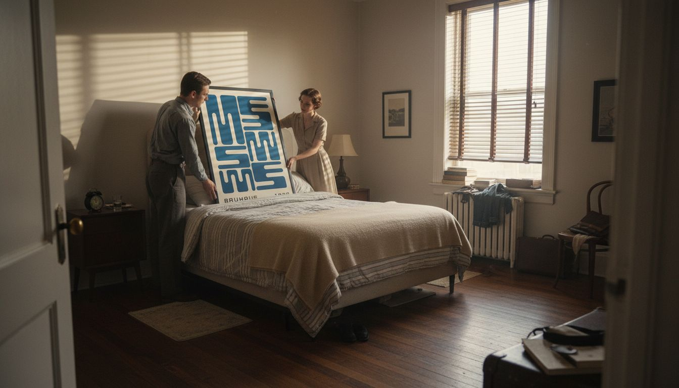
Selecting the right Bauhaus prints for your home isn’t about grabbing whatever geometric poster catches your eye. It requires understanding how these prints interact with your existing space, your lifestyle, and what you want your walls to communicate about your home. The process starts by honestly assessing your room’s existing architecture and design direction. Do your walls already feature clean lines, minimal ornamentation, and open layouts? Bauhaus prints thrive in these environments. They complement spaces built on modernist principles rather than fighting against ornate crown molding or busy wallpaper. The relationship between your print and your space matters enormously. A bold geometric composition on a wall already dense with visual elements creates chaos rather than sophistication. Conversely, that same print in a minimalist bedroom with neutral walls becomes a focal point that anchors the entire room’s aesthetic. When selecting Bauhaus prints for interiors, consider the interplay between form and function, ensuring your choices suit spaces demanding clarity and modernist aesthetics. This isn’t just about decoration; it’s about creating visual harmony through intentional design decisions.
Color consideration represents your second major decision point. Bauhaus prints typically feature primary colors (red, blue, yellow) combined with black, white, and neutral grays. Before purchasing, ask yourself how a bold red rectangle or blue circle will interact with your existing color scheme. If your furniture leans warm with browns and terracottas, a Bauhaus print heavy in cool blues might create tension rather than harmony. This doesn’t mean avoiding it entirely; tension can be good when intentional. But you need to understand what you’re introducing into your space. For many North American homeowners, the safest approach involves starting with prints that feature predominantly black, white, and grays with minimal color accents. These integrate smoothly into existing interiors while still delivering Bauhaus impact. As you gain confidence, you can introduce prints with bolder color statements. Room function also influences your choices. A Bauhaus print in a home office can be more aggressive in its composition because the space invites focused, intentional thinking. That same print might overwhelm a bedroom designed for relaxation. Consider wall placement too. A print above your sofa becomes a conversation piece everyone sees. The same print tucked into a corner office nook can be more experimental and personal. Think about your audience and the feeling you want each space to evoke.
Size and scale deserve attention that many homeowners overlook. A stunning Bauhaus print at 12×16 inches might feel timid on a 14-foot living room wall. That same print blown up to 24×36 inches might dominate a compact bedroom. Bauhaus prints enhance minimalist interiors with bold abstract forms and restrained use of color that reflect design principles rejecting decorative excess. Pay attention to how much wall space surrounds your print. Bauhaus embraces negative space, which means your artwork needs breathing room. A print crammed between a shelf and a window loses its impact. Ideally, leave equal space on all sides, or deliberately use asymmetrical placement to create dynamic visual interest. Matting and framing also influence how your print reads in your space. A Bauhaus geometric composition in a simple black or natural wood frame maintains its modern aesthetic. An ornate gold frame fights against Bauhaus principles and undercuts the print’s impact. From ArtMandre, you’ll find prints available in various sizes and framing options designed specifically to complement contemporary interiors.
Finally, consider your home’s overall narrative. Are you creating a cohesive Bauhaus-inspired interior, or are you adding singular statement pieces to eclectic spaces? If you’re building a unified aesthetic, select prints that share color palettes and compositional approaches so they feel intentional rather than randomly collected. If you prefer eclectic design, choose Bauhaus prints that contrast interestingly with your other elements. Either approach works if executed thoughtfully. Step back and view your space as a whole before making final decisions. How does the print relate to your furniture, your other artwork, your lighting? Does it enhance the story you’re telling about how you live? The best Bauhaus print for your space isn’t necessarily the most stunning print available; it’s the one that looks right where you place it, that makes you pause and appreciate it daily, and that reflects your personal design sensibilities while honoring the principles that make Bauhaus timeless.
Pro tip: Order samples or use augmented reality visualization tools if available before committing to a purchase, allowing you to see how specific prints interact with your actual walls, furniture, and lighting conditions in real time.
Decorating With Bauhaus Prints Effectively
Effective Bauhaus decoration goes beyond hanging a print on your wall and hoping it looks good. The philosophy demands intentionality, balance, and a clear understanding of how each element contributes to your overall space. Think of your room as a composition, not a collection. Every piece of furniture, every color choice, every print placement works together to create either harmony or discord. To decorate effectively with Bauhaus prints, integrate them as focal points within spaces that favor clean lines and open layouts, ensuring they pair with understated furnishings and neutral color schemes. Start by identifying where your Bauhaus print will serve as the focal point. This doesn’t mean it needs to be the largest object in the room; it means it’s the piece your eye naturally gravitates toward. In a living room, this might be the wall above your sofa. In a bedroom, perhaps the wall you see first upon waking. Once you’ve chosen your focal point, everything else should support it rather than compete with it. This requires restraint. If your print features bold red geometric forms, your surrounding decor shouldn’t introduce equally aggressive visual elements. A simple wooden shelf, a minimalist side table, a neutral throw blanket—these support the print by providing breathing room. Your furniture should demonstrate clean lines and minimal ornamentation. Ornate Victorian pieces or heavily patterned upholstery work against Bauhaus principles. Contemporary or mid-century modern furniture, with its emphasis on functional form, complements Bauhaus prints naturally.
Lighting significantly impacts how your Bauhaus print reads in your space. Poor lighting renders even stunning geometric compositions flat and lifeless. You need sufficient light to reveal the print’s colors and forms clearly, but not so much that glare washes out the details. Consider warm-toned lighting for prints featuring warm colors like red and yellow. Cool-toned lighting complements blue-heavy compositions. Natural daylight works beautifully for Bauhaus prints because it’s balanced and neutral. Position prints where they catch morning or afternoon light without direct sun exposure that might fade the colors over time. If natural light is limited, invest in adjustable track lighting or picture lights designed specifically for artwork. The goal is illumination that enhances without overwhelming. When displaying multiple Bauhaus prints, combining prints with Bauhaus-inspired furniture and decor creates cohesion throughout your space. This doesn’t mean every object must be Bauhaus-period authentic. Rather, select pieces that embody Bauhaus values: functionality, simplicity, geometric forms, and purposeful design. A contemporary sofa with clean lines and minimal ornamentation honors these principles. A coffee table with a simple steel frame and wood top reflects Bauhaus sensibilities. These pieces don’t need to be from the 1920s; they simply need to respect the design philosophy.
Color coordination requires careful consideration when decorating with multiple prints or combining prints with existing decor. If you’re using a single dominant print, let it guide your color palette. A print featuring primarily blues and blacks suggests a room anchored in cool, neutral tones. Introduce other colors through subtle accents—perhaps a blue throw pillow, a black frame, or gray upholstery. If you’re displaying multiple prints, ensure they share a cohesive color language. Two prints, one predominantly red and one predominantly blue, can work together beautifully if they both use the same gray and white background tones. The shared neutrals create visual connection. Avoid creating color chaos by introducing too many competing hues. Your walls should typically remain neutral—white, off-white, light gray, or warm beige. These backgrounds let your Bauhaus prints shine without visual competition. Wall texture matters too. Smooth, matte finishes work best; glossy or heavily textured walls can interfere with viewing the print’s geometric forms clearly. The concept of the total work of art guides effective Bauhaus decoration. This German term, “Gesamtkunstwerk,” means every element contributes to a unified vision. You’re not decorating with individual pieces; you’re creating a cohesive environment where art, architecture, furniture, and accessories work together purposefully. This might feel restrictive initially, but it actually liberates you because the decision-making becomes clearer. Each new item must earn its place by supporting your Bauhaus composition.
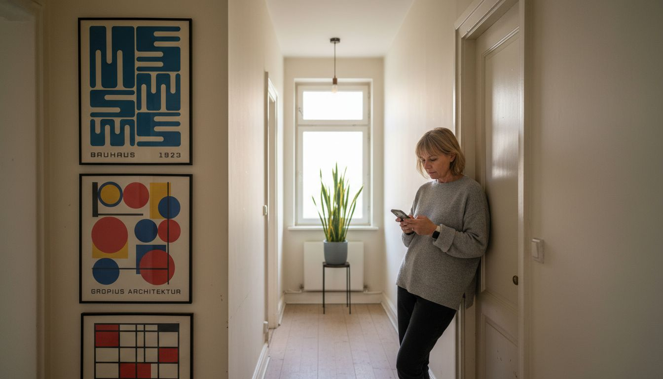
When arranging your prints on walls, spacing becomes crucial. Clustered arrangements can work if planned carefully, but they require more skill to execute successfully. For most homeowners, featuring a single statement print creates maximum impact. This allows the geometric forms to breathe and dominate the space. If you prefer gallery-wall arrangements, maintain consistent spacing between frames and select prints that share visual language. Don’t overcrowd; negative space remains essential. A common mistake involves filling every available wall area with artwork. Bauhaus celebrates what’s left unsaid, what’s left empty. A substantial area of blank wall beside your print often creates more powerful design than covering every inch with decoration. Step back frequently while decorating to assess the overall effect. Does the room feel balanced? Do your eyes naturally flow from one element to another? Does the space feel intentional or accidental? Trust your instincts. If something feels off, it probably is. The beauty of Bauhaus decoration lies in its directness; if a space respects the principles, it will feel right even if you can’t articulate exactly why.
Pro tip: Create a mood board by photographing your intended print against your actual walls and furniture using your phone’s camera, then review it over several days in different lighting conditions before making your final purchase decision.
Elevate Your Space With Authentic Bauhaus Prints From ArtMandre
If you are seeking to bring clarity, bold geometry, and purposeful function into your living space, Bauhaus prints offer the perfect solution. As highlighted in the article, the challenge many face is finding artwork that balances simplicity without sacrifice, where every color and form serves a clear intent. You want prints that do not overwhelm but instead enhance your home with timeless design principles rooted in Bauhaus philosophy. At ArtMandre, we specialize in offering carefully curated Bauhaus-inspired wall art that meets your design goals while fitting effortlessly into modern American homes.

Discover a wide selection of Bauhaus prints that feature iconic geometric shapes, functional typography, and restrained color palettes. Our collection supports your vision of intentional interior décor by blending retro authenticity with contemporary style. Venture beyond just decorating to creating a cohesive space where every element reflects thoughtful design. Browse the latest offerings at ArtMandre and take advantage of exclusive deals like buy 2 get 1 free while stock lasts. Start transforming your home today with artwork that captivates and complements your lifestyle. Visit Bauhaus Print Collection and make your next statement piece a genuine blend of form and function.
Frequently Asked Questions
What is Bauhaus print?
Bauhaus print refers to visual artworks created according to the design principles of the Bauhaus movement, characterized by bold geometric shapes, limited color palettes, and clean typography that marry form with function.
How can I incorporate Bauhaus prints into my home decor?
To effectively incorporate Bauhaus prints, assess your room’s architecture, choose colors that complement existing decor, consider the size and scale of the prints, and maintain a balanced design to create visual harmony.
What are the common characteristics of Bauhaus print designs?
Bauhaus print designs are known for their simplicity, geometric forms, restrained color palettes, functional typography, and purposeful use of negative space, which contribute to their modern and timeless appeal.
Why are Bauhaus prints considered timeless in interior design?
Bauhaus prints are considered timeless because they solve fundamental design problems through clarity and composition, allowing them to remain relevant across various interior styles and maintain their impact over time.